In moonlight the other retinal cells called rods are doing most of the work. Rods detect relative lightness and darkness, but they are entirely color-blind.
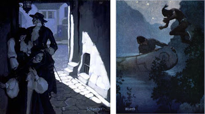
Moonlight is simply the white light of the sun reflecting off the gray surface of the moon. There’s nothing in that interaction to give the light a bluish or greenish quality. In fact, scientific instruments have shown that the light from the moon is very slightly redder in color than direct sunlight.
These facts added together suggest a mystery at the heart of how we as artists choose to portray moonlight in paintings. If moonlight is just gray-colored light, and if it’s close to the minimal threshold of our color receptors anyway, then why do so many artists paint moonlight as bluish or greenish? Do we really see it that way? Is it some kind of illusion, or perhaps is it just an artistic convention?
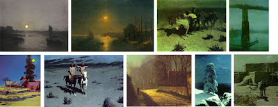
Let’s look at some paintings by master painters of moonlight. As you look at them, consider your own perception of the colors at night, and ask yourself which of the paintings best convey your own experience.
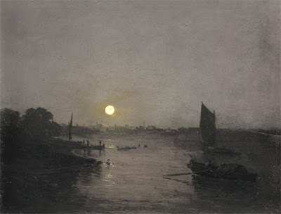 Here’s a painting by J.M.W. Turner. It’s fairly gray, with just a hint of warm color around the moon. Notice that there isn’t much detail in the shadow area. All you really see clearly are the silhouettes of the sail and the boat on the water.
Russian seascape painter Aivazovsky painted this night scene lit by a golden moon. The sky, the water, and the shadows all sink into blue-green tones. He doesn’t show very much detail, and he stops well short of black in the shadows.
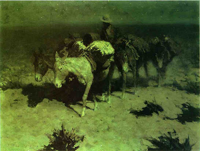
This lightening of darks was also a feature of Remington’s nocturnes. The cast shadow to the left of the pony’s nose is composed of dull umbers and greens. These luminous shadows lighten and liven the obscurity. Except for the light saddle cover, Remington has left most of the edges soft and undefined, especially on the donkey on the right.
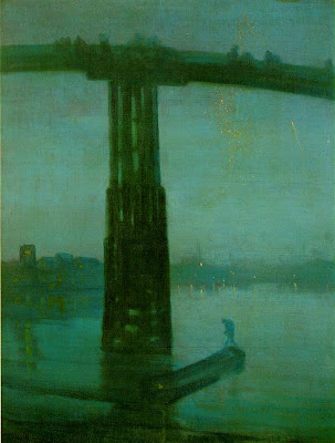
This famous nocturne by Whistler of the Battersea Bridge uses a fairly saturated blue-green color, especially in the water and in the silhouetted figure. The detail is blurred throughout, even in the areas where the bridge appears against the sky, setting up for the tiny sparkles of light in the distance.
One of the reasons for softening the edges is that we depend on the cones for fine discrimination of edges. Unfortunately the cones are located on the fovea, the centerpoint of vision, and with them off-line in the darkness, we just can’t sort out small details.
If you take a book or newspaper outdoors in moonlight, you can see that there is writing on the page, and you might be able to read headlines or other large type, especially when you glance around with your peripheral vision. But reading normal size text is almost impossible. When you look directly at the words, the blind spots get in the way.
I said earlier that our cones are barely functioning in moonlight. In fact, contrary to what some authorities have claimed, most people’s cones can make basic color judgments by the light of a full moon. But how much variation in color can we really see?
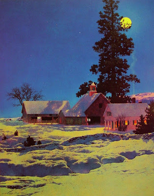
Maxfield Parrish rendered this moonlight scene with quite a bit of color saturation. He painted the yellow moonlight, the reddish cupula on the barn, the deep blue of the sky, and the orange color on the shadow side of the house. Did he really see such colors in moonlight, or did he invent them for pictorial effect? Too bad he’s not here to ask.
Direct plein-air painting is virtually impossible in moonlight. Every artist has to work from memory and imagination. We may try to convey our actual optical sensations, but we’re not scientists. Each of us is also trying to make a subjective aesthetic statement intended to evoke a particular mood or emotion. Any moonlight painting is an attempt to translate a “rod experience” into a “cone experience,” an image that will be seen in a brightly lit environment.
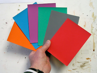 Here’s how you can test how your cones actually respond to color in moonlight. Paint a set of separate, matching, unmarked color swatches or find some construction paper at about the same value. Take them into full moonlight (this Tuesday) and let your eyes adjust (it takes about 30 minutes). Shuffle the cards, and while you’re still outdoors, mark on the back what colors you think they are.
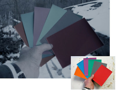 I have used Photoshop to manipulate a photo of the swatches (actually shot in daylight) to simulate how they appeared to me under the full moon: dulling, darkening, and blurring them. Both Jeanette and I could easily identify the basic hue family of each swatch. But beyond that basic classification, we weren’t sure, and the gray swatch confused us both.
When I looked at the same swatches in the much dimmer light of a half-moon, or in a moon shadow, I found my cones went sub-threshold and shut down completely, and the swatches became completely monochromatic.
Although the rods of the eye can’t actually see color, scientists have shown that they are most sensitive to greenish wavelengths of light. As a result blue-green hues appear lighter in tone in dim conditions. There’s a name for this: the Purkinje Shift. It’s a different phenomenon from, and often mistaken for, the perception of moonlight as blue.
You can demonstrate the Purkinje Shift by comparing a red and green swatch that start out indoors at the same value. If you take them outdoors in moonlight, the greenish one will seem much lighter in tone. Many observers have noticed that red roses look black in the moonlight.
If you scroll back up to my Photoshopped version of the moonlight color swatches, you can see I’ve adjusted the values to simulate the way the red and green looked to me as a result of the Purkinje Shift.
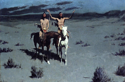
Here, Remington shows a scene with Indians in moonlight. We see their flesh tones and some clear red touches in their costumes. Throughout, the edges are much crisper than his other painting.
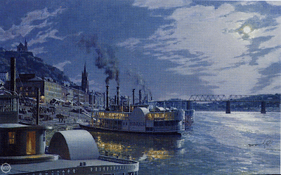 This nocturne of old Cincinatti by contemporary artist John Stobart has a distinctly bluish cast. He introduces much more detail than we’ve seen in the other examples, reminiscent of the “day-for-night” film shoots in old westerns. You can even read the name “Bonanza” on the shadow side of the ship.
In addition to the moonlight, there’s a secondary source of yellow-orange lamplight. In this case, one could argue that the blue cast to the picture may be a complementary color induced in opposition to the color of the lamplight.
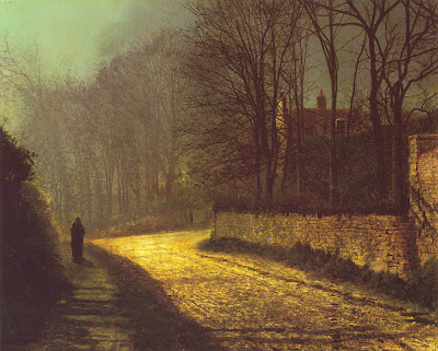 Atkinson Grimshaw was famous for his poetic moonlight studies. Here the shadow masses at the left are fairly soft and impenetrable, but the bricks and branches show up very clearly. The moonlight on the road is an intense yellow-orange, assuming this reproduction is accurate. The shape of the patch of light points to the lovers standing in silhouette at left.
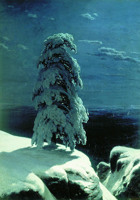
Russian landscape realist Ivan Shishkin, painted this haunting image of a winter night in the wild north. The snow in moonlight is relatively brilliant, with a soft halation along the edge at left, but it’s not yellowish. The cast shadow gradates in tone, getting lighter as it catches more sky fill and bounced light. There’s quite a bit of detail in the tree form, but he has kept the foreground and background description to a minimum.
So, to get back to the question posed earlier, why do we see moonlight as blue?
Saad M. Khan and Sumanta N. Pattanaik of University of Central Florida have proposed that the blue color is a perceptual illusion, caused by a spillover of neural activity from the rods to the adjacent cones.
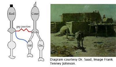 A small synaptic bridge between the active rods and the inactive cones touches off the blue receptors in the cones, kind of like an insomniac turning over in bed and rousing his sleeping spouse.
This influence of rod activity on the adjacent cones tricks the brain into thinking we’re seeing blue colored light, even though we’re really not.
As the authors put it: “We hypothesize that the rod cells predominantly synapse onto the S-cone (cone cells sensitive to bluish light) circuitry resulting in the visual cortex perceiving a tinge of blue.”
So moonlight isn’t blue; our eyes are just playing tricks on us.
Unfortunately, this tantalyzing hypothesis remains untested. I contacted Dr. Khan and he told me that because of other projects he hasn’t had time to prove the hypothesis in controlled conditions. I hope that he can shed more light—of whatever color—on this elusive topic.
Until then, moonlight remains a mystery at the meeting point of art and science.
Further reading:
- Khan and Pattanaik’s summary article in Journal of Vision, 2004. Link.
- Related discussion on the NASA web site. Link
- "The Eye and Night Vision," from American Optometric Association. Link.
- More on Remington’s nocturnes at David Apatoff's blog. Link
Tomorrow: Elegant Graphics

Hey James,
ReplyDeleteFirst let me say thank you from both myself and my roommate who have been reading your posts for a few weeks now and directly
applying some of this invaluable knowledge to our own paintings. Your generous and forthright sharing of knowledge with your
fellow artists is something, i think, that we should all aspire to!
This is a fantastic post and some great examples I havn't come across before. As painters, perhaps it would be fair to say
that the predilection toward blue as a night-time colour comes from a variety of subjective and objective catalysts - using
specific colours for a certain mood, to emphasize a narrative, to establish a warm/cool heirarchy and so on... As a
painter of both plein air and imagined landscapes, would you agree that it may also have something to do with 'colour
relativity' (i forgot the proper term) - the way we see a gray as warmer or cooler depending on the dominant colour around it? If
our perception of chroma is so limited at night due to the lack of sunlight, but a warm light is present, wouldnt the 'gray' of the moonlight
take on a complementary tint (in our perception?) While we have many cool lights in urban areas now (streetlights etc), most
lights worth painting, and most lights painted by artists worth examining, would have been warm (flame, lanterns, gas lights etc).
This definately begs more investigation as its a specific area I have neglected to think much on - time to do some digging and
painting. Thanks again - your blog and your books are daily inspirations in our studio :)
-Adam, Sydney
Thanks, Adam for your kind words and helpful thoughts. I believe you're right: orange light from incandescent or sodium vapor lights can make the night look blue by complementary contrast (I sometimes call this "induced color"). I've also noticed that the sky looks red-violet when I'm around yellow-green fluorescent light. Because of this effect, I tried to pick examples of nocturnes (the Stobart excepted) that didn't include much artificial light.
ReplyDeleteHi James,
ReplyDeleteThat was an interesting article. It is not too often that the artistic and scientific underpinnings of a uniquely (probably?) human experience are expressed in such simple and elegant harmony.
I must confess that I have personally never observed the blue shift phenomenon, but then again I'm a city dweller and not much of an outdoors person.
Saad, Orlando.
Thanks very much! (again!)
ReplyDeleteIt's sort of strange, but I've noticed that I tend to think that any night scene painted like the Aivazovsky one takes place on a sort of dark afternoon. I can't ever seem to accept warm colors for the moon.
ReplyDeleteThis was a fascinating post though. Reading this blog has helped my color work a lot, I think - I'm getting better at paying attention to actual colors that I see. Thanks for posting so consistantly.
Wow, what a post! Thank you. On a dino-related note, have you seen this Agatized Dinosaur bone? It's beautiful:
ReplyDeletehttp://www.flickr.com/photos/gembone/2205297565/
Your examples have me thinking about moon light in a whole new way! Thanks for the insights ^__^
ReplyDeleteThank you for such an extensive post on moonlight. As usual, you exceeded all expectations on the subject. Thank you for your thoroughness and generousity.
ReplyDeleteI find that the moon gives a blue light, at least to my eyes.
ReplyDeleteOn an interesting side-note, the other night I noticed that, while in a shopping mall parking lot, the yellow street lamps seemed to take all the color out of everything. It was all yellow--including me!
Spencer
I think this is the most interesting article I've ever read about color theory and lighting. I never even thought about it, or noticed that so many people paint the moonlight as blue. Thanks for sharing.
ReplyDeleteVery interesting topic! I linked your experiment and plan on trying it tonight. Thanks for all this great info!
ReplyDeletegail
I can think of one reason why night scenes drawn in blue or monochrome blue make sense.
ReplyDeleteEvening light is blue. Twilight is always a very rich vivid blue right before it goes dark. So there's something natural looking, if not accurate, about a painting that's saturated in royal blue with a few cold white moonlight highlights on it and sharp black shadows.
This is also my hypothesis for why monochrome blue paintings of anything, say, a still life, look good in a way that they just don't if they're say, monochrome red or green. It's that sense of twilight. Just my thoughts on the subject.
Robert
I didn't realize how excellent your blog is. Thank you so much for lavishing us with all of this food for thought, and I never would have thought that moonlight was redder than sunlight. Utterly fascinating.
ReplyDeleteMany thanks for this article. I worked for several months on a large mural not long after this that featured moonlight, and found this post invaluable.
ReplyDeleteMel, Sheffield, UK
Heya!
ReplyDeleteThanks for this blog. :) It's really helpful for light comparison.
Though, here's something to ponder- I did read your blog all the way through , and I do see that you said that light coming from the moon is slightly more reddish than the sun, so the light is generally warmer.
If we're JUST considering the light sources themselves, I'll have to take your word for it that the moonlight is slightly warmer than sunlight- as the sunlight itself is pretty fantastically bright white.
But in this blog, are you taking into consideration the way the light filters through the atmosphere?
For instance, as a human, you have seen that in the daylight, the sky is blue.
As an artist, you've probably seen that when sunlight hits an object, the shadow cast by that object (at least outside) is generally of a bluer hue, because of the ambient light of the sky around it - the sky is still a lightsource even if it's not as direct as the sunlight, right?
So what I'm getting at is, in general, is that when the light filters through the sky, the sky and the atmosphere become cyan, even though the sunlight itself is pure white, as far as our eyes can tell. When looking at mountains, etc, the further back the mountains go, the bluer they are.
I'm not saying that anything you've written in this blog is bonus (seeing as I've done very little research on eyes) but are you absolutely sure that the color of the sky has nothing to do with the way we perceive a blue night? There is still light filtering through the atmosphere, which is blueish during the daytime, at least - just much less light. Especially since we can seem to perceive at least some slight color variation in the light of a full moon.
Anyhow, that's just my question. What do you think?
Very interesting post. I learned something. That said, if it were merely my eyes playing tricks on me, than photos of scenes in moonlight would not look blue(ish). Cameras don't have rods and cones. I think the blue night comes not directly from the moon, but instead the sky, or, more accurately the atmosphere. After all, we can see it grow from daytime "sky" blue to nearly black as the sun disappears around the earth. The sky is always glowing a blue hue down upon us in thw daytime, but the sunlight is so bright, that this blue is lost, drowned out. As you said, moonlight is significantly weaker, so, the dark blue glow of the night sky, though nearly black, is still relatively strong, and blankets the earth in a slight blue. Or in short, sunlight makes the sky blue even when ricocheting off the moon. The more full the moon the better. Of course just like a sunset, it may appear red or other colors when near the horizon.
ReplyDeleteI really enjoyed your candid knowledge. In the field of painting it's rare. Awesome information and obviously timeless.
ReplyDeleteMy observations...Moonlight in the desert is a weak pinkish violet contrasted with the grayed blue-greenish shadows...both values close...moonlight vibrates. Looking at the moon on a clear desert night...you can see this hard-to-describe violet color clearly radiating and is especially noticeable when looking at the near planes.
ReplyDeleteWhen I have observed the moon in other regions of the country...the violet color is almost nil. The atmosphere and moisture must have something to do with most people seeing moonlight as blue since most people do not live in dark deserts. Visit Death Valley when there is a clear full moon and you will see what I mean...observe the radiance...beautiful beyond words.
Such a great post! I would have never thought of so many scenarios but the post made me imagine (and actually see through the photos you used) the wonderful effect moonlight can have on art.
ReplyDeleteNicely explained! Great job
ReplyDelete