By adding together the eye movement data from a group of test subjects, we can learn where most people look in a given picture.
To create the image below, the eye-tracking technology recorded the scanpath data of sixteen different subjects and compiled the information into composite images, called heatmaps. The red and orange colors show where 80-100% of the subjects halted their gaze. The bluer or darker areas show where hardly anyone looked.
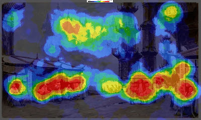 Here’s the heatmap for the painting Marketplace of Ideas, which we discussed in the last two posts.
 It turns out that there was very little interest in either of the main vertical columns. Instead, the red splotches reveal a concentration of interest in the figures. There were secondary interest areas in the far buildings and the sign in the upper right.
The interest in people, especially faces, appears to reflect a hardwired instinct to understand our fellow humans.
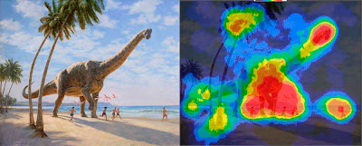 In the heatmap for Chasing Shadows, which shows a group of children running along a beach with a Brachiosaurus, there’s a strong focal point around the dinosaur's front feet and the nearby running children.
There are secondary points of interest at the dinosaur’s head and the leading child. Note how the action of the walking pose was read without directly looking at the rear leg.
Other spots of interest congregate around the dinosaur’s tail, the base and the top of the tree, and the vanishing point along the beach.
Hardly anyone looked directly at the sky, the upper palm fronds, or the middle section of the palm trunk. But these areas were presumably perceived in the halo of peripheral vision around the center point of vision.
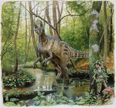 Have a look at this painting, and be aware of where your eyes travel.
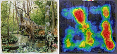
The heatmap for the painting Camouflage (click to enlarge) shows that everyone noticed the dinosaur’s face. They also spotted the hidden man and the small pink dinosaur.
According to statistical data connected to timing, these three faces drew almost everyone’s attention within the first five seconds. The dinosaur's face was statistically the first thing most people looked at, followed quickly by the hiding man. Below is one subject's scanpath, with the black numbers counting off seconds.
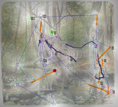 I was surprised that the two patches of lichen on the tree above the man scored near 100% attention. Evidently viewers noticed these strange shapes in their peripheral vision and checked them to make sure they weren’t important, or somehow a threat to the man. From a narrative standpoint, I suppose they were a bit of a red herring, distracting with no payoff.
The sunken log and the detailed patch of leaves in the lower left drew 60% of the viewers, perhaps because those were likely places for other dangers to hide.
Just because an element has sharp detail or strong tonal contrasts, it doesn’t necessarily attract the eye. The dark branches behind the dinosaur’s head drew almost no attention because they fit into the natural schema of a forest scene. Apparently the viewers developed a search strategy based on the threatening situation of a hungry dinosaur looking for a bite to eat.
PRELIMINARY CONCLUSIONS
These experiments force us to question a few of our cherished notions about composition and picture-gazing.
1. The eye does not flow in smooth curves or circles, nor does it follow contours. It leaps from one point of interest to another. Curving lines or other devices may be "felt" in some way peripherally, but the eye doesn't move along them.
2. Placing an element on a golden section grid line doesn’t automatically attract attention. If an attention-getting element such as a face is placed in the scene, it will gather attention wherever you place it.
3. Two people don’t scan the same picture along the same route. But they do behave according to an overall strategy that alternates between establishing context and studying detail.
4. The viewer is not a passive player continuously controlled by a composition. Each person confronts an image actively, driven by a combination of conscious and unconscious impulses, which are influenced, but not determined, by the design of the picture.
5. The unconscious impulses seem to include the establishment of hierarchies of interest based on normal expectations or schema of a scene. For example, highly contrasting patterns of foliage or branches will not directly draw the gaze unless they are perceived as anomalous in the peripheral vision.
5. As pictorial designers we shouldn’t think in abstract terms alone. Abstract design elements do play a role in influencing where viewers look in a picture, but in pictures that include people or animals or a suggestion of a story, the human and narrative elements are what direct our exploration of a picture.
As Dr. Edwards succinctly puts it, “abstract design gets trumped by human stories.” The job of the artist, then, in composing pictures about people is to use abstract tools to reinforce the viewer’s natural desire to seek out a face and a story.
--------------
Related posts on GurneyJourney:
Eyetracking and Composition, part 1
Eyetracking and Composition, part 2
Eyetracking and Composition part 3
Introduction to eyetracking, link.
How perception of faces is coded differently, link.
All the paintings are from Dinotopia: Journey to Chandara.
Many thanks to the team at Eyetools, Inc. for their assistance.


29 comments:
It was with a sense of relief and absolution that I read your first conclusion:
1. The eye does not flow in smooth curves or circles, nor does it follow contours. It leaps from one point of interest to another. Curving lines or other devices may be "felt" in some way peripherally, but the eye doesn't move along them.
Many times, I've looked at a painting and then read some analysis of it that said there was an embedded flow in the painting that the eye "followed," complete with a black arrow showing where it was. I knew my eyes hadn't made a tidy sweep. I was caught by a detail, then another, then another. Reading these analyses always made me feel I was too dense to "get" the route. It seems I was not alone.
Thank you very much for this series. It's quite enlightening. Were there any conclusions to what happens in compositions that just involve inanimate objects? Still life studies, for example. Or was this covered elsewhere?
Very ineresting!
Do illustrators or painters have a different eye path than "normal" people? And what would be your eye path on one of your own painting?
Does there necessarily have to be a connection between eye tracking and aesthetic value; would the results be any different if participants were told to stare at amateur artwork?
Sequential movements are a necessary result of the eye's small area of focus; making teleological assumptions is a great leap it seems to me.
I'm glad you brought up the idea of a picture with something "hidden". I know when I first looked at it and saw the two characters hidden in the leaves, I immediately started looking for anything else hidden. I don't think I would have done this if the two had been completely free of camouflage. It would be an interesting experiment to see whether the suject's attention is more focused on the three faces and less on the surrounding area if the same image were shown but without the camouflaging leaves on the two foreground characters.
(I remember this picture, and this event, from the book. I also remember another picture of the swamp, in which there were some crocodiles which were very obvious but also some well-camouflaged other animals: a snake that blended in very well with the fallen branches all around it, and a dragonfly. I enjoyed looking for all the hidden critters and finding them felt very satisfying.)
boy looks like a lot of misconceptions concerning those art rules teachers repeatedly drilled into there art students heads about controling the viewer with contour lines and divding the painting into thirds for focal points.....all looks like a bunch of bs now, haha.
i'm tempted to email this link to a few of my old art teachers, once again mr gurney your are on the cutting edge and making huge changes and improvments in the art world, thank you!
Great series, Jim! The only thing I'll add has to do with the dark trees behind the dinosaur's head. Whenever I'm composing an image, I try to pay attention to meta-contrast, a term that I slapped together to define contrast of contrast.
Contrast is always seen within context, so while something may have very high contrast, if everything surrounding it does as well, then it's lost its ability to call attention to itself. Also, in this case, the trees can't possibly compete with that dinosaur.
Great series.
I believe the old rules for composition probably provide a feeling of balance and understanding that then allows the eye to follow a path according to interest of content. If those elements aren't there , say in beginner's work, the eye probably treats things as separate objects or scans more constantly trying to make sense of the image.
etc,etc -- i don't know if teleology enters into it -- we are talking about a painting designed by a human for humans. The viewers are willing participants in the artifice -- and humans are always search for context and meaning.
This has been a very interesting series. I'd love to see the same experiments done with completely abstract art to see if similar patterns of jumping from one area to another were observed or whether this behaviour is only seen in representational art where the viewer is constructing a narrative as they look.
Very interesting. I'm curious if there has been any study on what happens after that first impression. I'm also curious if artists look a picture differently than most, perhaps stopping at interesting painting technique, or maybe taking it in more slowly with less over all darting.
Like Joe, I'm also curious what might come of looking at a pure landscape. It seems to me that "establishing context and studying detail" would necessarily happen in any composition, of course, relative to the image.
I've never believed that composition did much more than influence a viewer, because over the years I've conducted a test asking students to track the movement in a painting. I have them close their eyes and determine to note the first thing they look at, then repeat the process to figure out a rough pathway of the eye. The pathway often varies, except where there's some sock-it-to-you contrast, color or detail that's virtually unavoidable.
In your fifth point you say, "Abstract design elements do play a role in influencing where viewers look in a picture, but in pictures that include people or animals or a suggestion of a story, the human and narrative elements are what direct our exploration of a picture." So what of the non-narrative painting? Does abstraction play a more significant role then? Has Dr. Edwards explored that aspect?
Thanks for the lesson! Very instructive and interesting.
I read this post a couple of times to be able to capture it all.
(Especially the sentense "The unconscious impulses seem to include the establishment of hierarchies of interest based on normal expectations or schema of a scene." - gasp! That one has a high 'Art-By-Committee' potential!)
If you mean "A viewer will unconsciously be drawn to what seems anomalous in a scene." then, by Jove, I've got it!
But seriously, what do I want to remember from this great and thourough experiment? Let's be pragmatic and stick to a minimal set of practical rules-of-thumb.
1. Forget about composition, focus on 'interest'! (or...people first, and only then worry about compostion.)
2. Want to draw attention to something? Put a spotlight on it! (or...use whatever way to make it look just that little bit anomalous and it will automatically grab the viewer's attention.)
3. Don't overdo the above or underestimate your audience. They have a "natural desire to seek out a face and a story."
As a final side note: the common-sense notion that it's a good idea to place a human being in a landscape may actually be a very bad idea: the fella will suck up all the attention. No?
Thank you so much for sharing this experiment! I have to tell you I had a good laugh when I saw the first eye patterns, because they were so completely random, it was hard for me to see anyway to derive meaning from it. Here's one observation. In your first example painting, you wondered what role the tower would play, since it was along a golden mean line. If you look at the green dot (starting point), that tower was the first thing your viewer gazed on. So, what about all the other viewers? You should make more composite images, including all the green dots to see what drew people's attention first, and second, not just this average of where they gazed the longest.
I think this information would greatly add to your study.
This has been a very educational experience for me. As an artist and a fan of science, I can't thank you enough for putting this together. Ever since seeing you speak in San Francisco, I have had a whole new level of respect for the mind behind the art.
This has been an unbelievably fascinating experiment by you!!!
I have to admit, I wonder how much further you could take this into examining our id brain's dominance over our compositional understanding. For instance, if you put a naked lady in the LEAST attractive compositional spot, will it derail all of an artist's careful scholarly planning of composition?
The column is interesting in its lack of focus. I had always tried to figure that out about Steelyard or thirds cross sections. Do we end up looking at the paths, or do we look at the focal point cross section? You could argue the column succeeds greatly, because one of the biggest hotspots is its cross section with the horizon.
Thanks for putting all this great info out there! Can't wait for Imaginative Realism!!!!
Even though the eye does hop from one place to the other, if there is a strong "flow" in a composition I believe the eye would follow it to some degree... especially in more abstract artwork.
I tried viewing the image with the hidden man myself before I looked at the eye-path scan. I looked first at the dinosaurs face, the followed down to his feet, and immediately looked at that bush next to it... I don't think it has anything to do with "hidden dangers" as much as it was the direction the dino seemed to be moving and the bush was an object that my eyes could easily rest on. When I realized the bush wasn't terribly interesting, I moved to the lichen, down the tree and then spotted the man and did a double take. Ha.
Great experiment. Thanks again. Some good stuff to munch on for a while!
Hold on to your design elements and pictorial composition manuals!
Let’s not through the baby out with the bathwater!!
Just because the Human Animal has evolved to gather visual information in a way that does not jive with what we have learned and developed over the past several hundred years as techniques for creating ‘good’ design and pictorial compositions, it does not mean that those techniques are wrong or should be discarded. This eye tracking info is quite compelling and should be explored. We can add this to what we know about creating beautiful and compelling art.
It is obviously misguided to think that we are ‘controlling’ or ‘manipulating’ the way a viewer gathers visual information when looking at, or mapping, an image. But that is not the same thing as having an aesthetic experience about the map we have created by our looking. We ‘experience’ the painting as a whole, after we have gathered all of the visual information we need to create a map of it in our mind. A painting with solid design and compositional elements is, in my experience, more pleasing and compelling, than one without.
As Mr. Gurney’s second #5 preliminary conclusion states:
“As pictorial designers we shouldn’t think in abstract terms alone. Abstract design elements do play a role in influencing where viewers look in a picture, but in pictures that include people or animals or a suggestion of a story, the human and narrative elements are what direct our exploration of a picture.”
And I would add … while pictorial composition and design reinforces or enhances our aesthetic experience of the story.
As Dr. Edwards succinctly puts it, … The job of the artist, then, in composing pictures about people is to use abstract tools to reinforce the viewer’s natural desire to seek out a face and a story.
As several other Jouneyers have suggested, I’d love to see these eye-maps done with purely abstract compositions, both with color and in black and white.
Thanx for the Journey Mr. Gurney! -RQ
In considering this Eye Tracking and Composition Journey, I got to thinking about some of those paintings that are very successful and compelling in spite of their breaking or bending the rules of dynamic composition. The one that always stands out for me is Leonardo’s ‘Last Super.’ The main element of this most famous and successful painting is placed right smack in the middle of the composition, in complete violation of the most fundamental rule of design. And instead of compensating for this by some other trick of the eye, he reinforces the offense by nailing the main figure to the picture plane with the vanishing points of the other elements in the painting! Perhaps the great master understood what Dr. Edwards said, that “abstract design gets trumped by human stories.” Leonardo “use(d) abstract tools to reinforce the viewer’s natural desire to seek out a face and a story” and he placed the dominant figure, the image of God, at the center of the world and then uses the composition (abstract design) as a device to crucify him. Wow! Pretty powerful stuff! -RQ
Roberto, Daroo, Eric, and Etc: I agree--no need to chuck the traditional design theory (or write emails to your old art teachers!). The stuff they taught is useful if it leads to good pictures. Knowing how the eye actually moves around doesn't change the fact that some images feel harmonious and others don't. That's where science ends and art begins.
Erik: Sorry for the confusing sentence. I tried to edit my draft at 4 a.m.--dangerous. What I meant to say is that our brains automatically set up search strategies that favor anomalies. Or how 'bout: "We notice things that stand out."
Oscar, I'm glad you mentioned the column's importance even though it wasn't a fovea target. I think what the eye-tracking analysis misses is how things we DON'T look at help support the things we do look at.
There must be a lot of image processing going on in our peripheral vision. And a lot of areas in a picture that get passed over. What does that mean for us painters? If an area of the picture doesn't draw much attention, should we downplay it even more?
Joe, actually that 15-second "first impression" seems like an eternity to the test subjects. If you gave them a button and let them advance the screen, they'd spend only three or four seconds on each image. Ouch!
There was a good article on this topic in "Scientific American" June 1971, by David Noton and Lawrence Stark. It shows similar tracking records.
It is interesting to set up a video camera to show a close up of the eye of a person reading. The saccades are very obvious. The surprising thing is that vision is completely switched off during the "jump" - you do not see a streak as the eye moves. (Some people seem to see a bit of a streak - presumably their timing is not exact.) Try looking at yourself closely in a mirror: look at one eye and then at the other. You do not see the eyes moving.
As for traditional composition, I think that has its place further on in the visual process, when the mind is considering the picture as a whole, as an object in its own right.
What happens when one is taking photographs? In this case, you are looking for a composition in a real world which is not composed.
Tried to post this yesterday but it didn't seem to go through.
Jim, Id be curios to see how in the future you will use this information in your picture making. How or how much will this influence you. Will you be making different compositional decisions now knowing this? And if so Id love to see a step by step of a piece maybe showing these different compositional decisions being made. Explaining the reasons behind some of these decisions maybe comparing to old tried and true rules. Possibly a future Gurney Journey post?
Very interesting notes, thank you.
I agree with the comment by "etc, etc" above, it would be interesting to also see the heatmap of more sketchy/unplanned pictures and amateur pictures done without much attention to composition.
In your three pictures there are strong geometric elements pointing at the hot spots, I'd guess that the lichens in the third one and the palm leaves in the second one got attention because of both menacing contrast and being at one end of a tree trunk. In the first one I spotted the far away castle first and concentrated on it more than I did on the market for some reason.
Great study!
A couple comments asked about if artists see images differently, I found this related article which suggests that they do:
http://scienceblogs.com/cognitivedaily/2007/03/artists_look_different.php
My interpretation of the lichen hot spot in the camouflage picture is that the high contrast of the lichen attracted the eye after an initial look at the T-Rex face. We paused for a moment on that spot because in the periphery we saw an anomaly, then hey! there's a person there behind that thar tree.
Very interesting post, and great comments and well.
I feel the experiment you have used is unreliable in this account. When I am looking at an image,some feature in it will make me capture a part or full of the image and my mind and imagination are the things that track the contours in the image rather than rolling my eyes all over it.
Shamzu, I think you've brought up a very important point, one that has been bothering me, too. Put another way, these eye tracking experiments track foveal movement, but don't really measure how we perceive of larger shapes or contours through peripheral vision. I'll try to learn more about this topic and do another post in the future.
Interesting, I think it complements my own thinking. An article I wrote about compositon (jump to the bottom). http://www.androidblues.com/visualperception.html
I think this test data is misinterpreted just slightly - the branches for instance in the last one, if you look closely you can see that many people did look at or along them. It isn't zero. Also, for high-contrast lines like the palm trees and columns, the problem there is that the eye can't stop midway - it slides along to the end. So there's no data recorded of the eye having been there at all. So lines of higher contrast can be used to guide the eye to a location, to guide it away from the edge back into the image(usually a good rule of composition is to not push the eye off the image).
About the patches of moss, well they stand out a little due to a difference in contrast, and on top of that they are the general shape of a face.
Thank you for your intrepid collaboration with the tekkie guys.
I've always been suspicious of people saying that the eye "reads" like it does a text, or saying that leading lines are important, or that the rule of thirds is fundamental ... et cetera. But it was such a wall of "knowledge" that I doubted myself, at least a little. I've wanted to see studies like this but have only just found your page. It would be great to see larger studies, but as a preliminary essay this is great work, and full of much more plausible data than the old chestnuts.
As one commentator has already said, this does not negate traditional good deign and composition - but it does a fairly good job of blowing some half-knowledge that was wasting people's time right out of the water.
Many thanks for your efforts and sharing.
A 2020 paper cites your work:
The role that composition plays in determining how a viewer looks at landscape art. (Tanya Beelders and Luna Bergh University of the Free State, Bloemfontein, South Africa)
(https://www.ncbi.nlm.nih.gov/pmc/articles/PMC7963460/pdf/jemr-13-02-m.pdf)
They used landscapes without people in their study. This was to overcome bias towards seeking faces. The painting used had intentional composition rules applied so the expected eye path could be compared to actual eye paths of viewer.
Their conclusion:
“The results indicate that the composition is effective in leading the eye to a large degree, generally averaging higher than 50% similarity in terms of location. This result was seen for both comparison between actual- and expected-scanpaths and between participants, more often in the dwell-based scanpaths. However, the eye did not necessarily follow in the order or direction specified. Therefore, the standout elements are successful, but the guiding elements less so.”
So it seems composition helps set the focal points but individuals choose their own viewing sequence, perhaps nudged back to an intended path as their gaze shifts around. Interesting work!
Post a Comment