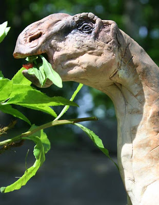
I found some very tiny leaves and put them in the dinosaur's mouth. I wanted to see real leaves to study the transmitted light. I also went to a botanical garden to photograph magnolia leaves, and used those leaf shapes for reference.
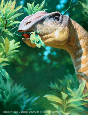
Here's the final painting in oil on illustration board. I concentrated detail and dark accents around the eye and the tongue, which in the maquette is curling back to grab the leaves.
 The far forest goes way out of focus to subconsciously suggest that this is a wildlife photo. Technically I handled this with white nylon flat brushes after a bristle block-in.
 Shallow depth of field is common in wildlife photographs because they are usually shot with telephoto lenses, which have a very narrow focal plane.
I also used an effect called "bokeh," which I haven't really defined yet on the blog. Bokeh (Wikipedia explanation here) is that cool photographic effect where far away bright highlights or sky holes become circles that increase in size with distance.
Even though I'm a traditional painter, I'm using a lot of photographic effects here quite deliberately to create a photographic impression and to blend the images naturally in Ranger Rick. Although I used those effects, I didn't trace the reference photos because there were a million ways I wanted to improve on them.
A lot of what I've learned about light and color and vision has come from my conversations with professional photographers, who think about imagemaking a little differently than artists usually do. Hope all this stuff isn't too dry and technical.
------
I'll be heading into New York City today for the Spectrum opening and Art Out Loud, so probably won't post tomorrow.


20 comments:
I think technical is one big reason I love your blog writing, James.
What a stunning final image. Fascinating use of photographic effect, too. I love those white nylon brushes as well, they're great for smooth gradation and blending.
Saw the first part. You are a master! Great work!
Wonderful work of art. I noticed on this piece as well as the last one you're getting some beautiful patterns and textures in the animal skin. Could you comment how you approach painting repetitious patterns like this?
I love these posts where you show your process!
Too dry and technical?
I think its wonderful.
Bil
I love the way you paint the surface textures and color variations in the dinosaur's skin. I've been working on a painting of a dragon and am finding that aspect of it very challenging.
As for the technical stuff, the more the better. At least for those of us who are painters trying to improve our work.
one reason for which I appreciate you so much is that you mix accurate documentation with inspiration, careful, patient handicraft with artistry.
I'm always surprised that you can build up many layers of oil painting in a short time, probably because I don't (can't) use turpentine.
One day I should try liquin or something like that.
To me, much more than with the 'big snake', this model shows how inspirational the random shadows can be. Most of those little shadows in that rough face are just impossible to imagine out of the blue. In the end result they add that little touch of credibility that you couldn't get otherwise. That 'ring of truth' as you called it.
I especially like the warm reflected light bouncing up into the cool shadow areas along the mouth, lower jaw and neck.
It seems to me,the bokeh effect works on two levels: As you say, by using photographic effects it gives the painting a naturalistic verisimilitude but on a painterly level its an excellent simplification that keeps the background subordinate. Whereas something like a lens flare competes for attention.
How do the nylon brushes stand up to Kerosene?
Fantastic image and these behind the scenes shop talks are great! Please don't feel you have to dumb the technical stuff down for us.
I'm curious to know what you've observed as the main differences between the photographer's and the painter's thought process.
I *love* how technical your blog is, especially as I am someone still learning how to draw, and have saved many of them to refer back to. (and as a professional photographer, how charming to find reference to bokeh outside of a photography magazine!)
THATS SOME NICE ART SHARPIE! I HAVE A LEO MOL PAINTING THAT HE DID BACK IN 1969 WHEN HE WENT ON A SKETCH TRIP WITH FREDERICK VARLEY FROM THE GROUP OF SEVEN!
IF ANYBODY IS INTERESTED IN PURCHASING THE PAINTING, FEEL FREE TO EMAIL ME AT QALLIX@YAHOO.COM
STARTING BIDS ARE NO LOWER THAN $10K. aS YOU ALL MAY ALREADY KNOW, LEO MOL PASSED AWAY THIS JULY - RIP TO AN EXCELLENT ARTIST AND SCULPTOR!
+++++++++++++++++++++++++++++++++
NOW READ THIS:
ALERTA!
La estafa automotriz mas grande en el territorio Mexicano…
Para MAS informacion pinche:
http://pedromillan.blogspot.com/
Gracias
Hey, thanks for all your work and sharing your techniques with us.
I do have a criticism though. This painting looks like you've posed a toy you bought from the store and painted from it. It looks so much like the reference that you should have spent more time on the reference, or model making, or just photographed the models.
It doesn't work as a 'wildlife photograph' it looks like someone photographed a toy.
I am learning a lot though. I just don't like this painting.
:-)
Barbara, that's just the Ranger Rick-bright-colors-for-kids.
The following procedure is blasphemic and shows great disrespect for the original artist, so do not try it, but I betcha that if you took the painting in photoshop, reduced saturation 25% and in the levels tool, reduced midtones to .8, you would end up with the National Geographic version of the painting.
(saturation up or down, followed by a midtones drop is a procedure I frequently apply to my own work, to give it some extra punch)
In regard to Pedro's post, am I alone in preferring to keep classified ads off Gurney Journey? A few of these have crept in recently. I feel it detracts from the blog.
I like the painting, I dislike classified ads, but I have one other thing to say:
"I'll be heading into New York City today for the Spectrum opening and Art Out Loud, so probably won't post tomorrow." - end of quote
Do you really think you can get away with that? ;)
Something about the toy colors-remarks: desaturation has become a color standard in many motion pictures.
Maybe that's why a dino with vivid colors looks very unfamiliar...
Steve -I agree. Hey wanna buy a watch?
Erik - interesting experiment.
Babara - a little harsh. But miniature photography shares some of the same characteristics as shooting with a long lens at a distance: it creates a limited depth of field, relative to the whole scene. Without a lot of visual clues as to scale, it can start to appear miniature.
Also, once you see up the magicians sleeve, sometimes its hard to see the magic.
Over at the Art Dept there are some shots of JG and Greg Manchess (and the others)
painting:
http://igallo.blogspot.com/
check out the twitter pic link on the right side
This stuff is gold, I can't wait for the book to come out.
This is not too technical or dry, its a great glimpse into the craft.
Fantastic, and thanks again.
Mark Heng: I meant to get back to you about your question about inspiration from photographers. I've been impressed with how photographers are incredibly aware of light---light levels, color temperature, and that sort of thing. They have a different vocabulary about many of the same things we think about as painters.
Post a Comment