Saturday, January 19, 2013

Part 5: Last question about the golden rectangle

I arrived at the end of my search for the truth about the golden mean. But I had one last question. Is the "golden rectangle" really more attractive than other rectangles? 

The answer was not what I expected, and not what I wanted to hear.

I had always accepted as an aesthetic axiom that the golden section rectangle (1.618 long by 1 wide) represented the ideal, even "divine" proportion. Was there any way to prove it?


In the 1860s, a psychologist named Gustav Fechner conducted experiments to explore this question. He presented subjects with an array of varying rectangles, and asked them which was their favorite.

The results showed that 76% of all choices focused on the three rectangles with ratios of 1.75:1, 1.62:1, and 1.50:1. The winner was the "Golden Rectangle" (D, above, with ratio of 1.618:1).

That seemed to settle the question for decades. Beauty, it appeared, could be defined in terms of a specific mathematical harmony of proportions.

Unfortunately, Flechner's conclusion unraveled as later scientists tested the hypothesis more rigorously. According to math expert Mario Livio,
"[University of Toronto professor Michael] Godkewitsch concluded from a study conducted in 1974 that the preference for the Golden Rectangle reported in the earlier experiments was an artifact of the rectangle's position in the range of rectangles presented to the subjects. He noted: 'The basic question whether there is or is not, in the Western world, a reliable verbally expressed aesthetic preference for a particular ratio between length and width of rectangular shapes can probably be answered negatively.'"
So, it seems, no rectangle stands out from the others as "golden" or uniquely beautiful. If a certain one gives us a warm feeling, maybe it's because we've trained ourselves to appreciate it.


The more I thought about it, the more it made sense. If the golden rectangle (1.618:1) really was the ideal shape, why didn't it appear everywhere in our carefully designed environment? Why don't we find it in the proportions of movie screens (1.37:1, 1.85:1, 2.35:1), photographs (1.50:1) television monitors, (1.33:1, 1.78:1) computer screens (1.33:1, 1.60:1, 1.78:1), credit cards (1.5858:1), not to mention iPhones, tablets, and office paper? Those rectangles, each so commonplace in our daily lives, vary greatly, and none of them quite matches the supposed ideal.

Perhaps there's a deeper aesthetic truth to be gleaned from all of this. A masterpiece, it turns out, does not issue from fixed mathematical rules. It comes from a happy mixture of all the elements of composition cohering with messy particularity. For one painting, a 3x4 rectangle might be the ideal choice; for another, a square might yield divine results. The picture's central idea must drive the decision. Just as there is no optimum running length for a film, no optimum key for a symphony, and no optimum structure for a poem, there's no optimum shape for a painting.

I welcomed these revelations as inspiring rather than disillusioning. Art cannot be reduced to any absolute formula. The golden conditions are situational, not preordained. A great creation pierces our hearts through an unexpected combination of factors. Beauty arrives in the night and hovers just outside our window, shifting and shimmering, floating just beyond the reach of our strings and calipers, unwilling to fit into any box we build for her.

Friday, January 18, 2013

Part 4. The golden mean and the human body

Yesterday we considered how even the most skeptical scientists agree that the golden mean is expressed in nature at the level of crystals, seed clusters, and leaf stems.

Then we followed the history of how golden mean geometry became accepted into art training, often accompanied by broader claims that golden mean geometry "permeates all structures" in nature, especially the human form.


The first question for today is: Can we believe assertions that golden mean geometry underlies the human form? 

This is more than just idle philosophical speculation for us as artists, because in order to draw accurately, we must always be looking for hidden proportions in the figure.

Art teachers have developed diagrams showing what appear to be golden mean relationships in the proportions of the face and the bones of the hand, and in other measurements of the figure. Below, the ratio of successive phalangeal bones of the digits appears to match the golden mean.

Are these measurements somehow baked into the human form as a kind of universal geometry, or are they convenient coincidences that inevitably appear to those who are looking for them? 

The advocate will point to the diagrams themselves as proof. Just look at the evidence. It's right in front of you.

The skeptic will argue that these measurements are a form of pareidolia, a phenomenon of perception where a random stimulus is given special meaning, such as seeing faces in clouds or hearing hidden messages in music. To convince the skeptic, one would need to demonstrate a physical mechanism, a logical cause, by which those relationships become manifest in humans. Such mechanisms have been proposed for golden mean properties of plants.

In the absence of such scientific evidence, this debate can never be settled rationally. Logically speaking, no skeptic can prove that golden mean geometry is not operating, and no believer can win over the skeptic with more and more examples, no matter how compelling. 

Let's pivot to the second question for today, which is much more practical:

Are golden section diagrams of the figure the most useful kind of structural understanding for us to use as artists? Or are we better off relying on Vitruvian diagrams (that is, diagrams based on whole number divisions)? 

Below is a classic Vitruvian diagram of the human head, broken down in halves and thirds, (from Drawing the Head and Hands, by Andrew Loomis).


My answer to the question, as it is with any argument about rival methods, is to learn them both and use what works for you. But don't overlook the Vitruvian system. These whole-number fraction systems have been used by artists for a long time—that's what Leonardo professed to be illustrating with his Vitruvian Man drawing, after all.

And Vitruvian systems were used in the 19th century Ecole des Beaux Arts, the Royal Academy, and the Art Students League. Why throw out those classic methods in favor of something Le Corbusier and the Bauhaus (second diagram) promoted?  

The prime measurement in the "divine proportions" analysis is the navel. That may have cosmic significance, but it's not a very important structural point for figure drawing. Vitruvian measurements are easy to see, measure, replicate, and subdivide on the drawing. It's much easier to place a mark in the 2/3 position than in the .6180339 position. When you're filming a dynamic scene with a video camera, it's easier to place a figure on the 1/3 position than in the golden mean position. 

No one is claiming that Vitruvian measurements have any mystical significance (except maybe Leonardo). They're just there as a convenient guide, to be replaced by another if it works better.

Regardless of what system one prefers, it's good to keep in mind that real humans don't fit any rule, thank goodness. We're not Barbie and Ken or Venus and Apollo, and any system of measurement is just a starting point for observation. Like many movements of anthropometry, claims of "divine proportions" in human figures are at best idealistic, and at worst unrealistic. Even if you average a lot of data, the measurement to the navel from the ground is higher than phi in men, and lower than phi in women.

Final note: I'm just trying to take a logical approach to this subject, to try and sort fact from misinformation. I'm not against mystical approaches--far from it. And I'm ultimately pragmatic. Whatever works to improve your art is good. What I'm going after are authoritative, scientific sounding assertions that students aren't allowed to question.

Tomorrow I would like to approach the last—and perhaps biggest—question: Is the golden mean rectangle somehow more attractive than other rectangles? 

GurneyJourney series: Mythbusting the Golden Mean
Part 2: The golden mean and Leonardo
Part 3: How the golden mean caught on with artists
Part 4: The golden mean and the human body
Part 5: Last question about the golden rectangle


Additional reading:
Book: Drawing the Head and Hands by Andrew Loomis
Book: The Golden Ratio: The Story of PHI, the World's Most Astonishing Numberby Mario Livio
YouTube video: "Nature by Numbers"
Finger measurement slide from here.

Thursday, January 17, 2013

Part 3: How the golden mean caught on with artists

After considering the Parthenon and Leonardo Da Vinci, let's see if we can continue taking a rational look at the claims about "phi," (or the "golden mean" or "golden ratio") that has been so popular with artists.

The story gets more complex in the nineteenth and twentieth centuries as artists begin to consciously adopt it in their work, and so it gets harder to separate fact from fiction. Let's start with what we know for sure.

One of the nineteenth century champions of the golden mean was German psychologist Adolf Zeising (1810-1876) who found the golden mean in nature, especially in branching patterns, leaves, and seed patterns. These manifestations of the ratio are acknowledged by even the most skeptical scientists.

Over the years scientists have found other places where the golden mean turns up. In 2010, the journal Science published a paper about how these numerical patterns appear in crystals at the atomic scale.

The golden mean appears most often in terms of numerical relations, such as the Fibonacci numbers that appear in flowerheads, seeds, and shells.

Zeisler promoted the idea that the golden mean could be found in the Parthenon and the works of Leonardo. He made broad claims that the golden ratio was: 
"the universal law in which is contained the ground-principle of all formative striving for beauty and completeness in the realms of both nature and art, and which permeates, as a paramount spiritual ideal, all structures, forms and proportions, whether cosmic or individual, organic or inorganic, acoustic or optical; which finds its fullest realization, however, in the human form." 
Whether or not Zeisler's ideas had a solid grounding in observable fact, they caught on with artists and mystics. 

A group of painters led by Jacques Villon and called "Section d’Or," (French: “Golden Section”) held exhibitions in Paris between 1912 and 1914. They included Juan Gris, Robert Delaunay and Giro Severini and several others, though not all used the mathematical principles. Later artists such as Salvador Dali also claimed to use golden mean principles. 

In the 1920s, Jay Hambidge, a student of William Merritt Chase, published a book called Dynamic Symmetry  which presented a grid system based on the golden mean. The system was picked up by artists such as Maxfield Parrish, whose preliminary drawing for the famous painting "Daybreak" is above. Here's one person's analysis of the structure behind Daybreak. 


Above: Architects' Data (German: Bauentwurfslehre) First published in 1936 by Ernst Neufert,

Golden mean principles were adopted in extremely different aesthetic quarters in the twentieth century. Many readers of this blog have encountered golden mean principles in the context of contemporary realist ateliers.

The methods were also embraced by the Bauhaus school (literally "House of Construction"), founded by Walter Gropius in Germany between World War I and II, and run by influential architects such as Ludwig Mies van der Rohe. 

The Swiss architect Le Corbusier, who championed the international style of building design, used the golden ratio and the Fibonacci series as a central tenet of his work and teaching. He described the patterns as:
 "rhythms apparent to the eye and clear in their relations with one another. And these rhythms are at the very root of human activities. They resound in man by an organic inevitability, the same fine inevitability which causes the tracing out of the Golden Section by children, old men, savages and the learned."
Many Bauhaus teachers emigrated to America, where their ideas about the golden section became incorporated in university art educations, where they are taught to this day. 

Wednesday, January 16, 2013

Part 2: The Golden Mean and Leonardo

Yesterday I challenged the cherished notion that ancient architects used the golden mean as a design template for the Parthenon of Athens. (For those who don't know, the golden mean is the ratio of 1.618.../1. It also goes by other names: the "golden ratio," "golden section," "phi," or the symbol "Ï•".)

Today let's consider whether Leonardo Da Vinci used this mathematical principle in his artwork. The claim that he did so appears in everything from modern how-to books on composition, to art school lectures, to popular novels such as Dan Brown's The Da Vinci Code.

Leonardo did several drawings of the idealized human figure set inside a geometric grid, including the so-called Vitruvian man.  


The drawing can be overlaid with golden mean measurements, and they seem to click. The distance of the full height of the figure compared to the distance from the ground to the navel is roughly equal to phi.

Leonardo mentioned phi in his notebooks. He illustrated a book called "On the Divine Proportion" by Luca Pacioli. In that book, Pacioli discussed the golden mean and its application to geometrical shapes and the human figure. Leonardo's illustrations for the book mainly include geometric solids such as Rhombicuboctahedron below.


But according to George Markowsky, "the biographies of Leonardo by Clark, Vallentin, and Zammattio et al give no indication that he used the golden ratio in paintings or drawings not intended for Pacioli's book." Instead, both Pacioli and Leonardo himself advocated a Vitruvian system of proportion, using relationships of whole numbers such as 1:2, 1:3, and 2:5.

In Leonardo's own notes to accompany the Vitruvian man drawing, he cites whole number relations such as: "a palm is four fingers; a foot is four palms, a cubit is six palms, four cubits make a man," etc. In the measurement markings on the drawing, he also places whole number ratios (or Vitruvian) divisions, such as halfway to the crotch, etc.

Artists today are familiar with whole number relations in figure drawing, such as "a figure is about eight heads tall," or "the eyes are halfway down the head," knowing that individuals can vary widely from the ideal.

The analysis of the geometry of the Vitruvian man drawing gets really arcane and will probably be endlessly debated. But for the purpose of this post, we have to ask the simple question: If Leonardo was thinking about the golden mean in the Vitruvian man drawing or any other work, why didn't he clearly demonstrate his intention anywhere in his notes?

The golden mean relations that people have found in the drawing ex post facto are not conclusive proof that Leonardo was thinking of phi, because anyone could overlay the figure in other ways with segments exhibiting nearly any other ratio. We would need to find, as Antonio said yesterday in the comments, "historical documents that proved the intention was there."

Was the golden mean a special, divine, or magical principle to Leonardo? Was it a secret aesthetic principle that, like the name of Voldemort, was too powerful to utter? Or was it for Leonardo just one of many fascinating irrational math numbers, such as:

pi=3.1415926535....
√2=1.41421356237....
phi= 1.61803399....
ζ(3)= 1.2020569031....
γ=0.5772156649....


I would like to keep an open mind about all this, especially because we're talking about a fascinating genius who combined art, math, and science in such unexpected ways. But I'm also skeptical of casual claims made about the golden mean geometry in Leonardo's painted work. Even the proponents don't agree in their diagrams, and each diagram on its own doesn't even make sense most of the time.

I bring all this up reluctantly and with respect, because many of my friends and colleagues—many of whom are great painters—use the golden mean centrally in their work and their teaching. My intention isn't to run around upsetting pretzel carts. And as I said yesterday, if any system helps you paint or observe better, than by all means use it. 

And I'm certainly not against the idea of mysticism in art. Much of my own artistic inspiration comes from sources that I can only describe as mystical. What I object to is pseudoscience and misinformation, assertions of fact that have no grounding in science or history.

The story continues tomorrow. 

Wikipedia on Vitruvian man.  

Tuesday, January 15, 2013

Mythbusting the Golden Mean, Part 1

In architecture and design schools, it's common to hear the claim that "golden mean" geometry was used in the design of ancient buildings, especially the Parthenon. 


According to mathematician Keith Devlin of the Mathematical Association of America, this is a groundless myth, with no basis in fact whatsoever.


The golden mean (also known as the golden ratio or the divine proportion) refers to the relationship of 1:1.618..., an irrational number also known as "Phi." The ratio is found in nature, and has been championed in the last two centuries, but many other claims are unfounded.

Although Greek mathematicians knew about Phi, there is not a shred of evidence that any Greek architect used such a system as a design principle. Euclid's study of Phi occurred long after the Parthenon was already finished.

Devlin says:
"The oft repeated assertion that the Parthenon in Athens is based on the golden ratio is not supported by actual measurements. In fact, the entire story about the Greeks and golden ratio seems to be without foundation. Numerous tests have failed to show up any one rectangle that most observers prefer, and preferences are easily influenced by other factors. As to the Parthenon, all it takes is more than a cursory glance at all the photos on the Web that purport to show the golden ratio in the structure, to see that they do nothing of the kind. (Look carefully at where and how the superimposed rectangle - usually red or yellow - is drawn and ask yourself: why put it exactly there and why make the lines so thick?)"
In the examples above, the placement of the golden rectangle doesn't agree from one diagram to the next. In the top example, the sides of the rectangle hug the columns, and in the next, they're touching the edges of the pediment. In some, the bottom of some rectangles correspond to the bottom of the columns, while in others, they're several steps down the base. In the middle example above with the white lines, the source photo itself seems to be stretched vertically by about 15%.

According to University of Chicago math professor Phil Keenan, it doesn't matter how you arrange the diagram, because the lines in the Parthenon aren't straight or parallel anyway due to entasis and other factors. He says:
"One cannot define an exact rectangle on the front or back faces of the Parthenon. Even though the Parthenon is built to extremely accurate specifications, its curvature precludes rectangular measurements of any greater precision than about 1%. This built-in error precludes finding any Golden Mean rectangles, since the required accuracy is simply not attainable."

George Markowky elaborates:
"The dimensions of the Parthenon vary from source to source probably because different authors are measuring between different points. With so many numbers available a golden ratio enthusiast could choose whatever numbers gave the best result."
Keenan points out that, "the presence of the Golden Mean in the Parthenon was postulated by Adolf Zeising in the 1850s, and appears nowhere in ancient Greek architectural treatises."
Devlin concludes: "I am not convinced that the Parthenon has anything to do with the Golden Ratio."

Anticipating some questions and comments:
1. Does the golden mean appear in nature? Yes, and I'll get to that later in the series.
2. Is it a useful tool for composition or analysis? Sure, if it works for you. Busting this myth doesn't take away anyone's candy.
3. Do contemporary architects use it? Bauhaus training has reinforced both the myth and the practice.

Monday, January 14, 2013

Backlighting Article in International Artist #89

The new issue of Issue 89 of International Artist magazine has a feature article that I wrote about the unique effects that you can get from backlighting. 


Included in the article are several never-before-reproduced studies that have appeared on this blog, such as Dockside Scene and Snyder Swamp.

International Artist was recently voted the "Best Art Magazine" by readers of this blog.

Sunday, January 13, 2013

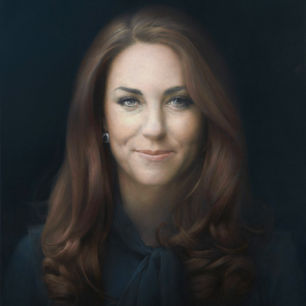
Kate's Stifled Smile

With a self portrait, there's only yourself to please.

With a private commissioned portrait, there's yourself, the sitter, and sometimes the sitter's family, who typically pays for it.


Visit NBCNews.com for breaking news, world news, and news about the economy

(Video link) With a portrait of an important public figure such as Kate, Duchess of Cambridge, there's yourself, the sitter, the Royal Family, the public, the pundits, and your fellow painters. That's a lot of people to think about. And which face do you try to capture, the "natural self" or the "official self"?


Artist Paul Emsley says that "after initially feeling that it was going to be an unsmiling portrait, I think actually that it was the right choice in the end to have her smiling, because that's really who she is, I think." After two sessions, he worked from a photo that he and Kate both approved (below, thanks, Mark Heng)


In the portrait, Kate has a complex expression called a "stifled smile." The smile is restrained by the action of the orbicularis oris, mentalis, and triangularis muscles. Those muscles act together to oppose the normal smiling action of the zygomaticus major.

Try to match the expression yourself, and you can feel the conflicting tensions.


In his book about facial expressions, Gary Faigin says that in the stifled smile, "the lips are frozen in a middle position and surrounded by a complex muscular landscape."

The stifled smile can appear either shy, endearing, smirking, impish, conflicted, scheming, self-conscious, or self-satisfied. Faigin says it's often used in advertising, but rarely in art.

Edit: Poll results from 78 votes "What emotion does Kate's portrait suggest?": Smirking 24 votes, Conflicted 15, Self conscious 14, Endearing 13, Self satisfied (tie) 13, Impish 9, Other 9 (tie), Shy 5, Scheming 4 votes. 

What emotion does Kate's expression suggest to you? And does it matter what you or I think? Both the artist and the model are reportedly happy with the results. According to Marvin Mattelson, quoted in the video piece, that's all that really matters. If anyone else likes it, that's just a bonus.
------
Book: The Artist's Complete Guide to Facial Expression
Photo of artist is from MSN News
Huffington Post: "Kate Middleton Portrait Unveiled....And It's Awkward."  (1400+ comments)
Making a Mark blog, with two additional videos
Paul Emsley's website

Previously on GJ: Smiling Presidents

Saturday, January 12, 2013

Leyendecker Exhibit in NYC

There's a exhibition of J.C. Leyendecker originals currently at the National Arts Club in New York through January 19th.
"Leyendecker (March 23, 1874 – July 25, 1951) was one of the pre-eminent American illustrators of the early 20th century. He is best known for his poster, book and advertising illustrations, the trade character known as The Arrow Collar Man, and his numerous covers for The Saturday Evening Post." 
Exhibit: J.C. Leyendecker: It's a Man's World 
Book: J.C. Leyendecker: American Imagist
Thanks, R.A.

Gamut Mapping at MICA

Many painting teachers have been using Color and Light: A Guide for the Realist Painter as a textbook in the classroom. Patrick O'Brien, who teaches painting at the Maryland Institute College of Art, described the lesson he taught out of the book:

We experimented with your method of gamut masking and mixing color strings. We used pages 123-131 in Color and Light, and also referenced pages 106-107 and 116-117.
For the exercise I brought in some simple photographs for them to copy, because I wanted to take the drawing element out of it, so they could concentrate on the color scheme. On the morning of class I went to the MICA library to find a color wheel to use. 
 In flipping through all the books about color, I could not find a single good color wheel that went to grey in the center. So we had to use the small color wheel in your book on page 75. We used index cards and tape to make the masks. As you can see, some students' first instinct was to photograph it with their phone and bring it back to their seat.  
 I had each student draw the subject twice. We did one small painting in one color gamut, and then their homework is to do another painting of the same scene in the other gamut. Pretty much exactly what you did in your video with the CircusCircus sign. 
 And now I've been inspired to incorporate these ideas into my own painting as well. I'm working on a New York 1940s maritime scene that would be perfect for a cool gamut.
Thanks for the great ideas! ---Patrick O'Brien, MICA

If other instructors are doing class projects based on ideas in Color and Light, please send me photos and a description, and I’ll try to share them on the blog.

And if you want to use Color and Light as your course guide, please let me know. At our little web store, we can offer you discounts on group orders, and I can sign them for each of your students.

MORE INFO:
Color and Light: A Guide for the Realist Painter signed from my web store
Color and Light: A Guide for the Realist Painter on Amazon
All photos by Patrick O'Brien
Previously on GJ:
My painting demo for Patrick's class at MICA 
Jason Dowd's use of C&L at LCAD


Friday, January 11, 2013

Bleecker and 11th

Yesterday in the West Village of New York City, a slice of afternoon light spotlit the brick apartments on the corner of Bleecker and 11th Avenue. 

What attracted me was the way the left tree was a dark pattern against the light building, while the central tree was a light texture against the cast shadow. Since my main interest was this tonal relationship, and since I only had a half hour to work, I limited my approach to a black and white wash drawing.


I'm sitting on a park bench holding the watercolor notebook on my knee. On the right is what the sketch looks like after about 10 minutes. At this stage I'm dropping in big tones over a rough perspective grid, careful to paint around the white of the branches and the windows.

For the big tonal areas, I use two Niji water brushes, one filled with water, and the other filled with Higgins Eternal ink. The light gray areas are the clear water brush picking up a little ink.


Here's a detail of a section the size of a postage stamp. After the big washes dry, I use a black watercolor pencil for the linear details of the windows, mullions, cornice details, and small branches.