A weird thing happened at 6:32 p.m. at the rest stop on the north side of I-90 near Angola, New York. We were stopped to look at a map and we heard someone doing something at the back of the car. We saw a guy with a long brown coat jog off past the dog walk area into the forest.
We checked and nothing seemed to be taken from the back of Trusty Rusty, but there was a little note on top of the load. It was kind of creepy—some crackpot stalker apparently trying to take credit for Dinotopia: Journey to Chandara.
I guess you can expect anything on Halloween, but how would this guy, whoever he is, know where we were at that moment?
Wednesday, October 31, 2007
Happy Halloween
Studio Lighting II: Key and Fill
Before there was light, utter darkness moved upon the face of the world.
That might sound sort of biblical, but it’s the best way to think about lighting. Everything starts out as black as night until the light comes into the scene.
It’s easy enough to see how the main light source illuminates the form. But it would be a mistake to think of the shadow side as the absence of light. There’s light filling the shadow, too, but it’s just another kind of light from a weaker source.
Here’s an example. I’m posing here with a kaffiyeh as a reference for a painting of Arthur Denison on page 119 of Dinotopia: Journey to Chandara. The main light, from the baby spot, is coming from above and to the right. The shadow side is getting weak, cool light coming from the skylight and the north window at left. The shadow side of the form wouldn’t be anywhere near black unless I was in a windowless room with black velvet wallpaper.
Here’s an oil study of a model lit from a low light coming from the left. Photographers call this main light the “key” light. The shadow is getting greenish light bouncing back from a cloth that was behind the model. This light that enters the shadow is called the “fill” light. In TV and movie lighting, a second, weaker electric light usually provides the fill light. But most often we painters use natural reflected light for the fill.
This head in profile has the key light coming from the left, shining directly in the face of the model. The fill light is much weaker, making an extreme “lighting ratio” of key to fill light. The greater the ratio, the more low-key or dramatic the form will appear.
Note that I placed the light in the direction of the subject’s gaze. I think we all have a basic instinct to look toward the light of a window or a doorway, and to me it is satisfying in some deep way to look at a face that is oriented toward the light. Next time you’re sitting absent-mindedly in a dark room, take note of the fact that you instinctively rest your gaze on the lightest area of the scene.
On this half-hour oil sketch from life, I used the baby spot with an orange gel for the key light coming from the right. I set up a second fill light with a contrasting blue-green gel. The brightness of the fill light almost equals the key light, leading to a close or “high key” lighting ratio. It looks unnatural and weird simply because such a relationship could not happen under natural conditions.
Only a few places on the face are not touched by either the key or fill lights: the side of the nose, the edge of the eye, the lower cheek, and the neck. As a result those areas are quite a bit darker.
Check back in a couple of days for the last in the studio lighting series: edge lighting.
Tuesday, October 30, 2007
Studio Lighting, Part 1: Equipment
When you’re setting up a model to paint from life, it helps to use a strong light source, placed well away from the model. If the light is set too close, you get a variation in light intensity: a hotspot on the top half of the figure, and the feet lit dimly from a different angle. Painting is hard enough! We don’t need obstacles like that.
The standard clamp-on reflector lights from the hardware store don’t cut it. Their light is just too weak. But they’re used all the time, even in art schools, which should know better.
It’s well worth investing in a professional light designed for use on the stage or movie set. Here’s a Mole Richardson Baby spotlight, a good solid workhorse for a small to medium-sized studio. It attaches to an adjustable tripod that lets you lift the light up to 14 feet in the air.
It will easily take a 600 watt bulb (about $30 each), which shines through a fresnel lens. If you want a lower intensity, you can use a smaller bulb. You can place the baby spot 20 feet away from a model and twirl a knob to zoom in the light just where you want it.
The baby spot also has adjustable “barn doors” to control how much light spills to the sides, and a rack for hanging the plastic gels or color filters in front of the light. The gels are made to withstand heat, but with a really hot light, you might want to clip the gels to the barn doors, farther from the heat of the bulb. In the photo I’m putting a blue gel in the rack.
It’s shining on a plaster cast of Abe Lincoln and a plastic chrome hemisphere. I mentioned the mirror ball on a previous post. It’s useful for recording the source and character of the light influences in a given scene.
Art supply catalogs don’t usually carry these lights, instead stocking wimpier equipment that isn’t worth investing in. I don’t want to sound like I’m giving anyone a commercial plug, so I’ll leave it to you to hunt down sources and brands. Try googling “stage or theater lighting supply” or search Ebay. The retail stores also sell C-stands, mentioned in an earlier post.
This 30-minute oil study of a model was painted using the baby spot set right up behind and above me for a fairly simple frontal lighting.
In tomorrow's post, (Studio Lighting II: Key, Fill and Edge) we'll take a look at strategies for placing the lights.
Monday, October 29, 2007
Rhode Island School of Design
RISD student Kelly Berg said that one of the favorite parts of her job as monitor in the Nature Lab of Rhode Island School of Design in Providence, Rhode Island is handling the Madagascar hissing cockroaches. “The make great pets,” she told me. "They hiss a bit, but they’re quite friendly."
The lab’s collection gives art students access to living animal specimens to use as models. Besides the giant cockroaches, there are millipedes, rhinoceros chameleons, rats, frogs and turtles.
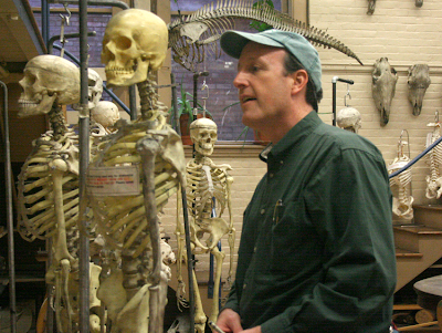
There’s also a large variety of animal skulls and skeletons. One room adjoining the nature lab collection had half a dozen human skeletons with drawing easels set up beside them.
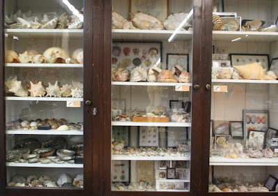
Along the walls were cabinets crammed full of shells, seedpods, and crystals.
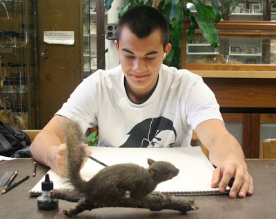
This student from nearby Brown University, one of the Ivy League colleges, was doing a careful pencil drawing of a stuffed squirrel. Brown students can share in RISD’s art offerings. In exchange, RISD students can broaden their education by enrolling in Brown’s first-rate courses in academic subjects to supplement the focused art curriculum.
RISD students also have access to the collection of the RISD art museum, whose collection ranks with some of the finest small museum collections of the northeast.
Illustration chairman Nick Jainschigg (above) toured me through the building which houses classes for the approximately 250 illustration majors. The school has graduated some notable illustrators like Chris Van Allsburg and has attracted some current high-profile teaching talent, including Jon Foster. Classes keep current with emerging trends, and include offerings in graphic novels, 3-D character animation, and video game design.
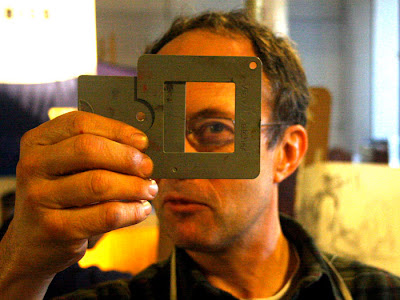
We met painting instructor Nick Palermo, here demonstrating a “View Catcher” device, which helps new painting students frame a composition. Palermo’s class was working on oil studies of a model posing on a stand with colorful props and upshot lighting.
Part of what makes RISD’s program unique is the winter session, sandwiched between the regular semesters. The six week winter session is both informal and intensive, allowing students to try out something outside their normal experience, like stone lithography or glassblowing.
The Fleet Library in the newly refurbished bank building contains not only a rich collection of art books dating back to the 1860s, but also a vast array of scrapbooks, sketchbooks, design collections, clippings, art prints and ephemera.
More than one person admitted that not enough RISD students take advantage of the school’s rich resources, and that the requirement to use them is not woven enough into the curriculum. But for a motivated student, RISD certainly has a lot to offer.
Sunday, October 28, 2007
Two More Lecture Portraits
Two more lectures yesterday yielded two more portraits.
First was Jack Levin, Ph.D., a leader in the study of violence in the media.
He started off his talk saying he is often mistaken for: Albert Einstein, Gene Shalit, David Crosby, Captain Kangaroo, Captain Krunch, Mr. Monopoly, Ben&Jerry, Mark Twain, Jerry Garcia, Juan Valdez (without the coffee), Grandpa Joe in Willy Wonka, Mr. Kotter (25 years later), Don King (with white skin), or even Beethoven.
My sketch, made during his hour-long presentation, looks no more like him than anyone on that list does, because I rushed the layin stage, and spent all the time modulating the tones. I arbitrarily introduced the dark backgound to dramatize his white hair.
The second lecture was by Robert Kraft, chief executive of Fox Film Music, Inc. He described his job this way: “At 20th Century Fox we have lots of film entertainment flooding your multiplexes and small screens, much of it garbage…I never imagined myself in the bosom of Hollywood.”
Unlike Professor Levin, who had a great many rounded forms and soft edges, Mr. Kraft had strong planes and straight lines. There were three sources of light—window light from the left, and two fluorescents from the right. With such complex lighting, I knew the form wouldn’t carry with tonal modeling. So I kept the shading light and tried to concentrate on the subforms around his eyes and mouth.
Saturday, October 27, 2007
Andrew Haines, Framer, Painter
The Museum of Fine Arts in Boston had a puzzle to solve.
Curators had always suspected that Bernardo Strozzi’s painting of Saint Sebastian, acquired in 1972, had at some earlier time been hacked down from its original size. The painting must have been incomplete because the saint was reaching heavenward and yet there was nothing in the composition above him. When the museum received a call that the missing top half of the painting had been located, they wanted to reunite the two pieces.
But that meant that Andrew Haines, the museum’s conservator of framing, would have to chuck the old picture frame and create a whole new one to match the period of the 17th century painting. Haines and his staff constructed a special frame with a black divider to artfully disguise the gap between Sebastian and the angels.
Haines is one of only about five full-time picture frame conservators in America. My wife Jeanette and I visited him yesterday morning in a workroom deep in the bowels of Boston’s beloved MFA.
He and his assistants were painstakingly restoring a large frame from a Courbet (left), using dental molding material to cast missing chunks of ropelike relief elements. Repairing this one frame required the labor of three people working full time for three weeks.
“A fun aspect of this job is that we get to see a painting in different frames,” he told us. Each period of art history had its own unique sensibility for framing.
But all the fancy gold styles ultimately trace back to the decorative bling prized by the church in the middle ages. “European painting comes out of the Catholic church,” he said, and so do the frames. "Before the Renaissance, painters, carpenters, and gilders were all seen as craftsmen of equal stature, all working together as contractors to make altarpieces," he said.
Haines rolled out the storage dividers in the painting collection to show us how the history of frames mirrored the history of art.
Frames for American paintings, for example, often included decorative motifs from nature, like leaves and flowers. Here, Adeline is painstakingly using purified water to clean the gilded decoration that once graced a painting by Fitz Henry Lane (formerly known as Fitz Hugh Lane).
Jeanette and I first met Andrew Haines in his second life as a realist painter. We attended the opening of his one man show at the George Billis gallery on October 11.
Mr. Haines gets up at six in the morning, sees his kids off to school, and then paints his own pictures for a couple hours before riding his bicycle to work at the museum. Take heart, you painters in spare hours!
His own paintings are breathtaking in their Hopperesque simplicity and mood. His mastery of light, color, and composition clearly grows out of the close working knowledge of art that he receives every day at the MFA.
Friday, October 26, 2007
Mike Dukakis
Here's a pencil portrait of Mike Dukakis that I made a few hours ago in my Moleskine drawing sketchbook. I was sitting about five feet from him as he gave a lecture. It was a bit of a challenge, because it was an upshot, and he was constantly moving during his hour-long talk.
Mike Dukakis was a three-term governor of Massachusetts, won the Democratic nomination for President in 1988, and has been a professor of political science here at Northeastern University in Boston for sixteen years.
Painting Pumpkins
To celebrate autumn, here’s a step-by-step painting demo from a local farmstand.
The pochade box is set up on a camera tripod, with the white umbrella mounted on a C-stand nearby. It’s an overcast day, so the umbrella isn’t really necessary as a light diffuser, but it protects against occasional sprinkles of rain.
To speed up the painting, I spent about 15 minutes premixing little piles of the main colors of the scene: dull yellow, orange, red, and cool gray. For each hue, there are about four or five separate steps of tone or value. The palette cups hold Grumtine turpentine and Liquin. The brushes and palette knife hang off the board on the left.
Here are the basic shapes sketched in with a bristle brush using burnt sienna and raw umber thinned down with turpentine.
Now the tones are lightly washed in transparently, just to cover the whiteness of the canvas.
Here it is about an hour and a half along, with the pumpkins in the foreground and the basket of ornamental gourds at left finished. Time is racing by, and customers keep coming up and trying to buy the gourds.
Here’s the finished painting after about four hours of work time. This was a "paint out" day, so it had to be auctioned off as a wet painting later that afternoon.
This amount of painting would have taken about four days in the studio. There’s something about the urgency of being on the spot that speeds up painting decisions. But the real secret to painting fast either in the studio or on the spot is premixing pools of color, because otherwise most of the time is wasted with color mixing.
Thursday, October 25, 2007
Contre-Jour Lighting
Contre-jour lighting is a type of backlighting where you place the subject right in front of a bright, sunny sky. In French the phrase literally means “against the day,” a poetic way to express this mysterious and powerful effect.
The term is still in common use among photographers. But cameras can’t deliver this effect as powerfully as painters can, because cameras are unable to respond to a wide enough range of intensities, and the silhouettes tend to go to black.
Artists of the 19th Century did wonders with contre jour. You’ll find it with Royal Academicians like Atkinson Grimshaw (upper left), Barbizon painters like Constant Troyon (the other images here), and American landscapists like Frederick Church.
Troyon’s student Leon Belly used this effect to capture a feeling of dazzling, intoxicating illumination in several of his Orientalist paintings, like this one of water buffalo in a desert oasis. I learned about contre-jour lighting from art historian Kristian Davies, who discusses it in his brilliant book The Orientalists (Laynfaroh, 2005).
When a form is placed contre-jour, it goes into silhouette. The colors weaken. Shadows stretch forward. Details disappear as the glare of the light spills over the edges of the form. The sun itself often shines from inside the frame of the picture, making the viewer’s eyes squint involuntarily.
I’ve been fascinated by the idea of contre-jour since starting work on Dinotopia: Journey to Chandara, and it crops up in quite a few of the paintings in the new book, like the one above, where Arthur and Bix are approaching the Imperial Palace.
Today I visit Rhode Island School of Design. Stay tuned in a couple of days for the report.
Wednesday, October 24, 2007
Bookplates from Bud
On the Journey to Chandara Road Tour, I’ve been spotlighting some of the bookstores that Jeanette and I have visited along the way. But I don’t want to overlook the mail order companies, who work quietly in the background and bring their own artistry to bookselling.
Bud Plant Comic Art in Grass Valley, California is the premier catalog retailer for fantasy and illustrated books. They have a staff of people that really know and love comics and visually told stories. They wanted to do something special for the new Dinotopia, so they asked me to design a custom bookplate to match the endpaper design.
The endpaper art (above) shows multi-lobed ginkgo, horsetail ferns, mayflies and other things from the fossil record.
I drew up the bookplate in pen and ink, trying to stay in the spirit of book design a hundred years ago, and showing maple seeds, which also turn up in fossils.
John Reed at Bud Plant took the drawing and had it printed (above) on a 1918 letterpress. The printers cast the image into a metal die and inked each impression by hand. Here’s a shot of the press being inked on the Dinotopia job.
And here’s the stage called “rolling.”
Thank goodness there are still people in the world who know how to run these glorious old letterpresses. I love the smell of the ink. It makes me want to put on green eyeshades and suspenders.
Letterpress printing is an art form that is almost lost, like harnessing an eight-horse team, or making a mechanical wristwatch. Check out the fascinating video about the art of letterpress printing, where the narrator muses about the potential disappearance of such skill and knowledge.
Tuesday, October 23, 2007
Cool Schools
Last week I visited the St. Albans School for boys in Washington, DC for a "Parents and Sons" event. After a potluck supper I shared my digital slide presentation.
Both the students and their parents had perceptive questions afterward about dinosaurs and about the process of writing and illustrating. I signed a lot of books, sketching pictures of Tyrannosaurs playing soccer, hockey, and even hang gliding.
On November 2, I'll spend a day at the Carl Traeger Elementary School in Oshkosh, Wisconsin. Since the beginning of the school year, students there have been developing their own fantasy worlds based on their direct observation of nature.
The students have carried their sketchbooks into the tall grass of the prairie outside the classroom to sketch bugs and flowers, and in class they've drawn pictures of stuffed animals, shells, and skeletons. They'll create their own fantasy characters and their own utopia, which might be called "Pigtopia" or "Dogtopia."
This method of sewing together science and art with the golden thread of fantasy was developed by teachers Teresa Moucha and Alice Toepel, who wrote the grant and developed the curriculum.
Transmitted Light
When sunlight travels through a semi-transparent material, the light becomes richly colored. Light that just bounces off the surface is fairly dull by comparison.
This “stained-glass-window effect" is called transmitted light, and you often see it when the sun shines through the green or yellow leaves of a tree. You might also see transmitted light when the sun backlights colored balloons, a sailboat’s spinnaker, or a translucent nylon awning.
This on-the-spot oil painting of a skunk cabbage plant is a study of transmitted light. The bright yellow-green area is much more intense than the other greens.
Here’s the picture again, with numbers superimposed in each area of the foliage to analyze what’s going on with the light and color:
1. Transmitted light, with intense chroma or saturation in the yellow-green range.
2. The leaf in shadow, facing downward. This is the darkest green, and would be even darker if it wasn't picking up reflected light from the adjacent leaf seen edge-on.
3. The leaf in shadow, facing upward. These ‘up-facing planes’ are blue-green, because they are picking up the blue light from the sky.
4. Sunlight reflecting off the top surface of the leaf. This is the highest tone or value, and the most textural, especially where it transitions to shadow. But the chroma is not very intense, because most of the light bounces off the waxy cuticle of the leaf.
When you are painting a faraway tree backlit by sunlight, it’s good to keep in mind these four conditions: transmitted, downfacing shadow, upfacing shadow and sunlit. These colors, visible in the skunk cabbage up close on a micro scale, are present here, too, mixed together like tiny pixels even if you can’t really see the component leaves.
The distant foliage is a composite of all four color elements, blended with the atmospheric effects. As you can see in this faraway view of autumn maples, there are more leaves shining with transmitted light at the lower left margin of the tree. The leaves in the central area are darker and duller because they’re lit by the cool skylight.
Monday, October 22, 2007
The Disaster at Kaaterskill Creek
Blog reader J. Fullmer asked about the disaster I referred to a while ago on the posts called From Endor to Chelsea and White Umbrellas. To recap, my artist friend Chris Evans and my wife and I were up in the Catskills doing some plein air painting.
We staggered down the rocky banks of Kaaterskill Clove in search of a waterfall called Fawn’s Leap, a favorite motif of the early Hudson River School Painters. I found a good vista from the middle of the stream, where a flat rock the size of a kitchen table provided just enough space to set up my tripod, pochade box, and white umbrella.
As I worked, the water surged around me from several days of heavy rain. The painting was finished in time for lunch. I left everything set up and hopped across the boulders to join Chris and Jeanette for a sandwich and coffee.
Suddenly there came a blast of cold wind down the clove. I heard a shout: “It’s going over!”
I looked up to see the umbrella fill like a sail and carry the whole rig—tripod, brushes, palette, and painting— into the rapids. Thinking quickly, Jeanette grabbed the umbrella, which had broken free and was floating upside down, circling like a leaf in one of the side eddies. I stood astraddle two boulders to rescue a couple of the brushes as they drifted by. The rest of them had entered the main current and disappeared into the next set of rapids.
Chris fished out the tripod and intercepted the painting as it floated downstream. It was cruising half-submerged with the wet oil palette stuck against the backside of it. Amazingly, the painting suffered only minor damage from the water, and only a few thumb prints and scrapes where it had bounced against some boulders.
The only moral to this story is to take down the umbrella when you break for lunch!
Sunday, October 21, 2007
The Schedule and the Leaky Roof
It’s a funny thing about schedules. When you’ve got all the time in the world, ideas often don’t flow as well as when you’re on a tight deadline.
At least it’s that way for me. Doing the art for the new Dinotopia book meant generating 150 paintings in about a four year period. Four years sounds like a lot of time, but as the crunch got closer, I had to produce each painting in less than a week, start to finish.
This schedule helped keep me on track. I tallied the finished pages in the margins, with the goal of six to eight pages a month. I completed the artwork out of sequence, following the plan of the storyboard and outline.
I had to completely lose myself in the project. Let the roof leak! Chuck the ‘Do List.’ Never mind Christmas! Chain your ankle to the easel and start another audio book! Somehow this regimen put me into the same kind of creative tunnel that monks, prisoners, and students often describe with a grim fondness. The painting studio became a kind of sideways elevator taking me completely into another world.
But now I’m back in this world. For the moment I’m wrung dry. And now I've got to do something about that leaky roof.
Saturday, October 20, 2007
Ringling College of Art and Design
It’s only a small step from the sophomore still life painting class, with its enticing linseed-oil aroma, to a balcony overlooking a palmetto-lined bayou, where manatees swim by from time to time. The Ringling College of Art and Design occupies a diverse group of Spanish-style buildings on its 35 acre campus in Sarasota, along the Gulf Coast of Florida. The school is still growing, actively acquiring new land, new degree programs and new students.
“We’re about destroying the myth of the starving artist,” college president Dr. Larry Thompson told me. Alumni polled a few years after graduation revealed that ninety percent were working in their field of interest. The school gives each student a fully loaded PowerMac Pro as they enter. According to Dr. Johnson, the two-to-one student to computer ratio rivals some of the top engineering schools. “Ringling is the MIT of colleges of art and design,” he said, reeling off a list of companies—Pixar, Lucasfilm, Dreamworks, American Greetings, and Electronic Arts—whose recruiters regularly lure away graduates.
Ringling offers a comprehensive program in computer animation and interactive game design, the latter using the latest CryENGINE 2 software tools. The new five-storey Ulla Searing Center is lined with framed posters from movies that Ringling graduates have worked on. Seniors in the animation department were hard at work in air-conditioned computer rooms refining their long-range assignments, which includes storyboarding, designing, sculpting, rigging, animating, and lighting their own short films.
But the school is not all high tech and corporate. Old-fashioned animation tables donated by the defunct Disney animation studios are still in use for teaching the traditional methods. The library has a huge collection of art books. I was impressed that when one of the librarians in Ringling’s library saw the listing of recommended art instruction books on this blog she got right to work tracking them down.
Department chairman Tom Casmer, himself an accomplished children’s book illustrator, supervises 400 students in the illustration major, almost a third of the 1200 member student body. “We focus on the basics of painting, drawing, and thinking,” he said. “We push drawing for the first two years of study.” At heart, he said, illustrators are storytellers, and “the narrative aspect permeates all majors.” He wants illustration majors to be “scholar-practitioners.” Art can’t just be an end in itself. It has to be founded on primary research, timeless ideas and clear communication.
I met the students one by one as I signed books for two and a half hours after my Dinotopia presentation and was struck with their friendliness, their intense focus and their enthusiasm for art. Most of them were carrying sketchbooks and doodling in them. Illustration senior Andrew Wright regularly paints en plein air with a group of his classmates and with teacher George Pratt.
Jeanette and I regretted having to take off so soon for the long nighttime drive across the state, because we knew we’d have to miss the opportunity to join the Ringling students for a painting session. But we were happy to think of all of our new friends working so hard in such a beautiful environment, with such bright prospects before them.