This is the second in a Sunday series on color. It introduces the most basic color relationship: warm and cool.
As I suggested
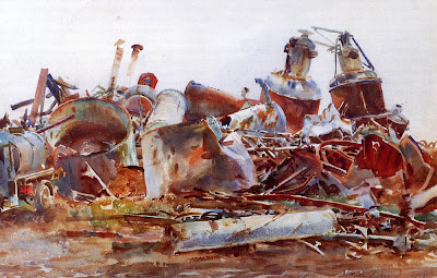
last time, most books or classes discuss color in an abstract, theoretical sense. But I’d like to concentrate on the pictorial application of color. Why, for example, did John Singer Sargent choose to emphasize those browns and blues in his plein-air painting of a wrecked sugar refinery, above? I'm sure if you had taken a color photo of the same subject, it would have looked nothing like this painting.
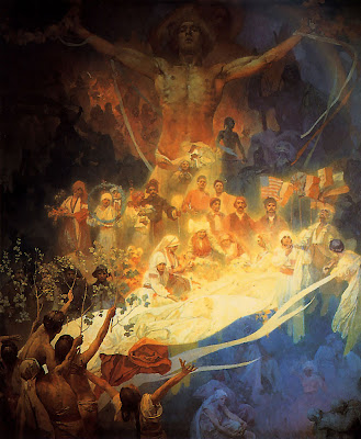
And why did Alphonse Mucha choose this particular blue and gold palette to express his deepest feelings about his homeland?
I’d rather give you useful tips about color that you can apply to your own pictures. So please forgive me if I don’t approach the subject comprehensively. Instead I’ll just fast-forward over the concepts that most of you are already familiar with.
Let’s assume that you already understand the foundation terms:
--the color wheel
--primaries and secondaries
--the concepts of hue, value, and saturation (aka chroma)
If you’re not sure about these ideas, you’ll find answers on
Wikipedia or on the website
Handprint (thorough and techical) or in most any book on color.

Here’s the color wheel I like to use. It has the various full-chroma hues arranged around the outside margin. Neutral gray is at the center. As each color approaches the center, the chroma decreases until it arrives at neutral gray.
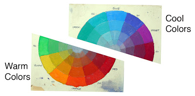
To get started, let’s take the color wheel and chop it in half. On the bottom half are all the warm colors: from yellow-greens, to oranges, reds. On the top half are the cool colors, the blue-greens, blues, and cool violets.
Someone might argue about where to divide the wheel. The greens and violets seem to have divided loyalties. But if you consider the “heads of the families,” blue and orange, there seems to be some basic psychological difference between them.
The cool colors seem to evoke feelings of winter, of night, of death and sleep. They remind us of quietness, restfulness, and calm.

The basic feelings suggested by the warm colors are completely different. We associate the warm colors with fire, sunlight and blood. (Above,
The Burning of the Houses of Parliament, by J.M.W. Turner.) They make us think of energy and passion. Orange and yellow are ephemeral colors. We see them only fleetingly in nature: at sunsets, in flowers, or in autumn leaves.
This basic perception of the two families of color seems to be woven into the fabric of our human existence. The anthropologists Paul Kay and Brent Berlin have studied the evolution of color terms in languages around the world. In European languages we have about 11 or 12 basic terms to describe colors.
But some so-called “primitive” languages, like the New Guinean language Dani, have only two basic terms. Kay and Berlin write: “One of the two encompasses black, green, blue and other ‘cool’ colors; the other encompasses white, red, yellow and other ‘warm’ colors.” (
Link for full story in
Scientific American).
Primitive peoples didn’t have poor vision; far from it. But rather, anthropologists suggest that as language evolved, it developed its first word-concepts around the most psychologically important divisions or groupings.
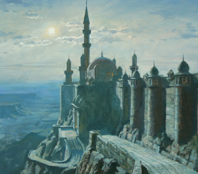
I think a lot about “warm and cool” when I’m painting. The moonlight painting of Khasra from Dinotopia shown earlier is painted with colors primarily from the cool side. I wanted to suggest mystery, calm, and night.

In a painting of one predominant family, an accent from the other side of the spectrum adds a lively contrast. Here’s a painting by Richard Parkes Bonington where he has enlivened his warm colors with a few accents of blue. Notice that there’s no green or red in this one. It’s painted almost entirely with blue and orange in various value ranges and degrees of saturation (mostly its duller cousins in the ochre and sienna ranges).
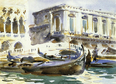
Warm and cool colors bring each other to life by these adjacent contrasts. This quick sketch of Venice by Sargent has a lot of areas where warm and cool are played against each other.
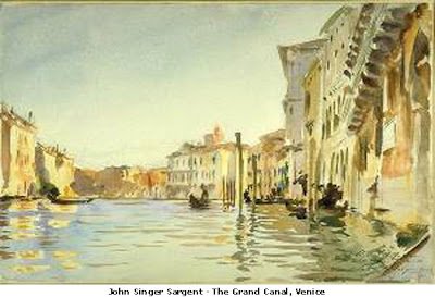
Many of Sargent’s best watercolors were painted primarily with two colors, probably ultramarine blue and raw sienna, exploring the dance between the cool and the warm. He must have been looking at other colors, like red and green, in the scene before him, but he was ignoring them.
Please let me know if this kind of stuff is useful, and if I'm pitching it to the right level.

 Here’s a detail from a recent painting (page 31 of the new Dinotopia book), showing how an image is broken up by the wavelets. Edges with strong contrasts, like the brightly lit wall against the sky, or the dark boat hull, break up in a loose—but controlled—painterly way.
 In this plein-air painting in Mamaronek Harbor, I started with a warm underpainting and then laid down a light tone for the color of the reflected sky. Over this thinly painted but wet oil layer I added the calligraphic strokes of the reflections of the boat hulls.


