Wednesday, March 31, 2010

Modern Stone Age Furries

Last weekend I drew the t-shirt design for Anthrocon. This year’s theme is “Modern Stone-Age Furries.”


I'll be giving three digital slide lectures and a technique demo.

But the big event will be the fursuit parade. This is one of the largest events of its kind, with over 600 participants. All the costumers don their fursuits, which are handmade and often very elaborate. They’re mostly based on anthropomorphic cartoon animals.


According to an insider's description:

"Fursuits, similar to what athletic team mascots wear, are constructed of fabric, not fur or animal skins. While in a fursuit, a furry walks upright.

Some furries superimpose human clothing on the fursuit; for example, a snow leopard diva may wear a red cocktail dress and a big yellow dog may wear blue jeans.”


Anthrocon Official Site

What is Furry?
Wikipedia on Furry Fandom

Tuesday, March 30, 2010

Formative Years

Glenn Kim is an artist at Pixar who has shaped the look of many of their films. In addition to that, he teaches art classes at Sienna Ranch.

He is especially devoted to helping high school age kids get the early experience and guidance they need. He says:

"I believe early experiences that spark a child’s imagination can influence their lives forever. I want to teach kids what I might have wanted when I was a kid, and also as a teen, when I seriously started considering what I wanted to do with my life, and I knew it was ‘art something’, but had no idea as to even what kind of artist I wanted to be."


Glenn just launched a new series on his blog GlennzArt called "Art School, I'm confident I can get there." He'll be interviewing artists working in various fields, and I was honored to be his first victim. Read Glenn's interview with me here.

Art copyright Disney/Pixar, from Sienna Ranch website.

Monday, March 29, 2010

A Lucky Pose


How do you get a goat to pose for his portrait?

It sure helps when some of the kids from the farm keep him interested with a few handfuls of grain. This is Lucky. He shares the stall with Billy, who you met last summer.

Sunday, March 28, 2010

Vermeer’s Pigments

Artists didn’t have hundreds of available pigments, as we do today. Paint samples scraped from the edges of Vermeer’s artwork show that he commonly used just seven pigments:

1. white lead, 2. yellow ochre, 3. vermillion, 4. red madder, 5, green earth, 6. raw umber and 7. ivory black.

In total, he may have used as many as seventeen, though many of them were rarely empoyed:
azurite
carmine
charcoal black
green earth
indigo
ivory black
lead white
lead-tin yellow
madder lake
red ocher
smalt
ultramarine
umber
weld
verdigris
vermillion
yellow ocher

The source for this information is an excellent website called Essential Vermeer. Thanks Walt Morton!

Saturday, March 27, 2010

Fixler's Plane Head

Fred Fixler was a great art teacher from southern California who died Jan 21, 2010. He was a student of Frank Reilly, and brought much of his teaching as well as his own experience of illustration to his students.


On his official website is more about him, and some of the notes and handouts that he generously gave his students. One of them is a nice plane analysis of a head. If you wanted to sculpt a little 3D reference maquette of this head, it would be a good one to use for reference.

Fred Fixler
Thanks, Steve Kloepfer

Previously on GurneyJourney: Plane Heads, Character Maquettes, Reilly and Beyond

Friday, March 26, 2010

Boldini at the Clark Art Institute

The nineteenth-century painter Giovanni Boldini (1842-1931) is best known for his dazzling society portraits.

But before he found that groove, he painted landscapes, cityscapes, night scenes and genre pieces, blending his academic and impressionist instincts into an formidable bunch of paintings and drawings now on exhibit at the Clark Art Institute in Williamstown, Massachusetts.


The early influence of Meissonier shows up in “The Dispatch Rider”, where an equestrian soldier digs a letter out of his bag, clenching another letter between his teeth. The recipient stands on the wet sidewalk he has just been cleaning. If you look closely at the original, you can see the building across the street reflected in the shiny helmet, which is no bigger than a quarter.

“Place Clichy” shows a street scene bustling with figures, some the size of sunflower seeds. It’s a joyous exploration of the human anthill, painted with tiny brushes. He cuts loose in the sky above, painting some of the clouds with six-inch strokes.

The contrast between delicate, tiny details and large dynamic gestures is typical of Boldini. His Jekyll-and-Hyde painterly instincts range from watchmaker miniaturist to unrestrained big-stroke action painter.

In “Nocturne in Montmartre” (Horses at Night), c. 1883, he uses deft strokes the size of housepainter’s brushes to convey the confused frenzy of horses and carriages at an intersection, partially glimpsed in the gaslight. In an age of impressionism, no other artist dared to capture such a fleeting and powerful visual experience.

“The Pont des Saints-Pères”, c. 1881–86 seems influenced by the burgeoning revolution of photography. He stages a scene of terrible action: A mother grabs her son out of the way of an oncoming team of horses. All that survives from this experiment was a semi-abstract concept sketch and two large fragments cut out of the original bedsheet-size canvas.

Throughout the exhibition are scattered a few samples of contempory artists who influenced him: Sargent, Meissonier ,Pissarro, Manet, Renoir, and Degas.
Adolphe von Menzel is conspicuously lacking, as is the incredible portrait that Boldini did of him.

Boldini gives the impression of an artist flexing his muscles, trying everything, reaching in a lot of directions, restlessly experimenting. The show chronicles the track of a artistic comet strewn across seventy canvases. He finally connected with portraiture in a small portrait of an artist friend. High society took notice. The orders streamed in, and the rest is the Boldini most of us know.

What his portraits and landscapes may sometimes lack in psychological penetration or lyrical power, they more than make up for in unadulterated brio.

The museum has free admission during the winter months. Don’t miss a visit to the library, open to visitors. It’s one of the finest collections of art books in the northeast. The Boldini show will be on view through April 25, 2010. The hardcover catalog is comprehensive and nicely printed. It contains 232 pages with 134 color illustrations ($45 at the show, $43 on Amazon).
----------------

P.S. Shout-out to blog reader Martha who came up and said hi at the show!

Official museum website about the exhibition

Berkshire review
Sample of Audio Tour

Thursday, March 25, 2010

The Old Drawing Table

I’ve updated quite a few things in my studio, but I hang onto a few old relics for sentimental reasons.

The drawing table dates back to my high school years. I took it to college at UC Berkeley. The wood is full of pinholes, and the wing nuts are always loose, a tightener crank busted off so I use a C-clamp, and it wobbles.

But I can’t bring myself to replace it. It’s like an old friend. All my dreams have flowed through it.

I’m not the only one who feels loyal to an old drawing table. The dark fantasy master Brom has kept his drawing table since he was fourteen (photo courtesy ImagineFX magazine).

What’s the oldest studio item that you keep on using? Do you use something that you inherited from a mentor or ancestor?

Please vote in the poll at left. I’d love to hear your stories in the comments.

Wednesday, March 24, 2010

David


Here’s a sketch of David, working in our creature design class last summer. He’s one of the regulars at the Grand Central Academy in New York. The sketch about 3 x 4 inches, drawn with water soluble colored pencils.

David told us his hat is made out of material from discarded couches.

Tuesday, March 23, 2010

Jims and Monkeys


The second guest of honor has been named to the upcoming Anthrocon convention in Pittsburgh, June 24-27. He's definitely a kindred spirit, and so are our sidekicks.

Jim Martin, puppet performer and builder, television director, writer and producer is very pleased to be asked to participate in 2010 Anthrocon. Jim's love for puppets began in a classroom a long time ago in second grade and continues today where he works mainly in television. His career spans many Children's TV shows from local shows in Pittsburgh to national shows like The Great Space Coaster (Gary Gnu, Baffle, M.T. Promises), The Puzzle Place (Ben and Blue Piece Police), and Bear In The Big Blue House. He is a five-time Emmy Award winning director for Sesame Street and was nominated last year as a producer and director for The Disney Channel's Johnny And The Sprites. Jim has traveled to Germany, Indonesia and Turkey to teach and audition puppeteers for Sesame Workshop.

More at Anthrocon's website
More about Jim Martin at his website, with a photo gallery of his puppets.

Blue Boy

Legend has it that Thomas Gainsborough painted Blue Boy to challenge the rule put forward by his rival Sir Joshua Reynolds:

“The masses of light in a picture [must] be always of a warm, mellow color, yellow, red, or a yellowish-white, and that the blue, the gray, or the green colors, be kept almost entirely out of these masses.”


Blue Boy places the blue color right up front and center, dominating the composition. Take that, Mr. Reynolds! The painting brought Reynolds’s theory into open dispute.
------
See the Blue Boy at the Huntington Library and Art Museum in the LA area.

Monday, March 22, 2010

Eyetracking in International Artist


The new International Artist magazine has a six page feature on the research on eyetracking and composition that I did with the help of Greg Edwards of Eyetools, Inc. The feature includes an extra painting that I didn't have room to analyze in Imaginatiive Realism.


You can virtually browse a few pages of International Artist on their offical website.
Previously on GurneyJourney: Eyetracking.
Subscription info for IA.

Saturday, March 20, 2010

Blizzard Entertainment

Last October I gave three different hour-long lectures to the senior concept artists at Blizzard Entertainment—the company that creates World of Warcraft, Starcraft, and Diablo online games.

It took a while to get past the rather tight security at the headquarters in Irvine, California. The sleek white buildings inside contain some of the company’s employees.

The public areas of buildings are decorated with impressive sculptures of horned warriors, dangerous females, and loathsome monsters.

The guys in the art department have a pretty well developed sense of fun, like chopping up visiting artists into sausage bits. That’s senior art director Jeremy Cranford on the left.

I drew a portrait of Jeremy after the lectures. I asked him what advice he’d give to a young artist who dreams of working at a place like Blizzard. “Everyone wants to be a character designer,” he said. But portfolios that show other skills are more likely hires. Get good at environments, backgrounds, props, and vehicles. A generalist who can draw and think well is always valuable.
------
Official Blizzard website
Wikipedia on Blizzard
Career opportunities at Blizzard

Friday, March 19, 2010

Portrait of Martin Keane

When I was in Corofin, County Clare, Ireland in 1995, I spotted a man in a pub that I knew I had to paint. I introduced myself and asked him if I could paint his portrait.

“That’ll cost you a pint of Guinness,” he said. After getting to know him a bit better, we planned for him to come to my rented house. I set up my easel next to the picture window. We had a six-pack of Guinness waiting, and he brought his own smokes. We talked about how the west of Ireland was changing.

The portrait is in oil on board, 10 inches by 8 inches. He was able to give me only one sitting of about an hour and a half.

He told me it was the only time anyone had painted his portrait. A few years later, I heard from a contact in Corofin that Martin Keane had passed away (RIP).

Thursday, March 18, 2010

Charting Pigments

Every pigment occupies a specific position on a color wheel. The position is a combination of its hue and chroma.

The chart above shows where many familiar pigments would appear. Earth colors, since they’re low in chroma, appear close to the center in the red and yellow sectors, and black and white sit together at the center.

Since maximum known chroma varies from one color to another, even the some of the strongest tube colors often fall short of the perimeter.

This chart doesn’t include every pigment. But even if it did, there would gaps where pigments are unavailable.

Further info:
This chart is hand-painted in oil, using dots of pigment over a high-key gradated Yurmby wheel. Note that the wheel is set up according to the way our eyes actually perceive color relationships. The complements are additive, not paint-mixing complements. So ultramarine blue is opposite cadmium yellow, not burnt sienna. The reason I set it up that way is because I want to know how the colors will relate and vibrate on my picture from the perspective of the viewer’s experience. I’m not as worried which paints I need to mix a gray.

This chart was based on data compiled by Bruce MacEvoy, www.handprint.com.

Dinosaurs at the Rockwell

Last Saturday I gave a digital slide show and a workshop for all ages at the Norman Rockwell Museum.

Thanks for all who drove so far to come to the event, and thanks to the Rockwell Museum for hosting.

Listen to the interview I did before the event on WAMC Northeast Public Radio.

Tuesday, March 16, 2010

What Does “Permanent” Mean?


The word “permanent” appears on many different art products, but it’s a confusing term. On many graphic art products, such as inks or felt-tipped markers, it really means “waterproof,” rather than “lightfast.” Many calligraphy or fountain pen inks, such as the brown inks in the drawing above, are not waterproof, but they’re reasonably lightfast, considering that most handwriting isn’t usually subjected to light for long periods.

The sketches are for sky galleys, part of the planning for Waterfall City, from Dinotopia: A Land Apart from Time.

Monday, March 15, 2010

Calvin Theater

Here's what the Calvin Theater looked like in 1995. The sketch is in pencil and marker.

Sunday, March 14, 2010

3D Gamut Animations

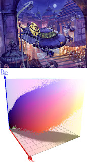
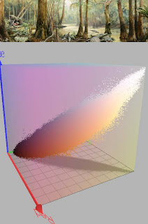
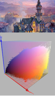
First, let's have a look at a video. What you’ll see is a visualization of three different color schemes as 3D shapes floating within the RGB color space.


(If this embedded video doesn't play, try this link to YouTube). Each painting will be followed by an irregular shape that represents the range of colors used within that composition.

If you’ve read this blog for a while or dug back in the archives, you may remember seeing how we can chart a color scheme as a shape or gamut that takes up part of a color wheel. Everything outside the gamut is left out of the composition.

The painting Palace in the Clouds, above, has a gamut limited to intense blue, opposed by fairly dull reds and yellows, and some fairly dull dark greens.

To the right of that is a computer-generated image made by sampling all the pixels and charting them on a color wheel. The software was created by Phillipe Colantoni, and is available for Windows users at couleur.org.

We can also combine the value or lightness data to see the color scheme as a 3D representation inside an RGB cube. The RGB color space is created by graphing red, green, and blue as three separate vectors in XYZ space. (The green vector above is hidden by the gamut.)

Where the vectors intersect is pure black. At the opposite corner is pure white. In this configuration, the secondaries are cyan, magenta, and yellow, which would lie on the plane between each of the two vectors. A pure yellow, for example, would be on the plane formed by red and green (the horizontal plane in this view).

By comparing each of the paintings with its gamut in RGB color space, and then comparing the gamuts to each other, you can see how the gamuts vary. The gamut for Crocodile Swamp is narrower because the color scheme is more limited. There are hardly any blues.

The yellow windows in this scene show up as a scattering of yellow dots at the bottom of the gamut.
------
Software by P. Colantoni at couleur.org.
Animation by Lester Yocum at lesteryocum.com
Previously on GurneyJourney: Color Wheel Masking Update

Saturday, March 13, 2010

Fire from the Eyes

We take for granted that our experience of vision results from the interaction of light with objects. It’s obvious, isn’t it? Light shines on objects, bounces off them, and then it stimulates our eyes.

But for thousands of years, that basic concept was not understood. People only knew was that there was some sort of connection between the eyes and the objects seen. During the time of Aristotle in the fourth century BC, one school of thought held that the eyes emitted a visual fire that traveled to the object and somehow massaged it. Others believed that objects gave off a substance that flew toward the eye.

These notions persisted until the time of Leonardo, who objected to the idea of fire from the eyes. He said there wouldn’t be time, after opening the eyes, for the fire to leave the eyes and travel all the way to a distant object and return. Others reasoned that if the objects gave off a flaming substance, why can’t we see at night?

The breakthrough came from an Arab physicist Alhazen around 1000 AD, who noticed that light traveled into the eye and caused it pain. He also noticed that we experience afterimages after looking at bright light. Light—not just our eyes, and not the objects themselves—was the agent of vision.

What I wonder as I reflect on these ideas is what was the ancient conception of light? It's mentioned often in the Hebrew bible, of course. Surely the ancients were sensitive of the action of light around them. How they regard it differently if they didn't understand its role in vision?
------
Based on material from Vision and Art: The Biology of Seeing, by Margaret Livingstone.
Image from Discover.

Friday, March 12, 2010

Posters from North Korea

Here’s a rare glimpse of official art from North Korea, with explanations by B.R. Myers, a contributor to Foreign Policy magazine.

“Kim Jong Il comforts a distraught nation after his father's death on July 8, 1994. In the background is the 66-foot bronze statue of the Great Leader that was erected on Mansu Hill in Pyongyang in 1972. Dark skies in depictions of this period symbolize the growing threat from without.”

“The Dear Leader stands guard as the waves of a hostile world crash ineffectually against the rocks.”

Say what you want about the grandiose personality cult and the bizarre geopolitical posturing. I’m intrigued by the paintings themselves. That’s some darn good water painting in the second piece, especially in the recoil of the foamy wave on the left. The strong silhouette, and Kim’s resolute defiance remind me of N.C. Wyeth’s Billy Bones. Just swap the spyglass for tinted specs.

Look at the far red flag in the second painting. It sits back in space because of the muted color and the softened top edge. All the figures are well studied, though the value organization is a little busy. The grouping of figures reminds me of 19th century Russian history painters like Vasily Surikov (1848-1916). Official art in east Asia took much of its early inspiration from the Russian painters.

Back in the late 70s, I used to go to Chinatown in L.A. to collect Mao posters, which were impressive paintings on a lot of levels. They’re a piece of history now. I’ve had the privilege of meeting many of the artists who painted them, and their stories are fascinating.

See more examples and read political commentary: B.R. Myers on Foreign Policy,
Thanks, Bryn.

Thursday, March 11, 2010

Peak Saturation Value

The great color theorist Albert Munsell observed that a given color reaches its greatest chroma at one particular value, called the home value or the peak saturation value. That peak value varies from color to color. An orange-yellow, for example, is most intense at a very light value, while blue is strongest when it is very dark. Red reaches maximum chroma at a middle value.

The hand-painted chart takes the three hues through all possible degrees of chroma and value. Yellow becomes a brown when it darkens, and you just can't get a strong chroma from a dark yellow.

In the chart, chroma is meant to be constant along a vertical line, while value is constant on a horizontal line. It’s good color mixing practice to make these charts, and Munsell-schooled artists benefit greatly from the experience.

For these charts I have arbitrarily limited the chroma range to six steps. But in Munsell’s system, there can be many more steps, and theoretically there’s no upper limit to the measurement of chroma. New pigments keep pushing the range farther out.

This digital chart from David Briggs's excellent website huevaluechroma shows a range of hues taken through the paces. Follow that link to his discussion of the same topic.

Wednesday, March 10, 2010

World Beneath Slideshow

Tom Lopez of ZBS Productions created a full-length audio adaptation of Dinotopia: The World Beneath using actors, sound effects, and music by Tim Clark.


This excerpt takes you from the pirate’s roost at Black Fish Tavern to the entrance of the luminous caverns. It combines the audio track with a slide show, shot from the original artwork. The pictures start at 0:30.

If you want to hear the whole 2 hour plus production (great for long car trips or studio stints), you can get a 2 CD set at the Dinotopia Online Store, or you can purchase a download at the ZBS website.

Tuesday, March 9, 2010

Art Program at the Rockwell

This coming Saturday, March 13, I invite you to join me at the Norman Rockwell Museum for an afternoon art program.

The event is free with admission, and will be fun for all ages. I’ll start at 1:00 with a digital slide presentation that shows what goes into making a realistic picture of an imaginary subject, including Dinotopia and other projects.

Then I’ll sign books, which will be available at the museum store. But you can also bring your old copies, too—the more tattered the better.

From about 2:30 to 4:00 we’ll draw dinosaurs together. I’ll do a couple of demonstration drawings, and I’ll bring a bunch of dinosaur models that we can all work from. I’ll try to answer whatever questions you have, and give pointers to artists of all ages—young people just learning to draw and experienced artists with specific questions.

The Rockwell Museum is always a fun place to hang out, and right now they’ve got a new exhibit of Rockwell’s fan letters in addition to "Norman Rockwell, Behind the Camera."

More information at the Museum site.

Admission is free for kids and teens thanks to support from Blantyre, Country Curtains, and The Red Lion Inn.

Monday, March 8, 2010

Female Illustrators

In honor of International Woman's Day, have a look at the fine new blog "Female Illustrators" by Leif Peng, who also creates the blog "Today's Inspiration."

Both blogs concentrate on the work of American illustrators of the mid-20th century. Female Illustrators is barely a week old, but it has already spotlighted such great illustrators as Mary Mayo (above), Marilyn Conover, Barbara Bradley, and Lucia Lerner.

Sunday, March 7, 2010

Flickr’s Season Wheel


Flickr has has come up with a clever way to show the changing colors of the year using a circle of color bands. The color streams widen and narrow as their distribution changes throughout the year.

The samplings come from thousands of photographs of the Boston Commons archived on the Flickr site.

Boston Magazine designer Heather Burke assembled this design combining the seasonal bands with a few source photos.
---------
Flickr Flow
Thanks, Andy.

Saturday, March 6, 2010

Lanzendorf Paleoart Prize

If you create paleoart, be sure to enter your work for consideration for the Lanzendorf Prize. The deadline is April 1, and the winners each receive a $600 prize payment.

Paleoart is “the scientific or naturalistic rendering of paleontological subject matter pertaining to vertebrate fossils.”

The John J. Lanzendorf PaleoArt Prize recognizes outstanding achievement in paleontological scientific illustration and naturalistic art. These are the only art awards chosen by the scientists themselves to recognize the work that brings their discoveries to life.

Categories include scientific illustration, 2-dimensional art, 3-dimensional art, and the National Geographic Digital Modeling and Animation Award.

Here’s more about the contest and eligibility and the submission procedure.

Friday, March 5, 2010

Armory Portraits

I spent the day yesterday at the Armory Show in New York, which assembles the offerings of over a hundred galleries from around the world. The show will be up at 55th and 12th through March 7. The works, set up in white painted cubicles, include modern and contemporary painting, sculpture and video.

Barry Friedman, Ltd. of New York was one of two galleries presenting the work of Gottfried Helnwein (Austrian, b. 1948), who paints gigantic portraits of wan children. The skin and hair invited scrutiny for their soft, downy surface, painted with a sense of photographic realism, but painterly energy at a small scale.

The Forum Gallery showed new works by Robert Bauer (American, born 1942) another portrait artist whose works are on a much smaller scale, but equally compelling. He has been creating lighter images in egg tempera, more resembling drawings. He can create them faster than his oils, which he was producing at four per year. They're made from a combination of photographs and live sittings.

Both artists seem to have made a point of having the subject avoid eye contact with the viewer, which changes the chemistry of a close encounter with a realistically painted face.

There was much else, perhaps something for every taste. A single ticket gets you into all the satellite venues, including the Volta (across from the Empire State Building).

You can save the $30 entrance fee by following this link and signing up for complimentary passes. Use the code "TASGALLERY" in the promotional code. (Thanks, James)

Wednesday, March 3, 2010

McEntee’s Train Deal

In 1860, the Baltimore and Ohio Railroad had a sweet deal for a couple of artists. The railroad approached Hudson River School painters Jervis McEntee and Sanford Gifford with the idea of a sketching trip.


“The company supplies [the artists] with two cars, one which is fitted with sleeping accommodations. They switch off at any picturesque point of view that may strike their fancy, and when they have exhausted its capabilities for artistic purposes, they book on to a train and proceed as far as they choose.”

It was good publicity for McEntee, Gifford, and the railroad. Hey, if Amtrak wants to try the idea out again, I’m sure we can find a couple of artists to sign up.
----------
From “McEntee & Company,” a catalog from the Beacon Hill Fine Art.

Tuesday, March 2, 2010

Charles Vess "Drawing Down the Moon"


Charles Vess and Dark Horse Comics recently teamed up to create a spectacular illustrated overview of his career, spinning legends in watercolor, and evoking the spirits of the enchanted forest. In the comments that accompany the paintings, Charles describes the interesting adventures he has had as a painter, sculptor, and publisher.

"Drawing Down the Moon" is 200 pages, 9 x 12 inches, with vellum chapter headers showing the line drawing, followed by the same image in full color. The book retails at $39.00.

High School Me

Here’s the high school version of me, measuring my way out of a thicket with a pencil and a handful of brushes. It’s obviously a hammy pose because I didn’t know how to paint yet.

I went to high school in Palo Alto, California, before it was the Silicon Valley. I was part of a remarkable 1976 graduating class that included Patrick Coyne, who runs Communication Arts magazine.

I was sort of a dim-witted (I flunked trigonometry) and low-level prankster, known for dumb stunts like drinking the fermentation project in biology class (on a 50 cent dare), and flying cardboard boomerangs around the room when the teachers weren’t looking. I don’t think I fully appreciated the golden goods the teachers were trying to give us until much later.

(Photo by David Gurney).

Monday, March 1, 2010

Megan Fox Speed Painting


Nico DiMattia dazzles with this 5-minute Photoshop speed painting demo.
Nico DiMattia.com.
Via Best of You Tube