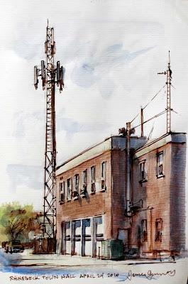
Most people regard cell towers as a blight on the landscape, but I’m weirdly attracted to them. They’re beautiful in their own strange way, delicate and mysterious. I don’t understand how they work. I can’t tell whether they’re listening or speaking.
Fifty years from now, cell towers will no longer be in use. Most of them will be torn down or converted to other uses. They’ll be a rare sight. Only older people will use cell phones or iPads.
The kids with their "implantcoms" will laugh at the old-timers who still use handhelds. Cell towers will be like sailing ships or neon signs. Artists will paint them in their nostalgic landscapes, and they’ll talk about how beautiful they are.
Friday, April 30, 2010
Thursday, April 29, 2010
Lovell, Photos, and Maquettes
Lovell used photo reference when he had to, as with this photo of a member of the 173rd Army Airborne Brigade in Vietnam, for his painting “The Chaplain in Southeast Asia.”
The connection between the photo reference and the painting was made by blog reader Gene Snyder, who noticed the resemblance while photographing over 9,000 art images in the Army's art collection over the course of several years.
But Lovell also used other, more traditional means of getting figure and animal reference. He preferred to work from drawings made from posed models in the old master tradition. He also frequently did mirror studies, posing himself in a mirror to take the action of the pose.
Lovell also made maquettes of animals and ships, which can be difficult to visualize otherwise.
The study of the clay model was made in charcoal and pastel 11x14 on Kraft paper.
The painting is called Camels in Texas, 1971, commissioned by the Petroleum Museum in Midlands Texas.
-------
Thanks, Joe and Gene S.
Previous Post: Lovell's Soldier (where he uses mirror drawings)
Wednesday, April 28, 2010
Lovell on Pyle and Dunn
Here's a letter from illustrator Tom Lovell on June 19, ’95 in answer to my questions about his preliminary drawings and his take on Andrew Loomis's material on Pyle in Creative Illustration.
"Yes, I still make great use of the mirror—just finished a painting in which all information derived from mirror drawings. Not easy, but at that stage you know what you want.
"All my work begins with charcoal drawings done on bond typing paper, with an effort to hold to black, white, and gray.
"I never saw any of Pyle’s writings but admire his work tremendously. Harvey Dunn (one of his students) said, 'Pyle did not understand color' and I wonder if he was partly colorblind. Remember the yellow night skies in some of the pirate pictures? I never heard of his color principles.
I saw Loomis’s book years ago and remember black was on his palette, which suggests that he had it to control his values, which is exactly the way he worked years ago in illustration: red + black, black + green, etc."
"Nowadays my task is to come up with subjects that have not been used before. Storytelling and history are not in demand—more interest in close-ups and artifacts. Keep up the good work."
Tomorrow: Lovell's mirror studies and miniatures
Lovell's charcoal, color sketch, and finish for "Battle of Hastings" (Thanks, Jeff!)
Tuesday, April 27, 2010
Lovell on Flesh Tones and Design
Here’s part 2 of veteran illustrator Tom Lovell’s painting advice:
"Keep in mind that flesh tones are essentially quite neutral. If they are overstated, figures tend to look like painted dolls.
Avoid lavish use of highlights. Avoid heaviness. Try reducing chroma with complementary color.
Good design is still the most important factor, though sometimes hard to live by, especially when one is obliged to handle complexities.
Good planning is half the battle.
Keep looking for big simple shapes, not always easy in storytelling pictures."
---------
First image: "The Blue Hour," 1951. More at The Rockwell Center/Blue Hour
Second image: Burial of Sarah. From “Abraham, Friend of God,” National Geographic, December, 1966.
For more Lovell in National Geographic, see also:
Norman Conquest, August, 1966.
In the Footsteps of Alexander, January 1968.
The Vikings, April, 1970.
Tomorrow, a letter from Mr. Lovell in 1995, with thoughts on Pyle and color.
Monday, April 26, 2010
Lovell’s Painting Advice
Between 1986 to 1995, I corresponded with veteran illustrator Tom Lovell (1909-1997), asking him some specific questions about his approach to composition and color.
For those of you who don’t know his work, Tom Lovell illustrated for the pulps and all the top magazines, and he did some legendary illustrations for National Geographic before he headed out west to paint western subjects.
He wrote back with helpful tips that I’d like to share with you over the next few days.
Color
Above: "Rendezvous with a Traitor", illustration from Colliers, oil, 21 x 16 inches. From Leif Peng’s Lovell tearsheet collection.
Previously on GJ: Color Obtains in the Light.
Tomorrow: Lovell on Flesh Tones and Design
For those of you who don’t know his work, Tom Lovell illustrated for the pulps and all the top magazines, and he did some legendary illustrations for National Geographic before he headed out west to paint western subjects.
He wrote back with helpful tips that I’d like to share with you over the next few days.
Color
“A good general rule is that color obtains in the light. Areas lose richness as they move into shadow. Restated: shadows tend toward the complement.-------
Look for movement in color—warm to cool, light to dark. It is all around us: sky, earth, grass, walls, etc. Areas will go back in space if slight amounts of complement are added.
Use of heavy reds tend to flatten out the illusion of depth.”
Above: "Rendezvous with a Traitor", illustration from Colliers, oil, 21 x 16 inches. From Leif Peng’s Lovell tearsheet collection.
Previously on GJ: Color Obtains in the Light.
Tomorrow: Lovell on Flesh Tones and Design
Sunday, April 25, 2010
Erechtheum
Here’s a pencil and watercolor sketch of the Erechtheum, an Ionic temple built on the Acropolis near the Parthenon in Athens. The porch on the left is supported by caryatid figures.
Sketching a famous subject like this is an extraordinary experience, because you can see the echo of this structure in so many other buildings that it has inspired. Only by drawing it do you fully appreciate it. All the proportions and details in this architecture seem perfect, which makes it impossible to capture in a hasty drawing.
A local came up to me and I asked her to write the name of it in Greek.
Wikipedia on Erechtheum
Saturday, April 24, 2010
Schoonover Explains Joan of Arc
In a 1927 issue of The Federal Illustrator, Golden-Age illustrator Frank Schoonover (1877-1972) described the thought process behind his painting of Joan of Arc.
---------
*I’m not sure why he says “yellow and orange” when the flag really looks red and green. Maybe there’s something wrong with the reproduction, or he was conjuring the colors from memory. But either way, he makes an excellent point about staging bright color, a point that probably echoes his teacher, Howard Pyle.
Thanks, Bob H!
“Glance for a moment at the reproduction of Joan of Arc and some of her army. This portrays a crowd of mediaeval figures, some mounted, some afoot, rushing across a causeway. Mediaeval costumes present in themselves great possibilities for color, but in this particular picture all that was held in abeyance.
The fragment of the army, the horses, and the foreground, are all kept well within a range of close gray color values. The sky is rather gray in its effect.
But against this effect of subdued color comes a horseman bearing aloft a yellow and orange* flag—bright and dazzling in the setting sun. This is a fine use of dramatic color.
And why is it dramatic? It is dramatic because the eye of the observer had been filled for a moment with the subdued color of the foreground of the picture, and when it encounters the sudden—the “unexpected”—burst of vivid yellow and orange, it is held as if some dramatic action were taking place against the curtain of the sky.
It is not necessary, in fact, it is more often a grave mistake to write your drama all over the canvas. Save your dramatic color note and play it with all the drama that is in you.”
---------
*I’m not sure why he says “yellow and orange” when the flag really looks red and green. Maybe there’s something wrong with the reproduction, or he was conjuring the colors from memory. But either way, he makes an excellent point about staging bright color, a point that probably echoes his teacher, Howard Pyle.
Thanks, Bob H!
Friday, April 23, 2010
Rockwell Center Essays
The Rockwell Center for American Visual Studies was recently created as an outreach of the Norman Rockwell Museum to lend scholarly insight to imagery in the popular culture.
Curator Joyce Schiller has written a series of essays that analyze various images, including one of Rockwell’s April Fool’s covers for the Saturday Evening Post.
Rockwell painted this 11-inch-square image in 1943 with 45 deliberate errors as a response to the finicky letters he received from fans. That didn’t stop the letters from coming; Rockwell commented that he received a letter from South America noting 184 mistakes.
The RockwellCenter.org website has other picture-related essays, including:
Dinosaur Parade
The Child, A Calendar
A Hungry Bear
Illustrating an Artist-type
The website also presents the mission of projectNORMAN, the new collecting strategies, the scholar’s program, and an image gallery.
Previously on GJ: The Rockwell Center announcement.
Thursday, April 22, 2010
Hold Still, Holsteins
Dairy cows don’t pose. You might think they hold still when you see them placidly grazing in a field, but the minute you set up to sketch them, they start moving around like chipmunks.
If you want to paint them from life, the key is to organize the palette. For these Holsteins, I pre-mixed a dark gray and a black for their dark spots, and a couple of light tones for their white areas. I kept a separate brush for each tone.
I quickly drew their shapes with a brush on the 8 x 10 inch panel, which was oil primed with a tint of burnt sienna. Then I dove in with the tones.
Wednesday, April 21, 2010
Spies, Kings, and Assassins
Michelle LaNasa, a student teacher in northeastern Ohio, has been using the methods described in Imaginative Realism as a textbook in her art classes.
She writes:
“I was inspired by your method of photographing friends and neighbors to create characters, and I passed around copies of Dinotopia and Imaginative Realism. We focused on creating a character through body language, being observant of fabric folds, and using pastels.
Above: “S's Time-Jumping Matador”
“I brought costumes to school and had each student dress up. They assumed the body language of a character that they had made up, and I photographed them. There were dancers and spies, kings and assassins, and even a deranged scientist intent on stealing breakfast cereal.
Above: “Z’s Aqua Girloo”
“I printed their photos so the students could use themselves as a reference. They lightly sketched out the drawing, adding imaginative details to further define their character, then fleshed it out with pastels. At the end, they wrote brief background stories of who they had drawn, what they were doing, and how they had gotten into their (sometimes wonderfully strange) situations.”
If you’re a teacher, and you’ve been using Imaginative Realism in your school class, send me photos and a description of your project, and I’ll try to post about it. You can reach me at jgurneyart@yahoo.com.
Tuesday, April 20, 2010
Butting Heads
Usually when I visit the farm, each of the animals comes up to the fence to say hello.
Billy the black goat likes to be scratched behind the horns. Lucky the white goat wants to be rubbed where his horns would have been. Peanut and Joy, the donkeys, prefer to be patted on the neck and offered a little hay.
But on a recent afternoon, Bo, the young dairy bull, leaned against the fence next to me. He wouldn’t let Billy or Lucky or Peanut or Joy come near. When they approached, he lowered his horns and chased them away.
He kept trying to lick my face with his disgusting long tongue. I stood just out of range.
Billy and Lucky were getting annoyed with Bo, so they challenged him to a butting contest. Even though they were much smaller, they had more experience.
Watch the video, and you'll see who won.
Monday, April 19, 2010
Lightfastness: Final Thoughts
To wrap up our week with lightfastness, here are a few suggestions to be sure your art will last as long as possible without fading:
Remember that your substrate is part of the equation. Some materials, like this pulp newsprint paper, darken and increase in chroma with exposure to sunlight.
Regarding point #1, a few color experts such as Michael Wilcox and Bruce MacEvoy have been urging manufacturers to give more information on their labeling. Manufacturers, for the most part, have responded, and most reputable makers will show the pigment names and ASTM ratings.
Book resources
Michael Wilcox has published an excellent book called The Wilcox Guide to the Best Watercolor Paints. Cloverdale, Perth, Australia: Artways, 1991. An exhaustive analysis of the composition of each watercolor pigment from each of the manufactures, accompanied by swatches and lightfastness tests.
Internet Resources
There are a lot of great resources on the internet to learn more about the lightfastness of common art materials pigments:
artiscreation.com By David G. Myers. Thorough chart of pigments and their properties.
handprint.com. By Bruce MacEvoy, 2005. Extensive guide to the watercolor pigments.
hilarypage.com. By Hilary Page. Reviews and tests of watercolor pigments, and a book called "Hilary Page's Guide to Watercolor Paints."
paintmaking.com. By Tony Johansen. Reference primarily for oil painters, especially those who want to make their own paints. Click on the link for pigments and follow to the various color groups.
makingamark.blogspot.com. By Katherine Tyrell. Various resources for artists, including a helpful resource list for art materials.
Katherine Tyrell also has a link-rich page on Squidoo with information about colored pencils.
After sorting through all these sites and doing some experimentation of my own, I’ve created a table with pigment information that ranks the most familiar pigments according to lightfastness, opacity, toxicity, drying time (in oil) and tinting strength. This pigment chart will appear in a table at the end of my upcoming new book on Color and Light (October, 2010, Andrews McMeel).
1. Buy paints that have ASTM ratings of II or I. Don't buy them if the rating is higher. If they don’t show ratings, or they don't list the pigment composition, assume they’re not lightfast and steer clear of them.
2. Keep art in a drawer or behind a curtain.
3. Use UV-filtered glass in picture frames.
4. Don’t hang artwork in direct sunlight unless you know it's lightfast.
5. Make a set of swatches out of the materials you use a lot and test them for yourself. Test not only the paints, pens and pigments, but also the paper, varnishes, and fixatives. Try them in all kinds of combinations so that you have an experimental control, and also you can see what happens with various interactions.
Remember that your substrate is part of the equation. Some materials, like this pulp newsprint paper, darken and increase in chroma with exposure to sunlight.
Regarding point #1, a few color experts such as Michael Wilcox and Bruce MacEvoy have been urging manufacturers to give more information on their labeling. Manufacturers, for the most part, have responded, and most reputable makers will show the pigment names and ASTM ratings.
Book resources
Michael Wilcox has published an excellent book called The Wilcox Guide to the Best Watercolor Paints. Cloverdale, Perth, Australia: Artways, 1991. An exhaustive analysis of the composition of each watercolor pigment from each of the manufactures, accompanied by swatches and lightfastness tests.
Internet Resources
There are a lot of great resources on the internet to learn more about the lightfastness of common art materials pigments:
artiscreation.com By David G. Myers. Thorough chart of pigments and their properties.
handprint.com. By Bruce MacEvoy, 2005. Extensive guide to the watercolor pigments.
hilarypage.com. By Hilary Page. Reviews and tests of watercolor pigments, and a book called "Hilary Page's Guide to Watercolor Paints."
paintmaking.com. By Tony Johansen. Reference primarily for oil painters, especially those who want to make their own paints. Click on the link for pigments and follow to the various color groups.
makingamark.blogspot.com. By Katherine Tyrell. Various resources for artists, including a helpful resource list for art materials.
Katherine Tyrell also has a link-rich page on Squidoo with information about colored pencils.
After sorting through all these sites and doing some experimentation of my own, I’ve created a table with pigment information that ranks the most familiar pigments according to lightfastness, opacity, toxicity, drying time (in oil) and tinting strength. This pigment chart will appear in a table at the end of my upcoming new book on Color and Light (October, 2010, Andrews McMeel).
Sunday, April 18, 2010
Lightfastness and Alizarin Crimson
The industry standards for lightfastness have been established by the American Society for Testing Materials (ASTM), which does very rigorous testing. The ratings range from Class I (very lightfast) to Class V (very fugitive).
Alizarin crimson has been a popular pigment in many art media since it was first synthesized in 1868. But it has received an ASTM rating of III or IV. It will eventually fade out of any painting that is exposed to the light.
These test samples were conducted by Bruce MacEvoy of handprint.com, an excellent website for color information. The right half of each swatch shows alizarin crimson watercolors after an exposure of 300 hours of sunlight. The brands, from left to right, are Winsor & Newton, Daniel Smith, Holbein, M.Graham, Rembrandt, Rowney Artists, Sennelier.
Genuine alizarin crimson can be identified by the color name of PR 83. Several manufacturers still offer PR 83 alizarin in all painting media in the name of being traditional, but they shouldn't.
And artists shouldn't use it, even if it was a favorite color of our artist-ancestors.
There are several replacements, which nearly match alizarin crimson’s hue and transparency. They’re sometimes called “permanent alizarin” or “alizarin hue” and they tend to come from the quinacridone, pyrrole, or perylene families, and include such names as PR 202, PR 176, PR 206, PR 264 and PV 19.
Tomorrow I’ll offer some web and book resources to suggest what you can do, and how you can find out more about other pigments.
Handprint.com on Alizarin
Saturday, April 17, 2010
Lightfastness in Pencils, Watercolors, and Oils
Now that you've seen the worst cases of fading, let's see some good news.
Some pigments are stable enough to withstand the ravages of light. The iron oxides and the heavy metals such as cobalt and cadmium are composed of solid particles of material unaffected by UV light.
That’s why barns are a brownish red: Iron oxide is one of the cheapest and most lightfast pigments. Farmers used to make the binder out of milk-based proteins.
Carb-Othello pastel pencils and Caran d'Ache colored pencils did very well when subjected to the same eight months of sunlight that faded the markers earlier.
Even though watercolors can sometimes be more fugitive than oils or acrylics, these pan colors from a portable set by Schmincke hardly changed at all.
And the oils did OK, except for certain pigments. We'll look at that question tomorrow.
Friday, April 16, 2010
Lightfastness and Dyes
Dyes differ from pigments because they dissolve easily in the vehicle or they are liquids themselves. They are used in markers because their solubility helps them disperse through the felt tip by means of capillary action.
Many dyes are susceptible to fading, but it all depends on the particular colorant, and in the older packaging, they don't tell you the colorant.
In this test strip made from a few older (early '80s) bottles of Dr. Martin's dyes, the violet color completely vanished.
The molecules in older synthetic aniline dyes were especially fugitive, or susceptible to fading.
However, recent technological advances have improved Dr. Martin's and other brands of dyes. They generally now use micronized pigments rather than the more vulnerable synthetic anilines.
Many of these same improved dyes are used in staining leather or wood, and they're much better than they used to be.
Thursday, April 15, 2010
Pixels
"Pixels," a video by Patrick Jean, shows the world attacked by 80s-style video game monsters who reduce everything to low-resolution.
Notice the verite camera moves and the understated soundtrack.
If the video seems cropped, click twice on it and it will send you over to the video on YouTube. Best of YouTube
Notice the verite camera moves and the understated soundtrack.
If the video seems cropped, click twice on it and it will send you over to the video on YouTube. Best of YouTube
Lightfastness: Markers
Today we continue a six-part series on lightfastness, which is the resistance of various pigments and media to fading as a result of exposure to light.
Highlighter markers fare very poorly. Fluorescent highlighters use relatively unstable colorants that convert invisible ultraviolet light into light that you can see.
That conversion of UV to visible light adds light; that’s why a yellow highlighter stripe can appear lighter than the white of the paper. But the effect lasts only as long as the molecules hang together.
The blue, pink, and orange highlighters vanished, and the yellow highlighter darkened to a brown.
Regular art markers, like these Berol Prismacolor brand Markers, didn’t do well. They faded away to the palest tints.
For this reason, if you have a marker drawing that you like, don't leave it exposed to light for very long. Put it in a drawer or between the pages of a book!
Why Do Colors Fade?
The reason colors fade is that the colorant molecules break down when they are exposed to light, especially to the shorter wavelengths of ultraviolet light, which pack more energy.
Ultraviolet light breaks the chain-like color particles into pieces, like a hammer smashing a necklace. The molecular fragments bond with oxygen to form new molecules that no longer have the same color-absorption properties.
Don’t worry: the news gets better from here on in.
Wednesday, April 14, 2010
Lightfastness: Part 1 of 6
Blue jeans, tattoos, leather stains, car finishes, and house paint all have a tendency to fade—and so will some of your art materials. For the next six posts, we're going to look at lightfastness.
To test how much common art materials fade, last August I made a whole lot of swatches on strips of cotton rag paper. Then I cut the strips in half. I put the left half of the strip in a dark, cool drawer. The other half sat facing the sun in a south window for almost eight months. I tried all sorts of media.
How do fountain pen inks survive light exposure? All of them became lighter in value.
Here's a range of popular pens subjected to the same treatment. The blue Pilot Precise faded away to a light gray.
Bic Ultra Round Stic stayed a little darker. The black Sharpie permanent marker did OK, but the blue Sharpie completely lost its color.
If you think these results are bad, wait until you see the markers tomorrow.
Tuesday, April 13, 2010
Gamut Masking Tool
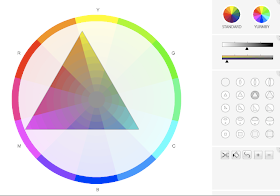
Painter and teacher Richard Robinson has created a free interactive tool that lets you experiment with gamut masks.
With the digital interface, you can choose from a set of pre-shaped gamuts and move them around on either a traditional or a Yurmby wheel. Or you can draw your own gamut shape. The sliders let you shift the value or neutralize the chroma of the wheel in increments.
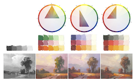
Once you find a gamut or a range of colors that you like, you can mix color strings and paint from them. The gamut-mapping method will be part of my new book on color and light coming out in the fall.
------
Richard Robinson's Digital Gamut Masking Tool.
Previously on Gurney Journey: From Mask to Palette, 2008, The Yurmby Wheel, Color and Light Book.
Monday, April 12, 2010
Shapewelding Sketch
Shapewelding is the compositional device of linking up related tones to make larger units.
Here’s a simple pencil sketch with some attention paid to shapewelding. The back of the white shirt links up with the white shape behind, and the dark front of the apron joins the farther shadow shapes.
We’re constantly faced with this circumstance in real life and in photographs, and the viewer enjoys imagining lost contours, but I find it takes a bit of deliberate effort to put it into a drawing or painting.
Previously: Shapewelding.
Sunday, April 11, 2010
Degas' Dancer Photos
Kodak created the first handheld camera in 1889, and it wasn’t long before Edgar Degas had one in his hands.
He was looking for a way to freeze the fluid action of dancers into stationary poses. In 1895 he took a series of photographs that he used for reference.
Those old Kodaks didn’t have a fast enough shutter speed to freeze real dancers in motion. A model had to hold still for a relatively long period under the artist’s direction.
But the photos gave Mr. Degas what he needed. His paintings portray dancers adjusting their shoulder straps in gestures that appear spontaneous, though they are really painstakingly posed.
[Note: To make these pairings I’ve inverted the values in Photoshop and combined them with details of Degas’ paintings. If you go to this Princeton website, you can see what the original negatives look like. The appearance of full color is an aberration.]
-------
The photo negatives appear on this website.
Thanks to the blog reader who told me about this.
Saturday, April 10, 2010
WCSU Masters of Fine Arts Exhibit
Western Connecticut State University has a Masters of Fine Arts Program presided over by noted illustrator Abe Echevarria
Here's a painting from one of last year's MFA students, Perry Obee "Studio Corner with a Reflected Painting" oil on paper.
I had a chance to visit the school in November and tour the downstairs cubicles where the small and congenial group of illustration MFA students worked on a variety of themes, from zoo posters to paper sculpture.
Now you can see the fruits of their labors at the Master of Fine Arts (M.F.A.) Thesis Exhibition, featuring the paintings and illustrations of WestConn M.F.A. students.
It is currently on display from noon to 4 p.m. weekdays through Friday, April 16, in the Higgins Gallery in Higgins Hall on the university's Midtown campus, 181 White St. in Danbury, Connecticut. The exhibition is free and open to the public. For more information, call (203) 837-8881.
WCSU Events
Pictures in the exhibit from this years class.
Friday, April 9, 2010
H. J. Ward’s Pulp Art
The new issue of Illustration magazine gives all its pages to a detailed article on pulp artist H.J. Ward (1909-1945).
The issue has an astounding 154 reproductions, some black and white, but mostly full color, showing everything from Ward’s early efforts at newspaper cartooning, his preliminary studies, his finished paintings (with some full-page close-up details), and his tearsheets, from magazines like “Spicy Mystery Stories” and “Super Detective.”
Author David Saunders has done a very thorough job of digging through the history, even locating Ward’s studio. The provocative imagery in this issue should interest not only illustrators and graphic designers, but also social historians trying to understand the zeitgeist of American culture in the late 1930s and early ‘40s.
-------
Illustration Magazine
View the Digital Edition
Thursday, April 8, 2010
Demons, Demons
Those who watched John Singer Sargent painting in his studio were reminded of his habit of stepping backwards after almost every stroke of the brush on the canvas. The tracks of his paces were so worn on the carpet that it suggested a sheep-run through the heather.
"He, too, when in difficulties, had a sort of battle cry of 'Demons, demons,' with which he would dash at his canvas."
From the notes of Miss Heyneman. Link to Craig Mullins site, which has the notes as a PDF. Hopefully that link will work. Follow the buttons to "miscellaneous" and look for the button that says "Sargent Notes."
The painting is a detail of the full length portrait of Ellen Terry as Lady Macbeth, 1889, collection of the Tate Gallery, link for full image.
----
Wednesday, April 7, 2010
Attack of the Tool People
On May 16, at the Delaware Art Museum, I’ll be offering a workshop called “Attack of the Tool People.” We’ll be designing mischievous monsters that are part household tool and part human. Below: Henrich Kley
This workshop is for all ages and ability levels. If you come, you can also see the Dinotopia exhibition and the fabulous collection of Howard Pyle and Pre-Raphaelites. Below: Boris Artzybasheff.
Here’s the backstory: Whenever your Do List gets more than 10 items long, a mysterious enchantment travels into the closets and drawers of your house, bringing a “Tool Person” to life. Tool people are impish superheroes that arise from common household objects. They want to help you with your Do List, but their way of fixing things is unorthodox at best and dangerous at worst. That’s why you want to keep your Do List short. (The Tool People are hammering and sawing in my house every night.)
Here's information for those attending:
Please bring:
1. A tool from the kitchen, art studio or workshop.
It should suggest a face or a head, but it doesn’t have to be symmetrical. It might be a wine cork puller, nutcracker, tea strainer, can opener, adjustable pliers, hammer, hole punch, pencil sharpener, drill, camera, or a few computer part. Bring a few other spare parts for components.
2. An action figure or doll.
It can be any size. It doesn’t have to match the size of the tool.
3. Your favorite drawing media.
Everybody should bring a couple of regular pencils and an eraser to get started with concept work.
If you like, you can also bring markers or watercolors, but please no oils because a lot of people are sensitive to the fumes. I recommend bringing a set of water-soluble colored pencils. Caran- d'Ache Supracolor, Derwent Inktense, Prismacolor, or other brands are OK. Twelve or eighteen colors should be more than enough. If you don't want to get a whole set, you can buy about six or seven individual pencils.
If you bring the water-soluble colored pencils, I also recommend bringing a water brush. This is a hollow-handled plastic brush with a nylon fiber tip, marketed under the name Niji or Kuretake and other brand names. Fill the handle with water from the tap.
4. Sketchbook paper or card stock.
The paper should be fairly heavy and smooth. You can use watercolor paper in a separate sheet or a Moleskine watercolor sketchbook, which is perfect.
Recommended for all ages and both beginner and advanced students. Those of you who came to the February workshop are most welcome to return, because we’ll be doing a different challenge this time.
Sunday, May 16 | 11:00 a.m. – 4:00 p.m.
$55 Members/$65 Non-Members
On Saturday, May 15 at 1:00, I'll be repeating the talk I gave in February: "Fact and Fantasy: The Making of Dinotopia," free with paid admission.
That's about it! Look forward to seeing you all at workshop.
----------
Delaware Museum Workshop information.
Previously on GJ: Drawing portraits with water-soluble colored pencils.
The Dinotopia exhibit at the Delaware Art Museum.
Tuesday, April 6, 2010
Ustinov at a Film Shoot
In 1987, when I was in Jerusalem, a film crew had taken over the American Colony Hotel. They were working on the movie called “Appointment with Death,” starring Lauren Bacall, Carrie Fisher, Sir John Gielgud, and Sir Peter Ustinov.
Mr. Ustinov (1921-2004) was sitting patiently waiting for a shot to be set up. Waiting is the fate of all movie actors. I noticed he was passing the idle hours with a sketchpad.
I had my sketchpad in hand, too, so I drew his profile. It was from a long way off and not a great sketch. During a lull, I asked the production manager if I could show it to him. Mr. Ustinov kindly signed it for me, adding “Mirror, mirror. Well done.”
Appointment with Death IMDB
Sir Peter Ustinov on Wikipedia.
American Colony Hotel.
Monday, April 5, 2010
Maguire's Photo Shoot
Robert Maguire (1921-2005) was an illustrator of crime noir, pulp, and romance book covers from the 1950s onwards. He studied at the Art Students League under Frank Reilly.
When he painted the paperback cover called 'Willow Pond' in 1979 he hired a model to pose for a series of reference photographs, much like the process used by Norman Rockwell and other illustrators.
Directing the model was a lot like directing an actor, trying to get the right feeling of pensiveness. He started with her right hand by her chin….
….and eventually brought the hand down by the side of the water. When he saw a hand he liked, he marked it on the photo.
No single photo had everything he wanted, so he had to take a little from each one, and he made an effort to simplify accidental wrinkles and unimportant details.
The photo was printed in four different degrees of exposure so that he could study the variation in the extreme darks in the light photo, and the variations in the highlights in the darker photo.
-------
Many thanks to Harrison Chua who sent these to me!
Robert Maguire Cover Art.
Sunday, April 4, 2010
Saturday, April 3, 2010
Fibonacci Patterns
Nature is full of patterns based on the Fibonacci sequence of numbers. The way you get the Fibonacci sequence is to add the last two numbers in the sequence: 1,2,3,5,8,13,21,34, etc.
Fibonacci numbers turn up in the Archimedes spiral, the chambered nautilus, and the pattern of overlapping spirals in a sunflower or a Queen Anne’s lace.
In Dinotopia: Journey to Chandara, I did a page of small oil studies showing Fibonacci patterns in pine cones, pineapples, and thistles.
If you count the rows of seeds going one way around, you get 5, 8, or 13, etc. And if you count the rows going the other way around, you get another one of those numbers.
The video "Nature by Numbers" is a beautiful demonstration of the principles. Even if you’re not inclined toward numbers, there’s an unmistakable visual logic behind it.
A few inspired math teachers make the time in their curriculum to teach Fibonacci theory, along with fractals, topology, and tessellation, the right-brain branches of math that most teachers unfortunately have to skip over.
And maybe a math expert can explain in the comments why those Fibonacci numbers turn up in nature so universally.
From BoingBoing.
More at Lines and Colors.
Wikipedia on Fibonacci numbers.