Monday, April 30, 2012

Massachusetts College of Art and Design

Massachusetts College of Art and Design is a four year art school located in the heart of Boston, Massachusetts.

The main building, which is called the "tower," has the gloom of a modernist building that wasn't designed with people in mind. But the students have decorated the interior spaces with cheerful paintings of trees and faces that help to humanize it.

I toured the building with illustration chair Linda Bourke. There are 185 illustration students, making illustration the largest major subject.


Abraham Tena teaches a course on the Human Figure in Illustration, where he has the students diagram the muscles. The school offers a two-hour open drawing session each week, both costumed and nude, which anyone can attend for free.


Andy Reach, like all upper division students, gets his own dedicated workspace. It's OK if they don't keep the space tidy. "We love it when they get messy," Ms. Bourke said.


One of the most popular classes is illustrative mask making, where the students work directly with theater professionals from Boston. Students are encouraged to experiment with unconventional illustration media, such as embroidery, cutout sculpture, animation, and Sculpey. Above is a sculptural illustration by Virginia Kainamisis.


The graduating seniors put special effort into preparing their portfolio. On behalf of the students, the school produces and provides them with a set of business cards in the form of illustrated trading cards. 
------
Massart web site

Sunday, April 29, 2012

More on those Kley/Krupp devils

You might recall the recent post about Heinrich Kley's painting of the Krupps demons or devils in the factory. There was an interesting discussion in the comments about what the painting might mean. 

My friend Christoph Heuer has shed some more light on the picture. He went through the catalogue of the Mythos Krupp exhibition and found the following chapter, which gives a detailed account of the context of the Kley painting. It turns out that it had a specific point as a propagandistic retaliation to an article in the London Illustrated News. 


Here's the image which appeared in the London Illustrated News, with the subtitle "THE DEVIL'S FOUNDRY--FOR GERMANY'S GREAT GUNS: THE KRUPP WORKS AT ESSEN -- A PRESS-ROOM."

And here is Christoph's translation of the chapter in the exhibition book:

Myth of Steel
Since old ages iron and steel are surrounded with myths and a secret aura. The fact that it has a superiority over other materials is reflected by the high position a blacksmith had in early societies: they possessed special rights as they were able to master forces of nature like fire and with this tamed power be able to produce weapons, that promised and represented power. Even after the age of reason they were still surrounded by this aura well into the twentieth century. 

In art, this is well reflected in the paintings of Heinrich Kley's "the Devil of Krupp" from 1914 and Otto Bollhagen's "crucible steel casting in the old melting building" from 1912. Red glowing, gleaming colors illuminate the dark scene with a ghostly light and reflect an association of hellfire. At the same time, these paintings also display the pride in mastering the forces of nature by man and industry...

...The building for melting iron was the centre of the Krupp crucible steel production. In Kley's painting, between the workers, the giant devils supply themselves with liquid glowing steel as if having a drinking party. The scene is dominated by red glowing crucibles and appears in a ghostly light. The painting is the best known commissioned work of Kley for the Krupp company. It hung in the casino (a restaurant within the factory canteen) in Duisburg-Rheinhausen. 

It was made as a reaction to the anti-German propaganda in the British press. Shortly after the outbreak of WW I The "London Illustrated News" had published a Bollhagen painting under the title "the Devils Foundry: for Germany's great Guns: the Krupp Works at Essen". Kley accordingly displayed the devils with artistic exaggeration.

Kley also worked for the magazines "Simplicissimus" and "Jugend" who also reproduced the "Devils of Krupp."....Bollhagen captured the workforce intensive crucible steel casting. Under a ceiling illuminated by a red firelight and in front of the white glowing ovens workers draw the crucibles with long rods carrying them and emptying them into to a casting form in the middle of the image. 

The coloring Bollhagen chose make an immediate association to the "hellfire." At the same time the painting shows the physical power and the coordination abilities that a great cast demands from the numerous workers present in this scene, who had to take the glowing crucible from the ovens and transport them through the hall.

Bollhagen worked on a couple of Krupp commissions, including illustrations for a commemorative book celebrating the hundredth anniversary of the company. His painting "crucible steel casting" was also distributed as a postcard. 

I hope that will clear the rest of the questions that turned up in the discussion board."
------

Coiling snake illusion

If you glance around at this optical illusion by Akiyoshi Kitaoka, the snakelike coils around the outer edge will start to move.


But if you let your eyes come to a rest, the snakes come to a stop. Try looking toward one spot and 'spacing out.' Then start looking around again, and the snakes start moving.

Apparently, scientists have concluded, the illusion is somehow tied to eye movements.

Science News: Snakes Illusion

Saturday, April 28, 2012

American Artist Competition

While I'm on the subject of American Artist magazine, I should mention that they're celebrating their 75th anniversary by hosting an exhibition at the Salmagundi Club in New York next year.


The core artists have already been chosen, but they're inviting others to enter via a competition. If your work is in the tradition of the following artists, or if you "consider representational art a significant part of your influence or practice, but are expanding and experimenting in new directions," then this exhibition is for you.

Exhibiting core artists include: Stephen AssaelBo BartlettJudith CarducciJacob CollinsMartha ErlebacherDaniel GravesDaniel E. GreeneQuang HoEverett Raymond KinstlerDavid A. LeffelSherrie McGrawDan McCawOdd NerdrumAnne PackardPhilip PearlsteinJohn Howard SandenRichard SchmidNelson ShanksBurton SilvermanMary Whyte, and Jamie Wyeth.

The competition is limited to USA artists. The fee for entering three pieces is $75. There's a student rate, and there are prizes. Deadline is October 8.
----
About the exhibition
Rules for American Artist Competition

The Cultivation of Imagination

The May issue of American Artist is sometimes here and gone from the newsstands before May even arrives, but you still might be able to get a print copy.

It has a special feature on the art of imagination, with a focus on the upcoming "At the Edge: Art of the Fantastic" exhibition at the Allentown Art Museum, and an article that I wrote on "Howard Pyle and the Academic Tradition." The article begins like this:

One afternoon in Wilmington, Delaware, six of Howard Pyle’s top students were working on their drawings when a new student entered. The newcomer had just been admitted into the select company, and he was eager to prove himself.

He already had some art training under his belt — drawing from the plaster cast and the figure, a grounding in perspective and anatomy. Mr. Pyle set him to work in front of a cast of Donatello’s portrait bust of the “Unknown Lady.”


The next morning, when Pyle glanced at the results of his careful effort, he dismissed it with a gesture. “I don’t want you to go at it that way,” he said. “You are thinking of that head as a piece of plaster.”

Pyle urged him to see beyond the surface, to look for more than mere outline and shading: “I’d like you to think of the beautiful Italian noblewoman who sat for it; of her rich medieval surroundings, of silks and damasks; of courtiers and palaces; of the joy with which Donatello modeled the curve of that eyebrow, the sensuous lips, and the delicate feathering of the shadow over that cheek!”

Pyle asked him to start over, and walked away. The student stared into space, speechless. But his heart was soaring. This was a new sort of language. Pyle, the upright Quaker who painted dashing pirates and bloody battles, believed that what art students need most is “the cultivation of their imagination.”
-----
The bust shown is actually by Desiderio da Settignano, ca. 1430-1464, Florence.
Photo of Pyle students from Howard Pyle Blog

Friday, April 27, 2012

Vintage streetlight collection


Joe Maurath stores his collection of vintage streetlights in a maze-like museum behind his home in Abington, Massachusetts.

Ever since he was a child, he has always been fascinated by telephone poles, streetlights, and insulators—all the so called “street furniture.” He worked as a meter reader, and he has befriended utility crews, who often given him retired lamps and housings. 

He loves seeing streetlights in their element close up from a bucket truck. “You gotta go up in a truck and look at these in the wild,” he told me. “It’s a whole different world up there.”

He has a special fondness for the “cobra head” style streetlights from the 1950s. I was struck with how big the housings appear when they’re brought down to eye level. They look like weird metallic mushrooms or UFOs.

Here's a Westinghouse OV-25 Separate Ballast from 1963 in the wild. Maurath's collection focuses on streetlights and insulators, but he's also got high voltage signs, switches, and police call boxes. Movie companies rent them from time to time to use in period films.
  
The older mercury-vapor illumination, with its pleasant cool color tinge, has almost entirely been replaced by the orange-colored high pressure sodium lamps. The traditional mercury vapor lamps are friendlier to trees, and they make better economic and environmental sense, he says, because the lamps last longer. 

Mercury lights also have the aesthetic advantage of a fuller color spectrum. High-pressure sodium (HPS) spikes almost entirely in the yellow-orange, and has an abysmal CRI (Color rendering index). “Sodium vapor light at night has that city-crime look to it,” he said. “And it makes the snow look dirty.” Hopefully, the new LED street lights, which have superior CRI, may eventually replace HPS.

READ MORE:
Joe's website: Vintage Streetlights
Previously on GJ: Multi-colored Streetlights

Thursday, April 26, 2012

Horse Painting Session

Many thanks to Steve Doherty for mentioning some of our recent outdoor painting adventures in the Plein Air magazine newsletter.


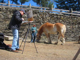
I've hardly told you yet about our impromptu horse painting session. The O.H. R.A.T.S. club (Old Hudson River Art and Truth Society) convened recently to paint horses and donkeys at the Southlands Foundation farm in Rhinebeck, New York.

Garin Baker, Susan Daly Voss, Kevin Ferrara, and my wife Jeanette wanted to try to walk in the hoofprints of some of our equine-painting heroes, especially Heinrich von Zügel and Sir Alfred Munnings. (Thanks, Christoph for finding this amazing photo of Mr. Von Z and his students.)

The farmer, Lenny Miller, posed with Turk, a prize Belgian gelding, while the stableboy Cody held two donkeys. Here's Kev painting Joy. Our session lasted an hour and a half, with breaks for Turk to walk around and blow off steam.

I laid in Turk with his head down munching hay, but then he got full and lifted his head up. 


Garin got so interested in Lenny as a subject that he wants to come back and do his portrait -- never mind Turk! 

The experience was challenging and electrifying— especially with the guinea hens screaming in our ears. Someone once said that painting live animals is the Mount Everest of plein air painting. I agree, and I feel like I barely got past base camp. 
------
READ MORE

Wednesday, April 25, 2012

RISD Nature Lab Workshop

Jeanette and I had a great day yesterday at the Rhode Island School of Design. This art school is famous for its Nature Lab, a collection of 80,000 study specimens. Neal Overstrom, director of the collection, told me that this is not really a natural history museum. The specimens are here to be studied by the art students.  


For our workshop, each student checked out an item from the lab: stuffed chipmunks, a squirrel, sheep skulls, beaver skull, fox skulls, insects, fish, an owl, and a wild turkey. Each of them drew a study of their specimen in watercolor pencils, and then drew them again with an imaginative transformation, either anthropomorphism, a scale change, or a vehicle design using biomimicry.

Most of the students were in Jean Blackburn's scientific illustration class or Lars Grant West's creature design class, so they were primed for this sort of thing.

In the evening, I gave an illustrated talk about the steps I use for making scientific and imaginative illustrations, followed by a 10-minute demo portrait sketch of Jesse.
-----
Thanks to everyone who came to the workshop and the presentation, and to the students and faculty who hosted.
Previous post on RISD, with a tour


Tuesday, April 24, 2012

Iron Worker

 A couple weeks ago I joined an evening painting group in Newburgh, New York. For the three-hour session, we had a model named Larry who works a day job in Manhattan as a "skywalker," a structural iron worker in high rise construction. I painted him in oil against a simple sky-tone background and cropped him tight to make him look even more imposing.

Garin Baker (left) was the host for the session at his studio, called the Carriage House Atelier. That's Kevin Ferrara with the "brushstache" on the right. Contact Garin if you're interested in his instructed or open sessions. Larry will be there this Thursday in a flyfishing outfit.

Monday, April 23, 2012

Lectures tomorrow and Wednesday in New England

For those of you in the New England, USA area, I'll be giving a lecture tomorrow on how to paint imaginary scenes. The illustrated talk and book-signing will take place at 6:30PM at the Rhode Island School of Design (RISD) auditorium in Providence, Rhode Island on Tuesday, April 24.
RISD Event

On the following day, Wednesday April 25, I'll be up in Boston to give a similar lecture and booksigning at the Massachusetts College of Art and Design. That talk starts at 4:30.
MassArt website

I'll bring a sketchbook and a couple of originals to each event. I'd love to meet you and sign your book if you happen to make it by. People of all ages and levels of ability will get something out of the presentation.

Sunday, April 22, 2012

Menzel's Brother

I find this combination of drawings immensely moving and inspiring.


Adolph von Menzel drew his brother Richard in 1848. One of his hands lies flat on a table, the other is closed, with his face resting against it. He has just combed his hair. His eyes are far away in thought. He is patient with his brother's request to hold still for a little while. Richard would have been accustomed to his brother drawing all the time.


Here is Richard again in 1860. He sits sideways on a chair, facing away, with his neck tie sticking out on one side and his hair on the other. He has grown a big mustache and the hair on top is thinner. His cheek seems a bit hollow.

 The third drawing shows Richard on his deathbed in 1865, just five years later. His hair is mostly gone now, his features are sharper, and there is a heavy growth of beard. His eyes are closed and sunken in death. The lines describing the white fringe of cloth move like a seismograph. 

Adolph lived for another forty years after Richard's death. He made these drawings only for himself -- no one saw his portfolios of thousands of drawings until after his own passing.


Saturday, April 21, 2012

Magical light effects

Horsetail Fall is a seasonal waterfall on the eastern face of El Capitan in Yosemite Park in California.

For a few days each February, the setting sun lights up the cascade with a bright orange illumination that makes it look like it's on fire.


It's hard for our brains to process the phenomenon as anything other than fire because there aren't enough contextual cues showing the same sunlight on other surfaces.


When you want to create weird and magical evening light effects in painting, it's good to keep this balance in mind: on the one hand, you want the light to be precious and rare, but it has to touch enough different surfaces to give it some context.


One artist who pulled this off beautifully is the American orientalist Frederick Arthur Bridgman. In this magical evening scene, the main subject is lit by a cool dusk twilight, which diminishes as the draped figures recede into the tree shadows. 


We see pinpricks of candles here and there, with just a hint of their glow on the white structure in the middle ground. The warm accent light in the left foreground touches the folds of different fabrics of the woman's costume, as well as the flowers.

He makes the bold choice not to show the source of the light itself, just its effect. The light effect really works because he was careful to set up large areas of mysterious darkness, softness, and shadow in the rest of the picture.

The painting is called "Fête of the Prophet at Oued-el-Kebir (Blidah), 1889.
See more paintings from this era at the blog Underpaintings. 

Friday, April 20, 2012

Starbucks to discontinue carmine colorants

The president of Starbucks announced yesterday that the company will no longer use the insect-based colorant called cochineal extract, also known as carmine dye, in its "Strawberries and Creme Frappuccino." 


The company had moved to the bug-based red coloring agent in order to use more natural ingredients. However, pressure from vegans forced them to reconsider.

The carmine dye is made from the Cochineal insect, which lives as a parasite on cactus plants. It is a harmless natural ingredient, and is already used in many cosmetics and foods, such as lipstick, barbecue sauce, and pie fillings. 


Despite its poor lightfastness, it has been used as a clothing dye and an artist's pigment. Scientists have done tests to find that the red in this portrait by Sir Joshua Reynolds was made from Cochineal-based carmine lake.

----
Starbucks announcement
Wikipedia on Cochineal
Color tests on S.J. Reynolds
More pigment stories in my book Color and Light

Thursday, April 19, 2012

Seybold's Old Woman


Super-detailed realism is not just a recent idea--it has been around for a while. This oil painting of an old woman is by Christian Seybold (1695-1768). He was a German artist active in Vienna in the Baroque period.


Even when you zoom way into the eye, the detail keeps on going. He has carefully rendered the delicate  overlapping wrinkles around the eye, and he has captured the redness inside the folds.


Compare to this detail of an eye from a Sargent self portrait.
------
High-rez file of this image on Wikipedia Commons
The painting is in Dresden at the Gemäldegalerie Alte Meister 
Thanks, Keita
Previously on GurneyJourney:


Wednesday, April 18, 2012

Seeing with the hands


A century ago, a British museum curator named John Alfred Carlton Deas organized sessions where blind children could handle objects in the Sunderland museum collection.


The event was so successful that he expanded the program to include blind adults.


The idea makes sense not just for blind people, but also for visual artists. If you know how a form feels, you can definitely draw it better.


An interesting drawing exercise is to confront a novel object blindfolded and then, without looking at it, figure out how to draw it. The experience gives you a whole new understanding of shading and contours.

These photographs come from the Public Domain Review.

Tuesday, April 17, 2012

Kley's "Demons of Krupp"

German artist Heinrich Kley is best known for his satirical animal drawings that influenced the work of Walt Disney. But he was also a great painter of industrial subjects. 

In this large oil painting, he portrays gigantic monsters lounging in an industrial space. The puny humans struggle to manage red-hot crucibles of molten metal to feed the giants, who toss them back like glasses of beer.

The creatures, which resemble satyrs or devils, should probably be regarded more as genies or benevolent demons, representing the archaic creative forces that the factories tamed and made to work for their purposes. The image is not meant as a criticism of industry or labor.

If you know Kley’s pen and ink work, it’s not surprising to see such a tour de force of anatomy, but his skills as a painter are a wonderful surprise, too. After his studies in Karlsruhe and Munich, he began as a landscape and genre painter.

He uses a “hatching” style of brushstrokes to describe the muscles, bones, and sagging flesh of each creature. He varies the color of the planes as they turn toward the warm light below or the cool light above. The interior has wonderful atmospheric depth, and the perspective is accurate, with the eye level set just above the heads of a standing human worker.


The painting, “Demons of Krupp,” dates from 1911 and was commissioned by the Krupp family, founder of Krupp Industries. It is part of an exhibition about the Krupp industries currently going on in Germany.
------

Monday, April 16, 2012

Voice of the Wilderness applications due this Friday

This Friday, April 20, is the postmark deadline for applicants who want to be part of this summer's "Voice of the Wilderness" program.


The artist residency invites artists to visit one of seven locations in in the far north: Tracy Arm-Ford’s Terror Wilderness, Misty Fjords National Monument, Petersburg Creek-Duncan Salt Chuck Wilderness, Nellie Juan-College Fjord Wilderness Study Area in Prince William Sound, South Baranof Wilderness, West Chichagof-Yakobi Wilderness and the Western Arctic National Parklands.
------

Article about Voice of the Wilderness
Voice of the Wilderness blog

Asymmetrical makeup


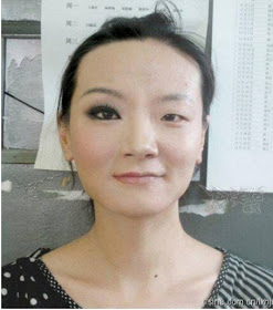
With just half of her face covered with makeup, this woman's face appears asymmetrical.


But is her face asymmetrical to start with? A split-and-repeat transformation turns each half into a new face.
----
Via BoingBoing

Sunday, April 15, 2012

Everett Raymond Kinstler portrait demo


Yesterday I traveled to the Norman Rockwell Museum in Stockbridge, Massachusetts to watch how a master paints an oil portrait. The three-hour event was offered in connection with the exhibition: “Everett Raymond Kinstler: Pulps to Portraits.”

Although I had a seat up front, I couldn’t see much of the canvas, so instead I sketched Mr. Kinstler from the back. Wearing his blue smock, he held his big wooden palette, with the easel and model directly beyond him. 

When he signed my little sketch later, he wrote, with characteristic humor and modesty, “Jim: You’ve captured my best angle.”

As he proceeded to lay in the light and shadow shapes on the blue-gray toned canvas, he regaled the audience with hilarious stories about his encounters with famous subjects such as Katherine Hepburn, Theodore Geisel, and Eric Sloane. 


Mr. Kinstler’s model, Lila Berle, posed under a high spotlight set for a three-quarter “Rembrandt short” scheme with a second light flooding the ceiling to provide a fill light for the model and a working light for the artist. Mr. Kinstler, a student of Frank Vincent Dumond, and a close friend of James Montgomery Flagg, emphasized the importance of finding the distinctive characteristics of the model, rather than flattering her according to some ideal type.

He explained that he was only really showing how he started a portrait, and didn’t try to finish it in such a short time. Instead, he took a few photos and will finish it up in the studio.

As he turned to speak to the audience, I did my best to sketch him with my watercolor pencils, sitting just a few feet from him. 

Mr. Kinstler is 86 years old and has been painting professionally for nearly 70 years. He has painted seven presidents from life, probably a record for any American portrait painter. He exemplifies curiosity, hard work, and a respect for history. He is a champion of three guiding principles: imagination, feeling, and means of communication.

The paintings in the galleries showed all those qualities in abundance, from the adventurous pen-and-ink work for the pulp magazines, to the romantic book jacket cover art, to the life-size portraits. One thing I admire about Mr. Kinstler is how he embraces every aspect of his career, and he explains how the pulp and comic work informed him as a portrait painter.

Seeing the work all together (or reading about it in the excellent catalog) also makes the point that whether you call it illustration or fine art, it's all Art. The presence of the originals is quite stunning; reproductions in books or on the internet really don’t do them justice. 

His painting of Christopher Plummer as Prospero, painted just last year, shows that he’s still at the top of his game. The museum exhibit will be on view through May 28. 


Kinstler's classic instructional book: Painting Portraits
Exhibition Catalog: Everett Raymond Kinstler: From Pulps to Portraits 
Thanks to Stephanie, Melinda, Martin, Jeremy, George, and Laurie