Monday, June 30, 2014

Al Dorne's Waterproof Ink Technique

American illustrator Al Dorne (1906-1965) painted this ad showing mother who is exhausted from hosting a birthday party being perked up by the thought of some Maxwell House coffee.

Dorne created the illustration with layers of transparent inks. In American Artist magazine, the Higgins ink company ran another ad sharing Dorne's method: "In working with waterproof drawing inks, Mr. Dorne finds that the tones never become muddy, no matter how many washes are used."

Here's an enlarged section of the preliminary pencil drawing. Dorne was a master of drawing hands. Note how authoritatively he drew the bones and tendons of the relaxed hand. Even though the hand is in shadow in the final painting, the light seems directional enough to bring out the anatomy.

The caption from the Higgins ad says: "The First Consideration. Because of the transparency of colored inks when used as a "painting" medium—a meticulous and thoroughly organized pencil drawing is important."

True, but it begs the question: How was Dorne able to change her from a brunette to a blonde and turn her head slightly in the published illustration (see first image in the post). Did he cover the original rendering with a layer of opaque priming? Or did he mortise in the correction with another piece of board? I'll bet it's the latter, and that he covered the mortise line with the addition of a choker.

In the days before Photoshop, such changes were a pain in the royal butt.

In any event, the notes say: "A rather finished underpainting in black and white establishes values and forms, important when colored inks are used as glazes in painting. Finally, colored inks are glazed over the monochrome drawing. A fully modeled painting results."
----
Wikipedia on Al Dorne
Book: Albert Dorne: Master Illustrator by David Apatoff, author of "Illustration Art" blog.
Higgins still makes black waterproof ink or you can get a set of colors.


Sunday, June 29, 2014

Nuthin' But Mech 2

Fans of robots, jaegers, droids, mobile weapons, drones, and transformers will be interested to know that the new edition of Nuthin' But Mech Volume 2 is now available.


This is the second volume in the series originated by Lorin Wood, who created the original Nuthin But Mech blog. Ian McQue produced these robot walkers with all the wear and tear and rust of a real machine that had been left outdoors for a long time.

Most of the images are either 2D or 3D digital, but there are a few painted in traditional media. All of the proceeds will go to help the medical costs of Francis Tsai, one of the book's contributors, who was diagnosed with Lou Gehrig's Disease in 2010.

This book features the work 40 contributors, ranging from whimsical concepts to realistic and compelling dystopian visions, such as this one by Bastiaan Koch.


There are six pages of my own artwork, mostly the new sepia paintings for Dinotopia, First Flight Expanded Edition. This one, called "Drainage Man," has the caption: "Poseidian D-class brontostrutters require frequent fluid exchange service. Drainage men, stationed at remote outposts along the steam safari routes of the Great Desert, replace hydraulic oil from the quad pistons after every 50K cycles. They also check lube levels, and they pump water into the belly tanks for the long hauls."

Nuthin' But Mech Volume 2

Saturday, June 28, 2014

Cuphead Game Trailer

One of the delightful surprises at the recent E3 interactive game expo was the trailer for an upcoming video game called "Cuphead" by developers Chad and Jared Moldenhauer. (Direct link to video)


The gameplay is classic run-and-gun with an emphasis on boss battles.


Here are some character sketches. The game uses traditional hand-drawn and hand-inked cel animation animation and painted watercolor backgrounds. A lot of the animation is on cycles. 


The bosses have rolling eyes and pop-out heads. Effects animation includes little puffs of smoke when Cuphead hits the ground and star-flash FX on shots and impacts. 

The period style is hard to nail down to just one era. The animation style owes a lot to Silly Symphonies like Hell's Bells (animated by Ub Iwerks) and the madcap mania of the Fleischer Studios of the 1930s. But the game also has a 1920s vibe because of the silent-picture title cards (complete with digital chromatic aberrations and "projectionist" focus pulls). The jazz music track has a bebop sound that places it more into the '50s.

Friday, June 27, 2014

Lucas Museum to open in Chicago

Ecstasy (c.1929) Maxfield Parrish (1870-1966)
The Lucas Museum of Narrative Art has announced that it will locate in Chicago in 2018. The Museum includes the substantial holdings of Golden Age American illustration amassed by George Lucas, including prime examples of Rockwell, Parrish, and Leyendecker.


In addition to illustration, the museum's holding include visual effects materials, concept art, comics, and animation. There's no other museum quite like it, and it defines narrative art as the full expression of the art of storytelling in popular culture, including "the evolution of the visual image from illustration to cinema to digital arts."

This is the very area overlooked by most mainstream art museums. With the exhibitions, publications, and scholarship that the LMNA is likely to bring to the table, they can do much to elevate the art of popular culture, and to change the way the history of art in the twentieth century is taught and understood.

Press release
Home page

Thursday, June 26, 2014

Pruett Carter's Palette


While I'm on the subject of American illustrator Pruett Carter (1891-1955), I thought I would share some notes about his palette and his use of light and color.


Here's his palette. Ernest Watson writes, "Note that the colors on the palette's edge follow the color circle of the spectrum—from ultramarine through the blues, greens, yellows and reds to alizarin and rose madder. The colors on the inside row are extra or additional pigments to be used for their particular color identity. The earth group—ochres and siennas—are kept by themselves at the top right of the palette."


In his early career, Carter, like Loomis, Lovell, Rockwell, and other contemporaries, worked within the confines of restricted color palettes. These two-color schemes were usually determined by the magazine, which could only afford black plus one other color of ink. This painting, for instance, would have been printed only in black and yellow, so all the cool colors had to come from grays. This discipline produced great colorists when the magazines made the full printer's palette available later on.

During the period that Carter worked exclusively from life, he would pose the models in a section of the studio where he could black out the ambient light and control the illumination with artificial lights only. However his painting area was under a skylight. Between the two parts of the studio, he drew a black curtain, opened just enough to see the models posing.

One other note: as Stuart Ng mentioned in the comments, Pruett Carter taught at Chouinard Art Institute, where one of his students was Mary Blair, a stylist for the Disney films, herself noted for her bold color designs. There's an exhibit of Mary Blair's work at the Disney Family Museum through September 7 which includes a Pruett Carter original.

Wednesday, June 25, 2014

Pruett Carter's Preliminaries


Pruett Carter (1891-1955) was an American illustrator who lived in Los Angeles and freelanced for the women's magazines in New York. In the days before email, faxes and FedEx, he often had to ship sketches back and forth to the art directors by special air couriers. 

Here's a finished illustration, a double page magazine illustration for a story called "Summer Land."

In Carter's day, sometimes the art director would suggest a rough layout. Back then, most art directors could draw well. Carter himself was an art director for a while.

But Carter himself planned this composition. After reading the manuscript he did several thumbnail roughs. This one includes a box for the copy and the title block, and a strong triangular shape awareness for the girl. 

In his early days, Carter drew and painted from live models, but he later shot photo reference. This is the pencil underlay for the color sketch, made with the benefit of models. The original is 17 x 22 inches.

He had an unusual method for color comps (above). He would transfer the drawing to transparent acetate sheets (like animation cels) and then paint the color in oil on the acetate, trying out different color combinations on overlaid layers. "The spots which look like dirt on the girl's legs and jacket and the boy's trousers are actually shadows created by air bubbles between the layers of acetate."

Ernest Watson writes that the acetate comp method "allows the greatest possible flexibility. If dissatisfied with any part, the painting can be wiped off and a new trial made. Usually, however, another sheet of acetate is laid down right on top of the first painting. This adheres to the wet painting and affords a fresh surface upon which the new trial for that particular area is to be made. The new transparent sheet may cover the entire picture or, as is usual, it may be a small piece designed only to cover the area to be corrected. There might be as many as fifteen or sixteen such overlays on a completed painting, a patch here, a fragment there....The advantage of this method of painting on overlays is obvious. The original drawing is not lost in the painting process; it is always under the acetate to be used as a guide."

Illustration by Pruett Carter
-----
Note for researchers: There's a chapter about Pruett Carter in Fred Taraba's excellent book Masters of American Illustration: 41 Illustrators and How They Worked
However, there is no Wikipedia page for Pruett Carter. Would someone like to create one?  He had an interesting career, but he had a sad end. The material in this post is adapted from American Artist, March, 1950. These old American Artist magazines aren't online or digitized anywhere to my knowledge, so if you like I'll keep bringing you nuggets like this.

Tuesday, June 24, 2014

T. Gurneyi Stalks Train Station

Torvosaurus gurneyi has been spotted in a train station in Antwerp (link).
------
Previously: Torvosaurus gurneyi
(Thanks, Erik!)

Kickstarting Walter Baumhofer

The Illustrated Press is Kickstarting a book on pulp illustrator Walter Baumhofer.


The author is pulp expert David Saunders. They're looking to raise $8,000, and plan to print only 1000 copies. Early birds can get the book for $35.00. It will be 9x12 inches, 224 pages, and 300 illustrations.

And knowing the quality publisher Dan Zimmer always brings to his books and his Illustration magazine, it will be gorgeously printed.

Link to Kickstarter page.

Monday, June 23, 2014

CLEMENTOONS "Troubles with Bubbles"

Direct link to video)

Clement sees a poster for a dancing girl, and the story that follows is as old as time.

This is episode 14 from the Clementoons adventures. I'm releasing the mini-movies out of order, but this is the first.


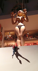
I shot the video on location at Mel Birnkrant's personal museum of comic characters. Mel is at right, operating the Miss Bubbles marionette, which was created by Bil Baird, the puppeteer for the goatherd sequence in "The Sound of Music." At center is assistant puppeteer Christopher Radko, better known for his Christmas ornaments and organic lavender.


I built the doghouse out of foam core board and craft foam, assembled with hot glue and painted in acrylic.

The song "She's a Hum Dum Dinger" is by Jimmie Davis, who later became the governor of Louisiana.

I had fun with the dramatic lighting and cinematography, and tried to use upshots as much as possible to make the characters seem larger than life. The digital pasties were added to the close-ups of Miss Bubbles by Roger Bansemer, because otherwise the video would have been a bit too hot for YouTube.

The Clementoons title music is called "If There Weren't Any Women in the World," performed by the Yanks, from their new album, "Haymaker."
------
Previously:
Clementoons: Behind the Scenes

Sunday, June 22, 2014

Whitney Darrow Prepares a New Yorker Cartoon


Whitney Darrow, Jr. (1909-1999) produced about 1500 cartoons for the New Yorker. A fine draftsman who studied at the Art Students League, Darrow put a lot of careful planning into his cartoons.

"Reverend, you certainly sold me!" Whitney Darrow, Jr., 1950
The original drawing was 9x12 inches, built up with carbon pencil line and charcoal, and solidified with watercolor wash.

Once he got an idea, his first step was to make a number of small sketches to help visualize the situation. Should it be indoors or out? Should the salesman be taller than the reverend?

After he worked out the composition, he submitted a rough to The New Yorker. He had two possible captions: "You certainly sold me!" or "Well, you certainly sold me!" The caption actually used (see above) was still another variation.

Once he knew the setting and arrangement of figures, he did a larger sketch to work out the perspective and the cropping.

The final drawing may seem spontaneous, but it was the result of a lot of preliminary work to finalize the gestures and expressions.

Even after the rough was approved, he redrew the composition several times. If you compare this one to the final at the top of the post, he deleted the woman at the right, and he lifted the salesman's hand (and hat) onto the reverend's shoulder.
 ----
Adapted from the Feb. 1950 issue of American Artist. Thanks, James!

Saturday, June 21, 2014

Miss Bubbles Poster

On Monday morning, I'll be releasing the first full installment of Clementoons animation, an episode called "Troubles with Bubbles." 

The video features Clement's encounter with a dancer named Bubbles LaRue. She's ten times Clement's size, and she's the most beautiful and dangerous female in Melville, the world of cartoon people. I created this poster as a prop for the production. It's painted in casein on illustration board.  

I based the style of the poster on the classic posters of the Moulin Rouge, with their fabulous swooping lettering, bright colors, and sense of excitement.

Miss Bubbles is a marionette, originally built and performed by Bil and Cora Baird, the puppeteers who created the goatherd scene in "The Sound of Music" (link to that scene on YouTube).

She is a treasure of Mel Birnkrant's collection of comic character toys and puppets.
-----
Read more about Miss Bubbles at Mel Birnkrant's website
Video: Clementoons Behind the Scenes
Video:Toy Collector Mel Birnkrant

Friday, June 20, 2014

OK Go's Artistic Music

For some years now, the band OK Go has been creating music videos that feature unique visual artistry, usually involving long single takes and complicated setups. 

This latest one, called "The Writing's On the Wall," takes the camera through a warehouse full of optical illusions that materialize and dematerialize as the camera moves position. (Link to video).

But that's not all that they've done to combine art and music. 

Their crowd-funding campaign through "Pledge Music" has some fun ideas, including (for $250) a caricature drawn by band member Dan from a photo that the pledger supplies.

Or, for $175, "the band will personally hand decorate a pair of Converse Jack Purcells for you."

The band will be partnering with the Museum of Contemporary Art in Los Angeles to unveil their new album. According to Love is Pop,  "OK Go is at the forefront of an emerging class of independent creative entrepreneurs making art across numerous disciplines, hop scotching over the boundaries of content classifications in order to best realize the vision at hand. Or, in the words of Kulash: “We’re working to create a 21st century company that just makes cool s**t.” 
-------
If you haven't seen it, also check out OK Go's "Rube Goldberg" music video.
AND, speaking of new fan-oriented business models of music, check out yesterday's piece on NPR about my son Dan Gurney's web-streaming music platform Concert Window.

Thursday, June 19, 2014

Update your Subscription

A lot of people have emailed me saying that they had signed up for an email subscription to GurneyJourney but that the subscription was interrupted.

I'm not sure why this happened, but I've added a new "Subscribe" widget in the column at left so that you can sign up with any of the web-based newsreaders like Yahoo, Feedly, Bloglines, NetVibes, or SubToMe to get the daily blast by email.

You can also use a blog reader service like Pulse, which lets you organize all your favorite blogs to show you new posts whenever they come up.

Behind the Diner

Here's a sketch I did yesterday called "Behind the Diner," painted in casein on location in Red Hook, New York.
The basic process involved washing the color in transparently and then blocking the big shapes in with flat brushes, then finishing up with smaller round brushes.

Incidentally, the blue colors aren't this intense--has anyone noticed that Blogger seems to have installed an auto-color enhancer algorithm?
-----
EDIT: Thanks to Stuart for researching about the auto-enhance feature on Google plus (see comments). I went into Google Plus settings and deactivated that setting. Here's the image with the auto-enhance turned off, which is a lot closer to the original:

You can see a step-by-step sequence with more steps that you can click through, on my public Facebook page.

Here's more about the tools I was using:
Casein tube colors
1/4 inch flat brush 
Moleskine watercolor notebook
Waterman Phileas red fountain pen 

Wednesday, June 18, 2014

Water Cup Magnet


Here's an improved way to use magnets to hold your water cup to your metal watercolor set. I embedded three small neodymium magnets (1/4"x1/16") in an epoxy sculpting compound called Magic Sculpt. The compound sticks to the bottom of the water cup.


This way I don't need to drop a magnet into the water itself, which will rust eventually. And it holds better to the metal. It would even hold just fine if you held it upside down and shook it.
------
Neodymium Magnets 1/4" X 1/16"