Wednesday, September 30, 2015

"Secondaries" as Primaries

In yesterday's post about charting limited palettes, I mentioned that the colors you choose for your palette don’t have to be blue, red, and yellow.

Autochrome by Louis Lumière"Madeleine, Suzanne et Andrée à travers les vignes"
You can use what we think of as "secondaries,"—orange, green, and violet—as primaries and come up with very interesting color schemes. The Autochrome process, an early form of color photography, did just that.
Jean-Baptiste Tournassoud ( French, 1866 - 1951); Le Phonographe;
Autochrome, circa 1912 courtesy the 
Photography Museum
Autochromes used grains of potato starch dyed red-orange, green, and blue-violet.

Through a magnifier (below), the individual colored grains are visible (left courtesy PhotographyMuseum.com, right courtesy Univ Delaware).


I'm not sure how accurate the color in these examples are. The first one looks Photoshopped to pump the colors, and the second one looks yellowed. But you get the idea.

Yellows are mixed from orange and green, similar to the way they're mixed from red and green in computer screens and theater lights. Yellows are the hard color to achieve this way, because they come out weak and low value, so they have to be tinted up with white, and at best they'll be sort of beige.

But the experience of building a color scheme where the colors we think of as "primaries" have to be mixed from "secondaries" is a strange exercise that will rewire your color brain.
-----
Resources

Tuesday, September 29, 2015

Limited Palette Tests


I just finished writing an article called "Extreme Limited Palettes" for International Artist magazine and I want to preview one small part of it for you.

The article will include these four color charts. Each diamond-shaped diagram represents the possibilities of three colors, plus white.


Each diamond shape is composed of two isosceles triangles. The left triangle represents the gouache colors straight out of the tube, and the right one represents the mirror image of those colors, but mixed with white. Secondary mixtures appear as rectangles along the side of each triangle. The darkest "black" you can get from those colors is the small dark patch in the center of the left triangle.


Each chart gives a sense of the full available gamut for that limited palette, so you can see at a glance what's possible with a given set of colors. For example, you can see how this painting belongs with the chart in the upper right, the one with yellow ochre (Holbein), perylene maroon (Winsor Newton), and viridian lake (Winsor Newton)—plus white (M. Graham).

Below is another way to set up the charts using hexagons to represent the color wheel, with tints in the center. These are done with oil.


The colors you choose for your limited palette don’t have to be blue, red, and yellow, or even cyan, magenta, and yellow. As long as they’re differentiated, the painting will seem to have a full universe of colors.

Before you start a given painting, you can refer to a set of charts like these to decide which limited palette would suit the subject you want to paint. These charts would be a big help if you're thinking of joining in with the Graveyard Painting Challenge for October.
----

Monday, September 28, 2015

Ink and Scratchboard Technique

Here's an unusual technique that's effective for a backlit subject with edge lighting. It uses white scratchboard, a chalk-coated drawing surface that allows you to scratch through to white with a sharp knife or a scraper tool.
Typical Houses in Orange County, CA. James Gurney, ink on scratchboard, 4 x 6 inches

Here's the sequence:
1. Choose a backlit subject. Outline subject carefully in pencil to map out the placement of elements.

2. Block in the large gray areas with waterproof drawing ink and a large flat brush, covering the entire area from the roofline to the ground. This tone goes down quickly and can't be fussed with or changed. It's OK to paint past the lines in the sky because you can cut back to white easily.

3. Add in small black shapes and lines with a brush or pen.

4. When that's dry, cut the edge lighting back to white with the scraper tool.

Being able to cut clean, thin, white lines could be ideal for night subjects or for scribing white letters or neon on a sign, or for defining telephone wires, animal whiskers, highlights and things like that.

Scratchboard can be a bit expensive and hard to find these days, so I'm currently developing a way that I can prepare a surface with inexpensive materials and get the same results. More on that in a future post.

Sunday, September 27, 2015

Approaching Strangers for a Portrait


Visual journalist Richard Johnson wanted to do portraits of the homeless in Washington, DC, but it took a while to figure out how to approach them.

As he describes in an article for the Washington Post, at first he sketched them from a distance without asking. Then he approached them and asked permission, but he was usually rebuffed. They just wanted to be left alone. He offered them money, but that didn't work either. 

Eventually he made a connection with the organization and newspaper, Street Sense, and he found people there who would let him draw their portraits and hear their very individual stories. 

His sketches include written notes alongside the portrait drawings. He says, "drawing and listening at the same time was a not entirely new challenge for me – I recently covered the trial of Dzhokhar Tsarnaev, the Boston Marathon bomber." 

Once people began to open up, he realized that drawing was a trust-building exercise. He says, "Something about the quiet process of studying and drawing I think allows even the naturally wary to gradually let their guard down and open up." 

But it was often an intense encounter, and "staring right into their eyes is one of the hardest things I think for an artist to do. There is a whole world of pain in there." 


Brandon Stanton is the photographer who created the wildly popular "Humans of New York" blog, which documents the extraordinary stories of ordinary people. He has successfully approached thousands of strangers on the streets of New York, Iran, and other places, and has elicited not only their permission to photograph them—and even their young children — but also has documented some of the most personal and challenging stories.

In his talk at the University College Dublin, Ireland, he demonstrates the approach he uses to begin a conversation that most often leads to a successful encounter. (Link to video) Bottom line: be small and unthreatening, show them your work, don't ask for too much at first, and be willing to listen.

Saturday, September 26, 2015

Eye Movements While Drawing


A new study published Science Direct Vision Research examines what happens with our eye movements when we're drawing.

The act of looking back and forth from the subject to the drawing involves the coordination of perceptual, cognitive, and muscular skills. You have to see a shape, then remember it briefly, and finally translate your understanding of it into hand movements.

The main focus of this study is how the saccadic eye movements of an artist engaged in the task of drawing differ from the eye movements of a person who is free-viewing a subject without such a task in mind.


It turns out that the kind of looking we do while drawing is quite different from normal free-viewing:

1. The saccadic leaps are slower
2. The eyes tend to follow contours more
3. They move in saccades of shorter distance
4. And they fixate longer on individual details, rather than skipping around the whole scene.

No huge surprise there, I suppose, especially if you give someone a task of copying a curving line.

The authors note that not many scientists have studied the specialized kind of visual perception that artists bring to the act of drawing and painting. I would be interested to see additional studies that ask subjects to solve a drawing problem that involves more comparative observation, rather than contour-following, such as accurately copying the slopes of a quadrilateral, or drawing two circles, one twice the diameter of the other.

I would also be interested to see someone examine how artists use peripheral vision, squinting, blurring of the visual field, seeking alignments, and other specialized skills to shift attention from small details to the "big picture." These are skills that beginning artists take a while to master.

Later in the article, the authors note that there has been a lot of debate about what drives saccadic eye movements, not only in a specialized task like drawing, but in normal viewing. Are our eye movements passively driven by features in the scene, or are they actively controlled by the conscious attention? I would suspect that it's a combination of the two, and that artists in the act of drawing are much more on the "active control" end of the spectrum.
-----
Visuomotor characterization of eye movements in a drawing task by Ruben Coen-Cagli, Paolo Coraggio, Paolo Napoletano, Odelia Schwartz, Mario Ferraro, and Giuseppe Boccignone.

I'd like to thank the authors for making their study available for free, and I'd also like to thank Paul Foxton for sharing it with me.
-----

Friday, September 25, 2015

Lone Rooster


Over the years the chickens and guinea fowl population on the farm has ebbed and flowed as they fall victim to raccoons, foxes, and hawks. At the moment there's just one fine looking rooster. He's a bit lonely, but every ounce is fiery Microraptor. I'll sketch him one of these days if I can find him in a quiet moment.
-----
GurneyJourney YouTube channel
My Public Facebook page
GurneyJourney on Pinterest
JamesGurney Art on Instagram
@GurneyJourney on Twitter

Graveyard Challenge (in case you missed it)

John Singer Sargent, Graveyard in the Tyrol, 1914
In case you missed the announcement, I'm inviting everyone to paint a graveyard on location in a limited palette of colors. Here's the original blog post with all the details.

It's free to enter, and you can post your entries on the Facebook event page (where works are already appearing), and you can also informally share your work on Twitter or Instagram at the hashtag #graveyardpaintingchallenge.

Thursday, September 24, 2015

Interactive Music Visualizer

Panoramical is a music visualizer that creates moving images tied to a music track. Here's the trailer.


But it's also a game that lets users customize various parameters of experience, resulting in something that resembles electronic lucid dreaming, or interactive hallucinogenic synesthesia.


It was created by Argentine DJ, visualist, and programmer Fernando Ramallo and Proteus co-creator David Kanaga.
Via BoingBoing
GurneyJourney YouTube channel
My Public Facebook page
GurneyJourney on Pinterest
JamesGurney Art on Instagram
@GurneyJourney on Twitter

"Gouache in the Wild" reviewed on USK


"Citizen Sketcher," Marc Holmes of the Urban Sketchers blog reviewed "Gouache in the Wild," and here's an excerpt:

"The take away here is Gurney’s passion for the potential of this under-utilized medium. He is here to demonstrate how gouache can offer you all the advantages of opaque painting in oils or acrylics, but in a fast drying, clean and portable, water-soluble media that is highly suited to working on location, sketch-booking and the small studies which many painters enjoy on location."
----

Wednesday, September 23, 2015

Stop-Motion Honda Ad


Animator PES created this ad for Honda using stop-motion paper animation techniques. There are all sorts of clever ways of turning 2D into 3D. (Link to video on YouTube)


The behind-the-scenes video shows how computers were used to previs the shots and work out the perspective angles, but the final animation was shot in camera with multiple sets of hands manipulating the paper in ingenious ways. (Link to YouTube)

Via BoingBoing

Interview with Cell Phone City


Not sure why Cell Phone City wanted to ask me about my art (I told them I don't even have a smart phone, and I don't live in a city), but here's the interview anyway. Thanks, Christopher!

Tuesday, September 22, 2015

Mental Floss Article on Paleoart

The news magazine Mental Floss just posted an article about bringing dinosaurs back to life, tracing the journey from fossils to oil paintings.
----
"How Paleoartists Recreate and Illustrate Dinosaurs" by Gabe Rivin
Order the 40-minute full-length tutorial video "Tyrannosaurs: Behind the Art" at Gumroad (credit cards) or Sellfy (Paypal).


Monday, September 21, 2015

Shishkin and Photography

Ivan Shishkin, Woodland. 1889. Oil on canvas. 39 1-2 x 29 in. Date 1889
Although he was a devoted and prolific outdoor painter, Russian landscape painter Ivan Shishkin was also a big fan of photography, according to an article in the Russian archives.

He became closely involved with photos while working in Andrey Karelin's photography studio in 1870, coloring black and white photos for an album that was presented to emperor Alexander II.

Shishkin encouraged his students to work from photos, especially in the depths of winter, for example, when painting outdoors was impractical. Shishkin wrote in one of his letters:
"... Let me give you one major piece of advice, that underlies all of my painting secrets and techniques, and that advice is — photography. It is a mediator between the artist and nature and one of the most strict mentors you'll ever have. And if you understand the intelligent way of using it, you'll learn much faster and improve your weak points. You'll learn how to paint clouds, water, trees — everything. You'll better understand atmospheric effects and linear perspective and so on..."
Shishkin enlarged details with a magnifying glass, and he also used a projector. When he came to teach at the Academy of Fine Arts in 1897, he specifically mentioned the need for a "magic lantern" type projection device to aid in student learning, not only for enlarging photos, but for presenting drawings at a larger scale.

Although photographs were used widely by artists during his time, Shishkin was conscious of not mindlessly copying. He told his students that the way an artist uses a photo will reveal the artist with talent, because "a mediocre artist will slavishly copy all the unnecessary detail from photos, but a man with a flair will take only what he needs."

Shishkin's enthusiasm for modern tools like photography is not surprising during an era of technological innovation, and in an age of positivism, which placed a value on verifiable facts. His friend, portrait painter Ivan Kramskoi also used photography, and he probably used one to guide his portrait of Shishkin below:

Portrait of Shishkin by Ivan Kramskoi
But Shishkin never regarded photography as a substitute for painting outdoors from life. Kramskoi marveled at his productivity: "He paints two or three studies a day and completely finishes each of them."

Shishkin wrote: "In the case of art - be it art, architecture, such practice is of the greatest importance. It alone allows the artist to appreciate the substance of the raw material which nature presents. Therefore, the study of nature is necessary for any artist, but especially for the landscape."
Shishkin knew as much about individual plant forms as did the professional botanists of his day. He probably would have agreed with the critic Adrian Prakhov, who said, "I love the original character of every tree, every bush, and every blade of grass, and as a loving son who values ​​each wrinkle on the face of his mother."

Shishkin said, "Work every day as if it is your daily duty. There's no need to wait for inspiration! Inspiration is the work itself!"
------
Thanks to Samir Rakhmanov for the link and the help with translation.
Previously on GJ: Using Photo Reference
GurneyJourney YouTube channel
My Public Facebook page
GurneyJourney on Pinterest
JamesGurney Art on Instagram

Sunday, September 20, 2015

October Graveyard Challenge


We had such an enthusiastic response to our last Outdoor Market Challenge that many of you asked for another opportunity.

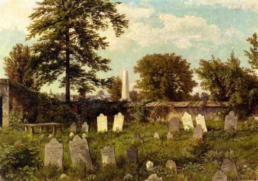
Leverington Cemetery by William Trost Richards

I hesitate to call it a "contest" because there's no entry fee and the spirit is more about cooperation, community, and camaraderie than competition. We're all at different levels of skill and experience, but we're all out there braving the elements and trying out new painting ideas.

The October Challenge
The challenge is to paint a graveyard on location with a limited palette.

West Clare Graveyard, Kilnaboy, Ireland, by James Gurney oil 8x10 inches
What kinds of subjects are OK?
Any cemetery, graveyard, churchyard, burial vault, crypt, tomb, columbarium, or other place for the repose of human remains. In keeping with the spirit of autumn and Halloween, I'm hoping your painting can somehow (through composition, color, lighting, or time of day) convey feelings about mortality, loss, transformation, horror, or abiding love.

Highgate Cemetery by Gleb Goloubetski
On Location
It must be painted on location and it must be a new painting done for this challenge. In addition to a scan of the final painting, your entry must include a photo of your painting in progress in front of the motif.

Paints
All traditional painting media are acceptable, such as: oil, watercolor, casein, gouache, Acryla-gouache, acrylic, and/or water-soluble colored pencils. No dry media or digital.


Burial Vault by James Gurney, 5 x 8 inches, watercolor and colored pencil
The Limited Palette
The palette must include just three colors of your choice plus white. The reason for the limited palette is to keep your painting harmonious. You can also use even fewer colors or just work in monochrome.

Here are some suggestions, giving equal time to different companies: 
Holbein gouache: ViridianCadmium red deep, and Yellow ochre plus white
M. Graham gouache: Ultramarine blueCadmium yellow deep, and Burnt umber plus white
Winsor and Newton gouache: Perylene maroonCadmium yellowCobalt blue plus white
Richeson casein: Cobalt blueLight redGolden ochre, and white
Feel free to come up with your own, you don't have to follow these suggestions.

Stone Church Graveyard by James Gurney, watercolor
Deadline
It's free to enter. You can enter as soon as you finish the piece, but no later than the deadline: Tuesday, October 27, 2015 at midnight New York time. Winners will be announced on Halloween, Saturday, October 31. 

What and How to Enter
Just shoot two image files: 1. Your finished painting and 2. A photo of the painting in progress on the easel in front of the subject. Your face doesn't have to be in the photo unless you want to.

Upload the images to this Facebook Event page (This way I don't have to deal with email, and you get to present your images your way). If you don't have a Facebook account, please ask a friend with an account to help you. Please include in the FB post the list of the three colors you chose (plus white), and if you want, a word about your inspiration or design strategy, or an anecdote about your painting experience.

In addition to the Facebook event page, you can use the hashtag #graveyardpaintingchallenge on Instagram or Twitter to see what other people are doing. 

Prizes
I'll pick one Grand Prize and five Finalists. All six entries will be published on GurneyJourney, and all six will receive an exclusive "Department of Art" embroidered patch. In addition, the Grand Prize winner receives a video (DVD or download) of their choice. Everybody who participates will have their work on the Facebook page, too.

EDIT: Here are the results of the Graveyard Challenge.
-----
Own the 72-minute feature "Gouache in the Wild"
• HD MP4 Download at Gumroad $14.95
• or HD MP4 Download at Sellfy (for Paypal customers) $14.95
• DVD at Purchase at Kunaki.com (Region 1 encoded NTSC video) $24.50