Monday, February 29, 2016

Painting a Portrait of a Group of Singers

On Saturday I was up in the mountains painting a portrait of a group of singers. They met in an old wooden church hall in the town of Phoenicia for an all-day singing event.

They came from six states with one thing in common, a love of Sacred Harp, an old-fashioned musical tradition which traces back to the American colonies and even earlier.
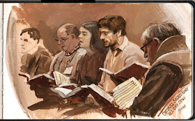


Men, women, and children sat facing each other in a square, singing at top volume in four-part harmony. The singers took turns suggesting tunes and leading. There was no preaching, no audience, and no instruments. But there was coffee and plenty of home-cooked food.


While my wife sang and helped set out the lunch, I sat off to the side and painted. (Link to YouTube). The singers hardly noticed me working.

However, it was a daunting challenge. Not only were they were moving a lot, but they were also changing seats every few songs. I didn't expect this, so I had to adjust my approach. 


Here are the strategies that helped me deal with the challenge:
1. Limiting the color to a warm grisaille. That simplified the variables and suited the starkness of the music.
2. Going immediately to finish on the central head (thanks, Gideon!) and painting outward from him.
3. Using an opaque medium like casein so that I could paint over and restart a section.
4. Drawing with the brush. The figure on the right and all the books were completely drawn with a round brush late in the session, which lasted about four hours.

Info about the music:
The song is #361"Loving Jesus" from The Sacred Harp book.
YouTube trailer for Awake My Soul documentary, available as a DVD
Catskill Sacred Harp Community website.
FaSoLa, the national Sacred Harp organization
Listing of upcoming All-Day Singings on the Eastern U.S.

Info about the art supplies:
Paints: Jack Richeson / Shiva casein colors 
Richeson's informative FAQ about casein.
Pentalic watercolor journal
Subscribe to the James Gurney YouTube channel to see videos before anyone else

Sunday, February 28, 2016

Painting an Anamorphic Illusion

To celebrate arriving at 20,000 followers on Instagram, I decide to paint an anamorphic illusion.


In this photograph, the "2" and "0" are made of cardboard, and the "k" is painted on the surface of the paper.


The way I do it is to first make all the letters, including the "k," out of four layers of laminated cardboard, cutting them out with a jig saw. I place the letters on a sheet of white paper, and take this photo of them all under a strong light.


Then I use a digital projector (lower right) to project that same photo onto the scene from the position I will be photographing it later. In the photo above I haven't removed the cardboard "k" yet. A simpler way would be to simply shine a sharp light from that position and trace the shadow. 

I will paint the stretched out "k" wherever it goes on the paper. The far edge of the paper is cut so that the top of the "k" sticks over it a little.


(Link to YouTube) Instead of starting with the illusion and then breaking it, I decide to start with a side angle and see if I can make it resolve at the end. I arrange the time lapse camera on a circular dolly, with a geared-down Lego motor providing motion-control. 

As you can see, I underestimate how dark the values have to be to match, and how the slightest wobble is wildly exaggerated. I also let the camera drift a bit too far on the dolly, which gives the "k" an italic tilt.


This popular YouTube video starts with some shots of the real objects, followed by the anamorphic illusions, cleverly using hand-held focus adjustments to sell the trick. I believe they were printed on the paper, not painted. (Link to YouTube)

If you're interested in anamorphic illusions, check out these painted geometric illusions painted on walls.
GurneyJourney on Instagram

Saturday, February 27, 2016

Little Green Men


The design blog and podcast "99 Percent Invisible" discusses the variations of the walking-man icons used as a signal for pedestrians and how those symbols communicate different inflections of national identities.

Little Green Men: Iconic Pedestrian Lights Signal More Than Change


Friday, February 26, 2016

Written Notes

It was too dark to sketch during the opera workshop, which was called "Drag me to Hell." So I sketched this guy during the intermission. 


The other quote was something I overheard at the diner. It's fun to surround a drawing with random words pulled out of the air. Sometimes weird sparks fly between the notes and the sketch because of the way our brains make associations.

I always carry a fountain pen (link to Amazon) in my shirt pocket. I refill it with brown fountain pen ink using a hypodermic syringe. I did the sketch in a watercolor sketchbook with a pocket watercolor set

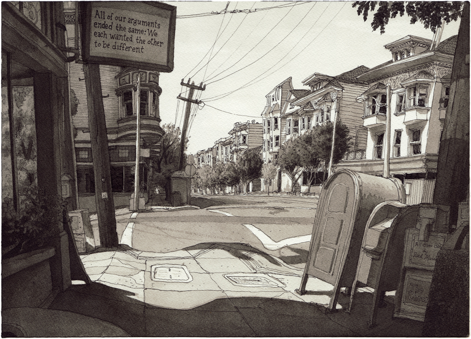
One person who inspires me on how to use written notes is the San-Francisco-based artist Paul Madonna, whose drawings are published in the newspaper and collected in the books All Over Coffeeand Everything Is Its Own Reward. He sometimes incorporates intriguing written notes into signs in the scene. His notes are often narrative fragments that don't relate directly to anything in the scene.  


Other times, he combines a sketch of an unpeopled view with a longer text that describes human moments unrelated to the scene, inviting the reader to form their own images beyond the picture presented on that page.
-----
I've got a fun Satyr Building Series going over at Instagram. Check it out!

Thursday, February 25, 2016

Atlas, a new humanoid robot


Boston Dynamics has revealed Atlas, the newest iteration of their autonomous humanoid robot. It can let itself outdoors, walk on snowy ground, pick up boxes, and right itself after being pushed by a human. (Link to video). They say:
"It is specialized for mobile manipulation. It is electrically powered and hydraulically actuated. It uses sensors in its body and legs to balance and LIDAR [laser surveying technology] and stereo sensors in its head to avoid obstacles, assess the terrain, help with navigation and manipulate objects. This version of Atlas is about 5' 9" tall (about a head shorter than the DRC Atlas) and weighs 180 lbs."

Wednesday, February 24, 2016

"Termite Terrace," a never-made film about Warner Bros. animators


Director Joe Dante talks about the never-produced script for "Termite Terrace," a live-action film proposal about the real-life stories behind the animators who created Bugs Bunny and Daffy Duck. (link to video) Via Cartoon Brew

Stapleton Kearns takes a look at my newest video


When I produced a video with "FANTASY" in the title, I knew it wouldn't appeal to everybody, because not everyone is interested in science fiction or surrealism. Some folks want to paint things more or less as they are (me too, actually, a lot of the time).

One of the best of those observational painters is Stapleton Kearns, a New Englander who would have been at home painting alongside Aldro Hibbard or Willard Metcalf.

Stape runs a great art blog that he'll be turning into a book, and in the latest post he reviews my video on painting concept art on location. He says:
"It is divided into two chapters, the first has James on location painting a street scene. He adds a flying car, and shows how he uses a small toy on location to do it. I can't imagine putting a flying car in one of my pictures, but who am I to say, having featured the occasional burning phone booth? The value of this is watching a master of drawing slice up a location picture like a roast. It is an excellent demo of outdoor painting skill, done with a bit of humor."


Since Stape says he can't imagine his painting with a flying car, I have taken the liberty of putting one flying across one of his paintings. He would point out that I have made the mistake of putting the key element in the middle of the composition, a classic compositional error. But the driver of the flying car is there because he is just trying to steer between those trees, and he is dealing with a stiff spring crosswind.

Stape was doing plein-air painting before most folks used the French word for it. Back in those days we usually called it "outdoor painting" or "on-the-spot painting." Plein-air was a term we read about in old art books, and we used the term when we wanted to sound pretentious. When we really wanted to sound pretentious, we'd half-close our eyes, tilt our heads back, and say we were painting en plein air.
Back row: Tom Kinkade, Stapleton Kearns, Kevin Eugene Johnson? James Warhola,
James Gurney, Tom Kidd, and Jeanette Gurney. Paul Chadwick and Elizabeth Moon
in lower left.
In his blog post he recalls an artist get-together in April, 1990 when he and I first met. My memory of that day was that all the rest of us artists were just talking about art, but he came in to the party with paint on his jacket and with three fresh oil paintings that he had done that morning. He blew us all away with his dedication and skill, and he still does.

Stapleton Kearns runs a painters' snow camp in March, which I recommend for the hardy. He says "I will work you like a borrowed mule," and he means it. You can find info about it in his latest post.

Here is Stape's review of "Fantasy in the Wild." And here is his post about the burning phone booth.
Gumroad link for my video.

Tuesday, February 23, 2016

While waiting for chicken tacos


After I put in the order for my chicken tacos, I get out the gouache. Just four colors: ultramarine blue, flame red (Daler Rowney), burnt sienna, and white.

There's a stop sign catching the full sun and a brick building in shadow just beyond it. I'm painting over a casein base layer tinted to yellow-orange, and using a dark blue colored pencil for the first lines. The horizontal line through the base of the stop sign is the eye level. 


At the end I bring in a little white Nupastel and light blue colored pencils for the lines of the bricks. Gouache presents a very receptive surface to chalk and colored pencils.
----
If you're ever passing through Kingston, New York, I can recommend the great homemade Oaxacan food at Just for You Mexican Restaurant

Monday, February 22, 2016

Lines and Colors reviews "Fantasy in the Wild"


Thanks to Charley Parker of the art blog "Lines and Colors" for the thoughtful review of my video tutorial "Fantasy in the Wild"
"To me, the approach taken in Fantasy in the Wild — and the general theme of taking inspiration and reference from the study of the real world as raw material for imagined scenes — reveals an appealing undercurrent relevant to plein air painting: the implied freedom of not feeling limited to reproducing the scene being painted, but instead taking nature as a source for painting whatever the artist wishes."
Link to full review
Gumroad link 

Color Charts Through History

For centuries artists have explored ways to map the universe of color. Each kind of chart reflects a different conception of color. Here are a few examples, from a selection by The Public Domain Review

"A chart from 1746 by Jacques-Fabien Gautier illustrating his theory that the primary colours
are black and white, with red, yellow, and blue being secondary. Colours were thought
to be drawn out of the shadows by the presence of light – Source."

"Philipp Otto Runge’s Farbenkugel (1810). The top two images show the surface
of the sphere, while the bottom two show horizontal and vertical cross sections –Source." 
"Johann Heinrich Lambert’s three-dimensional adaptation of
Tobias Mayer’s triangle, featured in his Beschreibung einer mit
dem Calauschen Wachse ausgemalten Farbenpyramide
(1772) – Source."

"Page from Priced catalogue of artists’ materials : supplies for
oil painting, water color painting, china painting … and
drawing materials for architects and engineers, manual
training schools and colleges (1914) – Source."
Captions quoted from: The Public Domain Review. See more at their post Color Wheel Charts and Tables Through History
More about color systems in my book: Color and Light: A Guide for the Realist Painter

Sunday, February 21, 2016

New Minis


There are two new mini horses at the farm, just waiting for their portraits to be painted.

OK Go Answers its Critics


The band OK Go released a new music video called "Upside Down Inside Out," shot entirely in weightlessness (link to video). They also made a behind-the-scenes video showing how it was done.

In a Reddit Ask Me Anything session, they were asked: "How do you respond to critics that call you a video band, implying that the theatrics and videos are more substantive than the actual music?"

"We just don't subscribe to last century's categorical definitions as much as most folks do... When I was in high school in the 90's, music came in one container (a CD), films came in another (theaters), tv came in another (that box in your living room), journalism another (newsprint), and on and on ad infinitum. Now every one of those supposedly distinct cultural forms is distributed the exact same way -- all of them are ones and zeros that you get through your phone or laptop -- and the boundaries between them are more and more arbitrary every day. So we chase our creative ideas wherever they lead, and it doesn't particularly bother us if an idea winds up being visual as opposed to auditory. For us, the joy is in making stuff, and we feel super lucky that we have such a broad and inspiring canvas to work with. Plus, we love our songs. Every band has critics... fuck'em. -- damian"
If you're new to OK Go, also check out their amazing Rube Goldberg video.

Saturday, February 20, 2016

Old Mugshots


Police mugshots have their own stylistic conventions that have developed over time. In 1905, some English police had the accused hold a chalkboard with their name and alleged crime—in this case, larceny.


In Australia in the 1920s, the accused was shown in close-up and in a standing pose, with the name written on the negative.


The Australian mugshots seemed more improvisational and less clinical than modern ones. But there's still that sense of defiance, as if to say, "You can catch me, copper, but you can't break me."


Some of the subjects look well dressed, and invite curiosity about their story.


These last four images are from a collection of 1920s mugshots collected in Sydney, Australia by novelist Peter Doyle for a book called Crooks Like Us.
---
Via First to Know Thanks, Kay.
First photo is from ViralNova
Related post: Happy Old-Time Photos

Friday, February 19, 2016

Harold Speed on Old Master Techniques

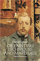
Today we'll continue Chapter 9: "Painting from the Life" from Harold Speed's 1924 art instruction book Oil Painting Techniques and Materials.
I'll present Speed's main points in boldface type either verbatim or paraphrased, followed by comments of my own. If you want to add a comment, please use the numbered points to refer to the relevant section of the chapter.

Today we'll cover pages 158 - 164 of the gold mine of a chapter on "Painting from the Life."
1. Analyzing Titian's Man with a Glove: "Unity and sublimity of impression is given to the head by this simple unity of focus."
There's a lot of information that he downplays, such as the line of the shoulder, the background, etc. The whole portrait hinges on the closer eye.

Note too how there's a single, large movement of tone on the model's right hand, from the higher light at the wrist to the extended finger.

2. "Do not soften one tone into another by brushing them together."
Speed says to use another carefully mixed tone between them. "The more often paint is touched, the less vital the impression." This reminds me of the "mosaic" approach of Carolus-Duran, Sargent's teacher. Good advice, but it can be taken too far if the artist makes brushstrokes the subject of the picture.

3. Analyzing Rubens' technique
I won't reiterate the whole process, but you can read it on page 159. Rubens was essentially a member of "the Brown school," but it was a very efficient method that allowed him to produce a lot of work.

4. When you paint a light tone thinly over a dark background, it will tend to look cool. When you paint a dark tone over a light BG, it will look warm.
This is also true of smoke, as I pointed out in a previous post.


Smoke against a dark background appears blue. Against a light sky, the same smoke will appear orange.


5. "Halftones are generally cool, and consequently they should be painted with the lighter side overlapping the dark."
He continues: "The enhanced effect that transparent color gives can often be got in solid (opaque) painting by lightly painting dark over a wet light tone." He goes on to talk about the color temperature of hair relative to skin. Such rules should be learned and tested skeptically against your empirical observation.


6. "When two edges come together with much variety on one side and little on the other, paint the variety side first, leaving the edge to be trimmed up when painting the simpler tone of the other side."
"You cannot vary the tones in a touch as you carry it along an edge."

7. "Another way of simplifying the larger modelling of a form that is made up of a variety of colours (that must necessarily be put on separately) is to sweep them together with one stroke of a large, dry brush. But this can only successfully be done once, or the softening effect of it will deaden the colour too much."
There are several kinds of brushes you can use for this sort of blending. I like to use a one-inch flat white synthetic.


8. Selective Focus—and lack of it
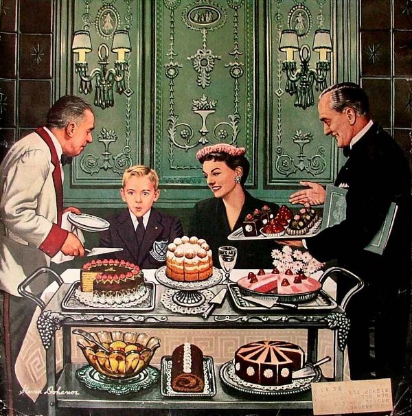
Speed cautions against painting a picture with a hard focus all over. American illustrator Stevan Dohanos above, would be an example of the "Primitive" school, in that he gives equal focus to everything. Speed emphasizes how a unity of focus comes from being more selective. The Venetians began to explore the idea of fusing edges and unity of vision, or tout ensemble vision, one of the French concepts imported by this time into the Royal Academy.


Next week—we'll continue this chapter with the section analyzing Velazquez, starting on page 164.
-----
In its original edition, the book is called "The Science and Practice of Oil Painting." Unfortunately it's not available in a free edition, but there's an inexpensive print edition that Dover publishes under a different title "Oil Painting Techniques and Materials (with a Sargent cover)," and there's also a Kindle edition.
----
GurneyJourney YouTube channel
My Public Facebook page
GurneyJourney on Pinterest
JamesGurney Art on Instagram
@GurneyJourney on Twitter

Thursday, February 18, 2016

While Waiting for Tires

My car is in the shop for new tires. It's too cold to paint outside, so I set up by the coffee machine. The car goes up on the lift. An impact wrench rattles. I've got about an hour.

Van Kleeck's Tire, Gouache, 5 x 8 inches, 1 hour
The view looks back into the office. Beyond the counter there's a desk with a computer. Beyond that, a passageway with a filing cabinet leading farther back into another office. Someone is working on a computer back there. 


This video shows a few stages of the process. (Sweater vest by Jeanette) (Link to the video on YouTube).

I set up a warm foreground and a cool background, going quite dark in the transition between them. The cool note of the computer screen in the near office was an exception to the warm foreground, like a dot on a taijitu.


I invent the color statement to add depth and mood. The actual scene is more evenly lit with uniformly colored fluorescent lights.
----
If you've been thinking of getting into Guerilla Gouache, there's no time like the present. Here's all you need to get started:
Pentalic watercolor sketchbook
Holbein gouache set
Richeson travel brush set
Take me along with you: Gouache in the Wild
And join the GurneyJourney on InstagramPinterest, FacebookTwitter, and YouTube