 This is the third post in a Sunday series about a method called color wheel masking. The first post showed how color masks can help to analyze color schemes, and the second post explored different shapes of masks.
In this post I’ll demonstrate how to actually mix the colors you have chosen for a given painting.
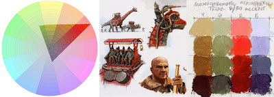
 To start with, here’s the color wheel on the left. To the right above the palette paper are some primary colors of oil paint. You can use as many tube colors as you want at this stage. I just have little demo dabs of Winsor Red, Cadmium Yellow, Titanium White, and Ultramarine Blue.
Let’s say you want a monochromatic atmospheric triad with the dominant (and the most saturated) color in the red-orange range. Using your palette knife, mix a batch of each of the three colors that you see in the corners of the triangular gamut.
I've placed a little white box over those colors in this photo. In this case, it’s a saturated red-orange, a desaturated red-violet, and a desaturated yellow-green.

Now you’ve created the “heads of the families” or subjective primaries. Next, extend those colors into four different values or tones. Try to keep the hue and the saturation constant as you do so.
Look again at the color wheel mask. Halfway along the edge of the triangle are little marks indicating your secondaries. These are your in-between colors, which you may want to mix as well. You may end up mixing and working with anywhere from three to six strings of colors.
Before you start painting, remove from the palette all the tube colors that you squeezed out, except for white. This is important, because these colors are outside your gamut. You don’t want to have access to those anymore during the painting process.

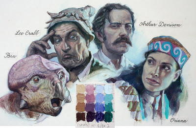
At left is a color wheel with a monochromatic atmospheric triad emphasizing red. This time it’s laid out on Tobey Sanford’s digital color wheel (link to download). On the far right are the color ranges I mixed. In the middle is the resulting painting from Dinotopia: Journey to Chandara.
 This group portrait takes place in Dinotopia’s phosphorescent caverns in the book The World Beneath (1995). I wanted the colors to suggest a cool, magical ambiance. With the colors in this gamut, it’s impossible to mix any intense warms, even if you wanted to. But as your eyes adjust to the color mood, it feels complete. The relative warm colors appear warm enough in the context of the picture.
I have noticed that when I use the color wheel masking system I am more careful to keep the brushes clean and to push against the outside of the range. Harmony and unity are a given, so the effort goes into reaching for accents. It's the opposite of the color-mixing mindset when mixing color from a full palette of tube colors, where I'm always neutralizing mixtures.

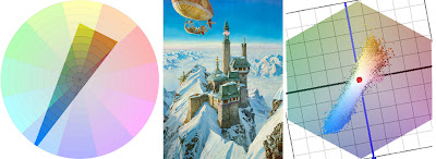
To conclude, here’s a painting from Dinotopia: A Land Apart from Time (1992), about the time when I first developed this method. I have digitally reconstructed the gamut I used for the narrow complementary color scheme.
Blog reader Briggsy provided the diagram on the right. He processed the image through a filter created by P. Colantoni, and available for Windows users at couleur.org. What you’re looking at to the right of the painting above is an objective computer visualization of the actual color scheme.
As you can see, it corresponds pretty closely to the generating mask, proof that the system is giving us exactly the intended color scheme. The blue colors are very intense, almost touching the edge of the wheel. The rest of the colors are in a narrow swath running across the grey center to the weaker complements.
I look forward to hearing how this method works for you, either with traditional or digital techniques.
Tomorrow: Pinkwater Portrayed

I'm slightly color blind.
ReplyDeletePeople often tell me that my greens are way to hard. (saturated)
So, I have difficutlies at identifying and worse - evaluating - colors.
But...I'm not giving up on painting!
Most landscapes I do, that contain lots of green, I cover with a final orange-brown wash (Burnt Umber+ Cad. Yellow).
I work with acrylics, so washes are easy.
It's a cheap trick, but it works rather well I think (hope).
In 'Gurney-language', I think you could say that I reduce the gamut at the end of the painting rather than at the beginning with this wash. It helps to cover-up color anomalies that I simply can't see.
Second trick :
I limit the colors I use to a number of tubes, but even if I don't, I typically decide on 2 dominant ones. Dominant means, that all other colors I use (could be from any tube) are mixed with one of the dominant ones, keeping them 'in check'.
Sounds suspiciously like the colorwheel theory in practice, but without the theory.
I guess lots of artists intuitively do something similar, but just like Ansel Adams did for photography, it takes one artist to put it into a convenient theory.
As with all theories, if it catches on, expect
1. fanatic followers
2. people who use it to their benefit.
3. people who abuse it to their benefit.
4. people who reject it.
Artist being typically in the 3rd category.
Ah, Sunday's with Mr.Gurney....great thought provoking stuff as usual. I think that one of the key points is the idea of mixing your colors and then putting away your other paints ;) It is so tempting to use whatever colors you have on your palette. I understand why you chose the color range in the underground scene but I wonder if you could elaborate on how you choose a color range for a given subject in general.
ReplyDeleteThis is amazing. It's much more clearer now to see how all of this works.
ReplyDeleteThank you.
Another great post. I really enjoy reading your blog posts James.
ReplyDeleteI am wondering if this color theory can apply to watercolors as well?
Not sure if it's possible or not, but I am going to give it a try.
This isn't exactly related to this post, but I thought you all might enjoy this color illusion:
ReplyDeletehttp://www.boingboing.net/2008/02/08/color-tile-optical-i.html
Sorry, the link should actually be
ReplyDeleteboingboing.net/2008/02/08/color-tile-optical-i.html
Very succinct. This is as workable a color system as I have ever seen. I think that in some circles the color wheel has fallen out of favor as a way of organizing color for painting. You've shown that it can be used as the heart of a very practical strategy. Thank you so much for being so generous with your information. Your blog is better than art school!
ReplyDeleteI'm a huge fan.
do the tron goggles give you an advantage to seeing color....haha
ReplyDeleteseriously, this is a really neat idea, and a pretty creative idea for a new approach to color use...
but i'm curious, is the main purpose to create a mood for the viewer, or to keep your paintings organized to the colorwheel?
anyway its pretty awsome and a neat inovative way to approach color, thanks!
Gator:
ReplyDeleteI think one application of this color approach is to set up various color moods for different sequences of a larger work, like a graphic novel, illustrated book, or film. But also it helps to make a single work like a paperback cover stand out from the rest.
Michael:
Choosing a color range is probably the most subjective part of this process. As much I love to rationalize things, I can't really explain why I would choose one scheme over another. It's quite intuitive and perhaps arbitrary, and you just have to play with the masks until you find something that clicks.
Brian:
I'm no expert on watercolors, but I'm guessing that you can mix wells of the subjective primaries and work from those. Or you could create a set of abstract color scheme swatches like Craig did on craigmaher.blogspot.com. Maybe there's a watercolorist reading this who can suggest something.
And thanks, Victor, Erik, Patrick, and Craig for your kind words.
I've been reading this blog for several days now and I think it's one of the best sites for artists on the internet. This color masking technique is really intriguing and I can't wait to give it a try at my studio. You are a very generous artist to set this all out for us.
ReplyDeleteMr. Gurney, I've been your fan since the '80s when I took your Sketching book out for weeks at a time from the library. You're a wonderful writer as well as a very gifted and creative artist. Please lend my vote to the chorus for a new book, please!
"Subjective primaries" is such a great term. For me, this pretty much sums up the entire process of creating a complete gamut using just a part of the larger one. Despite the limitation, nothing is missed.
ReplyDeleteAlso, thanks for the link to Sanford's digital color wheel. I think I'll give this a shot in Photoshop before I move to paint.
wow this is fantastic! a lightbulb in my head was switched on while reading these posts! So much possiblities are working in this way! I love these posts! And i am so inspired about this colorwheel masking.
ReplyDeleteat the moment i am experimenting with the colorwheel.
but i have some questions:
When i look at you color wheel it goes from saturated to desaturated to a neutral grey.
How did you mix this neutral gray? did you use black and white?
and if so, if i look at your post from 'mask to pallete' where you set up your colors i do not see the black to create the neutral grey color. Do you create this black with the colors you set up?
Cheers!
I have a question regarding the color wheel. I'm making my own color wheel, and using the colors i generally use in my palette. For
ReplyDeleteyour highest intensity primary colors, do you use straight tube colors or do you alter them with other colors, just to affect them a certain way? And the greying/neutralizing of the colors boggles me too.
Thank you for your compliments, Linda and Paolo!
ReplyDeleteGoldendhara and Anonymous:
In a nutshell, I do use tube colors for the wheel. Sometimes I have to tint them up, because some colors are really dark and transparent (like pthalo blue or alizarin).
Those transparent colors mix to make a good "black" --for example viridian and alizarin.
If you want to paint your own wheel, I would suggest following Tobey Sanford's color wheel arrangement, which is really more useful than mine. In fact I've got to redo mine.
To grey down the color, you can either mix increasing amounts of the grey paint or mix in the complementary color from across the wheel. I generally use complementary colors to neutralize color, but there are other valid painting systems, including that of Frank Reilly, which use grey.
what is so different between your wheel and Tobey Sanford's color wheel? accept that his is created digital and has more steps from saturated tho desaturated.. Your wheel to me feels more 'usable' then the digitale version...
ReplyDeleteor maybe i am missing something?
thans for answering the question concerning neutral grey.
I am going to create the complement mixing and see how far i come with this.
I assume working in this way, for example desaturate green to neutral gray, i use a bit of red to desature AND some white otherwise i darken it only? So the question is.. do you desaturate with the complement and some white?
maybe i just have to start and see what happends.
They should have teach me this in artschool! i am indeed also one of the swatch painters students at the artschool, although i learned a lot and colorclass was one of my favorite classes. I realize i never learned working with the colorwheel in this way. Looking at which colors should be taken out! Such an insight for me. Silly but true!
Dear Mr Gurney,
ReplyDeleteThis color wheel masking is a great idea. Thank you so much for posting it. I had never heard of it before, now it is all i can think about. I have a feeling it will be having a very big influence on how I think about color. Thank You.
Jacob Collins
Jacob,
ReplyDeleteI'm glad you find the color wheel masking idea helpful. Some of my ideas are developed from the Walter Sargent book "The Enjoyment and Use of Color" 1923,(available from Dover) I saw your work in Juliette A's book and in American Artist. Your work is very inspiring--figure, portrait landscape, still life--you do it all so brilliantly!
Goldendhara,
The spacing of the colors is a little different on Tobey's wheel, and his primaries are the same as the printer's primaries: cyan, magenta, and yellow, which are more scientifically or mathematically correct. But you can set up the colors the way I did on the traditional artist's wheel, too. You'll still get similar results when you use the masking system.
I love the idea of this system. Ive been working with this process and I am confused about one thing. how do I make the dark values? Or do I with this system? It seems like I would need them for a lot of things if want to paint. Sorry if this is a dumb question.
ReplyDeleteSamuraicop, it's not a dumb question at all. You have to mix a full string of values for each of the basic colors, all the way from light to dark. The trick is to mix different values, but to keep the hue and chroma the same.
ReplyDeleteCheck out this YouTube video, which shows how it works: http://www.youtube.com/watch?v=qfE4E5goEIc
Hi James,
ReplyDeleteThanks for the awesome info on this blog and in your book.
I understand you don't use the gamut masking technique when doing plein-air studies, what technique would you recommend for achieving harmony when painting from observation?
If I understood correctly, one of the benefits of using the gamut masking technique is the harmonious effect produced (since the tube colors or high chroma colors are not accidentally mixed in to the color scheme, creating a range that is too broad, or not harmonious)
I noticed that you had a "from life painting" in the gamut masking technique video on youtube (at minute 1:20) I was wondering what technique was used to paint that from life?
I'm a beginner, and when I paint outdoors I squeeze a sample of every color I have onto the palette, I'm wondering how I can look at a scene and decide which tubes i'll need for that particular scene, or if there is a way to create a gamut mask based on observation.
Also, are gamut masking and limited pallet essentially the same thing?
Thank you.