
I painted the wheel at left, below. As you recall, it has the full-intensity hues arranged around the outside edge, gradating to neutral gray in the center. It uses the traditional subtractive red-yellow-blue pigment primaries.
This painter's color wheel goes back for centuries, and was influenced by the theories of Goethe and Newton. Two of the astute commentators on this blog, ZD and Painterdog, correctly pointed out that the traditional painter's color wheel is technically obsolete and even somewhat arbitrary and dogmatic, but I still have a fondness for it.
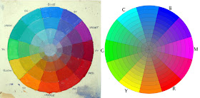
On the right is a mathematically correct digital color wheel based on the red-green-blue “additive” primaries of light. Spaced halfway between RG and B are cyan, magenta, and yellow, the subtractive colors used in printing inks.
My photographer friend Tobey Sanford created this wheel (downloadable here). It may be less familiar to traditional painters. It places the component colors differently around the wheel, but for the purpose of exploring the world of color, especially on our computer screens, it will serve us better in some respects, and we’ll see it again from time to time on future Color Sundays.
Regardless of which wheel we use, most color schemes are built from three component colors or primaries arranged in a triangle called a triad. The area inside the triangle is called the “gamut.” It includes all the possible mixtures from those three primaries, whatever they are.
 The primaries don’t have to be red, yellow, and blue. You can use any three colors as primaries, even orange-green-purple—which in fact is what early color photographs called “autochromes” used.
In the case of the limited palettes we looked at a couple weeks ago, for example, we talked about using a less saturated pigment like yellow ochre instead of cadmium yellow. This reduced or muted yellow corresponds with a point well inside the margin of the wheel.
By using a paper mask and rotating it around the wheel, we automatically get interesting reduced gamuts, each with a dominant full-intensity hue and two subordinate, weaker “primaries”.

The mask sets us free to choose exactly the color schemes we want. We’re not limited to the haphazard choices of existing tube colors in limited palettes; instead we can use the mask to analyze or invent any gamut.
The equilateral triangle that I call the “atmospheric triad” is only one kind of color wheel mask. There are other shapes, and each of these basic shapes carries its own personality, regardless of the component colors. Atmospheric triads are moody and subjective, great for “color scripting” a graphic novel or a film.
When you rotate the triangular window around the color wheel, you can see the color groupings change, yet each one seems complete to itself. It suggests the feeling of walking from a room lit by incandescent light into another room lit by fluorescent light, and then stepping outside into the blue twilight. Your brain shifts from one color environment to another. I’ll talk more about the brain physiology behind color adaptation in a future Color Sunday.
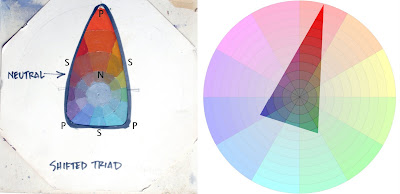
Here’s a color mask that crosses over the center a bit more, which I call the “shifted triad.” It’s shifted toward red, which means the subjective gray or neutral (N) in the composition is also shifted toward red. The secondaries (S) are what you get when you mix the dominant full-intensity red with the weaker blue-violet and blue-green primaries (P).
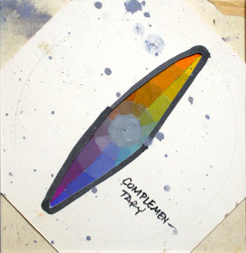
Here’s a complementary scheme, similar to what we’ve seen before. The complementary gamut, regardless of its component colors, suggests an opposition of elemental principles, like fire and ice. At the same time, it’s fairly stable, because its neutral coincides with the center of the wheel.
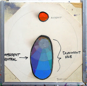
This one is called “mood and accent.” Most of the picture is in one color mood, with just one accent area from across the wheel and no intermediate mixtures. By the way, note that the octagonal color wheel mask and the color wheel slide into the top of the aluminum U-molding.
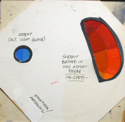
You could also pick an accent color that’s offset from the complement. It looks less natural, and therefore perhaps more attention-getting.
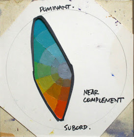
What happens when you create a mask that shifts the color balance off the axis? To me it feels like one of those diminished seventh guitar chords, or a dollop of sour cream dropped into sweet squash soup.
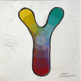
What effect do you feel with a split complementary arrangement, avoiding secondaries? To me it seems vibrant and attractive, but also a little unsettled and jarring.
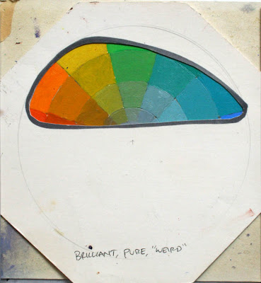
What if the mask selects colors all to one side of the wheel? To me it gives a sense of brilliancy, purity, or weirdness, not something you’d find in nature, but great for otherworldly science fiction.
There’s no limit to the kinds of masks you can cut, and then the infinite combinations you can generate when you start rotating a mask above your own wheel.
Next week, I’ll show you how to take a gamut you’ve selected, and prepare the paints on your palette so that you can use those exact colors in your own painting. The beauty of this method is that it jolts you out of any color mixing habits, and at the same time it forces you to stay within the limits you’ve chosen.
Tomorrow: Mountains Underfoot

I think most of you know the photographer Ansel Adams.
ReplyDeleteHe wrote 3 technical books.
The Negative.
The Camera.
The Print.
The most important one undoubtably The Negative because it contains the famous "Zone System".
I'm not going to explain it here (google on it), but it boils down to a system of dividing all grays between pure black and pure white in 10 'zones'.
Ansel Adams showed that these zones help a photographer in determining the 'values' of a scene to photograph, calculating how the values would be recorded on the negative, and eventually on the print.
The whole idea was to get the best idea possible in advance of the final photograph, a process which he called 'previsualization'.
I see something similar happening with this James Gurney's color wheel.
Hey, I'm not suggesting 3 books, but...one would be nice...
I'm not expecting a confirmation here 'from the author', but I'm sure may blog readers would agree with me. There just way too much valuable info for artist passing by this blog. I'd love to have all of this on my bookshelf.
agreed!
ReplyDeleteSign me up for one those...^^
A lot of stuff to process her, but it is fascinating. I'll be interested to see if your color ideas solidify better for me once I give the masking system a try.
ReplyDeleteI think I might be doing this while I paint, just more by intuition than anything else. I like doing my color studies in Photoshop because I can isolate and adjust color attributes very easily. But I'm anxious to see the next installment— to see how you actually put these color schemes into practice.
ReplyDeleteThanks again for sharing this with us! Your insights are incredibly helpful for everyone, and your willingness to share it is just as amazing. Thanks!
ReplyDeleteHello!
ReplyDeleteI just thought I'd mention something regarding you that I found funny yesterday. I tried to find your books at my local library, but they weren't in the general computer, and even the librarian had great difficulty in finally figuring out that this branch didn't have any of your particular books. She called our library "Gurney challenged." :-)
Isn't this just plain tragic?
Spencer
Dr. Paleo: Tragic indeed!
ReplyDeleteI hereby challenge your library to not be Gurney challenged.
hi James
ReplyDeleteyour blog is an amazing resource for artists !!!
I am subscribing :)
have added you to new listings today :)
Thanks a lot for sharing this invaluable info. I was surprised to see the color wheel masks, I just photographed all of my old masks and posted them on my blog ...
ReplyDeletehttp://craigmaher.blogspot.com/
Your post gives me great ideas to improve my hand made color wheels and masks, thanks again.
Thank you, Kim--I'm excited to be listed on LakeTrees.
ReplyDeleteErik: I love Ansel Adams' work and will look up his books. I saw him working in Yosemite when I was 10 and was smitten. About the idea of a how-to book, many of you have given me great hope along these lines, and I'd like to respond with a post on Tuesday to consider the prospect, so stay tuned!
I swear on my life, if you wrote a book on painting, color and picture making it would be the biggest thing since the Loomis books (and possibly Harry Potter).
ReplyDeleteSign me up for 5 copies!
Wow! Thanks, Victor. Loomis is my how-to hero. Impossible act to follow, even 60 years later.
ReplyDeleteCraig Maher: Hey--great minds think alike! Everyone should check out his blog (craigmaher.blogspot), where he shows his experiments with color masking from years ago, along with paint swatch tests to serve as a launching board for picturemaking.
Lol, I'll be ordering some from other branches to satisfy myself. :-D
ReplyDeleteWow! i haven't had color explained in such a logical way before.
ReplyDeleteTime to go experiment.
Also, i agree with some of the other comments, you should really write some sort of Loomis-esque instructional/theory books, sign me up for 5 copies also!
OH MY GOD!!
ReplyDeleteUr Blog is incredible!! I love it and i love u even i dont know u!! Thanks so much for sharing!!
Ur color theory is so cool!! I tried to teach myself but it's so hard! It's so good i found ur blog!! Im now looking forward to every sunday to praise color lord James Gurney!!
Thanks so much! And if u make a book! I buy three of them =)!!!!
Thanks so much!!
James when you have time, check out this digital interactive color wheel here:
ReplyDeletehttp://kuler.adobe.com/
It's pretty cool because it limits the palette, has a variety of theoretical presets, and alows you to do custom colors. Kind of a fun way to play with colors on computer(if you are tied to one of those!)- anyways, thanks for the post
Wonderful blog! James, you mentioned in the comments for the last installment that you would be interested in a programme that could plot colour histograms. Colorspace (Windows/Linux only) by Philippe Colantoni can produce a 3-D histogram of the colours from any image file in a wide choice of colour spaces. I've found YCbCr to be the most intuitive option as a hue-value-chroma space; if you view YCbCr from above you see the colours in a regular hexagon that is close enough to the familar colour wheel. I've taken the liberty of making some screenshots of the histograms for a couple of your own works to give you the idea:
ReplyDeletehttp://djcbriggs.googlepages.com/palace.jpg
http://djcbriggs.googlepages.com/windmill.jpg
You can download it from the author's website, where it is "made freely available to promote knowledge of color".
http://couleur.org/
Very chuffed that you liked my site by the way, and thank you Adam for giving it a plug!
David Briggs
Do ever have those moments when after studying an idea someone explains it in such a way that your brain goes "click" and there's a little gasp and you think "of course, now I understand"? Thank you for the color explanation, you have made my day.
ReplyDeleteMichelle, be sure to stay tuned to this coming Sunday, where it will all come together!
ReplyDeleteJames, thank you so much for your inspirational blog. I work digitally, and you inspired me to create a Photoshop file with a colour wheel and a vector mask which can be manipulated to try different colour schemes.
ReplyDeleteIf anyone's interested this Colour Planner file can be found at my website:
http://www.jasonjuta.com/blog.shtml.
I hope someone finds it useful. Please note my site contains some stuff which isn't suitable for everyone, so take care.
Jason Juta
Thanks Jason, but you'll want to know that clicking on the link on your site downloads Jason's Tools instead (cutting and pasting the link works though).
ReplyDeleteThanks Briggsy, the link is fixed!
ReplyDeleteNothing but inspirational good sir. Thank you very much. :]
ReplyDeleteWell I have translated in italian this article like the first. I think that I will translate the other article from this serie too
ReplyDeletehttp://www.praticalarte.com/2011/09/18/maschere-per-la-scelta-di-combinazioni-di-colore-secondo-james-gourney/
Thank you for the Italian translation, Grafite.
ReplyDeleteDon't know if you'll be checking the comments section after all this while, but I'm continuing the extremely exciting exploration (Triple X!) into gamut mapping and found this on-line tutorial for taking a photograph and mapping its gamut in Photoshop: http://www.zoepiel.com/tutorials/gamut/ Very helpful, especially since I'm using photographs taken of the landscape around my house at different times of the day to serve as reference for the color-scripting of my in-progress book. Now I can turn those photographs into gamut maps, which I can use to paint the pictures. Woo hoo!
ReplyDeleteJust want to say hi, and who else is still reading in 2020? ^^
ReplyDelete@Janet Oliver: Thank you. The link is helpful.
At Celeb Thanks for this amazing content.
ReplyDelete