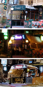
The top photo shows a pub in Malta as it appears in daylight. The middle photo was taken at night, with the neon, fluorescent, and incandescent lights all interacting. Each has a distinctive color corona around it, and each influences the area nearby. Note the mixing of light on the awning at right.

The bottom image is a 5x7 inch watercolor painted at night from observation from across the street. Even though the neon was intensely chromatic and very high in value, I knew I would have to bleach it, flare it, and use the color corona to get across the brightness. I couldn’t go any brighter than the white of the paper.
The brightness and color of a practical light is more evident from its effect than from the appearance of the light source itself.
To do a plein-air nightscape, I had to have just the right illumination on my work, and fortunately, the park bench where I was sitting had some spilled light from a hotel behind me so I could more or less see what colors I was using.

Brilliant!!
ReplyDeleteVery nice WC study, James. (No surprise there!)
ReplyDeleteCan you explain what you mean when you say you "bleached" the light? Does that involve anything in addition to leaving the white of the paper for the lightest lights? (I assume it also means "optical" bleaching - i.e. the contrast of the paper-white with surrounding colors.)
Tom
ReplyDeleteHopefully James might see your post and be able to specify what he meant, but I believe you assume right. To create the maximum feel of the brightness, James left the actual neon lights white, and had to rely on creating coronas of color around them to convey to the viewer what color the neon was.
I haven't done much watercolor work in the past, so I am really just beginning to understand the need to work around the brightest/white areas in order to let the paper come through (with acrylic I just add white to an area if I want it later:)
It's great how you get the same "makes you squint" effect as your color corona demo in "Color and Light".
ReplyDeleteTom, William got it exactly right. I didn't use any bleach or anything, just left the paper white and used the color corona around it to suggest both the brightness and the color of the neon.
ReplyDeleteI also knew I couldn't get the detail of the neon sign or even read the lettering on it, but rather had to "blow out" the neon to a bigger shape. Here's where my observation was influenced by what I knew photography would do.
By the way, I do read every comment, even though sometimes I don't always jump in.
I humbly apologize, I didn't stop to think about the way I worded that.
ReplyDeleteWilliam, it's OK! I feel bad for not being able to contribute to some of the incredible discussions or answer some of the questions people ask. That's why it's great when other folks jump in to answer questions or offer support, often better than I could do. But it's true, one of the most fun parts of my day is reading what y'all have to say.
ReplyDelete