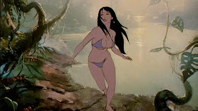
The animators didn’t exactly trace the photos. They found all sorts of ways to enhance and exaggerate the action, and there were a lot of giant lizards and pterosaurs that had to be completely hand drawn.

This rotoscoping process was kind of an ancestral analog version of the digital motion capture methods used nowadays on Avatar and the new Planet of the Apes. Director Ralph Bakshi had developed his rotoscope technique on American Pop, the film he produced and directed before Fire and Ice.
Bakshi oversaw all the staging and blocking of the scenes and worked closely with the actors on the set. Bakshi was fun to be around, always razzing us, drawing cartoons, and talking art. The building didn’t have a proper intercom system, so he’d yell into the ventilation system: “COFFEE!”
I was near a vent, so I yelled back, "NO COFFEE." He responded, "GET TO WORK, SLAVES!"
Ralph invited me to the set during one of the days of shooting and I did some sketches of cast and crew, but I can’t seem to locate that sketchbook.
The backgrounds were planned by layout artist John Sparey and drawn out in pencil by background layout Tim Callahan (who appears at 4:37). Though most of my time was taken up with painting the backgrounds, I sometimes contributed design work. We were all stumped by what the throne of Nekron, the ice king, should look like.

I went home and sculpted a wax maquette inspired by the Laocoön. Nekron seemed like sort of a tortured fellow, so an image of a gargoyle wrestling with a giant snake seemed to fit him. After using the maquette for reference I put it in the back of my car and forgot about it. On a hot day and it half-melted into a pathetic lump.
Tomorrow I’ll wrap.
Other posts in this series:
Part 1: Fire and Ice -- Rekindled
Part 2: Fire and Ice -- Frank Frazetta
Part 3: Fire and Ice -- Tom Kinkade
Part 4: Fire and Ice -- Ralph Bakshi
Part 5: Living Inside Paintings
Wikipedia on Rotoscoping
Wikipedia on Ralph Bakshi
Wikipedia on the original Fire and Ice.

awesome! i love Ralph Bakshi's stuff, as i mentioned. i definitely saw Wizards at a too early age, but it blew my mind none the less. i spent years tracking down a quality VHS of it as it never got made into a DVD, at least not that i know of yet. i saw Fire and Ice much later, but it also thrilled me and i'm very interested to see what Robert Rodriguez does with it.
ReplyDelete*cough cough* you labeled this as part 5....where's 4? ;p
-Phil
Concept Art for the new film:
ReplyDeletehttp://collider.com/fire-and-ice-concept-art/106119/
-Phil
Thanks, Phil. I fixed it to say Part 4. Final part is tomorrow. I think there should be a DVD version for sale, linked at he end of the last post. It's a 2 disk limited edition with the behind-the-scenes feature.
ReplyDeleteI also look forward to seeing what Robert R. does with it. In a way, digitally enhanced live action is a perfect new life for the property. Justin Sweet's art really nailed the look. Wizards also blew my mind at an early age.
I'm curious; did the main actors came close to looking like their animated counterparts or was that all the animators doing?
ReplyDeleteArmand, Larn did to an extent, but all of them were redesigned, especially the "subhumans." In the embedded video you can see some quick cuts of the live action plates.
ReplyDeleteBefore 'American Pop', Bakshi used rotoscoping (although crudely) in the battle scenes in 'Wizards', and of course his version of 'Lord of the Rings' was almost entirely rotoscoped.
ReplyDeleteI love seeing this video and the craft that went into the film. Thanks for posting.
ReplyDeleteThe cel painting makes me tired.
Rotoscoping is among other things, a tonal choice. It yields exciting movement and a certain reality to the physics. But it also creates a strange ethereal quality (related to the uncanny valley, methinks) because the rotoscope image is built from the outside in tracing the silhouette and making ever changing design/drawing decisions based on the live action photostat. You get a very active and frenetic line that races around the figure.
You can achieve more solid structure if use the live action as reference, and first make a structure pass, drawing thru, working out simple anatomy and perspective (The same way you'd use a mirror drawing as an intermediate step to a finished illo). Then once you understand the action you go back thru and animate the character from the inside out with an understanding of what's going on structurally. It becomes less frenetic but more solid.
The TRAP of rotoscoping for me is weird drawing choices that are not questioned because the live action was approved and the photostats printed and registered. Example at 6:18 the hero falls to the ground and we see a long prolonged shot of his backside that has no dramatic impact (or at least not the intended one). Its action over image -- an artist creating the image from scratch would make very different choices.
holly shit. I'm trying to make something like that. It's a lot of work.
ReplyDeleteI'm also working on a Bakshi-esque fantasy animation using rotoscoping - Fire & Ice is certainly the primary influence. If anyone wants to help out or follow the project, we're on Facebook. The rotoscoping part is still early - maybe 35 seconds done? - but there's a 6 minute Flash-style animation 'prequel' with a roto teaser after the credits. I should have a bunch of finished rotoscoped stuff up by the end of the weekend. Here's the page:
ReplyDeletehttp://www.facebook.com/pages/Gorgonaut/158228117573645