Monday, October 31, 2011

Marooned House

The old house in Columbus, Ohio was once part of a neighborhood. But the other houses are all gone.


Now it stands alone. It looks out over parking lots and empty warehouses. Where once stood trees, now stand utility poles, street lights, cell towers and billboards.

Maybe it’s haunted. Who knows, but anyway, Happy Halloween!


Today, Monday, October 31, from 11-12:30, I'll be lecturing on color, light, and composition at the Canzani Center Auditorium at the Columbus College of Art and Design (CCAD) in Ohio. It's free and open to the public.

Sunday, October 30, 2011

Coffee with C. F. Payne

In Cincinnati, Ohio yesterday, Jeanette and I had a cup of coffee with artist - illustrator C.F. (Chris) Payne. 


He has done hundreds of magazine covers and children’s books. He also designed this "Singing Mural" for a building in Cincinnati.


Most of the mural was actually painted by a team of local young people, but Chris had to help with parts of it. “I climbed the scaffold to work on Mr. Rogers’ daggone teeth,” he said.


As we talked shop, we couldn’t resist sketching each other.

He told us his definition of illustration. “Illustration is Art done under the circumstances,” he said.
------
More on C.F. Payne
On Halloween, Monday, October 31, from 11-12:30, I'll be lecturing on color and light at the Canzani Center Auditorium at the Columbus College of Art and Design (CCAD) in Ohio. It's free and open to the public.

Saturday, October 29, 2011

Blum’s Mendelssohn Music Hall Murals

Cincinnati-born Robert Frederick Blum (1857-1903) is perhaps best known for his paintings of Venice and Japan, but in his day he was also renowned as a muralist.


His most ambitious mural undertaking was the decoration of the Mendelssohn Music Hall, home of the Mendelssohn Glee Club, which was once located at 113-119 West 40th Street in New York.


The first was called “Moods of Music,” started in 1893, and followed soon after by “Feast of Bacchus,” from 1895. The Bacchus subject is shown in two repros above: Note Blum in the top black and white image, photographed working on the mural at center.

Each frieze was 50 feet long and 12 feet high. The twin panels flanked the proscenium arch of the concert hall.

Blum executed the murals on canvas in a studio that was too small to unroll the composition to its full extent. He opened it one third at a time, but wasn’t able to see it all together until it was installed.

He developed the composition for “Feast of Bacchus” over a period of three months by sculpting groups of small figures in clay and setting them on a ledge, rearranging them as a tableau until he was satisfied with the relationships of the figures. According to an observer at the time, by using this method, “he could study each figure in the round instead of in the flat, could block out the perspective, could tell which knot of figures to make prominent and which subordinate, and, in brief, handle a plastic theme in a plastic manner.”


After sculpting the maquettes, he sketched the design in color, posed models for each of the figures, and made individual studies of the costumes and decorative details.

Within four years of its completion, the Mendelssohn Glee Club fell into financial difficulty. The founders lost control and the building was sold in 1911. The new owners hoped to convert it to a movie theater, but the enterprise failed and it was torn down in 1912 to make room for a modern building.

Since the murals were painted on canvas and attached with paste, it was possible to successfully remove them before the building was torn down. The canvases went to the Brooklyn Museum, which displayed them in 1965. They’re preserved in the BMA collection, but not currently on view.

Blum also painted murals for the New Amsterdam Theater, which were later destroyed.
Sources: “The Making of a Mural Decoration: Mr. Robert Blum’s Paintings for the Mendelssohn Glee Club,” by Royal Cortissoz, The Century Magazine, November 1899, Pages 58-63

Wikipedia on Blum
History of the Hall
History of the Glee Club
Brooklyn Museum Website: “Feast of Bacchus” (mistitled “Vintage Festival” in the BMA collection)
Robert Blum by Martin Birnbaum (Free Google book)

Friday, October 28, 2011

Mountain Shadows

No, it's not Sauron reaching across from Mount Doom. It's just the shadow of Mount Rainier in the northwestern U.S., cast across the underside of the clouds at sunrise.

At the brief moment of sunrise and sunset, the rays of sun, peeking past the edge of the curving earth, can shine upward toward a horizontal deck of stratus or altostratus clouds, lighting them from below. If a mountain nearly bumps its head on that deck of clouds, it can cast a shadow across it. As with sunbeams and shadowbeams, the lines of the shadow converge back to the sun's position.


Seen from the top of Mount Rainier, facing away from the sun at sunset, the cast shadow looks triangular. That triangular shape is not the mountain profile you're seeing, but, again, it's the lines of perspective of the edges of the broad mass of shadowed air running back to infinity through lighter illuminated vapor.
-----
On Halloween, Monday, October 31, from 11-12:30, I'll be lecturing on color and light at the Canzani Center Auditorium at the Columbus College of Art and Design in Ohio. It's free and open to the public.

Links and Credits
More photos of Rainier casting shadows at Geekologie
The second photo of the mountain shadow is by Dale Ireland from Atmospheric Optics
Thanks, Chris Vosters

Previously on GurneyJourney:
Reflected Sunbeams
Shadowbeams
Sunbeams

Thursday, October 27, 2011

Inserting elements into a photograph

Here are four photos of a real scene. In three of the images, the objects on the table are rendered by various 3D digital imaging methods.


The objects are real in only one of them. Can you tell which one?


Rendering Synthetic Objects into Legacy Photographs from Kevin Karsch on Vimeo.

(Video Link) The following video demonstrates a method called LuxRender, introduced at the 2011 SIGGRAPH convention by a team from the University of Illinois. It allows users to insert virtual elements into a pre-existing photograph.

A few easy controls allow you to input the parameters of the room and its light sources. Then the software generates all the diffuse and specular surface effects, glowing light interactions, cast shadows, and occlusion shadows.

As a traditional painter who only watches the technology from the sidelines, I find all this stuff very impressive, inspiring, and a little scary. When I’m doing a realistic painting of an imaginary scene, I know how hard it taxes my brain to figure out these complex lighting interactions. The same is true today, I suppose, for 2D digital painters.

Now our machine brothers can do the thinking for us. It’s amazing to see how the computer can make these subtle 3D judgments so effortlessly, especially given that it is inferring the light sources from an existing 2D photo image.

What are the artistic implications of this technology? Once this sort of software finds its way into the hands of everyday users and magazine editors, our visual environment will be flooded with ever more fishy photos. I can put your car in my driveway or my flying saucer on the roof of your house. And I suppose these tools will save a lot of tedious labor in the live action visual effects field.

Links
Video of LuxRender on Vimeo (with abstract)
Color and Light: A Guide for the Realist Painter
thanks,  Steve Merryman 

Wednesday, October 26, 2011

Gurney's Daguerrean Saloon

One of my distant ancestors, Jeremiah Gurney (1812 – 1895), opened the first American photo gallery in New York in 1840.


But in those days Jeremiah didn't call them photographs. He called them "Daguerrean Sketches."


Jeremiah's studio was at 189 ("100 AND 89") Broadway in New York from 1843 to 1853.

Thanks, Katherine Tyrrell!
Images from Grand Monde
Previously: Goldsworthy Gurney's Steam Carriages

Tuesday, October 25, 2011

Color and Light Article

The brand new issue of American Artist's "Plein Air Painting" magazine has a 10 page feature that I wrote for them called "Color and Light in the Landscape."


It opens with this thought: "When you paint outdoors, the color you mix on your palette is almost never the same as the local color -- the actual surface coloration of a given object. The color must be adjusted -- but how and why?"

The article covers atmospheric perspective, the Yurmby wheel, warm and cool colors, limited palettes, and premixing. It reproduces several images for the first time, including a demo of the gamut masking method that I painted especially for the article.

This is the article you want to stick in your suitcase when you head off on a plein air painting junket.
----------
Previously: Gamut Masking Method
Also, look for my "Portable Portraits" article is also in American Artist's Watercolor Painting special issue
We've got copies in stock of Color and Light (Most retailers are sold out again).
-----
Finally: Odd Nerdrum beat out T. Hee in the Unusual Artist Name contest, 76 votes to 74.

Murakami on Fiction, Truth, and Lies

"Fiction," he told his audience in Israel in 2009 when he was awarded the Jerusalem Prize, the nation’s highest literary award, garners its power “by telling skillful lies–––which is to say, by making up fiction [Art] that appear to be true.

"The novelist can bring a truth out to a new location and shine a new light on it.  In most cases, it is virtually impossible to grasp a truth in its original form and depict it accurately.  This is why we try to grab its tail by luring the truth from its hiding place, transferring it to a fictional location, and replacing it with a fictional form.

"In order to accomplish this, however, we first have to clarify where the truth lies within us.  This is  an important qualification for making up good lies.”    
                   
---Japanese author Haruki Murakami
Full text of acceptance speech at Douban.com
Thanks, Dave and Randy

Monday, October 24, 2011

Monet Journey

A new innovative website features the work of Claude Monet by letting you interact with his paintings.
 
It begins by letting you topple over an inkwell. The splash turns into a series of encounters with his paintings. Discreet prompts invite you to use the mouse (or if you wish your webcam and microphone) to turn winter into spring, send a crow flying, and ripple the water.
It might take a while to load unless you have a fast connection.
Monet Journey

Thanks, Carol!

Sunday, October 23, 2011

Unusual Artist Name Poll (at left)

It wasn't easy, but I narrowed the list of interesting and unusual artist's names down to ten finalists. Thanks for all your great suggestions.

Here they are with links to their Wikipedia page. Please vote for your favorite name (never mind their art) in the poll at left.

Augustus Egg
Cy Twombly
Fra Filippo Lippi
Hercules Brabazon Brabazon
Tibor Gergely
Man Ray
Rupert Bunny
T. Hee
Ub Iwerks
Odd Nerdrum

Previously on GJ:
Unusual Artist's Names

Saturday, October 22, 2011

ImagineFX: Breaking In


The new December issue of ImagineFX magazine has a whole theme of Mechanics and Industrial Design --spacecraft, vehicles, and robots.

They've also got a column with tips to help rising stars break into the field of imaginative art. The article has quotes from Jon Schendehette, Boris Vallejo, Julie Bell, Colin Fix and me.

The column only had room for a few soundbites from each person, but here's the rest of my interview with Kerrie Hughes:

You are a prolific blogger - when did you start your blog and why? How important do you think it is for artists to sell themselves online?
I started my blog “GurneyJourney” in July of 2007 at my publisher’s suggestion. The idea was to do a photo journal of the book tour for "Dinotopia: Journey to Chandara." It quickly expanded to become a daily summary about whatever I was learning about. I can’t speak for what other artists should do online. I don’t do my blog with the intention of selling or promoting myself. I do it to play with ideas, to think out loud, and to pick up things up from other people who are interested in the same kinds of things. My books “Imaginative Realism” and “Color and Light” grew out of my blogging. I wrote and designed them to put the blog posts in a permanent, organized form.

Do you think that social media is a good way for new artists to raise their profile?
I’m just a blogger. I keep a low profile. I don’t really understand Facebook and have never even been to Twitter. I try to keep my time online down to an hour a day, or it would suck out my brain.

Please could you give three top tips that you think would be beneficial for new artists to know/think about when trying to break into the arts industry.1. If you put together a portfolio, show only your best work——eight pieces at the least and sixteen pieces at the most. Start and finish with your best pieces.

2. Don’t rely solely on electronic media to make contact with people in the business. Try to meet the art buyer. Go to conventions. Take workshops. And don’t overlook mailing traditional paper letters and printed leave-behinds. Since so few people do it these days, you might get your work up on someone’s bulletin board.

3. Always express a can-do attitude. On your first job, do twice as good a job as anyone would expect, and deliver it early. Make every published work your very best, regardless of the deadline or the budget.

What advice would you give to artists who are struggling with or lose motivation with their craft due to lack of work?If you go through dry spells where not much work comes in, don’t worry. That has happened to everyone, and it’s part of being a freelancer. And staffers get laid off from time to time as a matter of course. Every pro has had to reinvent himself or herself in the last decade or so. You must be doggedly persistent and never lose hope. Desire and application are more valuable than talent. Remember to consider the possibility that the reason you’re not getting that ideal job is that your stuff honestly isn’t good enough yet. Too much confidence is more dangerous than too little. If you keep working to make your art better, you will find your place.

All areas of the arts industry are extremely competitive - what advice could you give to new artists to make them stand out?Some parts of the arts industry are more competitive than others. Fewer people think of scientific illustration or toy design, for example, compared to movie concept art. And within the field of concept art, many more people try to break into character design than environment design. I don’t think young artists should worry about standing out or developing a unique style. I think it’s more important to be able to draw nature faithfully and express visual ideas clearly without calling attention to style. Too often art schools push young artists to develop a distinctive style before they’ve even begun to master the basics of perspective, anatomy, color, and light.

Many of your works invoke a feeling of actually being part of that scene. You are a master of the technical in your artworks, colour, composition etc. Having dropped out of art school – how did you learn about all of these aspects and develop them in such a way that makes the viewer feel like this? How important is it to understand these elements of art as well as just being creative? Thanks for those compliments. I’ve always been interested in making realistic images of scenes that couldn’t be photographed, such as monsters, spacecraft, and dinosaurs. That has led me to pursue plein-air painting and sketching alongside purely imaginative work. They weren’t teaching this information in art school back in my day, though some schools are beginning to now. I got memberships in the zoo and the natural history museum and drew there every chance I could. I combed the library to find books about Golden Age illustrators and academic painters. A century or more ago, “imaginative realism” (that is, painting mythology, history, and Biblical scenes) was considered mainstream art, and art schools were set up to teach it. Digging out this information took a bit of sleuth work and research before the days of the internet. I learned everything I could about the methods of artists such as Lawrence Alma-Tadema, Howard Pyle, Norman Rockwell, and Tom Lovell. Life is better now for hungry students: the information is available online and in books, more schools are teaching it, and magazines like ImagineFX have come along to fill the void and deliver the gold.
-----

Artistic Devices

Here's an observational sketch of an old guy reading with a magnifying glass.
I used a fat black marker and a skinny pen on smooth paper.
 
The idea, of course, was to group all the darks into a single shape and contrast that with the light line work. I did this sketch about 30 years ago when I was just out of art school.

If I were to do the same drawing again today, I'd probably use a water brush and a fountain pen, and I probably wouldn't have made the artistic device so obvious. 

Although it's a fun idea to contrast a big shape with line, the way I feel now is that if any abstract device gets in the way of seeing the character, it weakens the drawing. This is an aesthetic judgment, and we all differ on such things, but my feeling now is that artistic devices should be concealed and should be a conduit to more universal human values.

Friday, October 21, 2011

Illustration Master Class open for registration

Two days ago I received the following letter:
“I am an aspiring fantasy artist, and I'm trying to figure out ways to move forward and get started.  I would love to produce work for book covers.  I am currently in the midst of a great research quest in search of information and ideas on how to get to that point.”

I told her that in my opinion, the best way to move forward as a fantasy artist would be to attend the Illustration Master Class in June in Massachusetts.

For one intense, unforgettable week, a group of about 100 85 students stay in the dorms of Amherst College, a quiet, leafy Ivy League campus. They eat meals together in the dining commons and stay up late looking at art books. 

But mainly they work. Throughout the week, each student goes through all the steps in the process of making a picture, from preliminary sketches to gathering reference to drawing up the subject and painting the finished piece illustrating one of about five assigned topics. The students choose the topic before the class actually begins, and they arrive with initial thumbnail sketches.

There are both digital and traditional students set up in three big workrooms. Many are already at a professional level, but some are just beginning, and the atmosphere is extremely supportive and welcoming.


The group faculty offers one-on-one guidance to the students at each stage of the process. The week is punctuated by lectures, one-on-one critiques, and demos. Above are watercolor sketches I did of Dan Dos Santos and Greg Manchess. The core faculty brings their own portable studios and they each work on their own pictures right next to the students. The teachers are all really approachable people, and any of them will answer any question you throw at them.


The 2012 faculty includes the core faculty of Greg Manchess, Dan Dos Santos, Donato Giancola, Scott Fischer, Boris Vallejo, Julie Bell, Irene Gallo, and organizer Rebecca Guay. This year, Iain McCaig will be there for the week, and Adam Rex, Brom, and I are privileged to participate as visiting lecturers.
 
At about $2,000, the price is a little expensive, but not bad when you consider that it includes room and board, and when you realize how much you can get out of it. If you can afford it, it’s the best week you’ll spend building toward your goal.
They’re offering early bird enrollment until the end of the month, after which the price will go up. Sign ups are already coming in fast, and the spaces will probably fill up by the end of the year.

Illustration Master Class
Examples of student work
Previously:
IMC 2010 Day 1
IMC Day 2 and 3
IMC Demos
IMC 2011

Thursday, October 20, 2011

100,000 year old paint pot

Archaeologists have discovered a 100,000 year old abalone shell in South Africa with an ochre grindstone and a coating of bright red powder that may be the earliest known art studio.

 According to one of the study's authors, Christopher Henshilwood, the paint would have been made from a combination of a reddish iron oxide pigment, quartzite chips, crushed seal bone, charcoal, and a liquid, such as water. The site also contained grindstones, hammerstones, and a fire pit.


"They seemed to know that seal bone is really rich in oil and fat, which is a critical component in making a paint-like substance," Henshilwood said.
"They also knew to add charcoal to the mixture to bind and stabilize it, and a little bit of fluid, which could have been water or seawater or urine."
While relatively few ingredients were used in the ancient paint, each item had to be individually prepared before everything could be combined inside the shells. For example, the ochre pieces had to be crushed and ground into a powder, the bones had to be heated to release their oils and then crushed, and wood had to be burned to create charcoal.
"The mixture was very gently stirred, and you can see the traces of the stirring [done by fingers] on the bottom surface of the abalone shell," Henshilwood said.
It's not clear what the ochre paint was later used for, but Henshilwood said it's easy to imagine early humans using the substance to decorate their bodies or cave walls.


 The article was published in Science magazine. Excerpt from National Geographic News
Photo from Science / AAAS

The Subterranean Chronicles

This month, comic artist, wood engraver, and landscape painter Brad Teare started publishing an online comic called "Subterranean Chronicles."

 
It combines a feeling of the old EC Comics (complete with yellowed paper) with a scratchboard look inspired by great graphic stylists like Lynd Ward.


 The seed for the character came from a bit part in Teare's comic Cypher from the 1990s. New installments of the 128-page comic will appear on Tuesdays and Thursdays.

  Subterranean Chronicles Blog
Teare's Thick Paint Blog

Wednesday, October 19, 2011

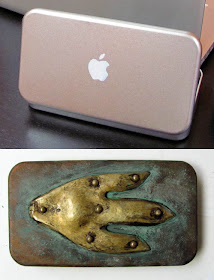
Armoured Pencil Box

You may recall that a year ago I dressed up my Japanese metal pencil box as a Mac iBox. But it started to get cruddy looking. It was time for a facelift.

So I asked my friends Tony Swatton and Jacques Louis David of Sword and Stone Armoury to help out. They make swords, weapons, and armour for movies like Blade, Zorro, and Pirates of the Caribbean.

We decided to give it an ancient Dinotopian vibe. In a makeshift workshop in the catacombs of the Mission Inn in Riverside, California, (above, right) they cut out a dinosaur footprint shape from brass. They hammered it into shape and riveted it to the lid. A little bleach helped oxidize the brass and some sandpaper and patina paint did the rest of the job.

Now I can take my sketch kit into the Rainy Basin and not have to worry about a Carnotaurus biting through it.


Here's a video to show what it's like in Tony's shop.

Sizzle reel for a reality show that Tony proposed a while back, though the show might take another form.
Sword and Stone Armoury website
Previously: The new Mac iBox

Tuesday, October 18, 2011

Mystery of Magenta

Why doesn’t magenta appear in the rainbow or in a spectrum cast by a prism?


(Video Link) This minute-long video explains that magenta (or "pink" as they call it here) is an "extraspectral" color. It's an invented color made to fill the gap between red and blue.

One way to achieve magenta is to overlap the two extreme ends of the spectrum.

 
Magenta is considered a primary color of printing ink, developed in the 1890s. It's the "M" is CMYK. For the purposes of charting the color universe, we regard it as a pure color, but it’s really a composite of red and blue.

Magenta sits directly opposite green on the "Yurmby" color wheel. You can get magenta light by subtracting lime-green light from white light. Magenta is also an afterimage of green. Look at that green dot for 30 seconds and then look at white screen to the right, and you'll see magenta. This is a reminder that color doesn't really have an objective existence apart from our perception of it.

Color theory is full of these niggly exceptions, and that's why it's so challenging to write about. Color theory just doesn't come out neatly like a geometrical theorem.

In the artist's practice, it lives at the intersection of the vagaries of visual perception, the chemistry of pigments, and the physics of optics. I was aware of all this when I wrote Color and Light, but if you include all the qualifications and footnotes, the book would have been 1000 pages instead of 224.  I see the blog as a way to extend the book. And maybe that's something an app edition could do.

Magenta on Wikipedia
Check out the "Rotating Dot Illusion" from Biotele

Spiral drawing of Vermeer’s “Girl with a Pearl Earring”

This ad for Faber Castell’s Pitt brush pen takes advantage of the way the flexible tip can deliver a line of variable thickness.


(Video Link: ) The immense patience and hand control of the artist’s drawing is belied by a rapid and whimsical time-lapse delivery.

Monday, October 17, 2011

Heavy Armor

Researchers at the University of Leeds in the United Kingdom have measured the effort required to walk on a treadmill while wearing a full suit of armor.


A complete outfit of late 15th century armor, with cuisses, greaves, and sabotons, weighs as much as 50 kg or 110 pounds. It was hard to find subjects who knew how to move in armor or were strong enough to carry that weight. But some historical interpreters from the Royal Armories were up to the task.

They found the replica outfit remarkably flexible -- they could even do cartwheels in it. But extended moving around took a toll. By measuring heart rate and respiration, researchers calculated that it took 2.3 times more effort to walk in the suit compared to normal walking, and 1.9 times more effort to run in it.

Credit: Graham Askew/University of Leeds
More at: Science
Web glossary of armor parts

Sunday, October 16, 2011

Randy's Donuts

Here's a watercolor sketch of Randy's Donuts near the airport in Los Angeles (note the jet coming in for a landing).

 
The black car illustrates the general principle: "Upfacing planes are cool and downfacing planes are warm." The curving side of the dark, shiny car alternately picks up the blue of the sky or the relative warm color of the parking lot.

Saturday, October 15, 2011

Cotswold Ram Lamb

 Here's a Cotswold ram lamb named Jasper, sketched today in watercolor at the New York State Sheep and Wool Festival.

The festival continues through tomorrow in Rhinebeck, New York, with shearing and spinning demonstrations, sheepdog trials, livestock auctions, Ravelry meet-ups, and lots and lots of yarn for sale.

Moonshine Book


Moonshine : Artists after dark from alexis wanneroy on Vimeo.
 Artists who work at DreamWorks Animation dream up other great stuff when they're on their own time, all of which is documented in this short video and this book: Moonshine: Artists After Dark."


Via Drawn

Friday, October 14, 2011

Old master drawing exhibit at Vassar College

The Vassar College's Frances Lehman Loeb Art Museum in Poughkeepsie, New York is currently presenting "A Pioneering Collection: Master Drawings from the Crocker Art Museum."

The exhibition shows fifty-seven rarely seen drawings dating from the late 15th through the 19th centuries. Artists include Vittore Carpaccio, Albrecht Dürer, Fra Bartolommeo, Federico Barocci, Peter Paul Rubens, Anthony Van Dyck, François Boucher, Rembrandt van Rijn, Jean-Honoré Fragonard and Jean-Auguste-Dominique Ingres.

The collection comes from the Crocker Art Museum in California. A scholarly catalog illustrates and explains the works.

Vassar College's art museum is in Poughkeepsie, New York. The exhibit will be up through December 11.

Exhibition checklist 

Flipcard Overview


"Flipcard" gives you a visual overview of topics covered in recent GurneyJourney posts. Link to Flipcard
If you have a blog, you can add "view/flipcard" to your blog's URL to get the same archive interface.
Thanks, Dan.

Baby Tattooville on Parade

Last Saturday, the Riverside  Art Museum opened an exhibit called “Baby Tattooville on Parade.”


The show presents a strange, fun sort of art that has variously worn the labels “Pop Surrealism” or “Lowbrow Art.”


Growing out of the underground comics, street art, hot rod culture and pop art in California as early as the 1960s, it spans a wide range of subjects, from sad-eyed Victorian girls to spoofs on 1950s moderne Americana (KRK Ryden, above), to ghoulish visions of zombies.


Many of the artists have cool monikers like “Buff Monster (above),” “Shag,” “KMDZ,” “Bob Dob” and “Lola.” A lot of them have unusual haircuts and tattoo stylings. Hmmm...Don’t know about the tattoos--and my hair options are limited, but maybe there’s still time to switch my name to “Smokescreen,” or “Jim Dim.”


Paleo-artist, book illustrator and movie designer William Stout and I got the same dress memo: skeleton t-shirt and black jacket.


Organizer  Bob Self used my painting “Marketplace of Ideas,” as a symbol of the bizarre bazaar that he has brought together.

The movement is associated with the internet phenomena SketchTheatre, Deviant Art, Juxtapoz magazine, and Molly Crabapple’s Dr. Sketchy events  -- all of whom were represented at the opening.


LINKS
Watch the Baby Tattooville Sketch Jam in time lapse video
Riverside Art Museum: "Baby Tattooville on Parade"
Exhibit continues through November 8 in Riverside, California.
Thanks to curator Kathryn Poindexter and the City of Riverside for your support of the anti-mundane.

Thursday, October 13, 2011

Watching His Own Portrait

Ben Thompson is one of the senior artists at Blizzard Entertainment, the game publisher that created World of Warcraft, Starcraft, and Diablo.


When I visited the company in southern California last week to give my composition lecture, Ben agreed to model for a twenty minute portrait demo.


He has posed several times before as an instructor at Cal State Long Beach, but he said it was the first time he got to watch a portrait of himself as it was being made.


Ben’s face has dynamic planes and a dramatic quality, like a stunt pilot, which makes him fun to draw. I was conscious of keeping the modeling of the values segregated into two groups: very light tones on the illuminated side of the face, and dark, rich tones in the jacket, hair, and background. I downplayed the random cast shadows from the glasses.


Blizzard Entertainment recently announced the new book of Diablo III: Book of Cain

,
The book has newly commissioned artwork by Jean Baptiste Monge, Iain McCaig, Brom, Alan Lee, John Howe, Petar Meseldžija, and me. (Photos courtesy Blizzplanet)


(Video Link) Here's a cinematic trailer for Diablo III. I enjoyed immersing myself into the unique form vocabulary of the Blizzard universe. I did several pencil drawings for the book, though we'll have to wait until the volume is out in November until I can share them.

Previously on GurneyJourney: A Visit to Blizzard Entertainment (2010)
Ten Tips for Drawing Glasses