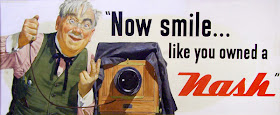
Howard Scott (1902-1983) was the premiere designer of billboard art in mid-twentieth century America. He created campaigns for Esso gasoline, Schlitz beer, Nash automobiles, and Heinz ketchup.
His billboards usually had a clever line with a likable, homespun character against a plain background, not unlike Norman Rockwell's Saturday Evening Post covers, which he admired.
He went to great lengths to find the simplest composition. His gags had to come across at a glance to people driving by at high speed. "Give them a nimble-witted one-act play," he said, "convincingly characterized with complete realism if you want to stop the crowds on Main Street."
He worked in a neat Manhattan studio overlooking Rockefeller Plaza, and was known as a thorough professional. He chose to paint in gouache because it was more direct and it dried faster, an advantage for tight advertising deadlines. In addition to billboards, he also painted posters and magazine covers.
"The camera is out. And for good reasons. The camera reproduces the colors of the subject; the artist intensifies them, makes them more brilliant than they are in nature....Another thing. It's practically impossible to get models to act successfully for the camera....The artist can often be more dramatic by taking liberties with drawing. Figures may be shown in actually impossible positions to put over an idea that would stump the accurate camera. Sometimes anatomical distortions —not obvious to the observer—serve to make the action more legible or to give it greater emphasis."
Books: Forty illustrators and how they work
Illustrator in America, 1860-2000


great quote!
ReplyDelete"The camera is out. And for good reasons. The camera reproduces the colors of the subject; the artist intensifies them, makes them more brilliant than they are in nature....Another thing. It's practically impossible to get models to act successfully for the camera....The artist can often be more dramatic by taking liberties with drawing. Figures may be shown in actually impossible positions to put over an idea that would stump the accurate camera. Sometimes anatomical distortions —not obvious to the observer—serve to make the action more legible or to give it greater emphasis."
to me as an art teacher, this concept is very important. if students understand that they can bring to an image something that the hyperaccurate camera can not, they have much greater respect for an artist's, and their own, place in society.
I love this kind of nostalgic work. I should put the "Stop needless noise" poster up for my kids ;-p
ReplyDeleteTo bad the "Stop Needless Noise" campaign didn't work. What a great artist. I had never heard of him before.
ReplyDeleteI used to work in advertising and most clients (and creative directors) didn't want to use illustrations for ads because it wasn't "real"...which is ridiculous considering the extant to which photos are photoshoped. I think it's precisely because illustrations aren't real that it's easier for viewers to project themselves onto the characters in the ads.
ReplyDeleteThis info you provided in the blog that was really unique I love it!!!
ReplyDeletePrescott Financial