I selected the six winning posters out of hundreds that were submitted. The grand prize winners, it turned out, came from all across the USA.

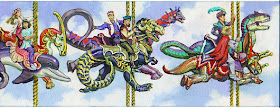
The prize for each of the six winners was not only a signed book, but a chance to pose for a new Dinotopia painting. My original idea was to show the six kids riding around in a dinosaur version of a merry-go-round or carousel, maybe flying through the air with a blue sky background. That's my concept sketch above.
I asked them to find a parent or helper to set them up with a "Dinotopian" costume and to take a few dozen photos, facing to the right, and not looking at the camera. The photos were even better than I expected, and the costumes and expressions were really fun to work from.

It dawned on me, though, that it made more sense to show them on real dinosaurs instead of on a carousel. So I switched the concept when I did the final painting, a large oil panorama.
• Read about the experience of Kathryn Noel of Utah, who appears on the left
• Some of the reference photos, as well as the final painting will be part of the Lyman Allyn Art Museum exhibition "Dinotopia: Art, Science, and Imagination" http://www.lymanallyn.org/exhibitions.htmlopening on September 22.
• More about the exhibition on the blogs Lines and Colors and Underpaintings
• The final painting appears in Dinotopia: Journey to Chandara
• The art also appeared as an accordion-fold greeting card, but I'll show that in a future post.


Fantastic! And so creative. This is something those kids will remember all of their lives!
ReplyDeleteIt's so great to see how you work with (i.e. transform) the reference photos. It took me a litle while to find the African American boy, until I realized you'd put him in a new costume with turban, and changed his head angle somewhat.
ReplyDeleteReally wonderful idea, and of course an excellent execution of it!
ReplyDeleteWhat a ride!
ReplyDeleteSome how I really think the carousel layout appeals to me more because of the dream and fantasy feeling but the other layout has a more natural and casual look. Both are interesting and pleasant to look at.
ReplyDeleteI've always liked the somber expression on the horn player. Now I see that it wasn't really planned.
ReplyDeleteThank you for posting this! I have no pictures of the photo session taken so long ago and seeing this brought back so many memories. I love that you chose to portray me in such a carefree and joyous manner. It dawned on me that that last time I spoke to you was exactly 5 years ago to the day when I found your blog. Don't know if you ever received my email in which I thanked you for my Field of Flowers print. I'm elated and honored that you chose this illustration for Journey to Chandara. I'm curious to see your follow up post on the greeting card as I never got to see it.
ReplyDeleteLaura Blanco Toledo
Hi, Laura,
ReplyDeleteGreat to hear from you. That was a fun project. I'm glad you reminded me to do a post about the greeting card. By the way, if you or someone you know happens to be in Connecticut during this month, the original painting will be on view at the Lyman Allyn through Feb. 2
That's really cool and fun! What a great contest. Is there anywhere we could see the winning posters?
ReplyDelete