Scott Waddell has released a downloadable art instruction video called "The Art of Painting: An In-Depth Look at How an Artist Thinks and Sees." In the hour-long workshop, he develops three paintings: two female head studies from observation, and a multi-figure composition from imagination.
The tutorial takes the viewer through the process of drawing and painting these images in oil from a live model.
Waddell is an instructor at the Grand Central Academy in New York, and has studied in Florence.
In explaining the first drawing steps, he shows how he first observes the shapes in 2D and then reconstructs them with knowledge of 3D structure.
(Video link) Here's a highlight reel. Waddell periodically cuts away from real-time close-ups of the process to explain the thinking behind each painting decision. There are some really helpful animations analyzing light and shade, perspective, anatomy, and color mixing, enhanced by Waddell's carefully scripted voiceover explaining logic behind his decisions.
Waddell's painting methods include a preliminary "poster study" to establishes the tonal shapes in simple, flat terms followed by an "underpainting pass" and "form pass" as he refines the final rendering. The videos are well-shot and rendered in HD WMV format, playable on Mac with a special player software. Audio quality is very good.
The process yields startlingly realistic results without any intervention of photography, but it's not for everybody. If you like intuitive, loose, or improvisatory styles of painting, this won't be your cup of tea, but if you want a clear explanation of how painting is taught in many contemporary academies, Waddell is an excellent teacher.
-----
"The Art of Painting: An In-Depth Look at How an Artist Thinks and Sees" by Scott Waddell. $35.00, 56 minutes.
Previously on GJ: Scott Waddell's Free Webisodes
Monday, December 31, 2012
Sunday, December 30, 2012
Mass in C
Here's a portrait in watercolor drawn entirely during a thrilling performance of Beethoven's Mass in C at Bard College. Jeanette was singing in the alto section.
I used two watercolor pencils (reddish brown and black) and three water brushes
 (clear water, black ink, and blue ink) in a 5x8 inch watercolor notebook. I chose these tools carefully before the concert started. Since there was no intermission, I knew I couldn't fish around in the sketch bag, and I had to hold the unused tools very quietly in my left hand.
Conductor James Bagwell delivered the tempi at a fast clip, so the running length was about 50 minutes.
I used two watercolor pencils
Conductor James Bagwell delivered the tempi at a fast clip, so the running length was about 50 minutes.
IFX Review: Dinotopia: The World Beneath
The January 2013 of ImagineFX magazine has a review of the
★ ★ ★ ★ ★
Jurassic Lark: James Gurney’s palaeontological masterpiece receives a welcome reissue
Just as Steven Spielberg resurrected dinosaurs in Jurassic Park, James Gurney’s classic Dinotopia: The World Beneath has been reanimated by those good folks at Dover Publications. The process didn’t require DNA and dodgy science, though. Instead, the book’s been tarted up and reprinted with a new introduction and afterword.
If you’ve not come across Dinotopia before (which surely makes you a cultural dinosaur), it’s a seminal work, combining Renaissance man Gurney’s abilities as a storyteller and an artist. The World Beneath is, in fact, the 1995 sequel to A Land Apart from Time, which was published three years earlier and received a similarly lush reprint last year. Both concern the titular continent, in which humans and dinosaurs coexist.
In The World Beneath, Gurney tells the story of Professor Denison, A Land Apart from Time’s original protagonist. Denison decides to investigate the mysterious caves beneath Dinotopia, which promises ancient technology and machines. He’s accompanied by his son Will and a fiery human Dinotopian named Oriana Nascava, as well as Bix, a friendly Protoceratops.
What’s so utterly inspiring about Gurney’s books is how detailed and well-researched the world is, and he even goes so far as to include maps and diagrams of places and items. Palaeontologist M.K. Brett-Surman — a consultant to Gurney — contributes a foreword, stating that Dinotopia’s artwork is not “for a ‘kiddie’ book on dinosaurs, but a series of masterworks suitable for any museum!”
ImagineFX hero James, it seems, can turn his hand to just about anything in the world of Dinotopia. His characters are distinctive, and Dinotopia’s cities and environments were rich and steampunky before the term was coined. But the dinosaurs take centre stage, at once proud and primal, and — apparently — anatomically correct.
Gurney’s new afterword is worth the cover price alone, even if you own the original publication, for its insights. As well as sketches and colour scripts, he created maquettes of the dinosaurs, characters, and buildings to deliver the correct proportions and postures.
The World Beneath was followed by three more volumes, all of which deserve a similarly rich edition. It also inspired a well-received TV series and made-for-TV film, but the books are still the best starting place. And while kiddies will enjoy them, they’re stunning and inspiring for any artist.
------
Order Dinotopia: The World Beneath: 20th Anniversary Edition signed by the artist
Saturday, December 29, 2012
Steampunk Miyazaki
That's cool! Animation background painting legend Kazuo Oga and his team painted a model of Goldsworthy Gurney's Royal Patent steam carriage (right, circa 1830) in one of their background shots for Hayao Miyazaki's Secret World of Arrietty (detail, left).
-----
Sir Goldsworthy Gurney
The Secret World of Arrietty on Amazon
Kazuo Oga
-----
Sir Goldsworthy Gurney
The Secret World of Arrietty
Previously on GurneyJourney:
Goldsworthy Gurney's Steam CarriagesKazuo Oga
Image Parsing
Thursday's post about the painting machine called Vangobot brought on a lively discussion about the similarities and differences between human painters and programmed machines.
As many of you observed in the comments, Vangobot executes physical paintings, but the results are only as good as the instructions it receives. As a result, it's easy to dismiss Vangobot as a kind of fancy inkjet printer.
Machines like Vangobot may develop the hand skills to manipulate the brushes and paints, but will they ever have artistic judgment? Is it possible for a computer to be programmed to see and interpret the world in the same way that an experienced painter does?
These are qualities of the "eye" or "mind" or even the "soul" more than the "hand." Blog reader M.P. invoked a quote from nineteenth century drawing instructor James Duffield Harding who characterized the great artist as having an instinct for "selection, arrangement, sentiment, and beauty" rather than just replicating reality.
Let's have a look at a photograph of two people in a parklike setting. How would an experienced painter transform this image?

For a computer to do this, it would have to understand what it was looking at, and have an instinct to do all these subjective interpretations. It would need to be able to handle a lot of brushes in a variety of ways depending on what forms it was painting.
Let's look another example, a photo of a landscape scene composed of sky, trees, water, and rock.


Video showing Photoshops "artistic filters,"
Previously: Vangobot
As many of you observed in the comments, Vangobot executes physical paintings, but the results are only as good as the instructions it receives. As a result, it's easy to dismiss Vangobot as a kind of fancy inkjet printer.
Machines like Vangobot may develop the hand skills to manipulate the brushes and paints, but will they ever have artistic judgment? Is it possible for a computer to be programmed to see and interpret the world in the same way that an experienced painter does?
These are qualities of the "eye" or "mind" or even the "soul" more than the "hand." Blog reader M.P. invoked a quote from nineteenth century drawing instructor James Duffield Harding who characterized the great artist as having an instinct for "selection, arrangement, sentiment, and beauty" rather than just replicating reality.

Note the difference in this master painter's interpretation. The details in the faces are accurately drawn, but rougher brushes are used for the foliage. The drapery is painted efficiently with big slashing strokes. The sky is painted loosely with spots of light. The sidewalk tiles are in perspective, but they're just suggested with thin dashing strokes. The colors are warmed up and intensified.
For a computer to do this, it would have to understand what it was looking at, and have an instinct to do all these subjective interpretations. It would need to be able to handle a lot of brushes in a variety of ways depending on what forms it was painting.
Let's look another example, a photo of a landscape scene composed of sky, trees, water, and rock.


The experienced painter uses a variety of paint handling depending on material. The water uses long horizontal strokes, the rocks are done with flat brushes, and the ducks are painted carefully with small brushes.
Note how different this is than an off-the-shelf "artistic paint daub filter" from Photoshop, which merely translates everything into blobby strokes indiscriminately across the whole image, without regard to the areas that are psychologically important, such as the faces.
Now what if I told you that the "master painter" of all of the examples is a computer?
The creators of the program are Kun Zeng, Mingtian Zhao, Caiming Xiong, Song-Chun Zhu from Lotus Hill Institute and University of California, Los Angeles. The goal for the software was to interpret photographs in painterly terms.
The process begins with "image parsing," where the scene is divided and grouped into various areas of unequal importance and of unequal character, such as foliage, branches, drapery, and faces. Each region of the painting has different meaning to a viewer and therefore requires a different paint handling. This visual meaning is known in the field of artificial intelligence as "image semantics."
The image parsing software works like the facial recognition system in a modern digital camera, but this system does it at a much more sophisticated level, recognizing and classifying various elements in categories such as:
face/skin, hair, cloth, sky/cloud, water surface, spindrift, mountain, road/building
rock, earth, wood/plastic metal, flower/fruit, grass, leaf, trunk/twig, background, and other.
Image parsing is similar to what a human artist does. Painter Armand Cabrera wrote about this recently in his post "Learning to See."
The authors of the computer program assigned the computer to use a hierarchy of as many as 700 different brushes for each of these forms, with various settings for opacity (depending on whether it's painting a cloud or a rock), stroke direction, dryness and wetness, and, of course color.
The strokes are applied differently depending on the forms, and they're overlapped spatially, painting from the background to the foreground so that the objects in front "occlude" or paint across the ones behind.
The colors in the painterly images are shifted according to a statistical observation that the typical hue and chroma distribution of colors in photos (left) differ from those of paintings (right). Paintings have less blue and green, and more yellow and red.
What does this mean for traditional painters? Should we welcome it or be worried? If this software is hooked up to a Vangobot, anyone could buy a really nice wedding portrait painted in oil from a decent wedding photo. A portable Vangobot with this software could start winning plein air competitions, just as computers have won chess matches.
Is there some skill set that is out of reach of programmed machines? As Anonymous mused in the comments of the last post, "maybe it's along the lines of caricature, and the intensification of forms and space and color and emotions and beauty and mystery?" Will computers ever achieve the higher level judgments, what Harding referred to as "selection, arrangement, sentiment, and beauty?"
I would be inclined to say yes, yes, yes, and yes. Computers will learn to caricature and they'll do a good job at it. They will learn to paint science fiction and fantasy, and to do Van Gogh or Picasso transformations. Anything that can be deconstructed can be programmed. The more these computers advance, the better we understand what we do as painters. As blog reader Todd said so well: "Robots will only be able to represent as much of humanity as we understand about ourselves."
Despite it all, I do believe that there is something elusive, some element of real genius in great artists that will always stay beyond the reach of materialistic or deconstructive analysis. The greatness of Mozart and Rembrandt and Shakespeare can never be matched by a computer. And for more earthbound practitioners like me, I can take comfort in the faith that other humans will always enjoy works that are filtered through the human consciousness and the human hand, just as we prize home cooking, hand knitting, wooden boats, and folk music.
I believe we should congratulate Kun Zeng, Mingtian Zhao, Caiming Xiong, and Song-Chun Zhu and applaud their accomplishment. These painting systems are not faceless robots, but the creations of amazingly bright people. The one thing that is certain is that these new systems will put certain kinds of artists out of business, they will redefine what we hand-skilled artists do, and the tools will bring to the table new creative opportunities that we can't even imagine yet.
-------
I encourage you to read the full paper: "Parse to Paint"
Armand Cabrera's post "Learning to See"
Thanks, Jan Pospíšil for linking me to this paper.Video showing Photoshops "artistic filters,"
Previously: Vangobot
Friday, December 28, 2012
To the Salon
Artists in nineteenth century Paris had to find a way to transport their paintings to the Salon exhibition. Some rented handcarts or hired a man to carry the painting on his back. Others carried them aboard the horse-drawn omnibuses.
The paintings were often still wet, which made the passage a bit hazardous both for the paintings and for the other occupants of the 'bus. Portraits sometimes arrived with smudged noses.
According to Edouard Cucuel, "The proletarian vehicles contained art,—art by the ton. The upper decks of the omnibuses were crowded with artists carrying their pictures because they could not afford more than the three-sous fare. And such an assortment of artists! There were some in affluent circumstances, who rolled along voluptuously in cabs on an expenditure of thirty-five francs, holding their precious tableaux and luxuriantly smoking cigarettes."
-----
Bohemian Paris of Today  by Eduoard Cucuel, p. 72
Thursday, December 27, 2012
Vangobot
Vangobot is a robotic painting machine that replicates a photo with real paint.
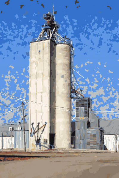
Vangobot can be programmed to simulate various Post-Impressionist and Pop Art styles. The output painting is created on a flatbed apparatus using actual brushes and pigment on canvas.
Nevertheless, according to Wired magazine, whose cover feature explores how robots will replace many skilled jobs, Vangobot has produced some pictures that were sold through the Crate and Barrel stores, "whose customers have no clue that a machine was the creative genius behind what's hanging on their wall."
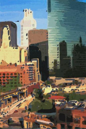
Above painting by Vangobot. Future iterations of such painting machines could enlist more advanced image manipulation such as blending, glazing, computer vision, edge detection, automated painting, and abstraction generators. In theory it could be set to the task of directly interpreting a 3D view alongside human plein air painters.
Computer Vision
Automated Painting
Abstraction generator
Edge detection
Random image generation

Vangobot can be programmed to simulate various Post-Impressionist and Pop Art styles. The output painting is created on a flatbed apparatus using actual brushes and pigment on canvas.
So far the images are limited by the initial photo and the image processing software, which has the look of an off-the-shelf Photoshop filter. In most of the examples that Vangobot has painted so far, there isn't much blending, so the result has a patchy, mechanical look.
Nevertheless, according to Wired magazine, whose cover feature explores how robots will replace many skilled jobs, Vangobot has produced some pictures that were sold through the Crate and Barrel stores, "whose customers have no clue that a machine was the creative genius behind what's hanging on their wall."

Above painting by Vangobot. Future iterations of such painting machines could enlist more advanced image manipulation such as blending, glazing, computer vision, edge detection, automated painting, and abstraction generators. In theory it could be set to the task of directly interpreting a 3D view alongside human plein air painters.
---
Vangobot.com by artists Doug Marx and Luke Kelly
Previously on GJComputer Vision
Automated Painting
Abstraction generator
Edge detection
Random image generation
Wednesday, December 26, 2012
Welcome new blog readers
I have received quite a few messages from people who are new to this blog. If you found your way here because you just received a copy of one of my books as a holiday gift, welcome!
GurneyJourney is a daily blog that covers a variety of art-related topics: color, light, sketching, visual perception, portrait painting—and the making of my fantasy book Dinotopia. There's also a bit of art history, focusing on realists from the 19th century and the golden age of illustration.
The art instruction books grew directly from the blog posts, and from the comments that follow after them. To learn about a specific topic or artist, try the search box in the upper left.
If you have a specific question or something you'd like to add to the discussion, the best place to do that is in a comment string after a related post. I do read comments on older posts, and if I don't get around to answering your question, most likely one of other blog followers will.
Color and Light
Part 1: Wrapping the Spectrum
Part 2: Primaries and Secondaries
Part 3: Complements, Afterimages, and Chroma
Part 4: Problems with the Traditional Wheel
Part 5: The Munsell System
Part 6: Cyan, Magenta, and Yellow
Part 2: College Obsessions
Part 3: Lost Empires
Part 4: Dinosaurs
Part 5: Treetown
Part 6: The Illustrated Book
Part 7: Utopias
Part 8: Building a World
Part 9: Words and Pictures
Part 10: Canyon Worlds
Part 11: Putting it Together
Part 12: Book Launch
Dinotopian Fire Engine
Popular Videos
Parakeet Artist
Gamut Masking
Painting Snyder Swamp
-----
Other ways to access GurneyJourney
You can sign up to receive the blog posts by email, or join my public Facebook page.
To order books
Order signed books from JamesGurney.com
Color and Light: A Guide for the Realist Painter on Amazon

GurneyJourney is a daily blog that covers a variety of art-related topics: color, light, sketching, visual perception, portrait painting—and the making of my fantasy book Dinotopia. There's also a bit of art history, focusing on realists from the 19th century and the golden age of illustration.
The art instruction books grew directly from the blog posts, and from the comments that follow after them. To learn about a specific topic or artist, try the search box in the upper left.
If you have a specific question or something you'd like to add to the discussion, the best place to do that is in a comment string after a related post. I do read comments on older posts, and if I don't get around to answering your question, most likely one of other blog followers will.
As an introduction to the blog, you might be interested in one of the following series:
Color and Light
Part 1: Wrapping the Spectrum
Part 2: Primaries and Secondaries
Part 3: Complements, Afterimages, and Chroma
Part 4: Problems with the Traditional Wheel
Part 5: The Munsell System
Part 6: Cyan, Magenta, and Yellow
Part 7: The "Yurmby Wheel"
Gamut Masking
Gamut Masking, Part 1
Gamut Masking, Part 2
Studio Lighting Series
Studio Lighting, Part 1: Equipment
Studio Lighting, Part 2: Key and Fill
Studio Lighting, Part 3: Edge Lighting
Gamut Masking
Gamut Masking, Part 1
Gamut Masking, Part 2
Studio Lighting, Part 1: Equipment
Studio Lighting, Part 2: Key and Fill
Studio Lighting, Part 3: Edge Lighting
IMAGINATIVE REALISM
Part 1: Childhood DreamsPart 2: College Obsessions
Part 3: Lost Empires
Part 4: Dinosaurs
Part 5: Treetown
Part 6: The Illustrated Book
Part 7: Utopias
Part 8: Building a World
Part 9: Words and Pictures
Part 10: Canyon Worlds
Part 11: Putting it Together
Part 12: Book Launch
Dinotopian Fire Engine
Popular Videos
Parakeet Artist
Gamut Masking
Painting Snyder Swamp
-----
Other ways to access GurneyJourney
You can sign up to receive the blog posts by email, or join my public Facebook page.
To order books
Order signed books from JamesGurney.com
Color and Light: A Guide for the Realist Painter
Tuesday, December 25, 2012
Merry Christmas
Yes, Christmas is here, and I wish all the very best.
This card is charcoal on vellum from 1987--Wow, was that really 25 years ago?
This card is charcoal on vellum from 1987--Wow, was that really 25 years ago?
Monday, December 24, 2012
Titles for Paintings, Part 3
To finish the series on titling paintings, I'd like to offer some practical tips.
1. Title it something. "Untitled" is a title. It's fine if you have one painting called "Untitled," but it's a headache for art historians or grandchildren who have to agree whether to call them Untitled 1, Untitled 2, etc. Above are some of the images that come up when you search for Picasso's untitled paintings.
2. Title everything you do, if for no other reason than so you can find it again on your computer. Come up with a regime for titling minor works, so that, for example, "Dead Neon.PA.jpg" means the plein air sketch of the neon sign, while "Dead Neon.LO.jpg" is the preliminary layout.
3. Write the title on the work. Write it as soon as you know it at the edge of a drawing, on the back of the illustration board, or on the stretcher bar of the painting. Also write the title in a database that you can find easily. That way if it comes up for auction someday, you piece won't be forced to live under a dishwater-dull descriptive title such as "Man Kneeling before Blonde Woman."
4. Let the file name reflect the variants. My system is to use caps for a big file shot by a professional photographer, such as "DESERT_CROSSING.JPG". If it's a large file I shot myself with my good camera, I call it "Desert_Crossing.LG.jpg." If I shot it with my so-so camera, I call it "Desert_Crossing.lg.jpg." If I have vignetted it to white in Photoshop, I call it "Desert_Crossing.LG.WT.jpg," etc.
5. Avoid articles, such as "The" and "An." This is simply because you can find it easier in an alphabetized computer folder. "Ferry Crossing" works just as well as "The Ferry Crossing," and it's filed under "F."
6. Be consistent with names. And here I confess I have failed to follow my own advice and have lived to regret it. I tend to make up new names if I am too lazy to find the painting and see what I called it last time. I have called one painting "Rainbow Bridge" in one exhibit and "Gideon's Bridge" in a book. Unfortunately, both names will follow that image forever.
7. Sometimes you may want multiple names. For example, if I paint a cover for a paperback book and the book title does not suit the painting, I rename the painting. So the cover painting for "Michaelmas" I know as "Hologram." Still, both names will always chase that painting.
8. Make sure you recognize the piece from the title. I try to use a title that is my mental shorthand for the piece, and I try to keep it as short as possible. That's why I don't use poetic titles. I called one painting "Last Gift of the Sun," and I can never remember which of the sunset paintings that was.
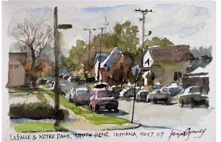
9. If in doubt, just be specific. If it's a plein air study of a street scene, I like to use the street names, such as "LaSalle and Notre Dame." If it's a sketchbook study and there are written notes beneath the image, make those notes into the title. Richard Estes titled his paintings with a random word that appeared inside the image. Plein air painters may want to tie the image to the date or the GPS coordinates.
10. If you run out of ideas, consider letting your friends or your spouse come up with titles. Betsy Wyeth came up with many of Andrew Wyeth's great titles. Blog reader Diana said, "A friend of mine took one look at a new landscape of mine and exclaimed "OMG Alice in Wonderland Goes Farming." I used the title, and it sold within 24 hours of being hung. I will always wonder if the title wasn't hugely responsible for the sale..."
------
Merry Christmas, everybody!
-------
Previously on GJ:
Titles for Paintins, Part 1
Titles for Paintings, Part 2
1. Title it something. "Untitled" is a title. It's fine if you have one painting called "Untitled," but it's a headache for art historians or grandchildren who have to agree whether to call them Untitled 1, Untitled 2, etc. Above are some of the images that come up when you search for Picasso's untitled paintings.
2. Title everything you do, if for no other reason than so you can find it again on your computer. Come up with a regime for titling minor works, so that, for example, "Dead Neon.PA.jpg" means the plein air sketch of the neon sign, while "Dead Neon.LO.jpg" is the preliminary layout.
3. Write the title on the work. Write it as soon as you know it at the edge of a drawing, on the back of the illustration board, or on the stretcher bar of the painting. Also write the title in a database that you can find easily. That way if it comes up for auction someday, you piece won't be forced to live under a dishwater-dull descriptive title such as "Man Kneeling before Blonde Woman."
4. Let the file name reflect the variants. My system is to use caps for a big file shot by a professional photographer, such as "DESERT_CROSSING.JPG". If it's a large file I shot myself with my good camera, I call it "Desert_Crossing.LG.jpg." If I shot it with my so-so camera, I call it "Desert_Crossing.lg.jpg." If I have vignetted it to white in Photoshop, I call it "Desert_Crossing.LG.WT.jpg," etc.
5. Avoid articles, such as "The" and "An." This is simply because you can find it easier in an alphabetized computer folder. "Ferry Crossing" works just as well as "The Ferry Crossing," and it's filed under "F."
7. Sometimes you may want multiple names. For example, if I paint a cover for a paperback book and the book title does not suit the painting, I rename the painting. So the cover painting for "Michaelmas" I know as "Hologram." Still, both names will always chase that painting.
8. Make sure you recognize the piece from the title. I try to use a title that is my mental shorthand for the piece, and I try to keep it as short as possible. That's why I don't use poetic titles. I called one painting "Last Gift of the Sun," and I can never remember which of the sunset paintings that was.

9. If in doubt, just be specific. If it's a plein air study of a street scene, I like to use the street names, such as "LaSalle and Notre Dame." If it's a sketchbook study and there are written notes beneath the image, make those notes into the title. Richard Estes titled his paintings with a random word that appeared inside the image. Plein air painters may want to tie the image to the date or the GPS coordinates.
10. If you run out of ideas, consider letting your friends or your spouse come up with titles. Betsy Wyeth came up with many of Andrew Wyeth's great titles. Blog reader Diana said, "A friend of mine took one look at a new landscape of mine and exclaimed "OMG Alice in Wonderland Goes Farming." I used the title, and it sold within 24 hours of being hung. I will always wonder if the title wasn't hugely responsible for the sale..."
------
Merry Christmas, everybody!
-------
Previously on GJ:
Titles for Paintins, Part 1
Titles for Paintings, Part 2
Sunday, December 23, 2012
Titles of Painting, Part 2
Some paintings have titles that are long and poetic.

Australian Jane Sutherland called this composition: “Numb Fingers Working While the Eye of the Morn is Yet Bedimmed by Tears.”
Her compatriot Arthur Streeton, called this painting “The Purple Noon’s Transparent Might,” a quote from Shelley. He called another painting, "Still glides the stream and shall forever glide," which is from Wordsworth. Streeton often carried volumes of poetry into the field with him for inspiration.
When Turner exhibited this painting in 1840 at the Royal Academy, he called it "Slavers Throwing Overboard the Dead and Dying—Typhoon Coming On." In the Royal Academy catalog, he paired the painting with an extract of a poem that he wrote called “The Fallacies of Hope.”

Sorolla’s painting of an injured fisherman has a socially conscious title: “And They Still Say Fish is Expensive.”
Another of Sorolla’s paintings is titled “Sad Inheritance." The meaning resonates on several levels.

Arnold Böcklin (1827–1901) called his masterpiece "The Isle of the Dead" (German: Die Toteninsel) It took him a while to work out the title—and the image, which went through various versions. Earlier titles include "Tomb Island" (Die Gräberinsel) or “Dream Image.”

The title gives a cue to the observer whether to regard the subject as specific or general. Which title is better for this Serov painting: “Portrait of Vera Mamontova,” or “Girl with Peaches”?
It has gone by both titles.
-----
The full series:
Titles for Paintings, Part 2
Saturday, December 22, 2012
Titles for Paintings, Part 1
American illustrator and teacher Harvey Dunn (1884-1952) said, “Always think of a title for your pictures. It will help you to keep up your interest. Give it a name that will stir you, a title that demands a good picture.”

Instead of calling this one "Man with an Apple in Front of His Face," he called it “Son of Man” (Le fils de l'homme).
This one is called “Prairie Drama.”

René Magritte (1898-1967) preferred puzzling, literary-sounding titles for his paintings.
Magritte usually didn't choose the names himself. He let his Surrealist friends come up with them. He explained, “The titles are chosen in such a way as to prevent my pictures from being situated in the reassuring region to which people’s minds would automatically assign them in order to underestimate their significance.”
Dunn quote is thanks to Kev Ferrara
------
Titles for Paintins, Part 1
Titles for Paintings, Part 2: Poetic Titles
Titles for Paintings: Part 3: Practicalities
------
The full series:
Titles for Paintings, Part 2: Poetic Titles
Titles for Paintings: Part 3: Practicalities
Friday, December 21, 2012
Central American Artifacts
Two good things: The world didn't end— and everyone is thinking about the Maya culture.
On that theme, here are some oil renderings I did of artifacts from Maya and other Central American cultures for a 1986 National Geographic map supplement.
On that theme, here are some oil renderings I did of artifacts from Maya and other Central American cultures for a 1986 National Geographic map supplement.
Thursday, December 20, 2012
Lost Art of Heinrich Kley
The two books about Heinrich Kley that I mentioned in an earlier post have arrived.
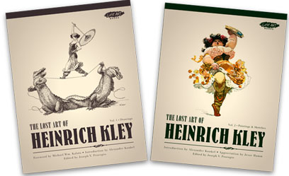
I already had copies of the other books on Kley published by Dover
For those who don't know his work, Heinrich Kley (1863-1945) was the German artist who produced amazing pen and ink drawings of dancing elephants, alligators, satyrs, and nubile ladies. These drawings have influenced Walt Disney's Fantasia crew and many other artists. They're full of wit and invention, and they're jaw-droppingly well drawn.
Publisher Joe Procopio combed through the extensive but untapped Library of Congress archives of the magazines Jugend, Simplicissimus, and Der Orchideengarten to find images that hadn't been reproduced before in recent republished collections. He also enlisted the help of Kley scholar Alexander Kunkel to look far deeper into what's known about Kley's life than previous books have covered.
Volume 1 (Drawings) is 216 pages long, softcover, 8.5x11 inches. It presents black and white work, mostly pen-and-ink, including children's book artwork, adult genre fiction illustration, and the more familiar satirical drawings.
Volume 2 includes a lot of examples in color, not only of animals, figures, and fantasy, but also of Kley's industrial and architectural painting. Each book has original essays by artists and historians which shed new light on his work and his life story. Jesse Hamm's illustrated essay in Book 2 analyzes the drawings from an expert artist's eye to deconstruct how Kley must have worked and what makes him so distinctive.
The books are available directly from the publisher through the "Lost Art/Picture This" website and at some retailers.
Wednesday, December 19, 2012
Frozen Niagara Falls
A few times in its history, Niagara Falls has frozen solid. And people, being naturally crazy and curious, have walked out over the unstable edge and snapped photos.
Here people walk on billows of ice that formed from the mist below the base of the falls.
An urban legend website debates when these photos were taken. Various claims have been made: 1848, 1890, 1911, and 1936. Another website, Environmental Graffiti, lays out the evidence, and says, "In 1912, an ice bridge broke apart as several people were crossing it, sending three to their deaths as the ice on which they stood plunged them into oblivion."
------
Thanks, Kay.
The Unknown Woman
According to the legend, her body was pulled from the Seine river in Paris in the late 1800s. When they brought her to the public display at the morgue, no one could recognize her. There were no signs of violence or struggle, so they suspected suicide.
People called her "L’Inconnue de la Seine (or “the unknown woman of the Seine”).
People called her "L’Inconnue de la Seine (or “the unknown woman of the Seine”).
Why did she look so serene? Her strange smile captivated everyone. Some compared her expression to the Mona Lisa. Some estimated that she was only 16 years old.
A pathologist at the morgue was so impressed by her beauty that he made a plaster mould of her face. Copies of the cast circulated around Paris, and soon became a decoration in artists' studios. In America she became known as "La Belle Italienne" In Germany, girls modeled their looks after her.
An art student, Edouard Cucuel, described how it was the favorite cast decorating his roommate's wall. "It occupied the place of honor over his couch," he said, "where he could see it the first thing in the morning, when the dawn, stealing through the skylight, brought out those strange and subtle features which he swore inspired him from day to day."
------
Bohemian Paris of Today by Eduoard Cucuel
An art student, Edouard Cucuel, described how it was the favorite cast decorating his roommate's wall. "It occupied the place of honor over his couch," he said, "where he could see it the first thing in the morning, when the dawn, stealing through the skylight, brought out those strange and subtle features which he swore inspired him from day to day."
------
Bohemian Paris of Today


