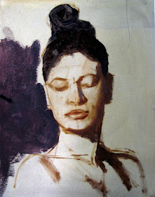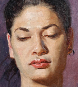
Here's an early step in the process. I laid the structure of the face with a bristle brush on the light gray oil-primed canvas. My goal at this stage was to work out the darks-- especially the shadow side of the face and the background.
The shadows are fairly transparent, just scrubbed in with bristle brushes. The light side of the form is just the priming color showing through. This is the foundation of the portrait, so I spend a little time checking and correcting, because it's hard (but not impossible) to fix drawing mistakes later.
(By the way, if any of these terms or concepts don't make sense, let me know, and I can try to do a post about it in the future.)

I spent the last three hours fine-tuning forms and adjusting edges. I left off the highlights, eyebrows, eyelashes, nostrils, and all those other final touches until the very end. They should be dropped in after the soft understructure is finished.
Carriage House Art Studio


This is a beautiful painting, and an extremely effective demo-post. As much as I truly love our short video posts, sometimes I feel that I'm able to assimilate the still shots better. (A combination of the two being - for me - the most effective.)
ReplyDeleteWould you mind giving a quick definition of "saturated" as you apply that to your warning about oversaturating the lights? I find that one word that I feel I intuitively know, but never feel quite confident of. Would "intensity" be a synonym, or is it something different from that?
Nice painting James! I love the "in progress" shots to. Thank you.
ReplyDeleteVery nice study! Tank you for the step by step process.
ReplyDeleteSomething that I don't really understand is why did you start with this yellowish skin tone in the "light side" stage then went into something more natural? Couldn't you go directly to the natural tone, especially with "alla prima" technique?
The other thing that troubles me in portraits is the use of green or blue in skin tones. I find it very efficient but I can't figure out how when and why, and I have difficulties to really see it on a model. Are there key points on a face that systematically needs to be cooled down? How would you recommend to deal with it when painting from imagination?
Thank you very much James.
Adrien B-R: You beat me to it! Great question.
ReplyDeleteWonderful post and a beautiful painting. At first I wished I could see more steps after where you stopped the process shots---but then again, where you stopped the process shots is probably the most important thing you could tell us: (that the light side "is dropped in with patchy, partially mixed colors applied loosely"). I've seen other painters do this, and admired it....but really didn't understand what they were doing.
ReplyDeleteWould it be safe to say that this initial loose application of paint is descriptive of the type of light that was hitting the model?
Stunningly gorgeous painting! Love, love, love it!
ReplyDeleteI have been wondering...Solomon mentions the use of a 'hand glass' when checking the accuracy of drawing from a model. The artist compares say, their head drawing to the actual model by checking them in the 'glass' holding the glass in such a way that both images are visible side by side, I think. Never heard mention of it when I was in art school but it sounds like it might be a useful tool. Do you know what type of 'hand glass' he means? - mp
Thanks, everybody.
ReplyDeleteGreat questions. Quick answers:
Anonymous: by hand glass I believe he means a pocket mirror, though a dark mirror or Lorraine glass is useful, too. I used a pocket mirror as I worked on this portrait. Good way to catch mistakes in drawing.
Celeste, the patchy blockin gives some hue, value, and chroma variation. Basically they are halftone planes as the light side turns away from the light. The paint is applied thicker. Blending can wait. This might be a good topic for a future post.
Adrien, the yellowish cast of the third step is a problem with my camera's white balance. The colors were close to the finished piece. As for cool colors, it's all relative. Some planes get relatively cooler because of local color (such as the area around the mouth), or because the planes turn away toward a cool window, or for other reasons. The cheek on the left side (our left as we look at it) is cooler, which turns it backward--it was getting some cooler light. Warm and cool are all relative--you're not using something that looks like a strong blue, just a bluish or greenish version of the skin tone.
Tom, glad you mentioned that the stills and text was helpful. By saturated I meant "high chroma" or intense if you prefer. In other words, I was holding back on using strong orangey colors in the light areass, and instead making them lighter in value, reduced in chroma, and narrowed in the range of modeling.
Beautiful study - I keep enjoying all those modelling steps up to the final result.
ReplyDeleteAs to the blue-violet background: Was there some cloth like that at the back? Or is it imagined? The figure blends well with it anyway.
My question would be: Had there been a green tinged background, for instance; would it have affected your model's skin tones?
Thanks for sharing, James. Will you ever release some practical DVD?
ReplyDeleteThanks! - mp
ReplyDeleteThanks for the demo, and for the follow up to all the questions!
ReplyDeleteThanks for a great process post, the only thing I remain curious about is what tube colors went into the various skin tones -- any chance of a discussion on that topic, in regards to this painting and/or in general?
ReplyDeleteWhat a lovely study of a memorable face! Thank you for sharing your enjoyable explanations and photos, James.
ReplyDeleteRegarding the "glass" mentioned: could that be a reference to a reducing glass? A mirror is helpful too, but a reducing glass could actually be used in the manner described to compare the drawing with the model, side by side.
I have a vintage rectangular one I picked up somewhere. It is about 3"x4" and quite heavy. (The last time I looked for it, I couldn't find it where I thought I had stored it. Bother.)
I see modern round ones available at artists' supply but the rectangle seems like it would be more practical.
James, may I ask why you toned your canvas with grey?
Gorgeous painting! You are so kind to teach us all about this.
ReplyDeleteNaive question: Surely in a six-hour sitting, some things change? Like the model's skin tone (sweat?), tilting the head a little as she gets tired, etc.? Seems like it would interfere with the precision of the drawing. What do you do about those things?
Thanks,
Leif
Here's an explanation of the reducing glass by Robert Burridge. Scroll down the page for the "Useful Studio Tip from Bob".
ReplyDeletehttp://www.robertburridge.com/newsletter/artsyfartsy_feb08/
Delivate and subtle brushstrokes !
ReplyDeleteI was most surprised, however, that
a James Gurney dares to show so much eroticism.
Diana,
ReplyDeleteA reducing glass! I think that's it! Thanks! - mp
Rich, yes, there was a dull red-violet cloth, which looks a bit bluer in the blog post. Had it been green it would have affected the skin tones by relative contrast, and I probably would have introduced greens into the side planes, since they tend to pick up BG color.
ReplyDeleteChequea, thanks for asking. I keep shooting and editing new pieces for several upcoming DVDs. I want to release them fairly close to each other. I do all the filming, audio, and editing -- plus painting, so it takes time.
Rod, Let me see--I used just a few: White, cad yellow light, Winsor red, burnt siena, burnt umber, ultra blue, cerulean blue. I think that's it. Maybe a viridian, too, but that's all you need. Don't even know the brand.
Diana, I toned it with a light gray to get rid of the white. Working over white takes experience to do well because it's tempting to mix the colors too light.
Anon, this model was very disciplined, so she didn't move much—except to smile a bit when people were cracking jokes. But I kind of like models to move around a bit. Honestly, I'm not used to working from posed models. I kind of prefer models to be animated and talking, because it makes the resulting portrait more alive, and it strengthens your form sense.
Pierangelo, Eroticism? If only I had 12 hours to work, I could have continued below the shoulders!
Diana et al, thanks for the thoughts on Solomon's glass. Maybe he was referring to a whiskey glass.
LoL...hic
ReplyDelete- mp
I must ask what is the meaning in english of "overmodeling". I found it also in some Andrew Loomis books, but for shadow tones: don't "overmodel" shadows. From the context my interpretation of the term is to state certain areas as light, in mr. Gurney case, while the rendering would have been better if treated as halftone
ReplyDeleteEmanuele, I'm glad you asked. Overmodeling means using too large a range of values to describe a form, and often too many hard edges and planes. Typically beginning painters overmodel areas in the shadow when they should be handled simpler, softer, and flatter.
ReplyDelete