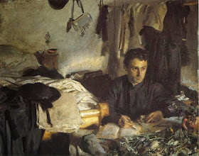
If you link together your little dark shapes into bigger units, you can simplify your value organization and give your composition more impact.
 |
| Stanhope Forbes The Seine Boat |
 |
| Edward Simmons Old Woman Peeling an Orange |
 |
| John Singer Sargent Padre Sebastiano |
This concentration of light brings attention to his face, and raises our awareness that he is gazing out of a window behind us, where, judging from the plants on the desk, there must be a garden. These design choices give psychological power to the portrait: Am I reading into it, or does it make him seem embedded, ensconced in his cloistered cell, reflecting on his inner and outer life? Sargent didn't find this composition, he made it.
All of these paintings are nearly monochromatic; you could copy them with black, white, yellow ochre, and burnt sienna....Except for that wonderful little dash of blue in the Forbes.
------
"Shapewelding" is one of the compositional devices mentioned in my book Imaginative Realism. If you order a copy from me today, you can get it signed and shipped tomorrow. It's also available unsigned at Amazon .
.
------
"Shapewelding" is one of the compositional devices mentioned in my book Imaginative Realism. If you order a copy from me today, you can get it signed and shipped tomorrow. It's also available unsigned at Amazon

Stanhope Forbes just blows my mind.
ReplyDeleteA couple of years ago, Stanhope Forbes' original painting of 'Fish Sale on a Cornish Beach' was exhibited at Exeter Museum. I'd seen reproductions of this work but to see this huge painting hanging on a wall just took my breath away. It dominated the whole room. And, like you say, it's almost monochromatic. Just blues and browns. The man certainly knew how to hold things back. I work in watercolour but I too, find I get my best results when I don't use every colour in the box (not that I'm comparing my work with that of Stanhope Forbes).
ReplyDeleteJim, you continue to share the great lessons for the masters with those of us struggling artists who value you as a teacher.
ReplyDeleteGlad to hear it's helpful, John, and best wishes to you.
ReplyDeleteDavid, I would love to see that original. Forbes was so true to nature.
James, it was an exhibition of the Newlyn School, so it was a real treat. But this was the painting that stuck in my memory. Another bonus were his sketches on show. As an artist I always find it fascinating to see the process behind the final result.
ReplyDeleteI've heard a lot about shapewelding from Stape. It's a concept that doesn't come up in painting instruction very often. But it works. Thanks for a great post. I look forward to my signed copy of the book.
ReplyDelete