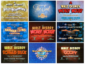
When I was developing a title card design for the CLEMENTOONS series, I looked at a lot of the opening graphics that inspired me as a kid. Most of my favorites were from the Golden Age of American Animation in the 1930s and '40s.
When a cartoon started with the Looney Tunes titles it made my heart race with anticipation--still does. I love the cockeyed block letters, and the concentric circles airbrushed to look like a tunnel. It was a special treat to see Bugs or Daffy or Porky featured in the title.
And I was crazy about the manic energy of the Warner Bros. theme music, based on the tune called "The Merry Go Round Broke Down."
All the cartoons from that period had beautiful titles. They were all colorful, beautifully lit, with an interesting texture behind the letters. I couldn't figure out how they made them, but they seemed to be made by hand from real materials.
For the Clementoons titles, I wanted to see Clement actually animated in front of the titles, and then somehow jumping back into them. If I made the stepped windows rectangular, in the same proportion as a 9x16 video screen, then I figured the camera could dolly back into that space, following Clement as he jumped into his new adventure.
I did all sorts of R&D for the letters, and finally discovered that craft foam worked best. I cut the letters out with a sharp X-Acto knife and spray-glued them onto a spacer above the background. For the background texture, I experimented with real burlap, but it didn't look right, so I hand sculpted the texture out of Magic Sculpt
Here's what the set-up looks like with my Canon T3i camera mounted on an improvised Lego dolly and set up for the stop motion sequence. Note the white "C" shape in the upper left. That's called a "gobo" and it's made of an aluminum pie plate. It's used to shape the light on the titles.
Here's the final sequence, which takes about 8 seconds. (Direct link to YouTube video) Note the focus pull and the dolly move at the end, zooming into the stepped rectangle.
I recorded the blink sound effects on a mandolin, plucking the strings between the bridge and the tailpiece. The theme music is courtesy of a young band called The Yanks, in which my son Dan happens to be the accordionist.
The Clementoons theme tune is called "If There Weren't Any Women in the World," an old barn dance they learned from fiddle player Seamus Quinn. If you listen closely, you'll hear a saxophone on the track, played by three-time All-Ireland champion Isaac Alderson.
-----
More about animation title cards at Animation Treasures
Respective titles © and ® Disney Enterprises, Inc / Warner Bros. / MGM / Paramount / Universal
Clementoons is © and TM little old me.


Fabulous! As usual, your attention to detail really pays off here. Looking forward to more!
ReplyDeleteamazing work
ReplyDeleteBruce Timm's Batman "The Animated Series" had some of the finest title cards Warner Brothers ever produced. In my opinion. Great post James!
ReplyDeleteI agree with Joshua. The title cards for Batman:The Animated Series are worth checking out. Each card was just so nicely laid out and painted.
ReplyDeletePersonally, nothing could top the Warner Brother's cartoons with the "swooping" sound at the beginning as the logo approaches and the music begins.
Personally, I've always been a huge fan of the Fleischer Popeye cartoons with the windswept boat motif and opening and closing doors revealing the title and credits.
This is unrelated to title cards but I've always wanted to experiment with the moving backgrounds/3D sets built for some of the Popeye cartoons. The sets were built on a rostrum and rotated frame by frame as each each new cel was exposed in front of it. While this device didn't allow the camera to go into the scene like Disney's Multiplane camera, the illusion of horizontal movement was tremendous.
Looks cool. In the BTS photo, there are several windows in the shooting area. I presume you black them out with shades, or shoot at night to keep the light levels consistent? Also, I noticed the camera got bumped just before the dolly in. Stuff like that is always an issue with stop motion. Maybe it is fixable in post if you have any extra room in the camera framing. There are no mouths on the characters, a stylistic choice or are you going to add them in post?
ReplyDeleteAwesome James! You make this look like so much fun.
ReplyDelete