Wednesday, December 31, 2014

Richard Estes: Reflections and Transparency

The paintings of photorealist Richard Estes (born 1932) are currently being featured in a major retrospective at the Smithsonian American Art Museum in Washington.

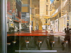
Richard Estes, "Murano Glass," 1976, 24 x 36 inches, oil
Calling him a photorealist is a little misleading. Although he uses photos as a source for his work, many of his paintings combine information from several different photos, and he doesn't paint over traced photographic projections. In the case of "Murano Glass," above, the reflection that you see in the window isn't actually visible in that particular store window. He had to construct the scene.

Richard Estes, "The Candy Store," 1969, 47 x 68 inches
Painting a reflection in a shop window presents a fascinating visual challenge. Usually the street reflection is most visible in the dark areas of the window. Wherever the reflection crosses an object seen through the window, the colors and values are added to each other, such as in the slanting yellow sign. 

Estes delights in creating a puzzle out of all the overlapping layers of information. In the painting above, the interior ceiling forms slant across reflections of buildings in the upper right. Some signs, such as "Burger" are reflected twice by parallel planes of glass or mirrors.

Painting reflections + transparency from observation rather than from photos is a much greater challenge because one has to overcome the effects of stereoscopic vision and focal depth. Whereas a camera will compress reflections and transparencies into a single plane, our eyes and brains separate them, so that it's almost impossible to perceive the combined effects of transparency and reflection at the same time. 
-----
Here's an example where I try an outdoor painting of reflections and transparency from observation.
New book related to the exhibition: Richard Estes' Realism

Tuesday, December 30, 2014

Dinotopia Serial Podcast Episode 8

Today we released Episode Eight of the serialized podcast of Dinotopia: A Land Apart from Time, which was available only for a week. Check a newer post for the latest episode.


The episode begins with Will Denison waking up in the sleeping barns of the giant sauropods, which brings him with strange dreams.  

Melanie takes Arthur on a tour of the exotic plants that grow near Treetown.

Will and his young companions learn to take care of the dinosaurs...

And then they take part in the ring riding event of the Dinosaur Olympics.

The Podcast Series
This acoustic adventure was produced by Tom Lopez, mastermind of the ZBS Foundation, with an original music track by composer Tim Clark.

Episode 9 arrives in a week. Each short episode will only be live online for one week, and then it will disappear.

If you'd like to purchase the full two-hour Dinotopia podcast right now and hear all twelve episodes back to back in a feature-length production, check out Dinotopia at ZBS Foundation website for the MP3 download.
----
You can also order the original book from my web store and I'll sign it for you.  It's a great New Year's gift for the imaginative person in your life. (Ships via Media Mail within 24 hours of your order. US orders only for the book, please). The Dinotopia book is also available from Amazon.
----
There will be an exhibit of Dinotopia originals at the Stamford Museum and Nature Center in Connecticut from February 14 - May 25, 2015. I'll be giving an illustrated lecture there on Sunday, February 22.   EDIT: The lecture date has been moved to Sunday, March 1, 2015 at 1:00

Monday, December 29, 2014

Book Review: How to Render by Scott Robertson


Scott Robertson recently released his new book How to Render: The Fundamentals of Light, Shadow, and Reflectivity, and he sent me a copy to take a look at.

It's a followup to his previous book How to Draw, which I reviewed last year. Once you know how to draw the outlines of an object in perspective, the next thing is how to to use light and shade to bring out the form, and how various surfaces will look in different conditions. That's what this book concentrates on.

Scott has plenty of experience as a teacher. He has taught at art schools, seminars, and workshops, and has produced a lot of DVDs for Gnomon. He also shares regular videos on his YouTube channel.

He brings all that experience to his organization of the book. The book is divided into two main sections: 1. The physics and the perspective of light and shadow, and 2. The physics of reflectivity.


The book opens with a presentation of drawing tools, and then dives into a discussion of the kinds of light and the elements of form. He uses as examples both ideal geometric forms and photos of real objects (such as sculpture and architecture).

In one section of the book, Scott guides the reader through various practical systems for constructing shadows in perspective using geometric forms. That section feels a bit like a math textbook, but that's the only way to learn it, especially if you're creating imaginary forms.

The second half of the book analyzes reflective surfaces and their specific properties: including the Fresnel effect, reflection flipping, reflection pools, reflections over graphics, and cast shadows on reflective surfaces. He also goes through a catalog of examples of specific materials, such as glass, plastic, chrome, gold, wood, leather, and cloth, as well as examples of photographic effects such as motion blur and depth of field.


Scott does some rendering demos using both digital and physical techniques, so they will be of universal value from a technical perspective. Although there is some limited coverage of organic, natural forms (such as portraits, plants, animals, and landscapes) and passing references to atmospheric effects, the chief focus of the book is on transportation design—such things as cars, airplanes and robots.

The book was created by Robertson's own publishing company Design Studio Press. It is large (9x11 inches), thick (272 pages), and printed on heavy opaque paper. The book also provides the reader with special access to dozens of supplementary online videos.

How to Render: The Fundamentals of Light, Shadow, and Reflectivity is a rigorous book that covers the subject comprehensively and authoritatively, and it should become a useful textbook for many years to come.

Sunday, December 28, 2014

Dinotopia Technique

The technique that I have used for most the illustrations in Dinotopia: A Land Apart from Time is an oil wash method that's quite fast and versatile.


I do a quick pencil drawing on heavyweight illustration board and fix it with workable fixative. Then I seal the surface with acrylic matte medium, applied quickly overall with a housepainting brush. While it's wet, I squeegee the matte medium to a whisper-thin layer using a scrap of cardboard dragged along the surface. Here's a video showing how that step looks.

When that layer is dry, I scrub in the oil colors with a bristle brush, thinning them with a combination of odorless mineral spirits and alkyd painting medium. The resulting layers take a couple of hours to dry to the touch, and they're dry enough overnight to permit additional layers.


What I like about the method is that you can use it entirely transparently, as I did in the painting above, or you can paint semi-opaque or fully-opaque passages, and bridge into a more conventional oil painting technique.
-----
Book: Dinotopia, A Land Apart from Time (on Amazon).
Book: Dinotopia: A Land Apart from Time (signed from my web store U.S. only)
More about Dinotopia techniques and methods in my book: Imaginative Realism: How to Paint What Doesn't Exist
Listen to the latest episode of the Dinotopia audio podcast.
There will be an exhibit of Dinotopia originals at the Stamford Museum and Nature Center in Connecticut from February 14 - May 25, 2015. I'll be giving an illustrated lecture there on Sunday, February 22.


Saturday, December 27, 2014

Animatronic Creature Mechanics


This behind-the-scenes sampling of animatronic heads from Spectral Motion shows some of the intricate mechanics beneath the flexible silicone skin. (Link to YouTube video.)

Combined with the creepy music "I Cannot See His Colour" by James Newton Howard, the video gives the feeling of creatures on the verge of coming to life.

Spectral Motion has built animatronics for "Hellboy: The Golden Army," "Hansel & Gretel" and many other movies.
Via Best of YouTube

Friday, December 26, 2014

Theodore Gurney, Aeronautical Engineer


(Link to Soundcloud File)
Theodore Gurney was one of my grandfather's younger brothers. He lived from 1908 to 2001. I sketched him in Rhode Island back in 1997.

Press the orange play button to hear him tell how his father doubted that airplanes would ever be commercially viable.


(Link to Soundcloud file)
Uncle Ted worked as an engineer for Pratt and Whitney in their aircraft engine division, and he helped Igor Sikorsky on flying boats and early helicopters. In this clip, he talks about what it was like to fly on giant airships during the golden age.
-----
Previously: Sir Goldsworthy Gurney

Thursday, December 25, 2014

Dear Santa Claus, from Jimmy the Reindeer


"Dear Santa Claus,
I want Willie the missile man, & BasketBall, FootBall Kicking Set, Bowling Ball, & Chevrolet stingray, & stuffed animal. Dog, & Master Pogo stick.
Sincerely yours, Jim GuRNEy"
(December 1964, age 6, on the left)

Wednesday, December 24, 2014

Merry Christmas 2014

Merry Christmas and Happy Holidays, everyone. Art by Ivan Shishkin (1832-1898) "In the Wild North," 1891, oil on canvas, 161 cm (63.4 in) x118 cm (46.5 in).

Tuesday, December 23, 2014

Dinotopia Podcast Episode 7

Today we released Episode Seven of the serialized podcast of Dinotopia: A Land Apart from Time, but the audio is no longer available, sorry! It was only online for a week. However, if you check the blog, the latest episode should be available.

Will and Arthur Denison attend the gathering of humans and dinosaurs at the Habitat Conference.

...and then they make their way to the village of Treetown.

The Podcast Series
This acoustic adventure was produced by Tom Lopez, mastermind of the ZBS Foundation, with an original music track by composer Tim Clark.

Episode 8 arrives in a week. Each short episode will only be live online for one week, and then it will disappear.

If you'd like to purchase the full two-hour Dinotopia podcast right now and hear all twelve episodes back to back in a feature-length production, check out Dinotopia at ZBS Foundation website for the MP3 download.
----
You can also order the original book from my web store and I'll sign it for you. It's the ultimate holiday gift for the imaginative person in your life. (Ships via Media Mail within 24 hours of your order. US orders only for the book, please). The Dinotopia book is also available from Amazon.
----
There will be an exhibit of Dinotopia originals at the Stamford Museum and Nature Center in Connecticut from February 14 - May 25, 2015. I'll be giving an illustrated lecture there on Sunday, February 22.   EDIT: The lecture date has been moved to Sunday, March 1, 2015 at 1:00

Monday, December 22, 2014

"Fire and Ice" backgrounds


Detail from Frank Frazetta's poster art for Fire and Ice, from Frazetta.net
Director Robert Rodriguez announced a few days ago that he has completed a deal with Sony to produce a live action version of the 1983 Ralph Bakshi animated film Fire and Ice, based on the artwork of Frank Frazetta.

I was one of two background painters on the film. The other was my friend Tom Kinkade, who later on became the "Painter of Light." Each of us had to produce about 600 paintings at a rate of about 11 per week, while working on our instructional book "The Artist's Guide to Sketching" on the weekends. 

 Some background paintings were fairly large — this establishing shot of the volcano city of Fire Keep is about 16x20 inches, and it took me three days. It's painted with cel vinyl animation paint and airbrush.

The layouts were drawn by Tim Callahan on illustration board. He started with photos of the actors, who blocked out each scene on a soundstage. Animators used the rotoscoped live action as a starting point, but then used their imaginations to create the action. The soundstages had ramps and scaffolding, which we had to turn into jungles and volcanos and ice caverns.

We painted the foreground elements on acetate overlays. Each sequence was held within a specific color gamut, usually with the color of the sky keying the mood of everything else.

Here's one of the paintings I did of a spooky forest. We were looking at Frazetta's paintings for inspiration, but also at N.C. Wyeth, Arthur Rackham, Frederic Church, and a lot of other artists. Frazetta and Bakshi often visited the background room to hang out with us and talk about art. We had a lot of good laughs together. 

Here's another establishing shot that I did, influenced not just by Frazetta, but also by Roy Krenkel and the Orientalists. It will be fun to see what Rodriguez does with filmmaking tools that are very different from what we had in the early 1980s.

Here's the trailer for the original film (YouTube link)
------

Sunday, December 21, 2014

Photos of Sorolla Painting

JoaquĆ­n Sorolla y Bastida (Spanish, 1863-1923) executed many of his famous paintings outdoors under the most challenging conditions, and fortunately there are photographs to show his ingenious panting setups.

I can't imagine a more dynamic and difficult subject: children, fabric, moving water, animals, and boats in the surf, contre-jour lighting, and probably sand, spectators, and worst of all, wind. All in a day's work for Sr. Sorolla.
He's working on a folding wooden tripod easel that was pretty typical for his times. His palette is resting on a low folding chair or table to his left. Even with the wide stance of the tripod, a gust of wind would blow this thing over. He always has a nice suit of clothes, good shoes, and a different hat.

The palette is in the left hand, and there's a chair on the right with the paint and brushes easy to reach. There's probably a farmer out of frame with a bowl of scraps doled out slowly to keep the pigs in place.

He's sitting this time, which lowers the center of windage. The paint box is on the chair at right. If that's an assistant, he seems to be holding another chair. 

The kids are taking turns as models. There seems to be a weight hanging from the easel to stabilize it, and the top of the panting appears to be resting against the rope. Judging from the fabric bellying out at right, the wind is a factor.

Now he's working much larger. The stretched canvas is mounted on a hefty wooden base structure, perhaps with some wood pieces driven down into the sand. The ladder/scaffold lets him reach higher in the picture. A couple of assistants are there to help. 

Here's what he is working on. Even with models for the kid and the horse to look at, there's a lot of memory work involved here.

Now he's working on the epic mural project on the peoples of Spain. He has enlisted local models to pose outdoors in costume. The large canvas is held vertical with weighted diagonals, and the base of the canvas is about a foot off the ground.

In his studio, he often has his palette on a low table and used long brushes to be able to paint with a full arm reach, backing up as far as he could to compare the painting to the model.


Here he's painting in the garden of the manor "Vista Alegre." He has portable stairs to stand on and a wooden box for his paints. There's a box-like structure built around the whole gigantic painting, and some shear fabric held up on both sides, which was described as "an awning to protect the paint." 

It looks like a set-up that he could leave deployed for a while. An observer recalled seeing "the construction of a large boardwalk outdoors where he could install his paintings and a scaffold to support the frame weight." The models were employees of the estate, and he also needed to hire a translator because he had difficulty understanding Galician. (Read more about this on a Spanish website.)

The big painting seen in the photo is "Galicia," one of the murals from the Hispanic Society in New York.
----