 |
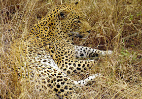
| Male leopard in South Africa, Wikipedia photo by Lukas Kaffer |

It can not only disguise a subject against its background, but also against others of its own kind, making the boundaries of the form hard to see. The effect would be especially powerful when these zebras are running off in all directions.
 |
| Abbott Thayer with Richard Meryman, Peacock in the Woods, 1907. |
Doing a painting like this goes against our artistic instincts to separate forms from the background, yet the effect presents a powerful appeal to the viewer.
|
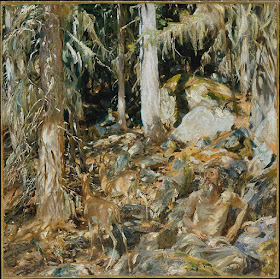
Other painters took up the idea around the same time, including John Singer Sargent. In his painting "The Hermit," he posed an old man in the foothills of the Alps and lit him with sun-dappled light, which nearly loses him in the the background.
In the left center of the picture are two well-hidden gazelles. The animals were based on a stuffed gazelle that Sargent brought with him as a prop on his alpine travels.
------
Smithsonian article by Richard Meryman, "A Painter of Angels Became the Father of Camouflage"
Wikipedia on Disruptive Coloration and Abbott Thayer
Related Topics on GurneyJourney:
Nude Girls and Overcast Light
Ghillie Suit
Countershading
Wikipedia on Disruptive Coloration and Abbott Thayer
Related Topics on GurneyJourney:
Nude Girls and Overcast Light
Ghillie Suit
Countershading


Brings to mind the art of Bev Doolittle which jumped to popularity several years back. Also related is the "fade-away" illustration art of the early 20th century as exemplified by Coles Phillips.
ReplyDeleteWow! I don't know how many times I've seen that Sargent, but I never spotted the gazelles before!
ReplyDeleteOneness in Nature.
ReplyDeleteDisruptive Coloration; rendered by those painters. How interesting an entry.
"We Are One."
...the Singer Sargent Hermit somehow looks overwhelmed (and perhaps enlightened) by the overall Unity.
Rich, interesting that you should bring up the spiritual associations of the image. According the the Met Museum website, "When approving 'The Hermit' as the translated title of the picture, Sargent wrote to the director of the Metropolitan, “I wish there were another simple word that did not bring with it any Christian association, and that rather suggested quietness and pantheism.”
ReplyDeleteTom, it's big of you to admit that. Me, too. I somehow knew there was one gazelle, but I had missed the second one.
Robert, glad you mentioned the Bev Doolittle examples. I think they called her style 'camouflage art.' Often the pattern of spots formed yet another hidden image.
Interesting too how an artist (you may know Keith from his Greenwich images) has contributed beyond the canvas...
ReplyDeletehttp://www.nytimes.com/1987/08/18/science/air-force-sees-beauty-in-ugly-ducklings.html
Ross
It's interesting, but I don't think the paintings work. I think one reason is that in order to succeed in creating the illusion of 3-Dimensional reality in a piece of 2-D artwork, artists need to use certain techniques and principles that help separate objects of different distances. Contrast (both value and color) and edges often need to be manipulated in order to avoid unintentional "camouflaging." This is obviously just my opinion, but I would consider the the Sargent shown as a failed experiment - and I can't even make out what the subject is in the other example!
ReplyDeleteI have to agree with Don here. It might be a personal preference, but these paintings just don't work for me. They have no focal point.
ReplyDeleteI don't agree with Don here:
ReplyDeleteImagine Singer Sargent doing this kind of work in one of his upper class society paintings. There he certainly followed the rules laid down by Don; no lack of contrasts and edges...
I can hardly imagine a harder contrast than between some vain upper class society people and an eremite!
So in this ermite experiment he just loosened up the contrasts (both value and color); painting this half naked self-outcasted eremite, instead of the usual gorgeous clad ladies: He somehow went from "high society" to "low society", so to say.
"Low" can be high, like Diogenes in his can:-) another eremite,... and "High" sometimes can be...
In short:
The concept of an eremite has been quite successfully illustrated here, IMO.
Sargent's "The Hermit" is in the Met. It is a fabulous painting. I've seen it several times and revel in it more each time. Great, great stuff.
ReplyDelete