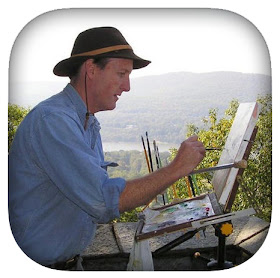
If you do Instagram, you might enjoy following my daily feed, which often includes images that are different from the blog. Here are my top 9 from 2016.
Saturday, December 31, 2016
Party Time
We're about to launch into 2017. Why not party?
We're all just refugees from a bygone era, doing our best to adapt to the demands of a new world. So let us bake a pie, play a tune, dance a jig, or paint a picture, because that's what we do.
---
Image from Dinotopia: Journey to Chandara, available signed from our USA web store or on Amazon .
.
Linkology
Instagram @jamesgurneyart
Twitter @GurneyJourney
Facebook JamesMGurney
iOS app GurneyJourney Blog
Pinterest GurneyJourney
YouTube GurneyJourney
We're all just refugees from a bygone era, doing our best to adapt to the demands of a new world. So let us bake a pie, play a tune, dance a jig, or paint a picture, because that's what we do.
---
Image from Dinotopia: Journey to Chandara, available signed from our USA web store or on Amazon
Linkology
Instagram @jamesgurneyart
Twitter @GurneyJourney
Facebook JamesMGurney
iOS app GurneyJourney Blog
Pinterest GurneyJourney
YouTube GurneyJourney
Friday, December 30, 2016
Old House by the Tracks
In its youth the house watched over sailing sloops and the busy river landing. Its heart burned with coal fire before the nervous energy of electricity. It clings on into the fury and frenzy of the modern age, shaken but resolute.
Thursday, December 29, 2016
Dealing with Our Inner Critic
Gabriel Cornelius Ritter von Max (1840-1915),
who actually lived with a family of monkeys
Over on YouTube, Natasha asks:
"Because of all your videos, it has inspired me to want to go out and quit being afraid of what others think or say about my paintings. Yet I think we artists may be our biggest critics of all. How were you able to overcome any fears of hearing what bad things other people have to say?"
Natasha, You're right that we're usually our own toughest critic. That can be a good thing. It's helpful to hold ourselves to a high standard, always asking 'How can I make this better?' That self criticism is what keeps us improving, hopefully. The other extreme, overconfidence— being overly satisfied with everything we do—can be as big a problem as being self-critical, and it makes a student unteachable.
At the same time, don't be so hard on yourself that you avoid taking risks. We all need to take satisfaction in our successes and in our experimental attempts, even if they don't work out the way we had hoped. You don't have to show anyone your duds. Paint over them or put them on the Gallery Flambeau.
So should we shut off our inner critic? OK, temporarily if that helps you get into the flow. But keep your critic nearby. You'll need that voice to guide the flow in the right direction.
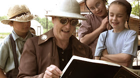 |
| Painting on an Amish farm in Ohio |
If a piece isn't going the way you had hoped, ask for the private opinions of a few people you trust and give them permission to say what's not working about your piece. Be ready for honesty, and thank them for it. People are usually unwilling to offer constructive criticism unless you ask for it, especially on social media.
Try new things. Don't let fear of criticism cause you to hold back and play it safe. You don't want to keep doing the same thing over and over again just because you know it will work and you'll get approval for it.
As far as strangers who walk by and make remarks when you're painting outside, don't worry at all! That's part of the sport. People say all kinds of nutty things, and just about every picture goes through stages of looking awful. But once in a while, you'll get a critical comment from a passerby that will really help you see you see your work in a new way. Keep your antenna tuned for that.
Previous Posts about Criticism and Confidence
Top ten ways to deal with curious spectators
How Rockwell turned a detractor into a defender
Gerome and his Critics (57 comments)
Critics Redux
OKGo Answers its critics
Zorn's Self-Confidence
Linkology
Instagram @jamesgurneyart
Twitter @GurneyJourney
Facebook JamesMGurney
iOS app GurneyJourney Blog
Pinterest GurneyJourney
YouTube GurneyJourney
Wednesday, December 28, 2016
Flint's Advice for Watercolor Procedure
In his book called "Water-Colour for Beginners " Francis Russell Flint (1915-1977) starts a picture with large flat washes in just four colors: cobalt blue, light red, French ultramarine, and burnt sienna.
Francis Russell Flint (1915-1977) was the son of the more famous watercolorist Sir William Russell Flint (above).
Previously: Flint's Watercolor Sketching Gear
Get the blog on your iOs device using this free app
In the top image, he first drew the outline of the mountains. He painted the sky in pure cobalt blue with a large sable brush. Then he lifted the painting off the easel to let the color run to the top of the sky. He continued by painting the silhouette of the mountains in light red.
In the bottom image, he notes:
"SKY: Using a slightly blue mixture of light red and cobalt blue and a large sable brush, paint the suggestion of clouds, darkest at the top. Dry. Then give the whole sky a third wash of light red and cobalt blue, using plenty of water, especially at the bottom of the sky. Leave a small part of the first wash visible above the hills on the right-hand side. Dry."
"HILLS: Using medium-size brush with pure burnt sienna, paint in middle tones over certain areas to give strength, warmth, and a feeling of solidarity. A new range of hills in the distance is introduced by carrying the burnt sienna over the original hill outline. The hills are low in tone and give added distance to the picture. Dry."
Previously: Flint's Watercolor Sketching Gear
Get the blog on your iOs device using this free app
Tuesday, December 27, 2016
4000 Posts—Highlights of My First 10 Years Blogging
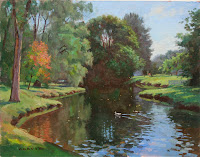
This is the 4000th post on this blog. What started as a simple journal of a book tour in 2007 has grown into a daily habit of learning that I enjoy sharing with all of you. For those of you who are relatively new to the blog, or who want to go back to visit some highlights, here are some of the most popular posts and series.
Lively discussions about the life of the artist
Pet Peeves about Art Videos (81 comments)
Using Photo Reference (33 comments)
Fine Art and Illustration (17 comments)
The Muse and The Marriage (31 comments)
Your experiences with curious spectators (110 stories)
Top ten ways to deal with curious spectators (24 comments)
Gorilla Portraits (46 comments and #1 on Reddit)
Unexpected Visitors (The day I sketched Jehovah's Witnesses—44 comments)
Mythbusting the Golden Mean
Part 3: How the golden mean caught on with artists
Part 4: The golden mean and the human body
Part 5: Last question about the golden rectangle
Media and Materials
Watercolor Materials
Gouache Materials List
Your Casein Questions
 |
| Painting in Wyoming with separate camera tripod |
Part 1: Camera Guide
Part 2: Microphones and Recorders
Water Reflections Series
Part 1: Wrapping the SpectrumPart 2: Primaries and Secondaries
Part 3: Complements, Afterimages, and Chroma
Part 4: Problems with the Traditional Wheel
Part 5: The Munsell System
Part 6: Cyan, Magenta, and Yellow
"Origins of Dinotopia" Series
Part 2: College Obsessions
Part 3: Lost Empires
Part 4: Dinosaurs
Part 5: Treetown
Part 6: The Illustrated Book
Part 7: Utopias
Part 8: Building a World
Part 9: Words and Pictures
Part 10: Canyon Worlds
Part 11: Putting it Together
Part 12: Book Launch
Fire and Ice Series
Part 1: Fire and Ice: Rekindled
Part 2: Fire and Ice: Frazetta
Part 3: Fire and Ice -- Tom Kinkade
Part 4: Fire and Ice -- Ralph Bakshi
Part 5: Fire and Ice -- Living inside paintings
Eyetracking and Composition
Eyetracking and Composition, part 1
Eyetracking and Composition, part 2
Eyetracking and Composition part 3
Studio Lighting Series
Studio Lighting, Part 1: Equipment
Studio Lighting, Part 2: Key and Fill
Studio Lighting, Part 3: Edge Lighting
Studio Lighting, Part 1: Equipment
Studio Lighting, Part 2: Key and Fill
Studio Lighting, Part 3: Edge Lighting
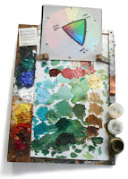
GurneyJourney is a daily blog that covers a variety of art-related topics: color, light, sketching, visual perception, portrait painting—and the making of my fantasy book series Dinotopia. There are also over 300 posts on Academic painting in the 19th century and more than 200 posts about the Golden Age of illustration.
The art instruction books grew directly from the blog posts, and from the comments that follow after them. To learn about a specific topic or artist, try the search box in the upper left.
If you have a specific question or something you'd like to add to the discussion, the best place to do that is in a comment string after a related post. I do read comments on older posts, and if I don't get around to answering your question, most likely one of other blog followers will.
-----
Linkology — Other ways to connect
Instagram @jamesgurneyart
Twitter @GurneyJourney
Facebook JamesMGurney
iOS app GurneyJourney Blog
Pinterest GurneyJourney
YouTube GurneyJourney
Monday, December 26, 2016
Do cultural factors influence how we look at faces?
According to experimental findings reported on LiveScience, the way we look at faces is not entirely hard-wired, and may be influenced by cultural factors, which vary between the east and west.
One study suggests that when reading an expression of a person in a group photo, Westerners zero in on the individual, while East Asians pay more attention to reactions of the other members of the group. Lead researcher Takahiko Masuda, a psychology professor at the University of Alberta, says "East Asians seem to have a more holistic pattern of attention, perceiving people in terms of the relationships to others," while "People raised in the North American tradition often find it easy to isolate a person from [their] surroundings."
In another study, illustrated above, cognitive neuroscientists compared the eye tracking data of Western and East Asian observers who looked at faces on a computer screen. The results suggest that "Westerners tend to look at specific features on an individual's face such as the eyes and mouth whereas East Asian observers tend to focus on the nose or the centre of the face which allows a more general view of all the features."
The author of the article, Charles Q. Choi, suggested the conclusion that "Westerners often concentrate on individual details, while East Asians tend to focus on how details relate to each other."
I'm a little skeptical about these findings, partly because there may be factors other than cultural ones that greatly affect how we look at faces, such as professional training and media exposure. For example, the way artists look at things, based on our training and inclinations, may supercede East/West cultural predispositions (see previous blog post on that topic). Also, I don't think eye tracking data alone can be used accurately to assess the degree to which people look at things holistically, since eye tracking can only record the path of the fovea, or center of vision. We need experimental data that can indicate to what degree the attention is focused on one spot versus a wider view.
Source articles:
Culture Affects How We Read Faces
Face Recognition Varies by Culture
Source articles:
Culture Affects How We Read Faces
Face Recognition Varies by Culture
Sunday, December 25, 2016
Ultramarine Blue
Why does the Madonna traditionally wear blue?
In the Renaissance, blue was reserved for the mother of Jesus because it was the rarest color, more expensive than gold. Originally it was made from lapis lazuli, a mineral mined in Afghanistan. Getting a supply required a long voyage ultramarinus, or "beyond the sea."
Contracts for paintings often stipulated that the artist use ultramarine, and sometimes the client was required to provide the rare pigment.
A synthetic ultramarine pigment was developed in 1826. Since then it has been an inexpensive staple of every artist's palette.
Happy holidays to all, and thanks for joining the fun.
Instagram @jamesgurneyart
Twitter @GurneyJourney
Facebook JamesMGurney
iOS app GurneyJourney Blog
Pinterest GurneyJourney
YouTube GurneyJourney
Saturday, December 24, 2016
Free GurneyJourney App
In honor of this season of holidays, I'd like to offer you a gift: a free GurneyJourney iOS app.
It lets you access the Gurney Journey art blog directly from your iPad or iPhone without having to open a browser.
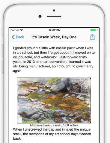
The app will give you all the latest posts updated daily. It's the ultimate pipeline to practical info for realist painters, sketchers, and illustrators, with 4,000 posts since 2007.
No connection? No problem, because the posts are saved offline. It also has a button so that you can read comments or add your own.
My son Dan coded the app, and he's freelancing his design services, so if any of you would like to commission him to build you a similar app, just email him at: gurney.dan [at] gmail.com
----
Gurney Journey app for Apple iOS at the iTunes store.
Gurney Journey app for Android at the Google Play store
It lets you access the Gurney Journey art blog directly from your iPad or iPhone without having to open a browser.

The app will give you all the latest posts updated daily. It's the ultimate pipeline to practical info for realist painters, sketchers, and illustrators, with 4,000 posts since 2007.
My son Dan coded the app, and he's freelancing his design services, so if any of you would like to commission him to build you a similar app, just email him at: gurney.dan [at] gmail.com
----
Gurney Journey app for Apple iOS at the iTunes store.
Gurney Journey app for Android at the Google Play store
Friday, December 23, 2016
Dinotopia painting, step-by-step
Here's a quick video that shows the painting sequence for an illustration in Dinotopia: Journey to Chandara. In the scene, Arthur Denison meets a retired musical conductor, surrounded by dinosaurs and musical instruments.
 |
| Old Conductor, 13 x 14 inches, from Dinotopia: Journey to Chandara |
The drawing is pencil on heavyweight illustration board , sealed with matte fluid medium
 . Over the drawing, I start by lightly washing transparent oil paint, and then paint area by area, making sure I get the major faces and the statement of light the way I want them early on.
-----
The painting is from Dinotopia: Journey to Chandara
More about the steps in a picture like this in my book Imaginative Realism: How to Paint What Doesn't Exist (James Gurney Art)
Thursday, December 22, 2016
Painting in the Conservatory
One way to escape the cold of winter is in a private conservatory, a glass-walled room that serves as a greenhouse and a sunroom.
Several 19th century artists explored this meeting place between exotic nature and civilized fashion. In a conservatory you can sip tea in the jungle, without the jaguars and mosquitos.
 |
| James Tissot (French 1836-1902) |
 |
| "In the Conservatory" by Frances Maria Jones Bannerman |
 |
| John Atkinson Grimshaw (English, 1836-1893) Il Pensoroso |
 |
| Rivals (1878 – 1879), by James Tissot |
 |
| Carl Blechen (German, 1798-1840) The Interior of the Palm House on the Pfaueninsel Near Potsdam, 1834 Oil on canvas 52 1/2 x 50 in. (135 x 126 cm) |
James Tissot, Lilacs, 1875
Wednesday, December 21, 2016
Build method for dragon or pterosaur maquette
Bluworm, also known as the Lone Animator, shows a method for building wing bones and membranes, using wire, latex, cotton, and plaster.
His build process would work well for a dragon or pterosaur. He's constructing a stop motion puppet, but his method would work equally well for a posable maquette that you could use for an illustration reference.
(Link to watch video on YouTube).
---
Previously: Skybax maquette
Tuesday, December 20, 2016
Rackstraw Downes and the Rotating Viewpoint
| Rackstraw Downes, "At the Confluence of Two Ditches Bordering a Field with Four Radio Towers" (1995), 46 x 48 in. |
 |
| Jean Fouquet, Arrival of Emperor Charles IV... 1455-1460. |
 |
| 360-degree panorama. Photo: Heiwa 4126 |
In many of his paintings, Downes uses a curvilinear perspective that's reminiscent of these photographic approaches. The painting below takes in more than 90 degrees.

Albertian perspective requires holding the head in one line of sight, what Downes calls a "head-in-a-vise" system. Downes' vistas often take in a 180 degree view, which would only be possible if you turned your head from one direction to another.
Such head-turning is in some ways more natural. It's what we do when we look around in a scene. Downes wants to capture this experience "empirically," a word he uses a lot. He's not terribly interested in following a strict geometric system, but would rather interpret the scene each time as he sees it.
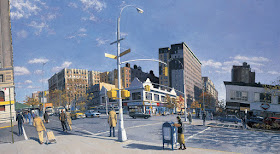
Sometimes the resulting paintings have idiosyncratic features. For example, in the scene above, the horizon or eye level is below the center of the image. That would normally require it to be cupped upward in a concave fashion. But instead, Downes sees the horizon as bulging upward convexly. This would only happen in a photo if you pointed a super wide angle lens downward and cropped off the bottom half of the image.
Downes also makes the line of the building at left leaning straight outward, rather than curving back into the scene at the top like a parenthesis, as a normal wide angle perspective would require. These idiosyncrasies of perspective might strike different people in different ways.
To me this one has a queasy, funhouse feeling, and also the sense that the city scene is on the surface of a small spherical planet.

Downes lays out the case for his approach to perspective in an essay called "Turning the Head in Empirical Space," which appears in the back of his book Rackstraw Downes
Another good book is Rackstraw Downes: Onsite Painting, 1972-2008
Monday, December 19, 2016
Two sculptors create each other's portrait
In this demonstration, two master sculptors create clay portraits of each other in real time. The artists are Professor Sarath Chandrajeewa (Dean Faculty of Visual Arts at the University of Visual and Performing Prt in Sri Lanka) and Professor Cao Chang Xu (Central Academy of Fine Arts in Beijing, China).
(Link to view video on YouTube)
Via Best of YouTube
Plein Air Convention 2017
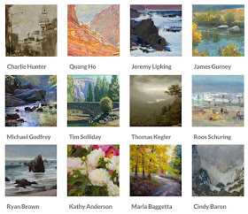
I'm looking forward to being part of the faculty at the Plein Air Convention and Expo coming up April 24-28, 2017 in San Diego. Above is a sampling of the over-60 person faculty.
The Plein Air Convention and Expo will be a combination of stage presentations, demos, networking, and outdoor painting opportunities. People bring their notebooks, business cards, and easels. It's a good opportunity for learning about new materials, techniques, and mindsets.
I'll also be one of the guests at the Spectrum Fantastic Art Live Convention in Kansas City just before. That's the place to be if you're interested in fantasy or science fiction illustration, concept art, and creature design. That event goes from April 21-23, 2017.
Sunday, December 18, 2016
Are you ready to meet your antiface?
This antiface is virtual image generated by a computer. The software begins by identifying your unique facial metrics from a data set of photos. Then it generates a 3D representation of your face called your "identity average."
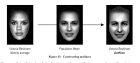
The computer compares the metrics of your identity average with those of the population average. Then it generates a new face with opposite metrics. So if you have a narrow forehead, your antiface will have a wide forehead. If your eyes point up in the outer corners, the eyes of your antiface will point down. If you have a bit of a frown, your antiface will have a bit of a smile.
R. Jenkins and A. M. Burton, the scientists who worked on this study, were unsure whether using metrics alone to make an antiface would generate a plausible photographic face. "It was not obvious in advance that this would be the case," they said.
Further, they observed that "psychologically relevant dimensions such as sex and emotional expression are reversed by this process (female becomes male; sullen becomes cheery), even though these dimensions are not explicitly coded at any stage. In addition, all aspects of the physical appearance of the face take on the opposite valence, so that dark complexion becomes light complexion, upturned nose becomes downturned nose, etc."
They also discovered that, because of the effects of accommodation, if you look long enough at an antiface and then switch to a looking at an average face, even the average face will take on qualities of the individual in question.
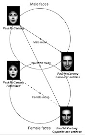
You can generate an antiface across the gender mean to output a same-sex antiface. Or you can use the data to render an opposite-sex version of your face. Or you can use it to create an opposite-sex antiface. The photo shows Paul McCartney's face taken through all those permutations.
Being able to look at an antiface would be an aid to portrait painters or caricaturists, because it makes clear what is unique about a given face.
More about Antifaces R. Jenkins and A. M. Burton
Saturday, December 17, 2016
Alaskan Art Residency Opportunity
 |
| Susan Watkins in Nellie Juan-College Fiord WSA, Chugach National Forest. |
Coordinator Barbara Lydon says that they're now taking applications now for the next season. She says, "We’re pleased to announce that we’re offering eleven different residency opportunities this upcoming summer."
Artists may travel by sea kayak, skiff, tour boat, foot, and airplane. They will be immersed in the wilderness in ways that few people experience. They will camp along intimate fiords, walk through towering rain forests, and have the opportunity to see whales, sea otters, bears and other wildlife.
Friday, December 16, 2016
'How do I keep from losing my style?'
 |
Ernest Meissonier (1815 - 1891)
Painter at the easel 1852.
Oil on panel, 21.8 x 16 cm.
|
"I notice that my style and approach have been "contaminated" with what I see everywhere around me, and the many styles I admire all want to be drawn at the same time, while my own way of drawing gets lost in the meantime...."
"I am feeling like my own work is starting to escape me. I get fewer works done and keep looking at other art all day while my to-do list grows ever longer...."
"Do you have any ideas how I can preserve my integrity? Is it abstinence from this modern-age diversity, or going back to the roots that inspired me to become an artist in the first place."
—Concerned
Dear Concerned,
I sympathize. There's so much great artwork out there on the Internet, and so many fun videos to binge-watch. Studying the work by others can be very helpful if it blazes a trail and shows you what's possible. Your own style will inevitably be a synthesis of what you've absorbed from others, mixed with your own invention and discovery.
But too much looking at the work of others can be paralyzing. It's good that you identified the problem, and that you haven't lost touch with your own personal vision.
Whenever you feel that way, it's time to stop looking at other people's art for a while. Close the book, shut off the computer, and leave the art museum. The farther you get away from those influences, the more your own style and approach will surface. Get out your sketchbooks and reserve one for your own pure imaginings, and the other for drawing or painting things in the real world that get you excited. You don't have to show them to anybody. Your personal sketchbooks will bring you straight back to your roots.
I remember reading
Nature is, of course, is the ultimate source for all great art. If Michelangelo and Raphael and DaVinci and Velazquez could be magically revived, standing next to their paintings, I am absolutely convinced that they would have advised us to go outside and look at Nature instead of at their mortal efforts.
Thursday, December 15, 2016
Three Tips for Painting a Sunset
 |
| Southland Sunset, oil on panel, 8 x 10 inches |
This sunset obeys three rules that usually apply:
1. Colors gradate to higher value and higher chroma approaching the position of the sun.
2. Hue shifts in broad bands from pale yellows higher up to reddish oranges near the horizon.
3. Foreground elements are not black. They maintain color identity in the darks. This is a big difference compared to how the camera sees a scene like this.
These effects intensify as the sunset proceeds until the sun passes below the tangent line of the earth, after which we would enter a dusk phase.
Any given phase of a sunset lasts no more than 10 minutes, so painting a scene like this from life requires a well organized palette, separate brushes for each color group, and accurate anticipation about what phase is likely to come next. I did not use a light on my palette for this one.
-----
More on painting sunsets in my book Color and Light: A Guide for the Realist Painter
Also available signed from my website (USA customers)


