Thursday, March 30, 2017

Demo by Kazuo Oga

Studio Ghibli's background painting master Kazuo Oga uses Nicker poster color (also spelled 'Knicker'), which comes in jars. He wets both sides of the paper before placing it on the work surface. Then he takes some liquid colors, together with white, out of the jars and places them on a nearby dish. 


He drops the paint into the wet surface and blends it while it is wet. The result is a soft atmospheric base into which he can place smaller details of branches and leaves.

Note:
• He is standing up when he starts and sits after 15 minutes.
• He gets his large, soft passages in first, and progresses to the details last.
• The paints are arranged in spectral hue order.
• He uses a large Japanese brush with a sharp tip for painting even the tiniest blossoms.
• He paints some branches from the tip down to the trunk, and others from the trunk outward.

Kazuo Oga says: "Basically, I use poster- color. Because as we have to paint much, we can't use expensive paint. Poster colors can show brightness or depth of color and, above all, it is easy-to-use."
------
Videos: Unfortunately, Studio Ghibli has removed videos previously available on YouTube
But there's a 24-minute version of the above video, free on Daily Motion.

DVD: Oga Kazuo DVD

Paints: Nicker (Knicker) poster color (imported from Japan)
The Art of Spirited Away

Previously on GurneyJourney: Kazuo Oga

Wednesday, March 29, 2017

A Watercolor Landscape by J. W. North

On the recent post about the misty landscapes of John William Tristram, you all had some great insights about methods with watercolor and gouache, in particular about painting over a ground primed with white gouache.

John William North, Spring, watercolor, Metropolitan Museum

The funny thing is that I ran across John William Tristram while searching for John William North (1842-1924), an English known for his experimental methods in watercolor. 

Here are a few quotes I discovered about him:

"1895 he entered a business venture with the Hayle Mill to develop a 100% linen watercolor paper (sized with pure, sterilized gelatin) that was extraordinarily hard and resistant to lifting and scraping techniques. This "OWS Paper" produced blotchy washes (North reputedly always had trouble with his skies) but it withstood any abuse and could even be ironed from the back, like a starched shirt. On this and similar papers North experimented for many years to produce a highly detailed painting style using only transparent watercolor and no gouache. His characteristic late paintings use a peach, brown, rose and violet color scheme (with accents of dull green) to produce the effect of an autumnal and decaying light, with overgrown grasses, stagnant waters and dwarfish trees that seem to luminesce inside their dark edges — an effect at once mystical and vaguely disturbing. North built up his forms through microscopic dots and touches of pure color, anticipating by more than a decade the better known pointilliste effects of 20th century French artists; his relentless attention to detail led a few contemporaries to suggest that he painted while using a telescope. Reclusive and somewhat eccentric, and inclined to putter unproductively until seized by a poetic inspiration, North's landscapes were most influential on young painters whose work extends into the 20th century."

A contemporary wrote of North's method:
North's interpretation of nature was that of a poet. He did not sit down, like the average landscape painter, in picturesque scenery and arrange it improvingly; but living his life full of varied interests he waited until an entrancing moment in the passage of light or some human episode happily related to its surroundings awoke in his heart the ecstasy which is the poetic state. Then no sacrifice of time or labour was too great in the searching of nature to aid his revelation.
------
Online resources
John William North on Wikipedia

Books with related content:
Breaking the Rules of Watercolor by Burton Silverman


My new app:
Living Sketchbook, Vol. 1: Boyhood Home is available for iOS on Apple phones and tablets at the App Store and for Android devices at Google Play.

"The 'Living Sketchbook' app takes a classic Gurney Sketchbook and adds audio, video, and written notes on the inspiration, palettes, and thinking behind the art. It's as if you were a friendly ghost watching the creation of every page."
Iain McCaig, concept artist for Star Wars, Jungle Book, Avengers

Tuesday, March 28, 2017

Announcing "Metro North" coming out next month.

Thanks to your support and enthusiasm, "Metro North"—Vol.2 of the Living Sketchbook app—is in production and will come out on April 17. (Link to video)

I'm using 1-Shot sign painter's enamel for the lettering on a Pentalic watercolor journal

If you haven't experienced it yet, check out the first volume, "Boyhood Home," for iOS phones and tablets at the App Store and for Android devices at Google Play. We're excited that it's one of the most popular apps in the Art and Design categories.


Shari Blaukopf of Urban Sketchers says:
"There is a lesson to be learned with every sketch in James Gurney's The Living Sketchbook — whether it's about light, colour, materials or composition. Spending time with each sketch and being able to zoom in on them with your tablet allows you to really think about how they were created. And videos that accompany many of the sketches enrich the experience because you see the sketch develop from large colour blocks down to final details. And of course hearing James narrate his thought process — whether it be about his limited palette choices or the characters he meets while sketching — is what makes it come alive for me. It's done with warmth, humour, honesty and a vast wealth of knowledge."

Some questions that you've asked:

(from Carl and Dominick Saponaro)
1. Is the app going to include additional sketchbooks as updates to the app? Or will it entail purchasing a new app for each sketchbook released? 
We explored the option of doing additional releases in-app, but it added a huge amount of technical complexity, so we're going to release them as separate apps that you could store in a folder or "bookshelf." They'll be numbered and named just like the actual sketchbooks. 

(from Valerie)
3. I'm having trouble getting audio on my iPhone 7+. What should I do? 
Try these ideas:
1. Volume adjustment or the headphones. Are other apps on your phone playing audio?
2. Go to Settings > Sounds and drag the Ringer And Alerts slider to turn the volume up.
3. If your device has a Ring/Silent switch, make sure it's set to ring.
4. Restart your device.
5. Open an app that has music or sound effects. Adjust the volume with the volume buttons or the slider in Control Center.
6. Go to Settings > Bluetooth and turn off Bluetooth. Then check the sound again.

(from Doug Condon)
2. Are there plans to sell the actual app tech to allow artists to record their own sketchbooks in the same way?
Several artists have expressed an interest, and we're considering whether to 1) Publish a select group of other artists using our brand and platform, or 2) for Dan Gurney, the app coder, to freelance directly with artists to create their own. Either of those would be a ways down the road. Right now we're putting most of our energy into launching a series of my sketchbooks, and we'll see where it takes us. I'd suggest if you want to create one of these down the road to be sure to capture audio and video multi-media of the content that you're sketching.
Monday, March 27, 2017

John William Tristram

John William Tristram (1870-1938) was an Australian watercolor painter with a poetic sense of softness and atmosphere.


The forms seem veiled, and the values are relatively light in key, with just that dark tree mass anchoring the tones.


The values in this painting are high key, with the warm bank at left nearly the same tone as the cool cliff in the distance. The top of the blue cliff is lost in fog. This fog has a granular effect of sedimentary pigments in watercolor.


The tree masses are greatly softened, blending into the sky and ground, and they're composed of variegated hues that seem layered over each other. He eliminates any detail that's not essential.


I'm not sure exactly how he accomplished these effects. I'm guessing that there's a lot of big wet washes, maybe some scrubbing out. He may also have painted over a surface primed with white gouache. It's hard to tell without seeing the originals.

Does anyone have any insights into his method—or his bio? Please share them in the comments. I couldn't find out very much. 
-----------
Online Resources
John William Tristram on Wikipedia

Books with related content:


Sunday, March 26, 2017

Flurry Effect


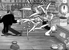
Animator Dave Tendlar invented what he called the "Flurry Effect" in 1935 for a Fleischer / Popeye short called Choose Your 'Weppins.'


(Skip ahead to 4:58) The idea is to fill the air with such a profusion of fragmented elements that you can't tell what phase of the action you're looking at.

The Road Runner / Wile E. Coyote cartoons that Chuck Jones directed for Warner Brothers played with the same idea.


The flurry frames stay on the screen for just a fraction of a second, long enough to give the viewer an impression of crazy action.

Previous Posts:
Getting Blur into Stop Motion
Elongated In Betweens

Saturday, March 25, 2017

Window 10 at the DMV

Jeanette is having her driver's license renewed, so we're sitting in the waiting room at the DMV.


People fill out their forms and get called up to different windows to have their picture taken and their eyes tested (Link to video on Facebook). I'm sitting across from Window 10. Everyone is so preoccupied that they don't notice me and my art supplies.


I have a page in my book with a cool underpainting that I did a few days ago, not knowing what I'd paint over it. 

The underpainting is in casein because I don't want that base layer to reactivate when it gets wet again. You could also use acryla gouache, acrylics, or tinted gesso instead. I use the following colors of gouache: cadmium yellow deep, burnt sienna, brilliant purple, black, and white.

Window 10, DMV, gouache, 3.5 inches square
The plan is to paint a warm, 'orangey' gouache painting over the bluish underpainting. Later, I'll do a blue or gray sketch over the warm underpainting to the right.
-------


If you like my blog, you'll love my new app: Living Sketchbook, Vol. 1: Boyhood Home. It's available for iOS on Apple phones and tablets at the App Store and for Android devices at Google Play.

''James Gurney's Living Sketchbook: Vol. 1 celebrates the mobility and charm of gouache, casein, colored pencil, and pen and ink in sketchbook form. This brilliant app is loaded with beautiful high resolution artwork set to a powerful environmental soundscape that brings you there. The narration is full of insightful observations and wisdom to pass on to artists of all levels. Additional layers of video are dispersed in the volume to clearly illustrate approaches by a master teacher and storyteller. An elegant and generous offering that will immediately make you want to sketch out ‘in the wild'!"
—Erik Tiemens - Watersketch.com

Friday, March 24, 2017

Question about Flesh Tones

Thomas DuVal asks: any tips for getting realistic skin tones with watercolor? I'm having a hard time with my portraits looking lifeless, or like dolls. Thanks!

Tom Lovell, oil 
Thomas, here's what one of my heroes, Tom Lovell, said I when asked him the same question (about oil): 
"Keep in mind that flesh tones are essentially quite neutral. If they are overstated, figures tend to look like painted dolls. Avoid lavish use of highlights. Avoid heaviness. Try reducing chroma with complementary color."  
John Gannam, watercolor
The same principles apply if you're working in watercolor. Keep the chroma down, use simple lighting and modeling, and look for other kinds of contrasting textures around the skin in the same light.

Anders Zorn, watercolor


If you like my blog, you'll love my new app: Living Sketchbook, Vol. 1: Boyhood Home. It's available for iOS on Apple phones and tablets at the App Store and for Android devices at Google Play.

''James Gurney's Living Sketchbook: Vol. 1 celebrates the mobility and charm of gouache, casein, colored pencil, and pen and ink in sketchbook form. This brilliant app is loaded with beautiful high resolution artwork set to a powerful environmental soundscape that brings you there. The narration is full of insightful observations and wisdom to pass on to artists of all levels. Additional layers of video are dispersed in the volume to clearly illustrate approaches by a master teacher and storyteller. An elegant and generous offering that will immediately make you want to sketch out ‘in the wild'!"
—Erik Tiemens - Watersketch.com

Thursday, March 23, 2017

Gouache: Tubes or Pans?


Today let's take a look at some questions that blog readers often ask about gouache.

Do you use gouache squeezed out of tubes, or dried in pan form? Secondly, how do you reactivate the gouache after it dries on your palette?
It is possible to use gouache in pans, since gouache is water soluble. It has the same binder as transparent watercolor does, namely gum arabic, which will reactivate when it gets wet again.

It used to be more common to find gouache manufactured in pan form, but there's at least one company that still offers it that way. Caran d'Ache offers a 15-pan set of pan gouacheMore about their gouache line on this previous post

If you want the ability to rewet your gouache, don't use any of the various "acrylic gouache" products, such as Acryla Gouache, which has a closed surface after it dries, meaning water won't dissolve the dry paint.

Can you use watercolor and gouache together?
Yes! In fact, transparent watercolor and "artist's" gouache aren't that different, because these days most quality manufacturers don't add a lot of whitener or filler to their gouache, as they did in the old days when it was called "designers" gouache.

Gouache and watercolor from reputable manufacturers such as M. Graham, Holbein, or Winsor and Newton tend to be pigment-rich and relatively transparent, unless the natural pigment tends toward opacity, such as Venetian red. Because of their close kinship, gouache and watercolor mix well with each other. So if you decide to work with pure gouache, you can achieve transparent passages, and those transparent passages are less likely these days to have that chalky, dull look that they had in days of yore.

Thomas Moran

Alternately, you can use a set of transparent watercolor for the colors, and just bring a tube of white gouache with you when you need opacity. That's what a lot of 19th century watercolor painters did, and they often called the result "body color." They commonly used zinc white, usually called "Chinese white," which is less opaque than titanium white, but often lovelier in tints.

Adding white is desirable for the following reasons:

1. You can paint over another passage opaquely.
2. A more opaque mixture can give you an absolutely even, flat layer, such as for a sky.
3. It allows you to work on tone paper, a technique with a venerable tradition.

Nathan Fowkes's gouache palette
Some painters I greatly admire, such as Nathan Fowkes, use this method. They bring their watercolors in pan form, squeezed earlier from tubes, along with a live tube of white gouache brought into the field and mixed with the regular watercolor to make them opaque. 

Filling your own pans
Whether you use gouache or watercolor, you can squeeze them from tubes into an empty pan set. This saves money in the long run and allows you to refill colors when you run out of them.

I recommend the straight-sided plastic paint wells called "full pans," which snap into the standard sized grippers inside the paint box. Or you can use smaller "half pans" for specialty colors. Full pans are better if you like to use larger brushes, but the smaller half pans will allow you to make a tinier kit. I like to mix full pans with small pans. You can buy a whole whole set of plastic full and half pans and prepare them yourself with tube paint. They'll fit into an empty metal watercolor box or a larger one, which will hold 24 full pans.

If you prefer working on large paintings, you can also use a large pre-made watercolor palette such as the venerable John Pike palette.

Fill the the pans just halfway up in the first squeezing, tap them against the table to get them to settle, then top off the pans with more paint. If the paint starts to crack, you can add more gum arabic to the mixture to give it more binding strength. Also, you can infill the cracks with more paint to lock it in place.

Note: don't use one of those round, dimpled plastic palettes. Those palettes are not designed to hold dry paint. They're for mixing large amounts of watercolor washes. If you use them for a portable palette, the dry paint is apt to break off and rattle around in your box as stray chunks.

Reactivating your paint.
As you start your sketching session, begin reactivating your paint by putting a drop or two of water lightly on each pan of color. You can use a soft brush for this, or a baby nasal aspirator or an artist's sponge. Get this started even before you start the drawing, so that the paint is softened up and ready for you when you need it.

Gouache from tubes
When it comes to gouache, I prefer to use it squeezed fresh from tubes because it gives me plenty of paint of the right juicy consistency.

I generally bring about 10 tubes of gouache at a given time in my small belt pouch, sometimes fewer. I like changing the assortment that I bring with me on a given outing, limiting my blue to just Prussian blue, for example, then switching that out for another blue such as Ultramarine. That way I stay away from color mixing habits, and I often discover weird combinations of colors that way.

For a flat mixing surface, I often use the steel lid of a colored pencil box painted with white spray enamel primer. I squeeze the paint onto a layer of damp paper towel if the humidity is very low and the paint risks drying quickly. A few spritzes of mist from a mini spray bottle can keep the paint active longer.

In some of my videos you'll see me mixing my gouache on the side flanges of my small watercolor box. That's just because I forgot to bring a simple empty palette. 
-----
Previous posts on GurneyJourney:
More about Caran d'Ache's line of gouache 
Gouache Ingredients: Info from Manufacturers

Teaching Resources
Own the 72-minute feature "Gouache in the Wild"
• HD MP4 Download at Gumroad $14.95
• or HD MP4 Download at Sellfy (for Paypal customers) $14.95
• DVD at Purchase at Kunaki.com (Region 1 encoded NTSC video) $24.50