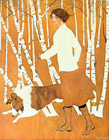
Coles Phillips was a Golden Age illustrator who popularized the "fadeaway" style of magazine cover.
In the fadeaway style, the subject is painted with flat colors that blend into the background tone, allowing the viewer's imagination to complete the lost contours.
 |
| Kanizsa Triangle |
The name for this perceptual trick is "illusory contours," and images that included them were very popular around the turn of the 20th century. There was another flurry of interest in the illusion when Gaetano Kanizsa published his triangle illusion in 1976.
"It was a number of years ago that the idea of the fadeaway style came to me. I was doing some advertising for a cigar company. The poster had to be done in solid blacks and whites, and I tried for some time to think of a new stunt for using them—something unusual and striking. At last I hit upon the fadeaway idea and tried it out. It seemed to take pretty well. And after that I used it quite often for a while."
"At that time I had a number of other artists working for me in the advertising business, and I tried to get them to do the stunt too. But they didn't seem to look at it the way I did, and they weren't so successful with it. If, for example, I was drawing a horse's head I made the whole head the same color as the background and let the bridle show the outlines of it. But the other artists always tried to put a highlight on it somewhere or did something else which changed the whole idea. So I gave it up for some time and didn't use the idea any more until after I began doing stuff for Life."
Phillips got the idea to apply the fadeaway style for the covers of Life Magazine.
"I thought it would be just about what Life wanted, and tried it out. This was in the middle of 1908, and since that time I have had about all I could do in the fadeaway line. The idea seemed to be popular and took so well that I kept receiving orders for similar drawings. I have done a good many of the other kind of covers, but the fadeaway stuff seems to be the most popular."Coles Phillips is the cover feature of the new issue of Illustration magazine. The issue also features editorial cartoonist Ollie Harrington and sporting illustrator Aiden Lassell Ripley. At the Illustration website, you can preview the issue online.


Just curious, have you ever seen any Phillip's fade away originals in person? I've always wondered if he worked on a toned board, or colored paper since the "fade away" backgrounds usually seem so perfectly flat in color which would be tough to achieve with his watercolor style.
ReplyDeleteFascinating post! I'm writing about Phillips on my blog (myyearin1918.com) and it's interesting to learn how he came up with the Fadeaway Girl.
ReplyDelete