Friday, July 31, 2020

Photographers and the Great Depression

Local children enjoy a dip in the pool in front of an Iron City billboard,

The photographs that document the Great Depression give a vivid record of life in America during the hard times nearly a century ago.

John Vachon/Library of Congress. (May 1938)

Those photos didn't just happen on their own. They came about as a result of a federal program to document the work of the FSA agency (Farm Security Administration). The program was launched by President Franklin D. Roosevelt and headed up by Roy Stryker. 


Stryker and his staff handed out detailed lists of subjects for the photographers to shoot as they fanned out across the country. In a shooting script for farm debt adjustment, the list included "Milk blockades -- dumping -- rioting -- trucks tipping over, etc." and "Worried farmer (going over accounts, etc.)" 
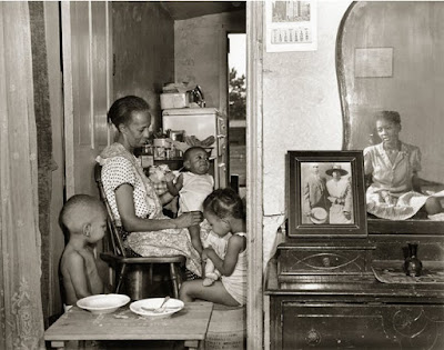
Arthur Rothstein

The program yielded many benefits. It launched the careers of photographers such as Dorothea LangeArthur RothsteinWalker Evans, and Ben Shahn. Secondly, as the images were printed in magazines, Americans were able to see how their fellow citizens fared. Finally,  it gave meaningful work to photographers, capturing images that might otherwise not have been recorded.  
----
Read More:

Thursday, July 30, 2020

How do you force yourself to improve?

Comando Speciales on YouTube asks: "How do you force yourself to improve? I'm a fine arts student and every time I try to paint or draw I get absolutely frustrated and feel like quitting. I like it and want to get better at it, but there's like a mental barrier. I know that we all have to start at some point to improve, but I feel like I'm old and after many years of doing this I simply can't get better at it."

My answer: Don't worry too much about improving, especially if you're forcing yourself. You'll improve if you keep experimenting and having fun. 

All through my career I have had plenty of moments of frustration. When I feel that way, I tell myself that all problems yield to effort. There's no shame in starting over, scrubbing off a lay-in, or trying a new material. Good paintings often have difficult births.

There's also nothing wrong with being frustrated. John Singer Sargent was like a boiling teakettle during every painting. He muttered "Demons, demons!" under his breath all the time. Embrace frustration; it's really your friend. It's good to intentionally pursue difficult challenges.

The person I worry about is the one who is too satisfied and never tries anything new. You've seen this person at sketch groups. They always use the same materials, same methods. They get the same results and they never get better.

If you have an insurmountable challenge, break the big problem into smaller parts that you can master. If you're painting an elk, take an hour in your sketchbook to draw elk antlers from various angles. If you're animating for a 1930s style video game, copy some character designs from that era. 

And don't worry about being too old. Your brain is capable of learning and growing at any age.

Wednesday, July 29, 2020

Interview with Pencil Kings


Here's a new podcast interview with Mitch Bowler of Pencil Kings. 

We discuss: 
Time management 
Thoughts on social media
Tips for making art videos
Radio and podcasting
Limited palettes
Painting exercises from Color in Practice
How to get started
Commitment and risk in traditional media
Art school myths, learning cultures
Composition and eyetracking
Taking risks
Online education
Learning with new technology
---

Tuesday, July 28, 2020

Irving Wiles

Irving Ramsey Wiles (1861-1948) painted this reclining woman in 1895 using watercolor, graphite, and gouache on paper. The size is 22 x 28 in. (55.9 x 71.1 cm). 

Irving Wiles, The Green Cushion

Her mood a bit of a mystery. The needlepoint pillow conceals half her face, and she lies languidly on the Empire revival-style recamier couch.

The painting is called "The Green Cushion." He could have called it "Reclining Woman" or "Melancholy." The title signals that color is a factor, and indeed the green patch behind the woman sets off the pearlescent tones of her skin.  


The painting, which won a prize at the American Watercolor Society's 1897 exhibition, is a feast of edges, contrasts, and accents, bringing to life the velvet cushions and silk dress. In addition to being an illustrator, he was a popular portrait painter. 
----
Website with more about Irving Ramsey Wiles 
Wikipedia about Irving Ramsey Wiles


Monday, July 27, 2020

To See, Your Eyes Must Move

In order to see anything, your eyes must move around. 

Painting by Magritte
In a classic scientific study back in 1976, John K. Stevens anesthetized test subjects but kept them awake. As they sat awake with their eyes open, but unable to move them, subjects found that the images quickly faded. 

Because they were unable to move their eyes across the visual field,  they couldn't re-stimulate the retina. Without constantly changing levels of stimulation, the neurons ceased delivering signals. 

The test subjects felt a strong impulse to move their eyes, and wanted to move them. It felt to them that moving their eyes would take a huge effort, and they just couldn't do it.

Another surprising result of the study was the sensation that the visual field was displaced in the direction of the anticipated jumping eye movement (or saccade) that they intended to make. 

As author Brian Dilg put it, "They were catching their own brains trying to make sense of an image that did not shift as it normally would when the eyes move."

What generates the impulse for a saccade? Vision specialist Dr. Martin Rolfs says, "When you analyze how many of our saccades are triggered by external events, you'd probably end up with very little. A part of the scene that has high contrast will probably capture your eye movements. But as soon as you have the second or third saccade, the influence of this basic visual information in the scene will become less important. Your own interests and your own task that you have at the moment will be much more influential."

This confirms an important insight for picture-makers. The observer's eye pathway does not follow passively through the composition like a ball on a track. It is driven by the viewer's own conscious and unconscious curiosity, and the artist's job is to awaken that active participation of the viewer.
----

More in the book "Why You Like This Photo" by Brian Dilg.  It's a gem of a book, designed for photographers, but full of insights about visual perception that artists can also benefit from.

Sunday, July 26, 2020

Giacomo Favretto

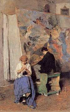
Giacomo Favretto (Venetian 1849-1887) was a 19th century painter who specialized in warmly anecdotal scenes of regular Venetians going about their work and play.


In the painting "Vandalism" or "Poor Old Masters," a retoucher dabs at a Titian or Tiepolo while his wife is busy sewing beside him. The sentiment is good-spirited and sympathetic, despite the title.

Favretto got his start working for a pittance in a stationer's shop cutting silhouettes out of black paper, when a wealthy person discovered him and set him up at the Venice Academy.


Favretto studied plenty of old masters at the Venice Academy with Pompeo Molmenti, and he also studied in Paris, but Favretto and other artists of his generation felt that the grand, serious compositions of mythological or historical figures was out of date.

"The Defect is in the Handle" 1881, by Giacomo Favretto

According to a 1902 book called The History of Modern Italian Art, he soon developed an independent style inspired by the younger artists of Venice such Domenico Morelli.


Subjects were taken from everyday life, ordinary people at work and play rather than mythological or historical figures. The paint surface alternates finished areas with loose sketchy passages, suggesting an improvisational approach to composition.


Favretto painted large areas of quiet colors, such as grays and browns, a patch of white and black, and a dash of orange, green, or red.


His success brought him to the top of society, with regular visits to Queen Margherita, quite an accomplishment for the son of a carpenter. 


But he had his hardships along the way, including the loss of one eye. 


 The 1902 book says: "The prominent traits of Favretto's character were the gentleness and kindliness of his disposition. He seems never to have wished anything but good to any human being, and he showed it both in work and in his relations with his friends."
----- 
Book on Amazon: Giacomo Favretto 
Giacomo Favretto on Wikipedia

Saturday, July 25, 2020

Roman Battle Galleons


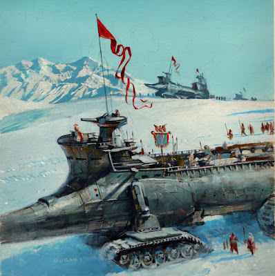
What if Rome never fell and they went on to conquer the world with motorized battle galleys? This concept plays out in Kirk Mitchell's science fiction series, Procurator. This was one of the preliminary sketches.

The final painting was a wraparound cover of a sand galley, an open-topped troop carrier, battle platform, and siege weapon built along the lines of a trireme.
-----
Previous post: Alternate History

Friday, July 24, 2020

Imaro Color Sketch


Imaro is an African superhero character created by novelist Charles Saunders. This is an unpublished oil sketch for a paperback cover.
----

Thursday, July 23, 2020

Sketch for a Space Comedy


I did this concept sketch for an unproduced Ralph Bakshi space comedy around 1981. It was kind of a mishmash of Star Wars, Wizards, and Heavy Metal Magazine.

Wednesday, July 22, 2020

Odd place to find a lobster

In the fishing villages of Connemara, Ireland, they say: ‘is fánach an áit a bhfaighfeá gliomach’ —"You'll find the lobster in the unexpected or neglected places."


When I'm looking for a subject to paint, I sometimes think of that saying. I have a hard time "finding the lobster" in the popular painting destinations where artists gather to paint picturesque views.

Instead I'm inspired by the odd, out-of-the-way places. An odd place to find a lobster. Sometimes the subject emerges when I see a weird juxtaposition of forms, a revealing effect of light, or a cropping that brings special meaning to a perfectly ordinary scene.  
  

Tuesday, July 21, 2020

Watercolor as a Controlled Emergency


RLD Studio asks: "I noticed you chose to eliminate some elements like several lily pads and make the frog larger in relation to the pad it was sitting on. I assume you did so to improve the composition. I find myself hesitant to change too much of an image when I'm painting outdoors... I'd love to hear your take on this and if you changed your approach over the years."


Normally, I try to stay true to what I'm seeing. But you're right, those changes happened, not so much as a deliberate compositional decision, but rather as the result of a sort of controlled emergency, like landing a parachute in a windstorm. I tried to lock in the frog first, assuming he'd move, and built the lily pads around him. I deleted some of the closer pads to make space for the rippling water which gave the picture some movement and context.
----

Monday, July 20, 2020

Painting a Frog and Wondering about Umwelt


In this new video, I paint a green frog from life. I'll need him to hold still over an hour. Will he do it? 

I consider the question of the frog’s Umwelt or its particular viewpoint of its environment, and I pose the philosophical question of whether we can ever understand the subjective experience or the cognitive ability of any animal, given that it lives in a very different perceptual environment.
---

Sunday, July 19, 2020

Foam on the Water

Rapids in a small stream pull air bubbles underwater. Those submerged bubbles take on a soft warm glow and rise to the surface in ringlets that are lightest just below the standing wave. A few dots of foam are flung up into the air. I soften the focus on the rest of the image both to save time and to put the detail in the areas where I'm most interested.

Saturday, July 18, 2020

Louise Abbéma

Louise Abbéma (1853-1927) was a French painter who specialized in flowers and portraits, particularly of women.

She studied with  Charles Joshua Chaplin, Jean-Jacques Henner and Carolus-Duran, and one of her early successes was a portrait of the actress Sarah Bernhardt, who remained a close friend for life.


According to the National Museum of Women in the Arts, "Her high-society portraits executed with a light touch and rapid brushstrokes reveal the academic and Impressionist influences that shaped her style. Her sitters included French diplomats and other notable members of society. Abbéma developed a variety of techniques using oil paints, pastel, and watercolor, and worked on various supports, including fans."
-----
Louise Abbéma on Wikipedia

Friday, July 17, 2020

Academy Board


During the 19th century, the plein-air painting movement was fostered by several key innovations in art supplies, such as collapsible paint tubes, metal-ferrule paintbrushes, lacquered metal paint boxes, canvas board, and millboard.


Another kind of board known as "academy board" was a popular surface for oil studies. According to Alexander Katlan, "as its name implies, academy boards were an inexpensive, thin, semirigid support created for the professional artist's use in quick oil sketches and studies. They were a cheaper, disposable alternative for an oil painting support than prestretched canvas or wooden panels."

Academy boards were manufactured from pulp board and primed with a lead pigment in a light gray or white color. To solve problems with warping, they were sometimes primed equally on the back surface. Various manufacturers offered alternatives with a canvas or thin fabric surface, and with other priming colors.
----
Source: The American Artist's Tools and Materials for On-Site Oil Sketching by Alexander Katlan, Journal of the American Institute for Conservation

Thursday, July 16, 2020

Seven Tips for Painting Moonlight


Here are seven tips for painting landscapes in moonlight:
1. Use cool, grayish colors.
2. Reduce chroma.
3. Unify Shadows.
4. Make them nearly opaque.
5. But don't go too dark overall.
6. Use warm accent lights for contrast.
7. Trust your memory more than photos.
------
More in Color and Light: A Guide for the Realist Painter, 224 pages, softcover, 9 x 10.5 inches. Purchase on Amazon or signed, directly from me.

Wednesday, July 15, 2020

Saul Tepper Thumbnail


Here's a thumbnail sketch by American illustrator Saul Tepper (1899-1987). This has all the qualities a good thumbnail should have:
1. Basic story situation reads immediately. Guy comes into a disordered room and sees woman on bed.
2. Simple tonal organization. She's light, he's dark. Coats on wall behind her frame the curve of her hip.
3. Basic acting through body language is strong. He seems shocked or angry, she seems sick or weak.
4. All other less important details are barely suggested and subordinated.
----
Illustration Art blog has a great post about Tepper's thumbnail sketches.
A lot of people don't know that Saul Tepper was also a songwriter. Here's one of his tunes.

Tuesday, July 14, 2020

Wisdom from a Peanuts Cartoon


Charlie Brown compliments Linus on his drawing of a man. Charlie says: "I notice that you've drawn him with his hands behind his back. You did that because you yourself have feelings of insecurity."

Linus: "I did that because I, myself, can't draw hands!"
----
©Peanuts / Charles Schultz

Monday, July 13, 2020

Movie Pitch: Epsilon Virus

Here's an idea for a movie story that I call "The Epsilon Virus": 

Communication from the International Space Station goes dark. A rescue mission of four people goes up to find out what happened, leaving two in quarantine in the arrival pod. The advance team discovers all the astronauts have transformed into reptilians who speak and act in superhuman ways that the rescuers barely comprehend. 
The reptilians cut off all communications with Earth. As each crew starts making sense to each other, the rescuers find themselves transforming too: one develops a turtle head, the other a lizard. An alien virus? Or a weird life cycle? It's clear the humans have gained in intelligence and capacity. 
The two humans who stayed back in quarantine must decide whether a) to cut loose and return to warn Earth, b) to escape with the aliens to the Epsilon system, or c) kill everyone on both crews.
PS I did this sketch in a copy ofColor and Light, one of dozens of copiesordered by the entire WETA Creatures team.

Sunday, July 12, 2020

Is Time Linear or Circular?

The helicoid geochronograph is Dinotopia's water-powered timepiece that reconciles cyclical and linear conceptions of time. 


Which is it? Is time linear or cyclical? Here are some arguments in favor of each view:

Linear
1. Things decay. The Second Law of Thermodynamics says that all systems tend toward maximum entropy.
2. Time cannot be reversed. Organisms grow older and die. Time travel isn't possible.
3. The past adds up. Libraries fill with books and our computers fill with data.
4. Time is precisely measurable in linear terms using clocks and other devices. 

Cyclical
1. The planets and seasons repeat their movements in very predictable ways. 
2. Cyclical time is more useful and increases our connection to nature. 
3. It's a falsification of history to see it only in terms of progress, because cycles of growth and decay can be well documented in human history.
4. We tend to underestimate the effects of circadian rhythms on the changing states of our body and mind.

Can we have both? Is it possible to keep both of these conceptions in mind at the same time? I think so. Even in the Western tradition, we say both "time marches on" and "history repeats itself." 

Saturday, July 11, 2020

Why Draw from Life?

domi_digital asks: "I need to get something cleared up. What is the biggest reason that pro artists tell me to draw from life? My opinion is, it's to get a sense for 3d space, and therefore placement of objects in that space. I've drawn from life before, but as a beginner it was really overwhelming. I drew still objects, but I can't even imagine how hard it is to draw a moving subject."


Answer: Yes, you're right. Translating 3D space to a 2D piece of paper is a cognitive skill that you develop while drawing from life. Does that skill make you better at creating a sense of solid 3D form or a feeling of depth when you draw from your imagination? I don't know, but I suspect it does. 

Also, as you suggest, when you draw a moving object, you develop your speed of execution. You'll be able to paint a picture in a fraction of the time it would take you in the studio. 


But drawing from life is more than a method of developing your skills. It builds your visual vocabulary. It puts you in direct contact with visual effects that cameras can't see. 

There's no filter. There's nothing between you and the subject: no lens, no film, no sensor, no distortion, no picture frame, no style guide, no color picker, no caption, and best of all, no words. As long as you're looking at photos or other people's art, you remain in the cave looking at shadows on the wall

Drawing by A. Menzel, 1902 
Profile study of a man with
sketching block and pencils
Drawings done from life by artists from centuries ago somehow transcend the stylistic mould of their times. 

Finally, it's a powerful experience on its own terms that makes you feel more alive and connected. When you draw or paint from life, you become very aware that everything is moving and changing: the sunlight moves, flowers fade, and the tide comes in. It's always a good thing to get in touch with the dynamic universe.

Friday, July 10, 2020

Wisdom of Austin Briggs

The new issue of Illustration Magazine (#68) takes an insightful look at American illustrator Austin Briggs (1908-1973).  


One thing that makes this issue special is that it quotes extensively from Briggs's rare master course that he made for the Famous Artists Course, so we get wisdom from the artist himself. Here are a few excerpts:

PERSISTENCE
"When a painting is going well, I am conscious only of the fact that I am having a wonderful time. When it is going badly—and very often it is—I am miserable until I find out what is wrong. This may take minutes, hours, or even days. But by hanging on and never giving up, I finally get something close to what I want."


IMITATION AND ORIGINALITY
"I cannot imagine anything more frustrating than the life of an imitator. When the vogue for the originator is over, or when the originator stops painting, the imitator is finished, too. Imitation is the blindest of all blind alleys, and the most destructive habit a beginning artist can possibly get into. I know. I can speak from experience, because when I was an immature artist I imitated like mad. Eventually I discovered that this kind of thing doesn't pay in the end. The only way to paint is to go to life and reality for material, and to express the excitement and emotion you feel as directly as you can in your own way."   


ADVERTISING ILLUSTRATION
"Every element in the advertising illustration must be slanted to appeal to the particular audience or 'market' the client is trying to reach. The picture must tell its story directly, so that the page-flipper gets its message in one quick glance. Above all, the painting must create a positive emotional response which leads directly to an enthusiastic acceptance of the product."


STYLE
"If I have a style, it is not a deliberate, conscious attempt to exploit a group of popular clichés. It is rather an unconscious projection of my personality into paint. Style is never created out of whole cloth. Style is the natural and inevitable reflection of my personality. Style is the direct expression of what you are. It is as intimate a matter as your manner of speech, the way you walk, the way you sign your name. Everyone inevitably has a style of his own—if he tries honestly to express what he feels, without trying to imitate someone else. Therefore forget about the question of style. Instead, concentrate on becoming a person. Learn to react—to feel, to love, to want, to dislike—and style will take care of itself." 
----

Previous posts on GurneyJourney about Austin Briggs

Thursday, July 9, 2020

Images of 19th-Century Evictions

With bans on evictions expiring in many states, the sad truth is that a great many renters will be forced out of their lodgings. Let's see how artists portrayed evictions in centuries past.
 
Blandford Fletcher, "Evicted" (1887)

William Teulon Blandford Fletcher (British, 1858-1936) focuses on the powerlessness of the widowed mother. The child clutches an umbrella, as rain will surely come, and she drags a toy horse that has fallen on its side. Villagers look on sympathetically.

"The Sale of Old Dobbin" by John Robertson Reid (1851-1926), 123 x 187cm.

According to BBC: "This picture tells the story of an event that happened in 1874 when a farmer worker, William Bromley, was evicted from his farm at Yalding in Kent and forced to sell off all his belongings, including his faithful old horse Dobbin. William Bromley is seated front left and the young girl next to him, weeping quietly in a handkerchief, is his eldest daughter Emma, who was ten at the time. A few months later the family emigrated to New Zealand." 

Art historians believed this was a fictional image until a descendant saw the painting in a museum and recognized his great-great grandfather and his story.


Erik Henningsen (Danish, 1855-1930) painted “Foreclosure” in 1892. The plight of the family is heightened by the snowy weather. The father is powerless to negotiate with the constable, who reads from the law book. 


There are many photographs of Irish evictions, as many families were forcibly removed from their farms in the decades after the Famine; this one is in County Kerry. See photos and stories of the Irish resistance and the practices of British landlords at this blog post.


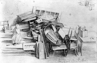
In 1844, Adolph Menzel documented a pile of household contents from someone moving out of a cellar. Chairs are stacked at right and a woman sits on the pile at left. I'm not sure if they were evicted or just moving, but the stuff seems piled hastily. 
-----
Read and see more online:
Post-Famine Eviction Photographs (Ireland)

Wednesday, July 8, 2020

Polenov's Drawing Evenings

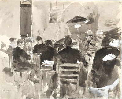
Vasily Polenov (Russian, 1844-1927) hosted artistic gatherings at his home where his friends could assemble to draw costumed figures.

Konstantin Korovin. Artists at a “Drawing Evening” at Vasily Polenov’s

Fortunately a few of these "drawing evenings" were documented in quick sketches. The model is visible dressed as a soldier.

For the session below, the model was dressed in a desert costume, probably acquired by Polenov on a trip to Egypt and the Near East when he was researching Biblical paintings. 

Yelena Polenova. Artists at a “Drawing Evening”
at Vasily Polenov’s Home. 1889

The sketch is by Vasily Polenov's sister Yelena Polenova, an artist who became well known for her illustrations of fairy tales. 

 
Here is one of her paintings, called "The Beast."
------

Tuesday, July 7, 2020

Hans Gude in Britain

Norwegian landscape painter Hans Gude (1825-1903) wanted his work to be better represented in the British art market, so he went to to England, Scotland, and Wales to paint there. 

Hans Gude, Scotland, 1889

He noticed a different approach to plein-air work among British painters. 

Hans Gude, Fresh Breeze off the Norwegian Coast

Among Scandinavian painters in the 1850s, most artists made plein-air paintings on location and then brought the studies back to the studio, where they used them as reference for their larger studio works. 

He noted the practice was different in England, where artists would often paint finished works on location. He wrote: "My English stay was of great benefit to me in that I freed myself from many of the prevailing studio maxims by being alone and in a landscape so new to me that it forced me to observe more keenly."
----
Hans Gude on Wikipedia