In my recent painting of a street scene in Ireland, I decided not to include people in the scene.
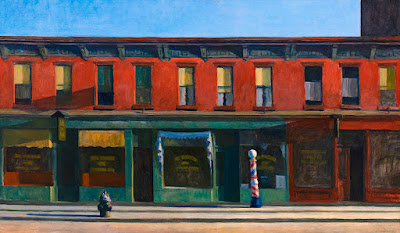
The image that occurred to me was Early Sunday Morning by Edward Hopper, painted in 1930. He says that the word "Sunday" was tacked on by someone else.
With or without the title, the painting gives the feeling of either a quiet morning when people are still asleep or a desolate row of shops stilled by the Great Depression.
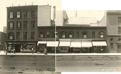
Hopper said the scene "was almost a literal translation of Seventh Avenue" in New York, but it wasn't literal at all, as you can see from the photo.
He rolled up the awnings, cleared away the far buildings, and blurred the signs on the shops. He also originally planned to have a woman looking out of an upper window, but he removed her.
By holding back on specific details his painting transcends a literal portrait of an actual street and achieves a more universal appeal.


This is a painting I've always admired. I consider it a textbook example of rhythm in a composition. You're definitely correct about the lack of people lending a universal feeling to the image.
ReplyDeleteThis is a painting I've long admired. I use it as an example of rhythm whenever I'm teaching composition. You're definitely correct about the lack of people lending the painting a universal feeling.
ReplyDeleteAs a practicing architect and amateur artist, I appreciate how Hopper uses architecture in his paintings. The subject matter is architecture, but the subject is loneliness. In "Early Sunday Morning" he paints a row of buildings in a virtually flat elevation, a sort of orthographic projection an architect would use. But the strong light source and long shadows are the work of an expressive, creative mind making a painful commentary on a world with plenty of detail but no sense of life. Not a human being to be found. Not even a cloud in the sky. It might as well be the surface of the moon. To me, it makes for a devastating image of heartbreaking beauty that only Edward Hopper could make. Simply marvelous.
ReplyDeleteDo you have any idea why the third window from the left seems to be casting a shadow?
ReplyDeleteDo you have any idea why the third window from the left seems to be casting a shadow?
ReplyDeleteThe long shadow to the left of the third window from the left is cast by a sign protruding from the face of the building; the sign can be seen in at least one other photo of the Seventh Avenue building from a later date (than the one in this post) and corresponds with other architectural details.
ReplyDelete