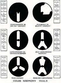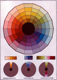
Another method, intended not only for the painter, but also for the interior designer, was published by Pedro J. Lemos around the same time.
The color designer can choose from six “color harmony dials” that can be placed over the wheel and rotated, revealing families of colors.

Lemos used a color wheel with lighter tints on the outside and darker shades on the inside. As a result, the colors visible within the dials include tints and shades, but lack any real deliberate choice of relative chroma or intermediate mixtures.
Thanks, Aaron Miller!

James, where do you get your color inspirations when rising these tools?
ReplyDeleteusing*
ReplyDeleteIs there anywhere where these can be bought today?
ReplyDelete(Well, I suppose an alternative, one could be made of card to fit over an existing colour wheel.)
ReplyDeletewww.livepaintinglessons.com/gamutmask.php
ReplyDeleteI'm not quite sure what you mean by "lack any real deliberate choice of relative chroma or intermediate mixtures"...but it's cool to see these old books being brought into the light again.
ReplyDeleteI need these for students...what a great idea...a bit of color theory in a box...maybe James will put his celebrity to use and get these made as a bonus item to be included with his painting book release... unfortunately my celebrity is not enough to coax him into action...but never hurts to ask...
ReplyDeleteDaroo, thank you for the link to the fabulous interactive color wheel. With a good printer you could print it out and have it be reasonably accurate as well, and just cut out the dials.
ReplyDeleteThanks Daroo!
ReplyDeleteAs a mildly colorblind animation artist, i'm always so interested in the objective science of color and color balance. thanks for digging up this awesome reference!
ReplyDeleteThanks James - another very useful post which I'm highlighting to my readers.
ReplyDeleteIt seems as if this aspect of developing a colour palette is something people tend to come to after they've learned how to paint. However there's not much out there - a conclusion I reached because my post about Colour Schemes: Split Complementaries, Triads and Tetrads is still very popular 30 months later.
I've also got a colour wheel which does the dial thing - and I can confirm it certainly helps me to fix on colour palettes for formal artwork when I'm trying to limit colours.