Thursday, February 28, 2013

Dinotopia painting, step by step

Here is an animated step-by-step sequence of a painting from Dinotopia: Journey to Chandara (2007). The painting shows a retired musical conductor named Cornelius Mazurka and his Therizinosaurus Henriette (left) surrounded by old musical instruments, with Arthur Denison and the Protoceratops Bix on the right.

Dinotopia step by step -- slower photo Dinotopiastepbystepslower.gif
(Direct link to animated gif) This way of painting involves doing a careful pencil drawing on illustration board, sealing it with acrylic matte medium, laying in transparent color, and then proceeding to the finished rendering, area by area, beginning with the center of interest.


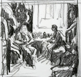
EDIT: to answer Tom's suggestion, I've made the animation a lot slower. And Ben, I have added above the preliminary pencil thumbnail showing how I worked out the basic tonal design before getting models and shooting reference. In this case I didn't do a full charcoal preliminary, just this quick (but very helpful) tonal study.
-------
The original painting "Old Conductor" is currently on exhibit at NHIA in Manchester, New Hampshire through March 13.
Thanks to Stapleton Kearns and Lines and Colors for reviewing that exhibit.
Journey to Chandara signed from my web store and from Amazon
More about technique in my book Imaginative Realism 

Wednesday, February 27, 2013

From Inspiration to Execution

Robert Louis Stevenson describes how a work of art changes in the translation from inspiration to execution.

"A work of art is first cloudily conceived in the mind; during the period of gestation it stands more clearly forward from these swaddling mists, puts on expressive lineaments, and becomes at length that most faultless, but also, alas! that incommunicable product of the human mind, a perfected design. 

"On the approach to execution all is changed. The artist must now step down, don his working clothes, and become the artisan. He now resolutely commits his airy conception, his delicate Ariel, to the touch of matter; he must decide, almost in a breath, the scale, the style, the spirit, and the particularity of execution of his whole design."
-----
Painting by Rupert Bunny, (Australian, 1864-1947) "Pastorale." Here's a big file on Wikimedia Commons (Thanks, Mike Dubisch)
Robert Louis Stevenson, Essays in the Art of Writing

Tuesday, February 26, 2013

Mould explains the the strange properties of magenta


(Video link) Using colored flashlights, science presenter Steve Mould explains why the color magenta doesn't appear in the rainbow.

---- photo rotating-dots.gif
In this optical illusion, the magenta dots switch on and off in series, producing a green afterimage on the retina. The effect is especially strong if you look at the cross in the center. Via Biotele, thanks, Damian J.

Related topic: the yellow we see on our computer monitor or our TV isn't really yellow; it's a blend of green and red, as explained in a V-Sauce video.

Previously on GurneyJourney
Mystery of Magenta

Star Trek, Pixar Style

Phil Postma has re-imagined the Star Trek characters in the style of Pixar. See the rest of the Star Trek characters at Phil's blog. He did the same thing with Star Wars characters.

Thanks, Steve.

Monday, February 25, 2013

Sketch of cat turned into animated gif

Cat's Lunch by James Gurney photo CatsLunch.gif
I missed my old cat, so I turned a sketch of her into an animated gif.

How to share this gif on your blog:
1. Copy the gif to your computer (make sure the file ends ".gif" and not ".jpg")
2. Upload the file to an image hosting site such as Photobucket
3. From the "Image links" dropdown, copy the HTML code.
4. Paste that code into your blog's composing window.

How to create animated gifs from your drawings:
1. Redraw parts of the pose, such as head turns.
2. In Photoshop, isolate parts of the drawing as independent pieces.
3. Create a Photoshop file with each element on a separate layer.
4. By switching on and off visible layers, create frames of animation.
5. Upload frames into online gif-creator such as "imgflip.com" and adjust settings
6. Upload file to Photobucket, etc. as above.


(Video link) Video: "Animated Gifs: The Birth of a Medium" from PBS Off-Book.
Another video: "Short History of the Gif" 
Thanks, Ben Valentine

Sunday, February 24, 2013

WPI Game Development

On Thursday I visited the Worcester Polytechnic Institute (WPI) in Massachusetts as a guest of the department of Interactive Media and Game Development (IMGD), where I gave a  lecture on Worldbuilding.

The IMGD program at WPI is designed to provide students with both programming expertise and art knowledge so that they're well rounded in their approach to interactive design.

One of the professors is Britt Snyder (left, with a Jordu Schell sculpt between us). Britt has worked as an artist in the field of video game development for the past 13 years, with clients like SONY, Blizzard, Liquid Entertainment, Rockstar, THQ, and many others.
He teaches 3D modeling, digital painting, and concept art.

WPI was one of the first to develop a program in game design, and is one of the top-ranked academic programs in the field. Since the department is part of a larger engineering school, there's always a focus on blending art and technology, with an eye on fostering close working relationships between artists and programmers.

Students get to jump right in and participate in hands-on projects and collaborations, creating games, virtual environments, interactive fiction, art installations, collaborative performances. They are encouraged to invent entirely new forms of media.

I was thrilled to be invited by PhD candidate Jia Wang to try out the virtual reality mo-cap lab, dubbed "Phase Space."

I am wearing a stereoscopic head-mounted display and holding a tracking constellation (basically a souped up Wii controller with very precise tracking points). 

The myriad sensors mounted on the outer frame follow  the exact 3D movements of my head and hand-held wand, turning me into a St. George with a sword facing off against a dragon, or whatever. 

Small fans mounted on the outer frame can generate the effect of wind, so that the player can feel completely immersed in a virtual environment.
------

Saturday, February 23, 2013

Digital gamut mapping tool for Windows

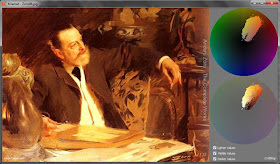
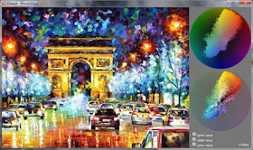
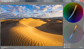
Cristian Romero has created a free digital tool for analyzing color schemes. All you have to do is drag a "jpg," "png," or "bmp" into a box, and it will output a gamut map. The gamut map shows which colors are inside the color scheme and which are outside.


Here is a painting by Anders Zorn, showing the narrow range of colors used in the picture. The scheme is centered in yellows and oranges. The "extra-gamut" colors (colors that don't appear in the scheme) are magenta, blue, cyan, and green.


This image has a wider gamut, extending across neutral gray at the center of the circle. It has full intensity yellows and reds as well as some cyan, green, and violet. The gamut doesn't reach all the way to the outer edges of the circle because some hues are only partially saturated.


Here's a fine example of a complementary gamut, a narrow slice of the color wheel from orange to cyan-blue.

The gamut mapping idea is useful both for analyzing color schemes, as we see here, but also for generating the color schemes that you want for your picture.
------
Further reading and exploration
Christian Romero's KGamut (samples) and free download (It works in Windows with Linux and WINE and it worked fine - openSUSE 12.2. ;-)
There are other digital tools at Live Painting Lessons
There's more about gamut mapping in my book Available on Amazon and signed from my web store.
Previously on GurneyJourney:
Gamut Masking, Part 1
Gamut Masking, Part 2

Friday, February 22, 2013

Animated cube-snake

(Direct link to YouTube) Chris Carlson created this chalk drawing animation showing virtual cubes moving in a snakelike fashion as they chase after a sphere in virtual 3D space.


The images are anamorphic illusions projected on the oblique surfaces of a seamless surface. Drawing and erasing the squares took Carlson 30 hours over four days.
Via BoingBoing

New Hampshire Institute of Art

On Wednesday I visited New Hampshire Institute of Art for a demo and lecture. The school occupies 12 historic buildings in downtown Manchester, New Hampshire. 

NHIA offers BFA programs in Ceramics, Painting, Photography, Interdisciplinary Arts, Arts Education, Graphic Design, and Illustration. 

There are 170 illustration majors out of a student body of 540. The Illustration faculty includes (from left to right) Ryan O'Rourke, Leigh Guldig, Jerry LoFaro, Kristina Carroll, me, Natalya Zahn, Jim Burke, and Doug Sirois. Follow the links to see their work on their personal websites. 


Kristina Carroll teaches courses on Science Fiction/ Fantasy and Worldbuilding. Above are some samples of student work. Kristina says: "Good technique is the foundation of all illustration, and concept is the heart of it. Regardless of style or subject matter, by learning the tried and true methods of the old masters and developing a strong process, students will acquire the tools to develop share their ideas clearly."

Speaking of tools, one student named Daniel showed me the sketching box he improvised. He hot-glued watercolor half pans onto the inside of the lid at far right, and mixed the paint on the inside surface. Smart idea! Who needs to buy those expensive watercolor sets?

NHIA is also hosting a small show of 25 original Dinotopia artworks, including "Dinosaur Parade" (above, frame by Troy Stafford), "Garden of Hope," "Dinosaur Boulevard," "Small Wonder," "Up High," and "Waterfall City." There are also a few preliminary sketches and reference maquettes. The show, organized by the Norman Rockwell Museum, contains a completely different set of artwork from the recent show in Connecticut. The NHIA museum is located at 77 Amherst Street and will be up through March 13.

Lines and Colors announcement of the show, with closeups of Dinosaur Parade

Thursday, February 21, 2013

Paint-Brush Duel

I'll be giving a free lecture tonight at the Worcester Polytechnic Institute in Massachusetts.
-----
Incoming male students at the Ã‰cole des Beaux-Arts in Paris a century ago were forced to endure some amazing hazing rituals. One involved stripping naked and dueling with loaded paint brushes.


"The Hungarian and one of the French nouveaux were next seized and stripped. Then they were ordered to fight a duel, in this fashion: they were made to mount two stools about four feet apart. The Hungarian was handed a long paint-brush dripping with Prussian blue, and the Frenchman a similar brush soaked with crimson lake. Then the battle began. Each hesitated to splash the other at first, but as they warmed to their work under the shouting of the committee they went in with a will.

"When the Frenchman had received a broad splash on the mouth in return for a chest decoration of his adversary, his blood rose, and then the serious work began. Both quickly lost their temper. When they were unwillingly made to desist the product of their labors was startling, though not beautiful. Then they were rubbed down vigorously with turpentine and soiled towels, and were given a franc each for a bath, because they had behaved so handsomely.

"Bishop was made miserable during the ensuing week. He would find himself roasting over paper fires kindled under his stool. Paint was smeared upon his easel to stain his hands. His painting was altered and entirely re-designed in his absence. Strong-smelling cheeses were placed in the lining of his "plug" hat. His stool-legs were so loosened that when he sat down he struck the floor with a crash. His painting-blouse was richly decorated inside and out with shocking coats of arms that would not wash out. One day he discovered that he had been painting for a whole hour with currant jelly from a tube that he thought contained laquer."

From Bohemian Paris of Today by Eduoard Cucuel, 1900. J.P. Lippincott, page 45.

Wednesday, February 20, 2013

Lighting with Unreal Engine

(Direct link to video) One of the reasons I'm glad to be a traditional painter in a digital age is that there's so much to learn from my fellow artists who are on the cutting edge of computer graphics.


In this video, Epic's senior technical artist Alan Willard takes us on a walk-through demo of Unreal Engine 4, a digital toolset used by a lot of game developers. The game engine offers designers the ability to modify parameters and see how they look in real time. 

Even if you don't use such tools or play such games, there's a lot to learn from the increasingly sophisticated vocabulary and way of thinking about the effects of light and smoke and surfaces and particles in the 3D game world.

Tuesday, February 19, 2013

New Hampshire exhibit opens tomorrow

New Hampshire Institute of Art opens its Dinotopia exhibition tomorrow, Wednesday, February 20.


The show of over 20 original Dinotopia paintings and drawings will be on view in the Amherst building through March 13.  Paintings include "Dinosaur Parade" (above, frame by Troy Stafford), "Garden of Hope," "Dinosaur Boulevard," "Small Wonder," "Up High," and "Waterfall City."

After the opening I'll give an illustrated lecture about "Worldbuilding: How to Develop a Fantasy Universe." The lecture starts at 6:30 pm and costs $20 to attend. There will be a book signing afterward.

I will also give a lecture on Thursday the 21st at WPI in Worcester, Massachusetts.
-----
New Hampshire Institute of Art event on Wednesday
Worcester Polytechnic Institute event on Thursday


Fawcett and Dorne Books

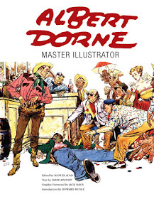
Two excellent books about major mid-century illustrators have been produced by Auad Publishing.
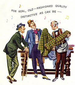
The newest book is about Albert Dorne (1906-1965), who had a dynamic cartoon-illustration style that was popular for both story illustration (above), and advertising (below).

Dorne was a hard-working, self-made success. He brought a no-nonsense approach to the business and cofounded the Code of Ethics and Fair Practices of the Profession of Commercial Art and Illustration.

He had an extensive photo reference collection, and he worked quickly, producing a vast body of images, most of which haven't been seen recently except by collectors of old magazines. The bulk of the new book is pure artwork, beautifully reproduced, with some preliminary sketches to show Dorne's process.


Illustration historian David Apatoff chronicles Dorne's career and tells how he founded the Famous Artists' School. Apatoff's writing style is very readable, full of information and anecdote. There's also an introduction by Howard Munce, who knew Dorne, a recollection by Dorne's daughter Barbara Dorne Bullas, and a "graphic foreword" by Jack Davis, one of many cartoonists who Dorne inspired.

The other book, which came out earlier, and is more expensive now, is about Robert Fawcett (1903-1967), justifiably dubbed the "illustrator's illustrator." His pictures are mostly ornate colored drawings with a profusion of intriguing and believable detail.

Fawcett is best known for his Sherlock Holmes illustrations, twelve of which are included here. 


Like Dorne, Fawcett was a legend among his peers, and this book is packed full of nicely printed examples. Some are taken from printed tearsheets and show the vintage graphics that went with the original illustration. Many others are scanned from originals. Altogether, there are more than a hundred color illustrations and numerous black and white drawings. Both books are hardcover, 9 x 12 inches, about 182 pages.

Let's hope that Mr. Auad and Mr. Apatoff will keep producing more of these great resources on classic illustrators.
------
At Amazon:
Albert Dorne: Master Illustrator
Robert Fawcett: The Illustrator's Illustrator
Auad Publishing
Online portfolio on Leif Peng's Flickr sets:
Al Dorne (157 images)
Robert Fawcett (179 images)
Author David Apatoff also does the Illustration Art blog

Monday, February 18, 2013

Fore-Edge Painting

Over all the centuries of book production, artists have painted images on the cover and the spine and the inside pages, but artwork has been bestowed on another part of the book called the "fore-edge." 

This is the area of the book you would see if you take the pages of the closed book and fan them out in one direction. The surface is composed of hundreds of tiny "steps" of individual pages spread out in series. When the book is closed normally, the edges of the book are simply colored with gold, and the painting disappears.


 The art form reached its peak in England in the eighteenth and nineteenth centuries, as collectors hired painters to create these ingenious novelties. It's hard to track down the names of the individual artists because they generally didn't sign their work. 
------
One of the great collections is in The Boston Public Library, whose website has more examples and explanation.
Video of a collector explaining the art form  
Thanks, Dick Hopkinson

Sunday, February 17, 2013

Sketching a Coke can

A few years ago I was sitting in a beer garden in Clonmel, Ireland, looking for something to sketch, when my eye fell upon a crushed Coke can on the table next to me.

No one was sitting at the table, and they hadn't cleaned it up yet, so I grabbed the can, set it up in front of me, and started drawing.

Halfway into the drawing, enjoying the music and the Guinness, I glanced up to find the can was not there. The server was heading off with it.

"Pardon me," I said. "Might I have the can back?" She turned, shook the can to see that it was empty, raised an eyebrow, and handed me the can.

I labored on for another fifteen minutes and was surprised to see another hand reaching to grab it, this time a guy clearing tables.

I was quicker this time. I pulled the can to my chest. "Oh, no, please if you don't mind, I'll keep it," I said. Just to be sure, I wrapped the fingers of my left hand around the base can to keep it from being plucked away.

After that they left me with the can, but they never seemed to understand what I was doing with a piece of trash.

The CIA funded abstract art during the Cold War

Former CIA agents have admitted what investigators have long suspected: that the US Government used taxpayer money to promote abstract painting as a propaganda weapon during the Cold War.

During the 1950s and '60s, the same period when the USA was building up its arsenal of nukes, it decided to use art against the Soviets to proclaim American cultural superiority.


How better to counter Stalin's Socialist Realism (above: Boris Vladmiriski, "Roses for Stalin" 1949) than by deploying art by Jackson Pollock, Robert Motherwell, Willem de Kooning and Mark Rothko?

The idea was initially tested in the open in 1947 by the State Department, which launched a program called "Advancing American Art." The centerpiece was a group of 79 avante-garde paintings purchased with $49,000 of government funds. Over the next two decades, several exhibitions of Abstract Expressionism were organized, including one called "The New American Painting," which traveled at government expense throughout Europe in the late 1950s. Other shows included "Modern Art in the United States" and "Masterpieces of the Twentieth Century."

Cracks in the program formed fairly quickly. Critics began attacking the artwork as “un-American” and “subversive.” The paintings were ridiculed in the national media and in Congress. President Truman, summing up the average American's opinion of the work, said, "If that's art, then I'm a Hottentot." A congressman complained, "I am just a dumb American who pays taxes for this kind of trash." Look magazine ran an article entitled “Your Money Bought These Paintings.” The chairman of the House Appropriations Committee wrote an angry letter to the Secretary of State, George C. Marshall.

Facing such criticism, the program then went underground, and the CIA devised a new strategy. Millions of dollars were channeled through fake foundations and intermediate organizations with names like the Congress for Cultural Freedom, the International Organizations Division (IOD), and the Propaganda Assets Inventory, which could influence more than 800 newspapers, magazines and public information organizations.

According to former case officer Donald Jameson, these organizations enlisted sympathetic critics, collectors, curators, and museums—most notably Rockefeller's Museum of Modern Art—and swore them to secrecy. The artists themselves were unaware of the source of the the support. The fact that the US was using covert means to promote the ideals of cultural openness was an irony lost on the planners.

As time went by, criticism for the exhibitions mounted, and it became clearer that many of the artists themselves were ex-communists, not exactly the sort of people that the US government wanted to back during the McCarthy era. The paintings that had been purchased by the government were recalled by Secretary Marshall and sold as scrap. They yielded a sum total of only $5,544. Many canvases sold for $100 or less and found their way into public universities.

Sources and further reading:
CIA's official explanation of the Congress for Cultural Freedom
Independent: Modern art was CIA 'weapon'—Revealed: how the spy agency used unwitting artists such as Pollock and de Kooning in a cultural Cold War
Gizmodo: How the CIA Spent Secret Millions Turning Modern Art Into a Cold War Arsenal
Book: “Advancing American Art: Painting, Politics, and Cultural Confrontation at Mid-Century" by Taylor Littleton and Maltby Sykes

Friday, February 15, 2013

What happened to Sir Thomas More's head?


Sir Thomas More, who coined the word "utopia," was a noted Renaissance statesman and humanist beheaded at the orders of Henry VIII. Here's the story of what happened to his head, according to Historic U.K.:


"Sir Thomas was beheaded in 1535. He had enraged Henry VIII by refusing to acknowledge that the king’s marriage to Anne Boleyn was legal. More’s head was taken from the scaffold and parboiled, stuck on a pole and exhibited on London Bridge. His devoted daughter, Margaret Roper, bribed the bridge-keeper to knock it down and she smuggled it home. She preserved the head in spices but was betrayed by spies and imprisoned, but was soon released. Margaret died in 1544 and Sir Thomas’ head was buried with her. In 1824 her vault was opened and More’s head was put on public view in St. Dunstan’s Church in Canterbury for many years."
Read more stories of errant body parts, including who ate Louis XIV's heart at Bits and Pieces / Historic UK 
Paintings: "Portrait of Sir Thomas More" by Hans Holbein the Younger, 1527 (top); "Margaret Roper Rescuing the Head of Her Father," by Lucy Madox Brown, 1873.
Wikipedia on Sir Thomas More

Thursday, February 14, 2013

Dinotopian Valentine

Happy Valentines Day!

This picture of Oriana and Arthur is from Dinotopia: The World Beneath (1995), oil on board. The book, republished with a new "making of" section in the back, is available from Amazon or signed from my web store.

Boudreau's Caricatures

Canadian caricaturist David Boudreau has worked for the big studios such as Disney, Warner Bros., Meatball Animation and Dreamworks. He is currently freelancing and adding to his portrait portfolio.

Clockwise from upper left: Norman Rockwell, Jean Giraud (Moebius), Andy Serkis (Gollum), and—hey, that's me.
-------
Thanks, David!

Wednesday, February 13, 2013

Bambi background / layout comparisons


Most of the original background paintings for the animated classic Bambi are lost. 

A lot of them were painted thinly in oil on glass or cardboard for use in the multiplane camera, while other finished backgrounds were painted in watercolor, depending on what the artist preferred. 

But Disney's archive still treasures the preliminary layouts for them. The layouts (shown at left above) were drawn with soft graphite on vellum. Those layouts work out the soft, atmospheric tonal transitions that gave Bambi its distinctive look.

Read more 
Source for this post: Animation Treasures (Hans Bacher's weblog)
Disney BG Artist Lisa Keene remembers studying the Bambi background technique on a visit to the Animation Research Library
Previously on GurneyJourney:
All art ©Disney

Tuesday, February 12, 2013

Pencil study of edge lighting

I drew this two-inch-high sketchbook study of a fellow listener in an Irish music session.

What really interested me was the unusual lighting: a sharp edge light on the left and a softer light from the right. The edges under the chin and the front of the shirt are completely lost. I used the wide edge of the 3B graphite pencil for most of the drawing.

New Harry Anderson website

Collector Jim Pinkoski has just set up a new website to feature the illustration art of Harry Anderson (1906-1996)


Harry Anderson (not to be confused with another illustrator Harold Anderson) did a lot of calendars, advertising art, and story illustrations for the American women's magazines. Later he gave his talent to religious painting. All of these categories are well represented on Jim's website.

Anderson's people always have a lot of warmth, sympathy, and animation, and he became known as a specialist at painting children.


He worked in water-based paint because he was allergic to oils. His fluid, relaxed paint handling and attention to edges shows his admiration of Joaquin Sorolla, John Singer Sargent, and Anders Zorn.

New website Harry Anderson Art
Jim Pinkoski's website on John Berkey
Another collection of Anderson art by Leif Peng
Book (mostly his religous painting): Harry Anderson: The Man Behind the Paintings