Saturday, February 28, 2015

Beaux-Arts Instruction (Part 3 of 4)


Earl Shinn, writing in The Nation magazine in 1869, described the terms of criticism that students heard most commonly from teachers in the École des Beaux-Arts, especially from Jean-Leon Gérôme. These terms, and the concepts they represent, provide an insight into the aesthetics that were valued in an academic figure study. Quoting Shinn: 

"Too insipid, too weak and soft.
This is said of the flesh, or, as the French say, the skin."

"Inlaid. 
This condemns our anatomy, when it has the look of being patched on the surface rather than woven under from the bone."

"False sentiment.
This stricture is not necessarily applied to a Della Cruscan* elegance, but has been heard over a drawing of the Laocoön expressing too much passion and motion instead of the wonderfully caught rigidity of the original."

“You have not seized the movement.
 This is one of the commonest of our difficulties; the word may apply to the most inert things, as the sweep of a lock of hair ; the lay of a fold of drapery, or of patterns on the fold; the expression of a supine hand, etc."
------
*Note: These criticisms have nothing to do with the painting above. "Della Cruscan" refers to members of a late 18th-century school of English writers of pretentious, affected, rhetorically ornate poetry.
------
BOOK SIGNING TOMORROW
------------------------------------------------------
------
The Nation, Volume 9, July 22, 1869, Page 68. "ART-STUDY IN THE IMPERIAL SCHOOL AT PARIS." by Earl Shinn
Previously in "Beaux-Arts Instruction" Series: Part 1, Part 2

Friday, February 27, 2015

Beaux-Arts Instruction (Part 2 of 4)

------------------------------------------------------

This is part two of a four-part series examining practices and principles taught the École des Beaux-Arts in Paris in the 19th century. (Part 1 here). This post is excerpted from an article by Earl Shinn, an American student in Jean-Léon Gérôme's atelier. Shinn wrote about his experience in an 1869 issue of The Nation.


Students painting from life at the École 
A Week-Long Academy
Students in the École who had graduated from cast drawing and drawing from the nude model were finally allowed to paint in oil from life. The resulting study was called an "academy." The model would typically be standing in a classical pose, lit from high north windows. Students would spend a full week on each study. Here, Shinn outlines how that week was spent.

Figure study or "academy" in oil
by Jean-Hippolyte Flandrin (1808-1864)
"What is really the week’s affair to the Beaux-Arts man is his 'academy.'

"On Monday he hits the pose, which is always vigorously pronounced and spirited, on the model's part, when first assumed; the dash that may be thrown into the attitude while the figure is perfectly fresh can never be caught up again if missed at the beginning.

"By Tuesday the artist has become absorbed in the complications of light and shade.

"On Wednesday the master comes, and perhaps rejects nearly everything that has been done, disfiguring and blotting the sketch from one margin to the other. The model, drooping upon his dais may bear little resemblance to the elastic attitude of the drawing, and the student is accused of attempting to idealize. 'You have been trying to modify nature from your reminiscences of the antique; you have ennobled the head, braced the shoulders,' etc. The study is altered, in the spirit of realism, until all the stark and pitiful ugliness of the model's lassitude is expressed.

"One of the difficulties of a life 'academy' is that, although the example before you is a moving, changing object, now braced, now drooping, now turned a little to the right and now a little to the left, your copy of it is expected to show all the purism of the photograph.

"If you were putting the same model into a historical picture, you would be expected to elevate the attitude and expression; and you would then begin to hear from your critics a great deal about the difficulty and responsibility of borrowing from nature, what to take and what to leave.

"'Only Phidias and Da Vinci,' I have heard declared,  'and perhaps Michelangelo, deserved to have received the revelations of anatomy.' If, on the other hand, you were copying the antique, you would have the full luxury of refining your line and your form, with no limitation of time and with
a rigid model. The life 'academy,' then, is expected to avoid the imaginative qualities of [a] picture, and to win, from a constantly deteriorating example, the accuracy which is so fascinating a quest in copying from statuary. A felicitous study is therefore a very desirable treasure, and old forgotten ones by [Thomas] Couture or [Hippolyte] Flandrin are preserved in the ateliers where those painters have studied, used as paradigms by teachers, or sold as something of unique value in the color-stores.

Albert Edelfelt (1854-1905)

"Another trouble is the variation in the color of the air on different days. 'The patron has accused me,' an energetically protesting youth will cry, 'of seeking the silver tint of Terborg; it was as far from my thoughts as silver from my pocket. But I established my key of color on Thursday, when there was a solid gray rain like slate-pencils; and the Italian turned blue and chattered; and how will you expect the tones of Titian in such a climate, my brothers?'

"On the closing day of the week I have known an incorrigibly gay lad to exhibit a canvas almost completely expunged by the blottings of the professor. 'This was to have been my masterpiece. I meant it for the altar of the church where I was baptized, whether as a St. Michael or a John in the Wilderness. The outline was good until Auguste changed it into a caricature of the Prince Imperial.'"

According to Albert Boime, "An experienced pupil could capture a head in a single session, but the others would often require several days. During the first session, the beginner sketched the head or figure, and then traced the drawing to canvas. When confronted with the live model, the pupil proceeded in much the same way as in rendering the head, only now he drew his pencil or charcoal sketch directly on the canvas. In the second session he traced the painted outline and established the principle masses of shadows in a diluted mixture of turpentine and red ochre. On the third day he prepared his palette carefully and rendered the flesh tones, as well as the hair and accessories. Finally the last session was devoted to completing the ébauche with respect to the tout ensemble." 
-----
Excerpts from The Nation, July 22, 1869, Page 68. "ART-STUDY IN THE IMPERIAL SCHOOL AT PARIS" by Earl Shinn
Final quote from The Academy and French Painting in the 19th Century by Albert Boime
More examples of academies at LARA (London Atelier of Representational Art)
Three excellent book sources:
The Lure of Paris: Nineteenth-Century American Painters and Their French Teachers
The Studios of Paris: The Capital of Art in the Late Nineteenth Century

Previously on GurneyJourney:
Beaux-Arts Instruction (Part 1)

Thursday, February 26, 2015

Beaux-Arts Instruction (Part 1 of 4)

What kind of instruction did the students receive at the École des Beaux-Arts in Paris in the 19th century? This begins a four-part series about the concepts and criticism in the atelier of Jean-Léon Gérôme (1824-1904), based on a rare first-hand account of an American student who reported his experience in 1869.


A Visit from the Master
A visit from Jean-Léon Gérôme was a special occasion for students in the Ecole des Beaux Arts, occurring only once a week. When the master was not in attendance, the students harassed each other, dueled with mahl sticks, and joked around.

On a typical morning, they went about their normal routines, making coffee, and, according to a student who was part of the class, "arranging themselves in the tobacco-smoke, setting palettes, filling pipes, trimming crayons, moistening bits of bread, and wringing them into erasing-balls in the corners of handkerchiefs."

Gérôme arrived exactly on schedule, removed his hat, and placed it on a peg reserved just for him. The students came to attention and the Italian model perked up.

He started in one corner of the room and went systematically from student to student, standing or sitting in their place, and regarding their drawing or painting with full attention and unsparing criticism.

Gérôme, Pygmalion and Galatea
"Observe," he said, looking at a very neat drawing by a student, "Your muscles are inlaid against one another. They are carpentered. There is a something—that is not the vivacity of flesh. Go next Sunday to the Louvre and observe some of the drawings of Raphael. He does not use so much work as you, yet one feels the elasticity of his flesh, packed together of contractile fibers, based upon bone, and sheathed in satin. You tell me you will express that texture afterward. I tell you Raphael expressed it from the first stroke!"

Raphael Sanzio (1483-1520)
Study of David after Michelangelo
"Your color rages," he said to another student. "That of the model is lambent. Besides, your figure is tumbling, it is not on its legs. I will save you labor by telling you the simplest way of correcting this. Turn the canvas upside down and draw it over. The error is radical."

To another, he said: "You do not yet understand the continuity of forms in nature. You accent too highly. That is vulgarity. For instance: it appears to you that the internal and external vastus, when gathered in at the knee, cause a break in the outline, like the cap of a pillar. Similarly under the calf. You are deceived, and should use your eyes; the accent is not in the line, it is in the shading beside the line, and even there far more slightly than you think. Here again, the vein crosses the forearm. You make a hideous saliency. Nature never, absolutely never, breaks a line."
------
The excerpts are from The Nation, May 6, 1869, Page 352. "ART-STUDY IN THE IMPERIAL SCHOOL AT PARIS" by Earl Shinn
----
Thesis about Earl Shinn by Daniel Timothy Lenehan
------
Three excellent book sources:
The Lure of Paris: Nineteenth-Century American Painters and Their French Teachers
The Studios of Paris: The Capital of Art in the Late Nineteenth Century
The Academy and French Painting in the 19th Century

Wednesday, February 25, 2015

Foreground Miniatures


Michael Paul Smith takes photos of his favorite town, called Elgin Park. The pictures look like snapshots from some midcentury utopian town.


Most of his photos involve some cars parked on the street and buildings and trees in the background. There are no people. 
The photos are actually taken in the present day. There's no digital trickery involved. Everything is shot in-camera. The cars and street are miniatures, propped up at tabletop height. 

Mr. Smith doesn't use a fancy camera, just a cheap point-and-shoot. These cameras work well, though, because the small apertures don't give away the trick with shallow depth of field. The great thing about this method is that you get all the lighting, reflections, and occlusion shadows for free, because the models are in the same light as the background. 

Mr. Smith is an excellent modelmaker, and he has made hundreds of cars and dozens of buildings.

This video takes you behind the scenes, where he generously shares his process—and his backstory.

Use of foreground miniatures in "The Aviator"
The use of foreground miniatures is an old visual effects technique from early days of moviemaking. It's still used by low-budget filmmakers and the occasional big budget film. (here's more info on that from Vashi Visuals).


In this shot for "Close Encounters of the Third Kind," the ship was only 20 feet long, and the people were standing way back in the shot.

Photos of Elgin Park via Studio 360
Film by Animal Media Group
Vashi Visuals
Book: Elgin Park: An Ideal American Town (8.5"x11" landscape hardcover book

Tuesday, February 24, 2015

Dinotopia: World Beneath Episode 4

It's Podcast Tuesday! This week we shared the newest episode of the serialized audio dramatization of Dinotopia: The World Beneath, but, sorry, it was only up for the week.


"Trust old Crabb," says Lee as they approach Black Fish Tavern by the light of the moon. 

Oriana proves herself to be a valuable member of the expedition. Producer Tom Lopez had fun elaborating the colorful characters.

The Podcast Series
This acoustic adventure was produced by Tom Lopez, mastermind of the ZBS Foundation, with an original music track by composer Tim Clark.

The Christian Science Monitor called this production "A dazzling soundscape that does full justice to Gurney’s wondrous lost world… perfect family listening.”

Episode 5 arrives in a week. Each short episode will only be live online for one week, and then it will disappear.

If you'd like to purchase the full two-hour World Beneath podcast right now and hear all fifteen episodes back to back in a feature-length production, check out The World Beneath at ZBS Foundation website for the MP3 download. It's also available as a CD.

The Book
You can also order the original printed book from my web store and I'll sign it for you. (It ships via Media Mail within 24 hours of your order. US orders only for the book, please). The book is also available from Amazon in a 20th Anniversary Edition with lots of extras.

The Museum Exhibition is now on view
Many of these paintings are now on view at the Dinotopia exhibition at the Stamford Art Museum and Nature Center through May 25. I'll be in attendance at events on Feb. 28 and March 1. Gentleman-cartoonist Jared Cullum is organizing a gathering of GurneyJourneyers for sketching and coffee before or after the events on Sunday.

Read more about the events here on this blog.

Monday, February 23, 2015

Phil May (1863-1904)


"Shave, or hair cut, sir?" "Corns, you fool!
Phil May (1863-1904) was an English cartoonist known for his deft and economical pen-and-ink caricatures. He grew up around the theater, so he was familiar with music hall actors and types. 

Benevolent Lady (distributing tract to inebriate, who has refused to accept one), "Do take one. If you read it, it will do you good."
Drunk (pulling himself together), —"Madam, I writes 'em."

He went to London and was so poor for a while that he slept on park benches, and he got to know all the varieties of gutter snipes. He portrayed them with a kindly wit and a sympathetic eye.

"Mos' 'stronary thing! a' most shertain th'was shome coffee in it."

He was so prolific that a publication came out using just his pictures, "Phil May's Illustrated." His cartoons of drunks and street characters made him wealthy and famous. 

Portrait of Phil May by J. J. Shannon
He liked to wear colorful outfits. According to John Lavery, "The last time we met he came to his studio door wearing the loudest suit I had ever seen. Seeing my look of surprise, he smiled and said, 'Come in and listen to it, dear boy.'"

ARTIST: 'My good man, may I have the honour of sketching your likeness? I am Mr. Phil May."
RUSTIC:  'Oh! are yer? Then, this time you'll be Mr. Phil Mayn't."

Sunday, February 22, 2015

Window-shading


This small oil study by James Perry Wilson was left unfinished, allowing us to see how he did it. After a careful line drawing, he painted from background to foreground, completing each area before moving on to the next.


This photo shows J. P. Wilson at work on an outdoor study, with two panels side by side in a special frame so that he could paint a panorama. This one also seems to be completed area by area. 

The method is sometimes called "window-shading," because it resembles unrolling the final canvas like pulling down a window shade. It was a common practice for painting museum dioramas, for which Wilson is best known.
Francis Lee Jaques painting the Peabody Museum's Alaskan Brown Bear diorama,
Courtesy Peabody Museum of Natural History and Michael Anderson
According to Michael Anderson of Yale's Peabody Museum, Wilson would have seen the practice used by his colleagues, such as Francis Lee Jaques: "From the horizon, Jaques would typically paint down and from left to right, though not always. Sometimes he would skip around painting an area to completion and then going to another area, painting it to completion and so on. Jaques typically painted the birds first and painted the background around them later."

Both artists would have done a tight color comprehensive of the overall scene first, and used that as a guide.


Frederic Church painted this study of the view from his home Olana in winter. I would bet that he painted it area-by-area from background to foreground. 

Window-shading is a fast way to work, and it can yield almost photographic results. It's a good way to paint fast under challenging conditions, such as winter landscapes or sunsets. 


Ilya Repin used a similar method in this study from costumed models. Over a preliminary line drawing, he applied the paint to achieve a finished effect area by area, like a coloring book or paint-by-number. There's no overall block-in or imprimatura or ebauche, as you might do if you followed the "BLAST Rule."

There are several advantages to this method. In oil, especially with an oil-primed board, you can make use of the white of the board for small highlights that show through thin textures of paint.  
------
Previously on GurneyJourney: Area-by-Area Painting

Saturday, February 21, 2015

Dynamic Downshots of Devambez


André Devambez (1867—1944) was a French artist who was fascinated by the bird's eye view.


His most famous painting is called "The Charge," which shows a confrontation between demonstrators and police on the Boulevard Montmartre. The black cluster of demonstrators in the lower area flees in a disordered mass from the regular line of the police, while spectators watch from the margins.


Devambez studied with Jean-Benjamin Constant and Jules Lefebvre in Paris. In this scene he shows the welcoming parade for President Woodrow Wilson. Blues and browns echo through the spectators and the uniformed horsemen. 


Families say goodbye to departing soldiers at Gare de L'Est railway station during the mobilization for the Great War. The fence in the middle keeps back the edge of the crowd.


Devambez also illustrated children's books. Here's a rout in a Medieval battle, with fleeing soldiers in animated poses in the foreground. Again, he sets up contrasts between big groups of figures.


He both wrote and illustrated for children's book, and in that sphere, his work was more fanciful.


Devambez also produced many illustrations in "Le Figaro illustrated" and was always fascinated by new modes of transportation—airplanes, automobiles, trains, and ships.

Biography of  André Devambez
More at Art Inconnu


Friday, February 20, 2015

A Composition by Robert Fawcett


Have a look at this picture, and try to self-monitor how you experience it.


The editors of the Famous Artists Course included this illustration by Robert Fawcett (1903-1967) along with an explanatory diagram to demonstrate some design principles. They say: "The scroll is the important point of interest in this picture. Robert Fawcett has skillfully used lines to direct our eye to it. The line formed by the arm of the foreground figure draws our attention almost irresistibly across the upper right of the picture, down to the scroll, and finally to the head of the king. Notice how we are forced to look back and forth from the king's head to the scroll."

I think it's a successful composition, but I don't agree with their analysis of why it works. To me the driving force of the picture's abstract design is the contrast between clutter and emptiness. At first I saw the busy detail surrounding the blank space, and I thought the empty space was a 2D shape left for design reasons.

A split second later, I realized that it was a piece of paper being held up by a soldier in chain mail, and that I was looking at the back of the paper. Once I saw the angry face of the seated figure, and I understood that he was a king, it dawned on me that he was being faced with a challenge by the knight, perhaps showing the Magna Carta to King John.

With the story in mind, my eyes scanned the picture driven by its human premise. I looked at the ecclesiastical figure, whose characterization isn't very well developed. I checked out the face of the soldier, and couldn't get much from him either. My eye then went to the various weapons on display to see if there was a foreshadowing of violent action.

Although I'd need to see an eye-tracking scanpath study to be certain, I'm quite sure my eyes never followed the pathways diagrammed by the FAC's editors, and I never spent much time in parts of the picture that had no story purpose.

My point is that I don't believe it when composition teachers suggest that my eyes are passively moving through a picture, led purely by design considerations. Design does play a role, but if there are faces and a human story, the viewer is operating on a much higher and more active level.

Your experience of the picture may have been totally different from mine, and I'd be interested to hear from you in the comments.
-----
Books: 
Robert Fawcett: The Illustrator's Illustrator
Famous Artists Course

Previously on GJ: Eyetracking and Composition
Eyetracking and Composition, part 1
Eyetracking and Composition, part 2
Eyetracking and Composition part 3

Thursday, February 19, 2015

A Visit to the Dinotopia Exhibition

Yesterday we visited the Dinotopia show in Stamford, Connecticut in preparation for the events that are coming up in a couple of weeks.


Over 50 original paintings are presented in several big rooms of the museum. For those who saw the Lyman Allyn show in eastern Connecticut a couple of years ago, this is a completely different show—all different artwork.


Most of the major paintings are here, such as Dinosaur Parade, Dinosaur Boulevard, Skybax Rider, and Waterfall City. Some of the paintings are paired with the original reference maquettes.


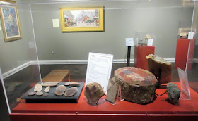
Throughout the exhibition are display cases showing some of the Museum's fine collection of dinosaur bones and trackways, Pleistocene mammals, and invertebrate fossils, as well as fossilized plants (above). Throughout the exhibition, you can see original specimens similar to the ones that inspired the fantasy world. 


At the Farm to Table Supper on February 28, I'll be taking guests through the show on a private tour, telling some of the stories behind the creation of the paintings. This will be an informal event (with very delicious artisanal food), and will be a memorable event for a fantasy or art fan of any age.


On Sunday, March 1, I'll be leading a hands-on Fantasy Drawing Workshop. We'll be drawing with water-soluble colored pencils. Materials will be provided. I'll do a very brief digital presentation and demo, and then let the attendees get to work. 

Curator Kirsten Brophy took us behind the scenes to select specimens and still life objects that we will borrow from the museum's collection and set up in the workshop room. This will be a rare chance to draw from real specimens.


They have also got some exquisite bisque sculpts by Jonas Studios of mammals, and we'll borrow a few of those, too. If you're interested in the workshop, you might want to act today, because I'm told there are only two spots left.

If you want to see a Dinotopia exhibition in your region, please contact your local art museum's curator or director and tell them you want to see "Dinotopia: The Fantastical Art of James Gurney" travel there, and that you'll rally your friends, too. A couple of GurneyJourney readers have actually done this and we're in discussions with their city's museums, so it can really happen.

Info and links
The exhibit will continue until May 25.
Purchase tickets for the Feb. 28 Farm to Table Supper at this link or call Madeline Raleigh at 203.977.6546.