Friday, June 30, 2017

Jean Béraud's Windy Paris

Jean Béraud (1848-1935) loved to paint Paris on windy days.


Wind is invisible, but its effects are not. A woman's hat boxes swing to the side. Skirts and jackets flap to the side. People grab their hats so they don't blow over into the Seine.


A contemporary critic wrote, "Paris is Jean Beraud's passion, his mistress, his idol. He knows and loves it in every corner. He has studied it in its splendor, and its squalor, flitting from the salons of the Faubourg St. Germain to the dives of the Rue Mouffetard, and from the green-rooms of its theatres to its prisons, its churches, and its boulevards."


Unlike many academic realists, he wasn't interested in imaginative paintings: "Jean Beraud doesn't care 'a fig for saints, nymphs, fauns, and Virgins! 


He would give them all for that work-girl tripping across the road with a bandbox in her hand, or for one group in a Montmartre cabaret. No classicism for Jean Beraud. Give him the Boulevard and you may keep the Colosseum."


"'Nothing if not modern' is Jean Beraud's device. He is modern himself. His studio is modern. His pictures are modern." 
----
Quotes are from "The Illustrated American," 1890
Jean Béraud on Wikipedia

Thursday, June 29, 2017

'What Is The Blast Rule?'

Detail, Sargent watercolor
Jonathan asks, "What is the BLAST Rule?"

That's a shorthand I try to remember when I'm painting. Those letters stand for five principles of paint technique:

Big brushes.
Large to small.
Accents last.
Soften edges.
Take your time.

Big brushes
Regardless of the medium, I get out the biggest brushes first. As I proceed, I may choose smaller brushes later if I need to, but I always try to use a brush that's a little bigger than I need for a given passage. Flat brushes are especially good for giving you a variety of strokes, from large areas to sharp lines.

Large to small
Typically, some overall light and dark value statement should be made right away, even if it's in a lighter key. It helps to work out the big shapes first. Rough them in, get them right, then subdivide. In watercolor, I often like to put down a big ghost wash early on, covering 90% of the surface, leaving only the brightest highlights.

Accents last
Accents are the eye-catching darkest darks and highest highlights, or the brightest dashes of chroma. They should stand apart from the rest of the system of values. Usually with oil or gouache or casein, they should be added last, saving the final punch for the end. With transparent watercolor, the whites have to be considered from the start.

Soften edges
Edges shouldn't be all soft or all hard. They should have variety. But softness is often a measure of quality and professionalism, and soft edges are harder to achieve in water media. To avoid the “coloring book look” it takes a conscious effort to capture a feeling of melting, merging, blurring, and blending. Softness must be accomplished early in the process. Forms get sharper and more detailed in the later stages.

Take your time
Patience and concentration are a rare commodity in our attention economy. You can be be both a lumberjack and a watchmaker. Paint fast and furious, but allow yourself also to slow way down and really observe. The limits I run up against are my ability and willingness to focus deeply and for long periods. To do that I have to ignore distractions such as wind, changing light, intrusive passersby, and the computer.


The BLAST Rule is one of many painting tips in my book Imaginative Realism: How to Paint What Doesn't Exist, which you can get signed with free shipping at my website store.

Wednesday, June 28, 2017

Dead Vehicle Challenge

Old tow truck, watercolor by Jeanette Gurney
We had such an enthusiastic response to our previous painting challenges, such as the Food Truck and the Weed Painting Challenge, that many of you asked for another opportunity.

This time the theme is Dead Vehicles.

Dead trucks in Highland Park, CA
painted in oil when I was an art student. 
You can paint any abandoned car, truck, bus, or motorcycle that's no longer in working condition. No tractors or construction equipment this time.

It could be parked in a garage or a museum, or outdoors behind a repair shop or in a junkyard. It could be damaged from a crash, covered with graffiti or partially dismantled. If it's got flat tires or weeds growing up around it, so much the better. 

On Location

It must be painted on location and it must be a new painting or sketchbook page done for this challenge. It doesn't have to be painted in one sitting; you can return to the spot multiple times if you want.

Media
All physical painting media are acceptable: casein, gouache, acryla-gouache, oil, acrylic or watercolor. There's no limitation on the palette of colors.

Two-hour paintout of an old pickup. Actually, I think this one wouldn't
qualify for this challenge, because the truck still ran.

What to Enter
In addition to a scan of the final painting, your entry must include a photo of your picture on the easel in front of the motif. Your face doesn't have to be in the photo unless you want to.

Multimedia Prize
If you want, you can record a video or audio (1 minute or less) of the owner describing their vehicle, or you can document something that happened while you were painting it. I'll give a special award to the best one.

Deadline
It's free to enter. You can enter as soon as you finish the piece, but no later than the deadline: Monday, July 31 at midnight New York time. Winners will be announced on the blog on Thursday, August 3. 


Where and How to Enter
Upload the images to this Facebook Event page (This way I don't have to deal with email, and you present your images your way). If you don't have a Facebook account, please ask a friend with an account to help you. Please include in the FB post a sentence or two about your inspiration or design strategy, or a story about the vehicle

If you share our image on Instagram or Twitter, please use the hashtag #deadvehiclechallenge


Prizes
I'll pick one Grand Prize, five Finalists, and one Multimedia Winner. They will be published on GurneyJourney. All the winners will receive an exclusive "Department of Art" embroidered patch. In addition, all the winners will receive a video (DVD or download) of their choice. Everybody who participates will have their work on the Facebook page, too.
-----
Resources and Links
Facebook Event page on Dead Vehicle Challenge
•If you want to try out casein, I've asked Jack Richeson to put together a basic set called Gurney's Casein 6 Packor Gurney's Casein Explorers Pack (12)
• Own the 72-minute feature "Gouache in the Wild"
• HD MP4 Download at Gumroad $14.95
• or HD MP4 Download at Sellfy (for Paypal customers) $14.95
• DVD at Purchase at Kunaki.com (Region 1 encoded NTSC video) $24.50

Tuesday, June 27, 2017

Terror of the Seas


Sea Monster study, gouache, 9x12 inches
An experiment in biomechanics spirals out of control, and the leviathan slips out to sea.

Monday, June 26, 2017

W. T. Richards Field Study

 William Trost Richards, field study
36.4 x 51 cm (14 5/16 x 20 1/8 inches), RISD Museum
Here's a field study in watercolor and graphite by William Trost Richards (American 1833-1905) The curators of the Art Museum at Rhode Island School of Design write:

"William Trost Richards’s close studies of nature reveal his belief, based on the writings of critic John Ruskin, that the way to truth was the study of nature in penetrating detail. On display here is Richards’s precision and agility with watercolor and gouache in vertical format—his favorite for such studies. He may have found this meadow on one of his many long walks around his daughter’s farm in Chester County, Pennsylvania. Before it came to the Museum the drawing suffered from sun exposure, leading to the fading of the sky’s blue pigment, some of which is still visible where it pooled."

I'm impressed with how he sets up two planes of focus: the near weeds and the far trees. While he carefully defines all the smaller textures of the flowers and foliage with a playful variation of colors, he does so within a controlled value gamut.

He keeps to his overall statement of light-foreground over dark-middle-ground over light-sky. The whole design is set up to feature the Joe-Pye weed in the center, where the tonal contrasts are most dramatic.

It would have been easy to get bogged down in other details, and a photograph would have presented a very different set of facts.

Sunday, June 25, 2017

Podcast: 1986 Readings on Gerome, Repin and Shishkin


In 1986 I was part of a group of friends called "The Golden Palm Tape Network" who shared art-talk via cassettes. I thought some of these recordings would be fun for you to listen to in the form of a podcast on YouTube. 


Let's start with a fairly typical one called "Academic Chatter," a combination of readings and commentary. (Direct link to podcast on YouTube).

Topics include: 


The nucleus of the G.P Tape Network was a small group who knew each other at the Art Center College of Design. We first met each other at the Golden Palms Apartment in Highland Park, California.

The artists involved included Paul ChadwickBryn BarnardThomas KinkadeRon HarrisRichard Hescox, Tom KiddDavid MattinglyJames Warhola, Brad Teare, and Barry Klugerman. All those people were (or are) brilliant and incisive and funny, and I owe who I am to what I learned from them.

There were hundreds of tapes, most of which were recorded over again with new stuff. But I still have a lot of these. If you enjoy this one, let me know, and I'll share some more.
---
Jean-Léon Gérôme on Wikipedia
Previous post on The Golden Palm Tape Network

Saturday, June 24, 2017

Exhibit of Courtroom Art

Tom Girardi with beating victim Bryan Stow by Bill Robles.
An exhibit in Washington called "Drawing Justice" examines the work of courtroom artists.
"The nearly 100-work exhibit will feature historic sketches such as Howard Brodie’s drawing of Jack Ruby at his sentencing for killing Lee Harvey Oswald; Marilyn Church’s trial drawing of Martha Stewart; Pat Lopez’s capturing of a nervous Ken Lay looking at evidence during the Enron trial; Bill Robles’s drawing of the haunting, dead-eyed Charles Manson on the witness stand; and Joseph Papin’s image of “Son of Sam” murderer David Berkowitz in mental anguish." Read the rest at The Washington Post. 
The exhibition will be at the Library of Congress in Washington through October 28.
Article about the show in Columbia Journalism Review
----
Related: Sketch artist recreates Sean Spicer briefing after White House camera ban

Friday, June 23, 2017

Book Review: Portrait Drawing by Mau-Kun Yim

I recently had a chance to read a copy of Lessons in Masterful Portrait Drawing: A Classical Approach to Drawing the Head by Chinese-born artist Mau-Kun Yim.

The book consists mainly of Mr. Yim's charcoal portrait drawings from life.  


The book includes many step-by-step sequences that show his process. He starts with a foundation of straight lines to establish the structure of the head and the placement of the features.

Then he adds masses of tone in a sculptural but painterly way. He describes drawing as "painting without color," and he compares making a drawing to building a house. Edges and highlights are reserved for last.


The title of the book, "Lessons in Masterful Portrait Drawing: A Classical Approach to Drawing the Head" is a bit of a misnomer, because it's not really presented as specific lessons to follow so much as ideas and drawings to be inspired by. 

The book is helpful for the drawings themselves, which are well reproduced. A gallery section of full-page examples takes up the last 50 pages of the 144 page hardcover book. I found the book is also helpful for understanding his philosophy, which he has developed through his study of many traditions of drawing: not only Chinese, but also European, American, and Soviet. 


He quotes the teaching of Soviet master Konstantin Maksimov on the principle of wholeness: "Start with large blocks, straight lines, and masses of light and shadow, before gradually moving on to the features, details, and expression in a drawing. If you can get the relationship between the building blocks right, then a harmonious whole will emerge."

He is a believer in keeping a sketchbook. "Sketch often and sketch slowly," he recommends. "Is faster better in sketching?" he asks. "Not always! I've seen many private studios in the West, Hong Kong and Taiwan where the time allowed for nude sketches is so short that the paintings come out looking like wild scrawls."

There are several videos showing his method on YouTube, such as this one, sponsored by Nitram Charcoal. There are other videos on his own YouTube channel, where he also shares his masterful oil portraits. (Link to YouTube)

His website is Mau-Kun Yim

Thursday, June 22, 2017

Berkey Crowd Scene

John Berkey's widow, Demi, remembers what it was like for John to paint the massive crowd scene in this Indianapolis 500 illustration.

"John hated those crowd scenes. One of the things he did to keep from going completely mad was to mask off most of the painting and work on only one section at a time. There was just no way to do the crowds fast. A piece like this took many days."
----
See more Art by John Berkey (1932-2008) at Jim Pinkoski's fan site

Wednesday, June 21, 2017

Your New Easel Builds

You've been sending in photos of your easel builds, and I've been very impressed with the ingenuity and problem-solving you've brought to the task.

Glenn Tait


1. The Coroplast Pochade Board
This light-weight, three panel, rig is built using a 14.5" X 6.25" panel of 1/4" plywood painted black to which black Coroplast panels are attached using Chicago screws and washers. Metal rods are inserted the length of bottom panel giving structural strength to support my water and paints. They also double as magnetic attachment points for my water containers. Neodymium magnets are placed into the right side of this panel to hold my palette. The board can be tilted using the 360 degree head mount on the tripod while the panels are adjusted with a 550 Paracord rigging tightened with a Cord Lock Stopper. Brushes are stored in a hanging support under the rig for easy access.

1B. Water cups
Other materials, extra water, etc. are easily accessed from the backpack, which hangs beneath the tripod acting as an anchor holding everything down.


2. Diffuser Screen
A wire mesh desk caddy found at a Dollar store made a great frame for my diffuser. The mesh was removed from the frame using pliers. A white nylon stuff bag was sewn for the diffuser cover. The support was made using a set of self-closing hinges with knurled screws for tightening all of which was attached to two sets of metal strips. 

2B. Diffuser Clip
This unit slides onto the plywood board and can be used whether the board is in a landscape or portrait orientation.


3. Tripod
I use a light, compact tripod with a sturdy load capacity. The Triopo MT-2205, an aluminum tripod with a 360 degree head mount, a spring loaded hang clip, a max. load capacity of 8kg / 17.64lb, a height of 162cm / 63.78in, folds down to 37cm / 14.57in and weighs 1150g / 2.54lb.


4. Construction and Materials Notes
I have no workshop or power tools but was able to build this using a few hand tools: a leather punch for the holes in the Coroplast, a universal screw starter to "drill" holes in the plywood, a utility knife to trim the plywood, scissors, a butane lighter (to melt the ends of the Paracord) and pliers.

Materials included Coroplast/Tenplast, Gorilla duct tape, Chicago screw, various sized washers (metal and rubber), 1/4 T-nut, Neodymium magnets, 550 paracord, Cord Lock Stopper, self closing hinges, brass knurled nuts and screws Loctite Super Glue for Plastics, (an instant super glue used to attach the magnets to the Nalgene containers.)

Nate Billings


Here are a couple of pictures of my build. I need to do some upgrading, but right now things are held on with clips and velcro in a modular system. I keep velcro on the back of my watercolors, cups, etc. It prevents things from falling off. 


Normally, I attach it to a tripod, but for this event, I had to use my standard easel. The bulldog clips allow me to attach it below the painting for easy access!

Keith Yong


Just wanted to share my very simple plein air setup. It's essentially just a flat plywood surface and some clips. I plan to add a light diffuser on top in the future too. It weighs at 440g (15.5 oz) and has a large available surface area. 


With this setup I can use it pretty much like a desk top. I attached a mini Swiss Arca plate on the bottom with screws and it's very solid. The only downside is that it doesn't fold, but it fits well inside my backpack like a thin book.


Edit: "I did add a light diffuser in the end and it works perfectly"

Piya Wannachaiwong


I just wanted to share my version of the Sketch easel (frankly I do more call it the Gurney easel). It's about 9" tall by 12" across for each panel. I use a Caran D'Ache 15 color gouache pan set and I'd like to be able to accommodate a Moleskine Sketchbook or a Perfect Sketchbook.

I've incorporated a 'ledge' for my sketchbook to sit on. It's simply a 1.25" tall and 12" wide strip of wood glued on just above the hinges. 


Wood-burned onto that ledge is the instruction 'First, Composition, then Values and finally, Colors'.


Also after using the easel for the first time, I decided I wanted to install a fold out brush holder. It's 4"x7", with ledges on the bottom and side. As I'm left handed, it's installed with simple hinges on the left side. I simply set the brushes down, I have found drilling holes on the side so the brushes can stand up makes the brushes an obstacle.
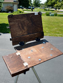

Otherwise, it's pretty close to what you suggested in your video. I have yet to install a holder for a light diffuser, but further down the line I probably will.

By the way, if anyone asks, I don't recommend birch plywood from Michael's. It's layered wood that tears apart under a circular saw and definitely made this easel a little less refined than I'd like. I'm planning on building another one for my wife with oak soon.
----
Thanks, everybody for sharing all these wonderful insights on all these builds. If you want to join the fun, check out my tutorial video. It covers how I make both the easel and four different diffuser designs.

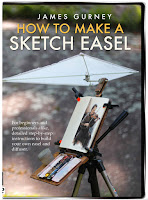
The HD download of "How to Make a Sketch Easel" is more than an hour long and costs only $14.95.
It's available now from Gumroad, and Sellfy, and Cubebrush

The DVD version is available for $24.50, and it includes a slide show. The DVD is also available on Amazon

My materials list for making a sketch easel
Also check out previous posts Your Sketch Easel Designs and Your DIY Sketch Easels