Wednesday, September 30, 2009

Son of Baby Tattooville Exhibition

If you live in the LA area, don't miss the opening of "Son of Baby Tattooville" at the Riverside Art Museum this weekend.

The exhibition includes that hard-to-classify artzone known as lowbrow, pop surrealism, graffiti, tattoo culture, and contemporary fantasy art. My recent painting called "Birdman" will be included in the show. More on the making of Birdman in a future post.

Other artists include Buff Monster, Johnny KMNDZ Rodriguez, KRK Ryden, Greg “Craola” Simkins, Yoskay Yamamoto, Audrey Kawasaki, Travis Louie, Elizabeth McGrath, Miss Mindy and a few surprise guests.

It's been a tough workout, but I think I'm finally in shape and ready to rock!

The exhibition runs through Nov. 21. There is a special public reception, but I must admit to a bit of confusion as to whether it takes place on Thursday (according to the Press Enterprise) or Friday (according to the Riverside Art Museum blog), or Saturday (according to the official Facebook page).

In any event, the opening reception will include a figure drawing event known as Dr. Sketchy's Anti-Art School, hosted by artist Molly Crabapple. Although the event is open to the public, please be aware that the figure drawing session will have nudity.
-------
The Riverside Art Museum is at 3425 Mission Inn Ave., Riverside, 951-684-7111, www.riversideartmuseum.org

For more information at the Riverside Art Museum blog
or the Press Enterprise.

Tuesday, September 29, 2009

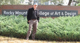
Rocky Mountain College of Art and Design

Rocky Mountain College of Art and Design in Lakewood, Colorado, has about 600 enrolled students. Illustration is the biggest department with about 120 students, but it also offers majors in game art, graphic design and digital media, animation, interior design, art education, and fine arts.

The 23-acre campus once served as a care center for tuberculosis patients. The historic buildings face now onto flower-bedecked lawns where students occasionally paint outdoors en plein air.

In the sculpture and fine art building, student Will Fortenberry was in the midst of taking apart an old projector as part of a “Deconstruction/Reconstruction” assignment. The machine’s light and fan were still wired up. He had sketches of how he planned to rebuild it as a robot.


The animation building had a variety of workstations for experimental animation, ranging from traditional cel animation and stop motion to the latest 3D software. Instructor Jeff Jurich showed me some of the stop motion puppets built from Sculpey, soft foam, and armature wire.

Illustration and animation students benefit from videoconferenced critiques with industry professionals like Michael Knapp of Blue Sky Studios.

After my presentation, I had the opportunity to visit Cherish Flieder’s computer illustration class. Each student described how he or she was approaching their conceptual assignment, which was to show how the human body is composed of not just of its own cells, but a host of foreign parasites and beneficial microbes.

Before he came to RMCAD, illustration department chairman Larry Kresek was instrumental in establishing the program at Ringling College of Art and Design in Florida. “We put together a program there that was mainly editorial,” he said. But when he came to RMCAD, he and his colleagues took a fresh look at the curriculum in the light of changes in the market.

“It occurred to me the industry was looking for a lot of new skills, not just in print illustration, but in production design and animation, so we set up a course of study that is heavy on traditional drawing and storytelling.”

Wikipedia on RMCAD
RMCAD website, link.

Monday, September 28, 2009

Video Contest


Blog reader GooGoo Supreme suggested a video contest for the new book Imaginative Realism. (Image above is a watercolor by blog regular Steve Gilzow.)

Great idea, Eric. Now you can get in on the fun. If you have a camera or a cellphone that shoots video, you've got all the tools you need. No experience necessary. It can be as simple as talking into your webcam, or it can be as fancy as a scripted, edited piece with music and sound effects.

It can be funny or serious. It can show your own art talents, your pet's unusual tricks, your animation skills, or a profile of your uncle Harry, the illustrator. But it has to somehow relate to the new book, and it has to be something that you created. You don't even need to own the book; you can create a video that uses content from GurneyJourney blog posts if you want.

Here are the guidelines.

1. Please limit length to 60 seconds or shorter.
2. Post your video on YouTube. Send the YouTube URL link to: jgurneyart@yahoo.com, subject line VIDEO.
3. Deadline for sending the email with YouTube link: November 9.
4. On Friday, November 13, I'll post the results on GurneyJourney, with a link back to your blog or website.
5. I'll set up a poll so that blog readers can vote for your favorite. Poll vote determines winner.
6. First prize: Signed copy of Imaginative Realism with a nice original sketch inside, plus a signed copy of Dinotopia: Journey to Chandara and a poster.
7. Second prize: signed Imaginative Realism and a poster.
8. Third through fifth prizes: Signed posters.

Have fun, and I can't wait to see what you come up with!

Sunday, September 27, 2009

Storybox


Don't think outside the box. Think INSIDE the box.

----------
This spoof of movie trailers brings Video Week to a close. I hope you enjoyed these little commercials. Tomorrow we return to regular programming.

Saturday, September 26, 2009

Special Delivery


Yesterday morning our shipment of Imaginative Realism arrived, and we packaged up all the orders so far. Here's a look behind the scenes at our high-tech operation.

Amazon says they won't ship until October 20, so it's not too late for you U.S. customers to switch your order to the Dinotopia Store. Where else can you get a signed book, plus service from a parakeet and a puppet, and our unique C.R.U.D. service (Custom Rural Unicycle Delivery)?


Tomorrow: Don't miss the last installment of Video Week.

Friday, September 25, 2009

Loose Ball


A ball falls off a homemade toy and takes a trip through the studio.

Thursday, September 24, 2009

Parakeet Artist


I'm proud of Mr. Kooks, my budgie. But I didn't expect him to upstage me.

Wednesday, September 23, 2009

Square Puppet


Hiram may be a blockhead, but he loves to draw.

Tuesday, September 22, 2009

Gallery Flambeau Video


Because not all paintings were meant to live forever.
-------
More about the Gallery Flambeau on GJ.

Monday, September 21, 2009

Unicycle Painter


Plein-air painting meets extreme sports.

Read more about unicycle painting, link.

Sunday, September 20, 2009

Eye Tracking and Composition, Part 3

(Note: This is the third and final part of a series of posts adapted from Imaginative Realism, Andrews McMeel, October, 2009). Please follow these links to the earlier posts, Part 1 and Part 2.)

By adding together the eye movement data from a group of test subjects, we can learn where most people look in a given picture.

To create the image below, the eye-tracking technology recorded the scanpath data of sixteen different subjects and compiled the information into composite images, called heatmaps. The red and orange colors show where 80-100% of the subjects halted their gaze. The bluer or darker areas show where hardly anyone looked.

Here’s the heatmap for the painting Marketplace of Ideas, which we discussed in the last two posts.

It turns out that there was very little interest in either of the main vertical columns. Instead, the red splotches reveal a concentration of interest in the figures. There were secondary interest areas in the far buildings and the sign in the upper right.

The interest in people, especially faces, appears to reflect a hardwired instinct to understand our fellow humans.

In the heatmap for Chasing Shadows, which shows a group of children running along a beach with a Brachiosaurus, there’s a strong focal point around the dinosaur's front feet and the nearby running children.

There are secondary points of interest at the dinosaur’s head and the leading child. Note how the action of the walking pose was read without directly looking at the rear leg.

Other spots of interest congregate around the dinosaur’s tail, the base and the top of the tree, and the vanishing point along the beach.

Hardly anyone looked directly at the sky, the upper palm fronds, or the middle section of the palm trunk. But these areas were presumably perceived in the halo of peripheral vision around the center point of vision.

Have a look at this painting, and be aware of where your eyes travel.


The heatmap for the painting Camouflage (click to enlarge) shows that everyone noticed the dinosaur’s face. They also spotted the hidden man and the small pink dinosaur.

According to statistical data connected to timing, these three faces drew almost everyone’s attention within the first five seconds. The dinosaur's face was statistically the first thing most people looked at, followed quickly by the hiding man. Below is one subject's scanpath, with the black numbers counting off seconds.

I was surprised that the two patches of lichen on the tree above the man scored near 100% attention. Evidently viewers noticed these strange shapes in their peripheral vision and checked them to make sure they weren’t important, or somehow a threat to the man. From a narrative standpoint, I suppose they were a bit of a red herring, distracting with no payoff.

The sunken log and the detailed patch of leaves in the lower left drew 60% of the viewers, perhaps because those were likely places for other dangers to hide.

Just because an element has sharp detail or strong tonal contrasts, it doesn’t necessarily attract the eye. The dark branches behind the dinosaur’s head drew almost no attention because they fit into the natural schema of a forest scene. Apparently the viewers developed a search strategy based on the threatening situation of a hungry dinosaur looking for a bite to eat.

PRELIMINARY CONCLUSIONS
These experiments force us to question a few of our cherished notions about composition and picture-gazing.

1. The eye does not flow in smooth curves or circles, nor does it follow contours. It leaps from one point of interest to another. Curving lines or other devices may be "felt" in some way peripherally, but the eye doesn't move along them.

2. Placing an element on a golden section grid line doesn’t automatically attract attention. If an attention-getting element such as a face is placed in the scene, it will gather attention wherever you place it.

3. Two people don’t scan the same picture along the same route. But they do behave according to an overall strategy that alternates between establishing context and studying detail.

4. The viewer is not a passive player continuously controlled by a composition. Each person confronts an image actively, driven by a combination of conscious and unconscious impulses, which are influenced, but not determined, by the design of the picture.

5. The unconscious impulses seem to include the establishment of hierarchies of interest based on normal expectations or schema of a scene. For example, highly contrasting patterns of foliage or branches will not directly draw the gaze unless they are perceived as anomalous in the peripheral vision.

5. As pictorial designers we shouldn’t think in abstract terms alone. Abstract design elements do play a role in influencing where viewers look in a picture, but in pictures that include people or animals or a suggestion of a story, the human and narrative elements are what direct our exploration of a picture.

As Dr. Edwards succinctly puts it, “abstract design gets trumped by human stories.” The job of the artist, then, in composing pictures about people is to use abstract tools to reinforce the viewer’s natural desire to seek out a face and a story.

--------------
Related posts on GurneyJourney:
Eyetracking and Composition, part 1
Eyetracking and Composition, part 2
Eyetracking and Composition part 3
Introduction to eyetracking, link.
How perception of faces is coded differently, link.

All the paintings are from Dinotopia: Journey to Chandara.

Many thanks to the team at Eyetools, Inc. for their assistance.

Saturday, September 19, 2009

Eye Tracking and Composition, Part 2

Below is a scanpath image of the artwork that we saw in yesterday’s post. The chart represents the behavior of an individual who, with no prompting, looked at the artwork for a sixteen second period on a computer screen.

The computer recorded a series of circles, indicating where the eye paused momentarily, connected by a thin blue line.

The scanpath reveals that the eye darts unpredictably in straight jagged leaps known as saccades. Saccades occur between three and five times per second, alternating with brief periods of rest called fixations.

The white glow around each circle represents the subject’s peripheral vision. (The heavier blue shows a running average of the center of attention and the orange line is an attempt by the computer to detect reading behavior. Those lines are not important for the study of artwork.)

The numbered black boxes are time markers, indicating the position of the eye at each passing second. The session begins at the green dot and ends at the red dot, the last point of rest before the image disappeared. By following the blue line second by second, you can precisely reconstruct the viewer’s experience.

The test subject’s eye enters the composition at the top center and zigzags down to the figures at left center. This happens within the first second. In the next three seconds it swoops to the right, leaps upward to glance at the upper right corner, and then moves across the center of the picture in large strokes, pausing briefly to look at the near and far buildings.

For the remaining ten seconds the subject’s gaze slides back and forth in smaller saccades, examining the people in the scene.

According to Greg Edwards, President and CEO of Eyetools, “During the first 3 1/2 seconds, this particular person was getting the lay of the land. How long people take to get this initial overview will depend on each picture. They’re trying to understand the basic structure or the context of the picture.”

After that, they usually settle into finer eye movements. “If they make a big movement,” he said, “they’re typically searching for context. If they make a smaller movement, they’re looking for detail.”

The second person’s scanpath (above) both resembles and differs from the first one. The eye also makes large orienting moves initially, taking in the far vista and the full array of people below. But this scanpath shifts between large and small movements throughout the session and spends more of the time looking at the distant vista and the surrounding architecture.


It might be hard to make out these diagrams in small Web illustrations. For the sake of clarity, this video roughly reconstructs the sequence of saccades over the same approximate overall duration——though it doesn’t accurately represent the relative duration of each fixation.

Tomorrow we’ll see what we can learn from crunching together data from a lot of different observers, and I'll suggest some preliminary conclusions.
---
Thanks, Greg! Link to Greg Edwards's Eyetools blog. and Eyetools website.

Related posts on GurneyJourney:
Eyetracking and Composition, part 1
Eyetracking and Composition, part 2
Eyetracking and Composition part 3
Introduction to eyetracking, link.
How perception of faces is coded differently, link.

Friday, September 18, 2009

Eye Tracking and Composition, Part 1

When a viewer looks at a painting, how does the eye travel? Does it move in a circular pathway? Does it follow contours? Does it go to the grid lines of a golden section? Is it attracted to areas of maximum contrast? Is it possible to design a picture so that it controls the eye?

Eye-tracking scanpath studies show how individual viewers actually explore an image. This information can be valuable for us as artists, because it allows us to test our assumptions about how the design of a picture influences the way people perceive it.

TRADITIONAL VIEWS
Most books on composition seem fairly sure about how people’s eyes move around in pictures. Henry R. Poore’s influential book Pictorial Composition (1903) presents the notion that the eye moves in a flowing, circular way through a design.

“One’s vision involuntarily makes a circuit of the items presented,” Poore claims, “starting at the most interesting and widening its review toward the circumference, as ring follows ring when a stone is thrown into water.”


In his book Composing Pictures (1970), Donald W. Graham argues that the artist “must find graphic controls so strong that they will force most of his audience to see the elements of his picture in the order he has planned.”

I was curious to find out whether these claims had any basis in fact, and I really wanted to try a study using my own artwork. So I approached Greg Edwards, president and CEO of Eyetools, Inc. (Left to right: Larry Kresek of RMCAD, Greg Edwards, and me).

Scientists at Eyetools use the latest technology to record how a viewer’s gaze actually travels over a picture. Sensitive instruments track the pathway of the center of vision, or fovea. The eye movements are input into a computer, which then outputs a map called a scanpath, superimposed over the image itself.

Here's the first painting we'll take a look at: Marketplace of Ideas, from my recent book called Dinotopia: Journey to Chandara. The painting is approximately 12 by 18 inches, roughly a golden rectangle. When I designed the painting, I placed the main vertical column near one of the key grid lines of the golden section. I was curious to see if the placement of that column drew any particular attention.

Tomorrow we’ll see what happens when we try this image with a series of test subjects.
-------
(Note: This material is adapted from Imaginative Realism: How to Paint What Doesn’t Exist, published by Andrews McMeel, ©James Gurney 2009.)

Related posts on GurneyJourney:
Eyetracking and Composition, part 1
Eyetracking and Composition, part 2
Eyetracking and Composition part 3
Introduction to eyetracking, link.
How perception of faces is coded differently, link.

Video Week Begins on Monday


Six videos. One each day. Each under two minutes. Don't miss them!

Thursday, September 17, 2009

Baby Mammoth, Part 2

Yesterday I showed you the first steps in reconstructing the baby mammoth, known from a well preserved frozen mummy.

It would have been tempting to just find a wildlife photo of a mother elephant and baby in more or less the same pose I sketched from my head. But mammoths have important differences from elephants, most obviously the small ears and the long tusks (in adults).


So I made a quick maquette out of Sculpey, following a sketch I made from the photo of the actual discovery. I also made a head maquette of the mom and attached it to a body that was a cardboard cutout.

Now I could really experiment with lighting and angles, and after a lot of experimentation, I hit upon this pose. It has a much lower eye level than the sketch, which makes them look bigger.

After talking to the art director, Donna Miller, I decided to change the background to a light value, which made more sense for the arctic, and I flopped the layout from the original sketch that you saw yesterday.

Even though the baby was found most of its wool worn off, in life it would have had a good shaggy coat.

For the wool texture, I studied images of woolly bulls and musk oxen. I designed the lighting so that the mammoths are in bright light, with the middle ground in shadow, and the distance again in light.

Wednesday, September 16, 2009

Baby Mammoth

Let's return to that series of paleo reconstructions for next month's Ranger Rick magazine.

You may have heard about that amazingly well preserved baby mammoth named Lyuba that was found two years ago in the Russian arctic.

Scientists studying her frozen tissues speculate that she was healthy before falling into a stream and drowning.

I wanted to show her with her mother near the water's edge. Her mother's trunk reaches over her to protect her, as modern elephants do. This concept sketch was drawn out of my head. It was done with water-soluble colored pencils, ink-filled water-brush, and fountain pen.

Tomorrow I'll show how I went from this sketch to the finished painting.

Tuesday, September 15, 2009

Art By Committee: Chains

The 15th of September has arrived, and that means it's time for our group sketch game called "Art by Committee." The way it works is I share an excerpt from a science fiction story and you come up with a picture to go with it.

This month the quote was "He stood and held his arms out before him, pulling the chains taut. The muscles in his shoulders and his chest bunched, standing out in sharp relief, and a moment later, the chains snapped cleanly."

Everyone had fun dealing with those elemental forces, and the results are wonderful.

Mario Zara
Blog

Andy Wales
Link to art:
Link to blog:

Mei-Yi Chun
Image

Andrew Walker

Michael Geissler
Blog


Susan Adsett
Blog

Honey Amplegood

Here's the drawing that appears in the original ABC book, done by me and a bunch of friends.

Thanks to everyone who participated.

Now here’s the quote for next month: "I became immediately and irrationally angry. How dare this six foot chicken with a silly red crest on top of his narrow foolish head say that we humans were deficient in feii? I controlled...."


Have fun! Please scale your JPG to 400 pixels across and compress it as much as possible. Title it with your name, send it to: jgurneyart(at)yahoo.com, subject line ABC. Please let me know in your email the full URL of the link to a larger image or your blog or website so people can see your image in all its glory and learn more about your other work. Please have your entries in by the 12th of October. I'll post the results October 15.

Monday, September 14, 2009

Spectrum and Art Out Loud

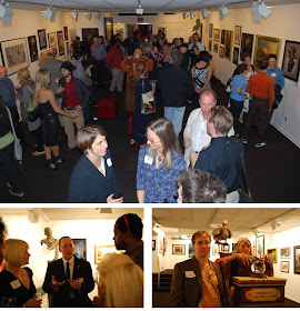
Fantasy art is alive and well in large measure because of the tireless efforts of Cathy and Arnie Fenner (lower left photo), who publish the Spectrum annual collection of fantastic art.


New York's Society of Illustrators was the host on Friday for the opening of the second Spectrum exhibition, with over 100 paintings and their creators. Irene Gallo, art director of TOR books, is visible in the left foreground of the top photo. She spent huge amounts of time making the tough choices of what to include in the exhibition, and there wasn't room to include many deserving artists.

It was a privilege for me to meet many whose work I have admired, including Thomas Kuebler (photo lower right), whose vividly real sculpted fortune teller inhabited the center of the room.

On the following day, the Society opened its doors again for Art Out Loud, a live painting event that included Sam Weber, Charles Vess, Donato Giancola, Greg Manchess, and me.

I had the painted quick portrait sketches of Walt Reed and his son Roger. Walt is a renowned historian of American illustration and founder of Illustration House gallery. It was Walt's book Illustrator in America, 1900-1960 which got me interested in the profession when I was a junior high school student, and I was thrilled to have him sign my dog-eared copy.
-------
The Spectrum exhibition will be on display through October 17, and it's free. More info here.
Thanks to the Society of Illustrators and to Jessica and Gene for the photos.

Sunday, September 13, 2009

"On Stranger Tides" Next Pirates of the Caribbean Title


Since the announcement at Friday's D23 Expo, speculation has begun about the next installment of the Disney Pirates of the Caribbean franchise. The title for the summer 2011 movie will be "Pirates of the Caribbean: On Stranger Tides." The title comes from the Tim Powers novel for which I did the cover of the skeleton pirate.
------
More at the blog "Coming Soon"
The behind-the-scenes story on GurneyJourney of the making of that painting.

The artwork will be featured in a large reproduction in the soon-to-be-released Imaginative Realism. At the same store site you can order a signed copy of the collectors edition of the book, which has just become a lot more collectible.

Baby Tattooville in Three Weeks


The blog BoingBoing spotlighted Baby Tattooville, an art event coming up in just three weeks.

The idea is to bring about 50 collectors together with a small group of artists for a weekend in an unforgettable destination. The collectors get a lot of cool free stuff and they can watch the artists at work and ask them questions.

The place will be the fanciful Mission Inn, in Riverside, California, which seems to be woven of dreams already.

The artists hail from the pop-culture surrealism genre, and they include Michael Hussar, Audrey Kawasaki, Travis Louie, Elizabeth McGrath, Miss Mindy, Johnny KMNDZ Rodriguez, KRK Ryden, Greg "Craola" Simkins, Yoskay Yamamoto, and me.

One of the paintings I'll exhibit and offer for sale is the painting I did for the creature design class that I taught at the Woodstock School of Art last summer (8x10 oil).

I'll be doing an Explorer's Journal of 50 sketches on location, documenting the rarely seen weirdnesses hiding just behind the observable world of the Mission Inn. Each collector will get to return home with one of the sketches.

Here's the full description from the organizer, Bob Self:
This October, Baby Tattoo Books is offering a rare opportunity for a very limited number of fans and collectors to spend a weekend immersed in a creative wonderland with James Gurney, Audrey Kawasaki, Travis Louie, Elizabeth McGrath, Miss Mindy, Johnny KMNDZ Rodriguez, KRK Ryden, Greg “Craola” Simkins, Yoskay Yamamoto, and a few surprise guests. This event, which is strictly limited to 45 paying attendees, is unlike anything you have ever heard of before. Imagine having three days and two nights to hang out with your favorite artists in a socially casual yet creatively stimulating environment; then imagine receiving a gift bag full of original sketches, exclusive prints, collectible art toys and other surprises (perhaps James will let you in on a few of the top secret details). The event is called Baby Tattooville, and you do not want to miss it. Full details and registration information can be found at http://www.babytattooville.com, but here are a few highlights...

- Collaborative live painting by all of the Featured Artists
- Limited edition print featuring work by all of the Featured Artists
- V.I.P. preview of “Son of Baby Tattooville” museum exhibition
- Dr. Sketchy’s life drawing salon with Featured Artists
- ‘round-the-clock art and entertainment
- Accommodations at Southern California’s most visually stunning hotel
- Multiple meals including a spectacular Sunday brunch
- Did we mention the jaw-dropping gift bag?

Baby Tattooville 2009 is taking place October 2-4 at the historic Mission Inn in Riverside, California. It is truly an experience beyond your imagination. Fewer than 10 tickets remain available, and the event is only two weeks away. Register now at http://www.babytattooville.com.

-----
There are still a few spots left for collectors to join the fun. Sign up soon; they'll go quickly.
BoingBoing piece.
BabyTattooville.
Photo credit: Cal State Riverside

Friday, September 11, 2009

Gryposaurus, Part 2

With the maquette described in yesterday's post, I went outside and set it up on a piece of filmmaker's grip equipment called a C-stand. Now I could experiment both with different angles and different light directions and see exactly what was happening with the shadows.


I found some very tiny leaves and put them in the dinosaur's mouth. I wanted to see real leaves to study the transmitted light. I also went to a botanical garden to photograph magnolia leaves, and used those leaf shapes for reference.

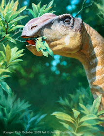
Here's the final painting in oil on illustration board. I concentrated detail and dark accents around the eye and the tongue, which in the maquette is curling back to grab the leaves.

The far forest goes way out of focus to subconsciously suggest that this is a wildlife photo. Technically I handled this with white nylon flat brushes after a bristle block-in.

Shallow depth of field is common in wildlife photographs because they are usually shot with telephoto lenses, which have a very narrow focal plane.

I also used an effect called "bokeh," which I haven't really defined yet on the blog. Bokeh (Wikipedia explanation here) is that cool photographic effect where far away bright highlights or sky holes become circles that increase in size with distance.

Even though I'm a traditional painter, I'm using a lot of photographic effects here quite deliberately to create a photographic impression and to blend the images naturally in Ranger Rick. Although I used those effects, I didn't trace the reference photos because there were a million ways I wanted to improve on them.

A lot of what I've learned about light and color and vision has come from my conversations with professional photographers, who think about imagemaking a little differently than artists usually do. Hope all this stuff isn't too dry and technical.
------
I'll be heading into New York City today for the Spectrum opening and Art Out Loud, so probably won't post tomorrow.

Thursday, September 10, 2009

Gryposaurus, Part 1

Today we continue the behind the scenes look at the new paintings for the October issue of Ranger Rick magazine.

The next creature I needed to visualize was a duck-billed dinosaur called a Gryposaurus (and I misspelled the name). As you can see from my colored pencil sketch, I wasn't too sure what the forms would look like. Even though I was looking at lots of fossils, he looks lumpy and unconvincing. If I went ahead on the final painting, it would only have looked about 10% better.

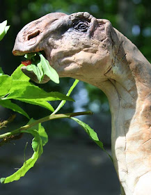
I think you really learn a form through your fingers (that's why I love museums that have casts of great sculptures that you can run your hands over). By making a tiny sculpture of this particular dinosaur, using Fimo over tin foil and armature wire, I came to know my subject.

I kept checking it against the drawing. That nasal bone is not quite high enough.

I painted it with acrylic, darkening around the eyes. Many animals have dark color around their eyes for the same reason that football players smudge stuff around their eyes: to cut down on glare.

Tomorrow I'll show you how I photographed the maquette and proceeded with the painting.

Wednesday, September 9, 2009

Titanoboa, Part 2

The next step in the painting of the giant fossil snake was to make a maquette of the snake and the croc out of Sculpey, painted in acrylic. It only took a few hours to do this rough model, but without this step I never would have understood how the forms needed to wrap around each other.

I set up the maquette in a tiny diorama, with a rock and some sticks that I found in the backyard.

The wrestling reptiles are sitting half submerged in a take-out food container which I painted black inside and filled with muddy water. The background is a piece of mat board.

I lit the maquette with a theater spotlight and shot it with a Canon Digital Rebel single lens reflex camera and printed out several variations.

With that information, combined with many photographs of living snakes, I proceeded with the final pencil drawing and then the painting. For more info on this procedure, check out these earlier posts “Technique Nuts and Bolts” “Utopiales Line Drawing.”

Here’s the painting in progress. The pencil drawing shows through in the lower area.

And the final painting, 14 x 19 inches, finished five days after starting the maquette. By contrast to the Cumberland painting, this painting went together pretty briskly. Inset in the painting is the page layout as it will appear in the October issue of Ranger Rick magazine.

I find that the greatest value of the maquette in a case like this is in providing little accidents of cast shadows, like the hand of the dying croc on the snake’s neck, and the tail’s shadow crossing the snake's body farther down. It also helped in the placement of the highlights, something that can be tricky to guess at on an organic form.

Those little unexpected nuances are almost impossible (for me) to invent out of pure imagination but they give the ring of truth that I believe is vital in a piece like this.