Friday, March 31, 2023

Does Language Constrain The Speed of Thought?

Here's a question: Are our thoughts limited by having to move at the speed of speech? 

And a bigger question: How is our mental life constrained by speech altogether?

These questions elicited a lot of lively discussion on my Instagram account. To the broader question, Rosemary reminded me of the truth and limitations of the Sapir-Whorf Hypothesis, also known as linguistic relativity, which argues that our thought is shaped by language we speak.

One problem with such a theory is that it tends to assume that all thought is verbal. Artists, musicians, architects, and engineers know otherwise. We can form purely visual or musical ideas which surely qualify as a form of thought or reasoning. If you've ever had an artistic encounter with another artist with whom you share no spoken language, you know that those visual ideas can be shared between people no matter what languages they speak.

Regarding the first question about the speed of thought, it occurs to me that when we are speaking, our language necessarily places upper limits on the pace at which we can roll out ideas, a problem for human-computer interfaces. An artificial intelligence can generate paragraphs in milliseconds, but it takes us a lot of time to type or say a series of ideas. 

Sometimes I have the opposite problem, where my brain works a little too slowly to articulate a sentence fluently, so the result almost sounds like aphasia. I believe that for most people, our receptive capacity for language by timing how fast you can read, or while listening to an audio book by doubling or tripling the normal speech velocity. You can demonstrate this on YouTube or your favorite podcast app by increasing the speed settings on audio playback. 

Certain non-linguistic modes of thought don't seem to be limited by velocity of expression. For example, the thought that goes into solving a Rubix cube seems almost like an instantaneous pattern recognition, and the act of puzzle solving appears to be limited only by the neuro-muscular action of the hands.

To me, the limitations of language become clearest when trying to translate a memory of a dream after awakening. Rendering a dream into words is like trying to taxidermy a jellyfish. The act of trying it makes me realize how words can do violence to certain kinds of non-logical ideas.

Thursday, March 30, 2023

Exhibit of 19th C Drawings and Watercolors

The Albany Institute of History and Art recently opened an exhibit of plein-air drawings and watercolors called "Hudson River School Journeys: Watercolors and Drawings by William Hart and Julie Hart Beers."

The featured artists are a brother and sister pairing, with a large room filled half with William's work, and the other half with Julie's. 

William Hart, white pine, watercolor

Both of them traveled throughout the northeastern USA, sketching in watercolor, gouache, pencil, and pen. 

William Hart, First Snow, Grafton, Maine, watercolor and gouache

The small image was painted on September 30, 1867 by William during a trip to Maine, as an early snow fell while the autumn colors were at their peak. One reviewer from the time said "It was a strange meeting of two seasons."

Hart's sister Julie Beers frequently went sketching with her brother, and she often brought her friends and students. Her children were artistic too, and the show includes intimate glimpses into their joyful moments, with sketchbooks, photos, and illustrated letters and postcards by her daughter Marion Robertson (Beers) Brush. 

Most of Julie's works are generously being loaned to the exhibition by her descendants.  In the photograph below, Julie is standing amidst her students. She's the one holding a brush behind the central seated woman. 


William Hart's ink wash composition (below) displays "the artist's masterful handling of washes and dry brush application of India ink to create a scene that captures the luminosity of soft sunlight fading in advance of an approaching rainstorm." 

Keene Valley, New York, William Hart, 1873, India ink on paper

William Hart said, "The picture, indeed exists primarily in black and white. The first thoughts of all great pictures are simply beautiful bits of chiaroscuro." 


It's a rare treat to see a whole exhibition of original drawings and watercolors. Curator Doug McCombs quotes from contemporary reviewers in the captions, giving a sense that American society at large was keenly interested in regular updates about the travels and creations of these artists.

Mr. McCombs will be giving an in-person curator talk about the exhibition on April 16, 2023, and you can sign up at this link.


While you're there, be sure to go up to the top floor and check out the large room of Hudson River School oil paintings. Also, don't miss the adjoining exhibition of costumes called "It's a Wrap: Two Hundred Years of Outerwear." 

It's all at the Albany Institute of History and Art in Albany, New York through August 6, 2023. 


Tuesday, March 28, 2023

Stereo Audio Capture


In my latest YouTube video you'll notice stereo mics clipped on the sides of my usual easel setup. 

These communicate wirelessly with the camera and capture contact noises and street sounds into the video.

Monday, March 27, 2023

Shadows and Light

Shadows are not the absence of light—they're just areas lit by weaker and differently colored sources.

New video: "How to Paint Light and Shadow" (link to YouTube)

Saturday, March 25, 2023

Illustration by Balliol Salmon

A.J. Balliol Salmon (1868-1953) was a British illustrator who painted high-society subjects using pencil, watercolor, gouache and pen. 


Various drawing and painting media were used in early 20th century illustration: "There are very few technical limitations in general illustration. You may use charcoal, chalk, pencil, wash, oil-colours, line and tone combined—practically anything which will reproduce effectively. The minor periodicals use pen and ink, chiefly because the paper on which they are printed isn't suitable for tone work, but your readers want, as far as possible, as complete a representation of a subject as they can get, and full tone or colour can of course be suggested more easily by the tone mediums than it can be by line."

—Percy Bradshaw, quoted in the Artist MagazineAug. 1932, p. 248. Thanks, James W.

Thursday, March 23, 2023

Painting in Gardens

I've got tips for painting in the garden coming up in the April/May 2023 issue of International Artist.


Here's one of the tips: Leaves are lighter than their surroundings.

In a natural setting, leaves get lighter in value at the top of the plant because they receive more illumination than the ones farther down the plant. It’s safe to say that all leaves are lighter than their background, unless they are against the sky, in which case it’s safe to generalize that they’re darker than their background.

Wednesday, March 22, 2023

BAM Logo

While I was a college student at UC Berkeley, I got a part-time job as a designer and paste-up artist at BAM magazine. BAM was a music magazine in the San Francisco Bay Area. It was kind of like the Rolling Stone of California.

They asked me to redesign their logo. Back then designing a logo meant using ink pens, T-squares, compasses, circle templates, photostats and waxers. The gradient tone was made with Zipatone, a pre-printed grid of black dots on a self-adhesive clear plastic sheet. I would stick it on the pen drawing and cut away everything outside of the design.

BAM used my Broadway-on-neon-style logo for a while, but it really was too complex for a magazine logo, so they  adapted it to a simpler design. 

Tuesday, March 21, 2023

Etching by Callot


Beggar with Pot, etching by Jacques Callot, 1623

Wikipedia says that Callot "made more than 1,400 etchings that chronicled the life of his period, featuring soldiers, clowns, drunkards, Gypsies, beggars, as well as court life."

Monday, March 20, 2023

'I'm Done with Girls on Rocks.'

After painting dozens of successful calendar illustrations, Maxfield Parrish felt that his subjects were getting stale, and he wanted to paint pure landscapes for his own pleasure.

"I'm done with girls on rocks," Parrish said in 1931. " I've painted them for thirteen years and I could paint them and sell them for thirteen more. That's the peril of the commercial art game. It tempts a man to repeat himself. It's an awful thing to get to be a rubber stamp. I'm quitting my rut now while I'm still able."

He continues: "Magazine and art editors—and the critics, too—are always hunting for something new, but they don't know what it is. They guess at what the public will like, and, as we all do, they guess wrong about half the time. My present guess is that landscapes are coming in for magazine covers, advertisements and illustrations...."

"There are always pretty girls on every city street, but a man can't step out of the subway and watch the clouds playing with the top of Mount Ascutney. It's the unattainable that appeals. Next best to seeing the ocean or the hills or the woods is enjoying a painting of them."

---

From Associated Press, April 27, 1931, quoted in the book Maxfield Parrish by Coy Ludwig, page 129.


Sunday, March 19, 2023

Maxfield Parrish's Edison Mazda Calendars

The Edison lightbulb company commissioned American illustrator Maxfield Parrish to create paintings for a series of calendars, which were published starting in 1921.

 The theme was the history of humanity's relationship to light.


The calendars were extremely popular, in part because they came out during a time when electricity was making its way to rural America.


The name Mazda comes from Ahura Mazda, the chief deity of Zoroastrianism, which divided the world into realms of light and darkness.

Saturday, March 18, 2023

'To Quicken Our Souls'


Harvey Dunn said of his teacher Howard Pyle, "His main purpose was to quicken our souls that we might render service to the majesty of simple things."

Friday, March 17, 2023

What Do Watercolor Societies Say About Gouache?

Can you enter a painting that uses gouache into the annual competitions of the various watercolor societies? What are their rules about mixed media?

There are several different organizations in the USA, and they have different rules. The oldest group is the American Watercolor Society (based in New York and founded in 1866), followed by the National Watercolor Society (a California based group founded in 1920), and the Transparent Watercolor Society of America, which formed in 1976.

The American Watercolor Society rules allow "water soluble media: watercolor, acrylic, casein, gouache and egg tempera on paper. Watercolor board is not accepted," but forbid "collage, pastels, class work, copies, digital images or prints."

The bylaws of the National Watercolor Society don't mention gouache specifically, but they define watercolor fairly broadly to include "aquamedia, watercolor, acrylic and other watersoluble media," specifically excluding work in encaustic or oil. The latest exhibition prospectus puts it this way: "Painting must be watermedia paintings on natural or synthetic paper Yupo, Aquabord and Clayboard. No stretched canvas or canvas board. Collage may be used but aqueous medium must constitute 80% or more of the work." They forbid digital media and photography, which presumably means that generative AI is not acceptable.

I asked Lana Cease, who is on the board of directors of the National Watercolor Society to explain. "The main difference between the societies that you mention," she says, "are mainly the media that they allow. Of course, anyone could be a member but to enter the exhibitions you have to use your materials in a certain way."   

Lana says that the NWS "welcomes everyone in any media with all skill levels. We have members that just started painting recently, and also have members that are highly trained, awarded and successful. We do allow art such as collage if the collage is mainly water media, but we don't do mixed media like oils and acrylics together. You could mix anything water based. So essentially, you could use watercolor, gouache, watercolor pencils, water soluble pencils (although we allow pencil as long as it's not predominantly pencil), watercolor markers, and fountain pens if they contained water based media.... and still be considered water media with the look of mixed media. We can't allow things like pastel or oil based paints in our exhibitions, but of course, we still would love to have those types of artists be part of our organization. We're very inclusive and we try to be progressive."

Specifically, the rules of the The Transparent Watercolor Society say that the work "Must be transparent watercolor, applied on a single piece of rag or wood pulp paper that is free of pigment and imbedded materials." 

The TWSA goes on to exclude the following: 
• Opaque white paint, of any kind, such at titanium white, Chinese white, etc. 
• Gesso, matte medium, or any other priming material or exterior surface treatment 
• Gouache, acrylics, or water-soluble oils - Inks, metallic, or iridescent paint or products that leave a metallic, graphite, or reflective sheen. 
• Watercolor crayon, colored pencil, charcoal, pastel, Conte sticks, or Conte Crayons 
• Varnish, wax, wax crayon, oil sticks, or oil pastel 
• Collage or surface constructions, impasto, embossing 
• Watercolor resist, such as Frisket, that is not completely removed from the final painting 
• Yupo or similar papers. 
• Canvas or canvas paper 
• Use of digital images or enhancements printed on the paper.

What is the rationale given by the TWSA for excluding gouache when so many pigments classed as watercolor (such as cadmium yellow) are more opaque than other pigments (such as diazo yellow) that may be in a tube of gouache?

In their FAQ, the TWSA addresses this issue: "The use of transparent watercolor paint includes pigments classified as 'opaque', such as the cadmiums and others which are acceptable as long as they are applied largely in a transparent manner. The focus on the way paint is applied to the paper, 'in a transparent manner', is to allow the white paper to create luminosity rather than, 'in an opaque manner', which obscures the reflected light. This shifts the emphasis from a discussion of pigment to the way in which pigment is applied. In practical terms, if the texture of the paper can be seen through a dark area of the painting, or there is an undulation of value or color(s) within it, then it is not 'opaque'."

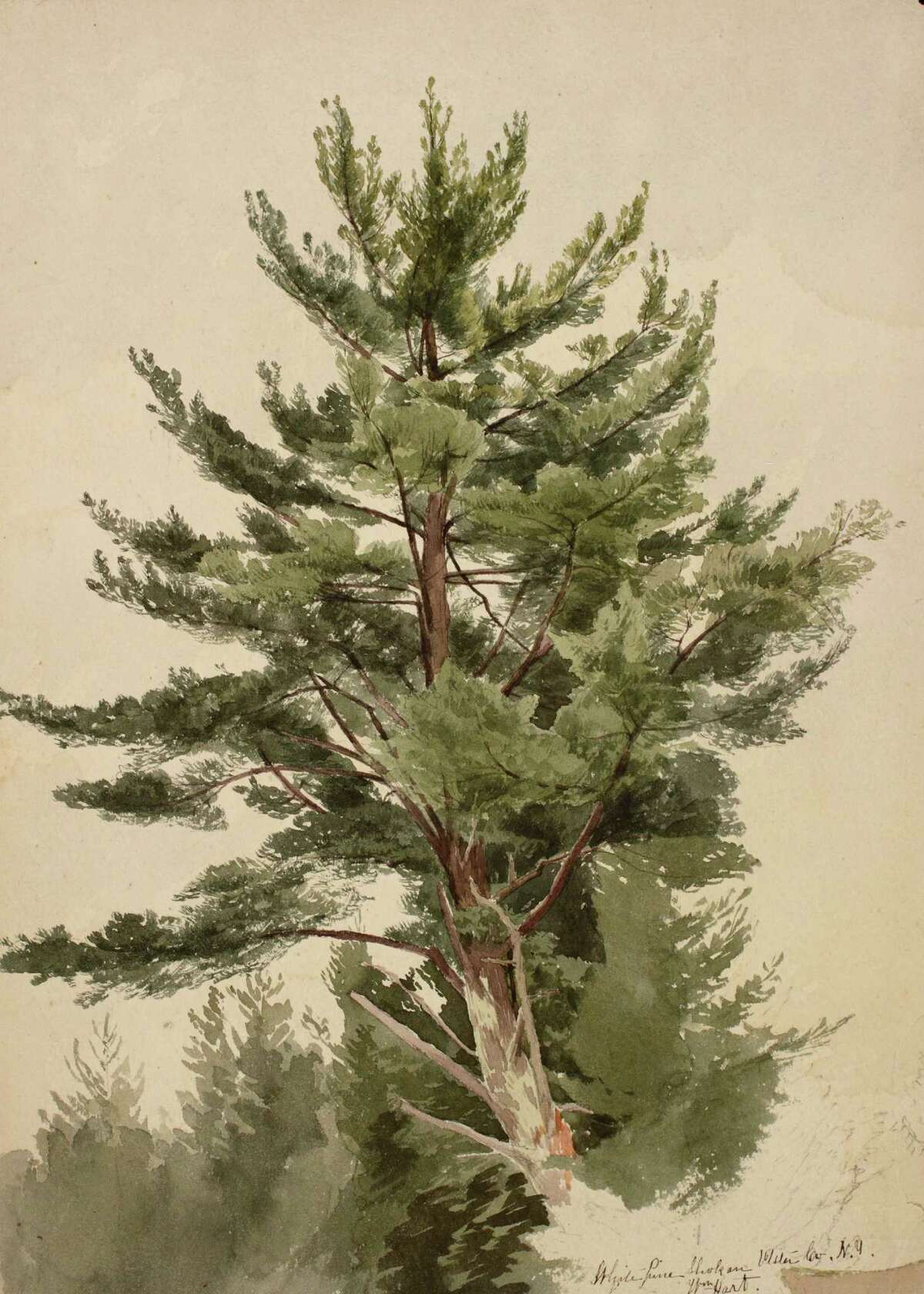
What is the reason for banning opaque media and so many other techniques, especially given the fact that many traditional masters of watercolor, such as John Singer Sargent, Winslow Homer, and William Trost Richards frequently used gouache? 

In a single word, the answer would be luminosity. As the NWSA argues on their website:

"'The white paper showing through a transparent wash is the closest approximation to light in all the media, and light is the loveliest thing that exists.' This is how Edgar Whitney describes and extols the virtues of transparency. Cheng Khee Chee expands on Whitney's definition by describing the effects of transparent washes. 'The flow of washes possess a strong evocative power. The interpenetration of colors creates mysterious precipitations and nuances.' Respected artist and teacher, Frank Webb, describes luminosity as '...the painting's ability to give off light. It generally derives from the light within and beneath - such as the white of watercolor paper under paint.'

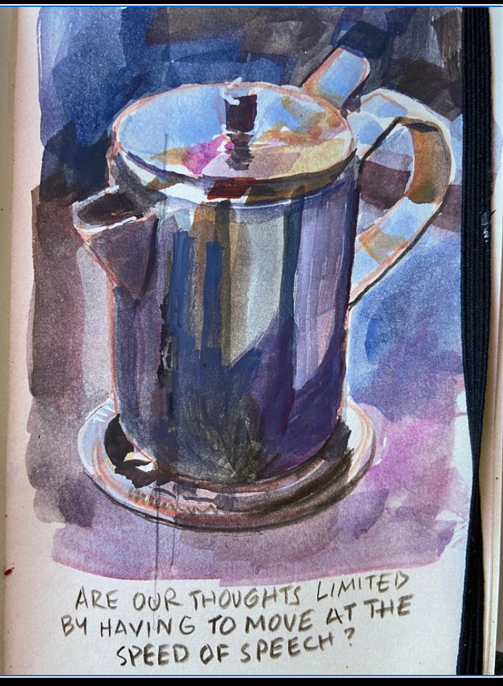
I'm sympathetic to these reasons for using transparent pigments, because transparent passages can lend themselves to efficiently achieving certain kinds of gradients and textures that are hard to execute with opaque paints. 

But in my experience, transparency offers neither a guarantee of luminosity, nor a hedge against muddiness, since those qualities have more to do with the disposition of tones within a picture, however they are achieved technically. Flat, opaque, or thickly painted passages, if they are of the right value, can sometimes bring light and air to a picture.

My own preference with water media is to begin a picture transparently and bring in opaques or other mixed media wherever they're called for, and most often my own paintings in water media are a blend of opaque and transparent passages, just as they would be if I were painting in oil. 

Thursday, March 16, 2023

Bistable Percepts

Most people are familiar with the face / vase illusion (below). Psychologists refer to it as a "bistable percept." 


A bistable percept is an image that can be perceived in two different ways. The perception can switch back and forth between the two interpretations, but you only see one at a time. 


Another example of a bistable percept is the Necker cube which switches from appearing above you and projecting to the right, to appearing below you and projecting to the left.

One characteristic is that the duality, once perceived, can't be forgotten.

Wednesday, March 15, 2023

Tuesday, March 14, 2023

Portrait by Peterssen

Hjalmar Eilif Emanuel Peterssen (Norwegian 1852 – 1928) painted this portrait of his artist friend Kalle Løchen  in 1885. 

Eilif Emanuel Peterssen, Kalle Løchen, 1885. Oil on canvas, 151 cm (59.4 in) x 96 cm (37.7 in) .

Monday, March 13, 2023

Changing Color Preferences Over Time

If you had the impression that cars were more colorful in the past, you'd be right. Thirty years ago, green was quite popular, but its popularity decreased, while white has increased rather dramatically.

In recent decades, consumer products and advertising have tended to head more in the direction of neutrality: white, gray, and black.

The objects we surround ourselves with are sometimes colorful and sometimes gray, white, or black. How have the colors of those objects changed over time?

The chart below was created by sampling the distribution of pixels in samples of online museum collections of objects. The machine-learning algorithm also presumably also filtered out background colors. 


The chart starts at the left with objects from 1800 and it finishes on the right in 2020. The range of warm colors has compressed in the last 20 years.  But blue has increased in frequency. 

At first I thought this was simply the result of objects yellowing with age, but there seem to be other factors at play as well. Before about 1900, most objects were made of wood, paper, brass, or other metals. When colorful plastics and printing became available, the gamut of colors widened. 
--
Read more from Science Museum Lab via Paul Graham.

Sunday, March 12, 2023

Drawing over Watercolor Washes


Here’s an urban sketch from Montreal using the technique of fountain pen over watercolor washes.

More about this technique at this YouTube link.


Saturday, March 11, 2023

Pen Over Watercolor

Here's a strategy for sketching subjects with a lot of surface complexity.


In this YouTube video, I demo a sketch of a woodpile using fountain pen over loose watercolor washes.


It's more common for artists to do the line drawing first, which I presume is how Thomas Girtin did this one....
...or this one by John Sell Cotman.

The first stages can be remarkably loose, just setting up possibilities for the pen line.

I use a few blobs of white acrylic to suggest the bright sun, and add loose, scrubby textures from a house painting brush.


Check out the whole presentation in the YouTube video, which contains links for supplies in the description.

Thursday, March 9, 2023

What did Andrew Wyeth mean by "drybrush?"

What did Andrew Wyeth mean when he called his paintings "drybrush?"

Undersnow by Andrew Wyeth, drybrush, 1977

I've found Wyeth's use of the term misleading, because Wyeth's "drybrush" paintings often have a lot of very wet passages. Wyeth didn't think like other artists, and his notions about his use of the medium are mixed in with a lot of emotions and instincts. Here's what Wyeth himself said: 

"Drybrush is for more contemplative works (as compared with watercolor), or when a work arrives at a profound emotional stage. I use a smaller brush, dip into the color, splay out the bristles, squeeze out a good deal of the moisture and color with my fingers so that only a very small amount of paint is left." Drybrush is layer upon layer — a definite 'weaving process.' Source of quote: Thomas Hoving in conversation with Andrew Wyeth, From Handprint

Wyeth also said to Hoving: “Now drybrush comes to me through the fact that after I finish a tempera I may feel exhausted. I may have worked four or five or six months on it and I’m desperately tired. But then I may see something that interests me and watercolor doesn’t have the strength somehow. I start with a watercolor sometimes and realise, damn it all, I feel stronger than that. I want to go into it with a little more detail so I start working in drybrush.... " 

Garret Room" (right) is a very good example.

Wyeth continues: “When I stroke the paper with the dried brush, it will make various distinct strokes at once, and I start to develop the forms of whatever object it is until they start to have real body. But, if you want to have it come to life underneath, you must have an exciting undertone of wash. Otherwise, if you just work drybrush over a white surface, it will look too much like drybrush."

It was rare for Wyeth to allow other artists to watch him paint, but he made a few exceptions, and what follows are some quotes from what these observers noticed about his materials and methods.

Les Linton says: "I met Andrew Wyeth in March of 1976 and was able to not only speak to him about his materials, but also ask about his techniques. He was usually reticent about tech talk, but for some reason he warmed up to me and I was able to spend an entire afternoon asking questions.

Les continues: His paint box was there on the table by the back door and that's when I got the first clue about his use of gouache. I did notice he had a tube of Shiva casein white in there also. When I asked him about it he said once it dried, it was less likely to pick up when painted over again. I think that was the opaque white he used most in his watercolors and drybrush paintings, but I can't swear to it."

According to Linton and other observers, "most of the paper was Imperial (22" x 30") 140 lb. Cold Press (or "Not," which in Brit-speak means not smooth or rough) woven linen, not cotton, and handmade. This is why the sizing was "harder," unlike the softer cotton watercolor paper later revived under the Whatman name (and mould made mimicking the original Whatman handmade texture). This harder surface is one of the reasons why Wyeth was able to abuse the surface of the paper so easily. He used sandpaper, knives, steel wool, and just about anything else he could find. Wyeth also had a large supply of rough Whatman Imperial sheets on hand as well."

"Many of Wyeth's drybrush watercolors were painted on extremely smooth 3-ply, plate finish (Bristol) from Strathmore. Some of the earlier Bristol paper he used (50's & 60's) was not archival, but current production is. You can see yellowing in some of his earlier studies and drawings on that particular paper.

"Mr. Wyeth used Winsor & Newton watercolors (with a few Grumbacher colors) and also made much use of W/N Gouache in his darker, earthier passages. The opaque watercolor came in handy in his drybrush watercolors painted in a more detailed egg tempera technique. He occasionally added alcohol (or whiskey) to his water when painting outdoors in cold weather to retard freezing."

"The paint thickener came from liquid gum arabic as well. These passages look thicker, 'juicier,' and are characterized by little bubbles (not possible with just water). He used an old, beat up, folding, enameled metal watercolor palette when I saw it in the 70s. I'm pretty sure his own watercolor palette was made in the U.S., but the nearest thing I've seen to it is the large, black, metal folding palette made by Holbein of Japan - most likely a copy of that same design. He favored W/N Series 7 Kolinsky sable rounds and used to buy the size #1's "by the fistful," again according to Berndt (who used to baby sit Andy when he was a child!). I've always assumed these very small brushes were purchased for his temperas and drybrush paintings and he wore them out readily."

"The main thing I came away with from my visit was Mr. Wyeth's willingness to break 'the rules' and use anything that gave him the effect he wanted in a painting. There were studies littered all over the floor of his studio, some with dusty shoe prints where he'd walked on them. 

Tuesday, March 7, 2023

E.H. Shepard meets E.A. Abbey

Pen illustration by E.A. Abbey 

When Ernest H. Shepard (1879-1976) was a young, aspiring artist, he dreamed of meeting the reigning king of pen-and-ink illustration, Edwin A. Abbey (1852-1911).

E.H. Shepard, illustration for A.A. Milne

Shepard first met Abbey while a student at the Royal Academy Schools, but he also went to meet the master painter and pen draughtsman in his studio:

"Abbey was already one of the world's most distinguished artists, but it was his incomparable illustrations in line to Old English Songs, and the Comedies of Shakespeare, which made him the outstanding idol of all young illustrators of his time. Shepard acknowledges his deep gratitude to Abbey, who showed him what black and white work really meant. All of us knew Abbey's enchanting work can easily understand the influence which it had on Shepard's own graceful talent. That influence has remained. Shepard's line has always been delicate and sensitive, and his feeling for atmosphere especially notable. Abbey was most generous in his encouragement, and, selecting one of the young man's drawings, insisted on sending it to Punch, with a strong recommendation. That drawing was accepted, and Shepard began to add a very pleasant chapter to the history of illustration."

Shepard would later become the beloved illustrator of Winnie the Pooh and The House at Pooh Corner.

Wikipedia on E.H. Shepard and E.A. Abbey 

Quote from The Artist Magazine, May 1941 (Thanks, James W.

Books: The Drawings of E.A. Abbey and The Work of E.H. Shepard

Sunday, March 5, 2023

The Architect

The architect stands above us, framed by soaring arches, holding his plan for the structure that is being built by workers scurrying among the scaffolding. 

Henri Marcel Magne, L'Architecte, 1910 Musée d'Orsay

The architect gestures upward with his cane. He grips the plans against the tug of the wind, and his assistant holds onto his hat. The billowing clouds behind him appear weightless, while in the foreground rope lifts a heavy block against the pull of gravity.

Everything in the composition speaks to the lofty ambitions of the architect during an era of optimism.

Saturday, March 4, 2023

A Cottage Garden


A Gardener in a Cottage Garden by Helen Allingham, 
watercolor, 28 x 37.5cm (11 x 14 3/4in)

Friday, March 3, 2023

Learning by Sketching


Quick pencil and gray-wash study thumbnails of compositions are a helpful way to “train your mental model with an optimized dataset.”


The composition on the lower right is "Cinderella," 1880, by Valentine Cameron Princep (British, 1838-1904).

Thursday, March 2, 2023

Charles Léandre


Charles Léandre (1862-1934) was a French artist best known for his comic drawings and caricatures.


When he drew caricatures, he knew just what features to exaggerate, and how much to exaggerate them to convey the character.

But he was much more than a caricaturist, painting scenes that were true to nature. This one is in pastel.

He often portrayed children and women, doing so with remarkable sympathy.

Wednesday, March 1, 2023

Herbert Olivier's Spring Scene

Herbert Arnould Olivier, Summer is Icumen in, 1902, oil on canvas

In 1902, English painter Herbert Arnould Olivier painted a charming image of a young woman beside a flowering tree and exhibited it at the Royal Academy.


Sotheby's says: When the picture was exhibited at the Royal Academy in 1902 it was given the title of "Summer is Icumen In," being the first line of a traditional English song known from a thirteenth century manuscript at Reading Abbey:

Summer is icumen in,
Loudly sing, Cuckoo!
The seed grows and the meadow blooms
And the wood springs anew,
Sing, Cuckoo!

"The song describes the approach of summer and the glories of the reawakening of nature after the somnolence of winter. Olivier therefore used the symbolism to create a painting imbibed with the symbolism of abundance, fertility and rebirth. The subject of Primavera and of Persephone, the Greek Goddess of Spring was popular in the twentieth century as an allegory of rebirth, of the optimism for a new century."

More at Sotheby's. Thanks, James W.