


Anton Dieffenbach, (1831-1914). Window, 1856, Height: 36.5 cm (14.3 in); Width: 25.1 cm (9.8 in), Met Museum
Monday, May 31, 2021
Dieffenbach's Window
Sunday, May 30, 2021
Seeing Depth for the First Time

Neurobiologist Susan R. Barry was an adult when she acquired depth perception for the first time.
"Barry had been cross-eyed and stereoblind since early infancy. After half a century of perceiving her surroundings as flat and compressed, on that day she saw the city of Manhattan in stereo depth for first time in her life. As a neuroscientist, she understood just how extraordinary this transformation was, not only for herself but for the scientific understanding of the human brain. Scientists have long believed that the brain is malleable only during a "critical period" in early childhood. According to this theory, Barry's brain had organized itself when she was a baby to avoid double vision - and there was no way to rewire it as an adult. But Barry found an optometrist who prescribed a little-known program of vision therapy; after intensive training, Barry was ultimately able to accomplish what other scientists and even she herself had once considered impossible."
The story shows not only that the brain is malleable, but also that a conscious awareness of experience isn't the same as actually having that experience. As author Bruce Goldstein puts it, "Scientific knowledge is not enough."

Saturday, May 29, 2021
Figures in Landscape
Does it improve a landscape painting to add small figures? Figures can give a sense of scale; they can let viewers project themselves into the scene; and they can animate an otherwise still scene.

Jasper Cropsey (1823-1900), Mount Washington
Some Hudson River School painters put in stock figures that weren't too attention-getting.There might be a couple of fishermen launching a boat or a shepherd and his flock or a milkmaid ambling across the farm.
Art historians call them "staffage" figures, "a descriptive term for figures to whom no specific identity or story is attached, included merely for compositional or decorative reasons. In the latter sense, staffage are accessories to the scene, yet add life to the work; they provide depth to the painting and reinforce the main subject, as well as giving a clear scale to the rest of the composition." 


Vladimir Makovsky, Fishing, 1884
But a few painters have put well crafted figures that tell more of a story and reward the viewer's attention.

Caspar David Friedrich The Evening Star
If you give a little thought to the placement and pose of the figures, and combine them with a good title, they can add a touch of drama, satire, or whimsy.
Friday, May 28, 2021
The Clothesline

The Clothesline by J.G.
The summer sky coaxes the dripping wetness
From the yellow tee, the blue jeans,And the red flannel shirt.
The breeze teases them,
Into dancing together,
Before they return indoors,
Folded and stacked in separate drawers,
Secretly glowing with the memory of sun.
Thursday, May 27, 2021
Painting Monkeys as People
Gabriel Ritter von Max (1840-1915) painted satirical pictures of monkeys in human roles. He earned the nickname “Affenmaler,” (monkey painter).

In the 19th century, many people were seeing live monkeys for the first time. The London Zoo opened in 1828, and the Philadelphia Zoo opened in 1874.
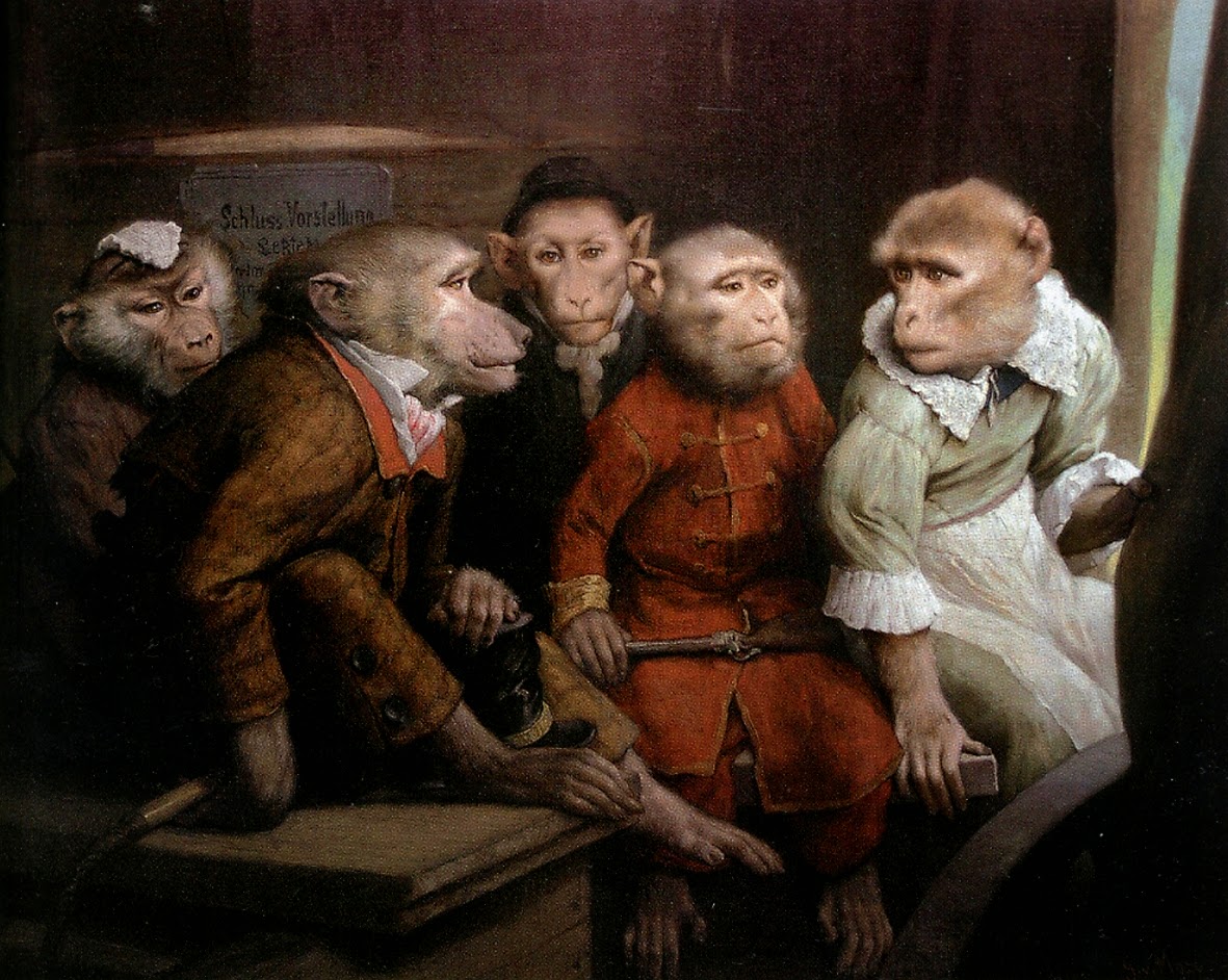
There were also traveling performers with monkeys dressed as humans. Seeing animals up close in an era before wildlife films must have been a revelation.
Charles Darwin's book "On the Origin of the Species" was published in 1859, which began to draw the connection between human and non-human primates. 

Von Max, Monkeys as Judges of Art, 1896
Von Max had monkeys as pets, too. He adopted his first capuchin monkey in 1870, and later:
"he bred the animals at his Munich home near Starnberger Lake. He painted the monkeys in both living and deceased states; when the monkeys died, he positioned their bodies in specific poses and photographed them as material for later paintings. Von Max was fascinated with the link between humans and primates, an interest that aligned with the recent developments in evolutionary biology. Whereas the tradition in European paintings often associated monkeys with the vulnerabilities of humans, von Max humanized his subjects."Source for quote.

Wikipedia Gabriel Ritter von Max. He also painted spiritual subjects which deserve another post.
Book: Gabriel von Max
Wednesday, May 26, 2021
Painting an Abandoned House Results
The results of our recent Painting Challenge: Abandoned House were so moving and fascinating that it was hard to choose the finalists. Instead of picking five, I've chosen eight.
There's something so sad and moving about a piano left outdoors to the elements. Your faithfully observed capture of that scene would have been impressive enough, but it's incredible that you even painted the dramatic following story of the fire.

Here’s a painting entitled “Upright Grand” that depicts an abandoned piano in front of an abandoned farmhouse in northern New Hampshire. The piano was being removed by an antiques dealer. When it fell on the front porch, he just left it there. I covered it with a tarp to protect it between going back to the site to paint it.


My favorite technical aspect is that the bright white on the front porch in my painting is the primed linen. The farmhouse ultimately burned down and I painted that too.
Sandy Derrick
Wonderful choice of subject, good writing and fun results. The gas pump looks like a sleeping robot.


At first, I was drawn by the barber poles placed around the gas pumps. But as I painted, I couldn’t help wonder[ing] about our love affair with trucks and cars and the oil industry. You can place charging stations almost anywhere…Elon might be right.
Paints used: Ultramarine blue, Yellow Ochre, Transparent Oxide Red, and White.
Nathan Loda
Such a great backstory to the cabin and a painting adventure as well.

Upon packing up my gear, wouldn't you know it, disaster struck again and my painting nearly fell down a woodchuck hole! I had to clean it up and refinish the painting in studio.

I really like the challenge of limited palette and since I've rarely use Sap Green so I thought two complementary colors (Ultramarine Blue, Raw Sienna) along with Sap Green and titanium white would give me a great challenge. Overall I felt decent about the painting and it's probably the most green painting I've ever done!
Anna Rich
Anna Rich
A thoughtfully written caption accompanies a carefully painted study. The store happens to be where my wife's Aunt Josephine worked in S. Klein's accounting department.

Western Nassau County NY, not known for its public architecture so no picturesque Victorian structures slowly being reabsorbed into overgrowth here. All that was paved over long ago. My family moved here in 1967, I don’t remember a time when downtown Hempstead wasn’t being economically challenged, probably because malls were being born nearby, siphoning shoppers away.
I’ve painted a classic Big Box store on Hempstead Turnpike that operated as S. Klein’s from 1955 until 1974. I can’t remember ever going in there, my mother favored Abraham and Strauss (also now defunct) a mile or so down the road. In 1974 it became E.J. Korvette until 1980 then Shoppers Village from 1980 to 1995. Shoppers Village was a concession store if I remember correctly with many merchants selling their particular goods, here luggage, there, watches or sneakers. I think they were bustling in the go-go 80s around the time 10k gold jewelry became popular.

In 1995 it became National Wholesale Liquidators where the merchandise was an ever-changing assortment of stuff from food to furniture. My son and I share a hobby I’d call Tat Trawling. I liked the remaindered books, foodstuffs, and dangerous Christmas ornaments. He was there for the small electronic components, lightbulbs, and dangerous Christmas ornaments. One day we showed up to engage and it was closed. It re-opened after maybe 24 months.
There were always shoppers in there but in 2018 it was itself liquidated.
The building was so big I couldn’t actually see all of it at once unless I sat too far away to recognize detail. As for architectural or even visual features to draw interest well, as we say here in New York, ‘you can fuhgeddaboudit’. I used casein in cadmium yellow medium, alizarin crimson, and permasol blue with white.
Mike McCleer
Here's a boarded-up old house in Detroit, with a monumental feeling reminiscent of Edward Hopper.

An abandoned house on East Canfield St. in Detroit in the evening sun. Gouache on 9x12" toned card stock; Winsor & Newton gouaches: Ultramarine, Vermilion and Spectrum Yellow.

The progress photo shows that I originally made the sky too bright, and I had to repaint it in thick lighter blue.
Samuel Alvarez
Samuel Alvarez
The use of dark values of the building gives this painting a tremendous sense of realism. Nice upshot angle.


I've never tried gamut masking like this, normally I use a much more extended palette. It made me realize how much I can get away with. I don't need that many colours. I will definitely try this again!
I also recorded a time lapse of me painting this, unfortunately fakebook didn't allow me to upload it here. I will however be uploading it to my IG.
Dan Sharp
I also recorded a time lapse of me painting this, unfortunately fakebook didn't allow me to upload it here. I will however be uploading it to my IG.
Dan Sharp
Sad to see such a venerable old diner left to the elements. Dan's return to physical paint is a big success.

Rosie’s Diner has had an interesting history, (see “Rosie’s Diner” Wikipedia page) and has been abandoned for the past ten years. It’s ten miles from my home in Michigan so I drove there this week.
I started with a yellow ochre acrylic wash, and worked in gouache using yellow ochre, indigo, flame red and white. I worked for about an hour on site, then an hour at home from a photo, then finished up with another hour on site.

It really is a beautiful diner and sad to see what it’s become now. The shot through the broken window is the spot they filmed the Bounty commercials you might remember. Hopefully someone with a vision for this place will rescue it one day.
Tyler Gedman
I'll end with a nice painting accompanied by a thoughtful written piece. Let's hope some of those towns and homes can be re-populated.
English painter David Hockney once said “The moment you cheat for the sake of beauty, you know you're the artist.” I love this quote because as plein air artists we are constantly trying to simplify the complexities of nature. It’s impossible to render everything exactly as it appears. Instead, we’re forced to make spontaneous decisions, probably thousands during the course of a typical painting. Nowhere is that more true than when working with a limited palette.

For my submission, I worked in oils on a birch panel, 11 x 14”. The colors I used were Cadmium Red, Hansa Yellow medium, Cobalt Blue, and Titanium White. I chose a fairly traditional primary color scheme in order to remain as true to my scene as possible. I worked en plein air (on location) over the course of 5 days. Returning to the scene at the same time on a similar days.
For this challenge, I thought I’d search for a subject somewhere along the Monongahela River Valley. Growing up in the southwestern Pennsylvanian city of Duquesne, I am no stranger to the coal mines and steel mills that defined the heritage of this region.
The Mon Valley was basically the Silicon Valley of the Industrial Age. Once a bustling region that produced steel that helped build America and drive the Industrial Revolution. The steel that was shipped out of this area was used to build skyscrapers, automobiles, and to strengthen America’s war machine. The Mon Valley was known for being a place of American ingenuity and promise. Today, due to unprecedented deindustrialization and globalization, its landscape is littered with the skeletal remains of an industry that once seemed unstoppable.
The residents of these former steel towns are in the midst of a decades long postindustrial depression that has shown no sign of letting up. As I drove through the towns of Homestead, Braddock, Rankin, Clairton, McKeesport, and Duquesne looking for subjects, it is clear that they’ve largely been forgotten. I saw thousands of decaying abandoned structures to choose from. Mostly abandoned houses, due to the declining population, but also many buildings, storefronts, churches, and schools. Most of these abandoned structures have been reclaimed by nature, while others have succumbed to fires.
I’ve come to realize that these towns share one cruel but unshakeable truth: they’ve outlasted their original purpose. When most of mills shuttered and work disappeared, the local economies began to fail and many new problems arose: unemployment, blight, population loss, violence, crime, addiction, and poverty.
Poverty is what saddens me the most about these towns. It has remained a persistent problem in the Mon Valley even with many of these towns being just outside of the limits of Pittsburgh. A city with a growing reputation around being a tech hub and its innovations. Where tech giants such as Amazon, Uber, and Google have set up headquarters.
Moving east from Pittsburgh’s urban core into the towns of the Mon Valley like McKeesport or Duquesne can feel like transitioning between worlds. You feel isolated, the remaining population is aging, the economy is mostly gone, storefronts are shuttered, and the children of these communities are bused to neighboring school districts that have not closed.
The scene I chose to paint is on Madison Avenue in McKeesport. There were many vacant homes like this here due to the city’s severe population decline. In the 1940 census the population of McKeesport was around 55.3k whereas today it’s at a mere 19.4k. I was attracted to this scene because of the contrast in architecture between it and the apartment building erected in the background. Both great examples of architecture from 2 separate eras. Something you see often in the Mon Valley. But ultimately I was drawn to this specific abandoned house because it simply felt left behind in a world that has moved on. A theme running through this region and feeling that we as humans all can relate to.
One of the greatest things about being artists, is that we have this ability to give a voice to the things that most people overlook. And if I’ve learned anything as a 21 year old painter it’s that once someone see something as a painting, they tend to never see that thing exactly same way again. They will now see it through my eyes.
Lastly, I just wanted to say it was a joy to participate in this challenge, it’s caused me to deeper explore the region which I’m from. And I can’t wait to check out everyone’s pieces. We’re all in this together. Becoming better artists every day.
---
See all the entries for the Abandoned House Challenge
To all the finalists, please email me your mailing address so that I can send you a Department of Art patch, and what instructional video download you would like.
To all the finalists, please email me your mailing address so that I can send you a Department of Art patch, and what instructional video download you would like.
Monday, May 24, 2021
Do Artists See Differently?
In this new YouTube video, I paint a pile of firewood in watercolor and gouache.

As I progress, I describe the mental models of visual perception that I use to help me focus on what's important at each stage.

This leads to the question about whether artists really see the world differently or whether we're trained to focus our attention in selective ways.
Watch my YouTube video
Along the way, I introduce the current scientific idea that visual perception is being driven at least as much by top-down processes as bottom-up processes.
I refer to the work of two cognitive scientists in this area: Donald Hoffman: TED Talk "Do We Really See Reality as it Is?" and Robin Carhart-Harris (on Sean Carroll's Mindscape podcast--start at 33:00)
--
Sunday, May 23, 2021
'Chronicle of Our Artistic Circle'
Russian landscape painter Vladimir Polenov attended the social events arranged by Alexey Bogolyubov (1824–1896), whose house in Paris felt like a Russian colony.
Presumably it was there that Polenov painted this charming gouache cover design for a book about their artistic group.

Vladimir Polenov Chronicle of our Artistic Circle (Cover), 1894
Bogolyibov helped orient young Russian painters who came to Paris to study. "He played a vital role in the careers of young artists because he would find them clients and present them to the restricted circles of the Parisian artistic world. Every Tuesday, the preceptor organized ceramics and etching workshops while bringing together painters, writers and singers."
Saturday, May 22, 2021
Bird Songs Visualized
Bird songs take on a whole new dimension when you see them visualized in a spectrogram. Time moves from left to right; higher pitches are higher up on the chart.

Spectrogram of Ruby-crowned Kinglet song,
Larimer County, CO, 6/1/2008 from Earbirding
The syrinx, or vocal chords, of many birds can make at least two tones at once.

The following video has a sliding spectrogram matched to a song. (Link to YouTube)
The best spectrograms are the free Merlin Bird ID app produced by the Cornell Bird Academy
Friday, May 21, 2021
Science is Measurement

Henry Stacey Marks (1829-1898), Science is Measurement, 1879
Henry Stacey Marks's 1879 painting Science is Measurement was his diploma work for the Royal Academy.
"The painting depicts "a scientist with measuring instruments before the skeleton of an adjutant stork...He got the idea of painting this scene while taking measurements for his earlier paintings. "In making studies of the birds, I went to the Museum of the Royal College of Surgeons to take measurements of the bones, their proportionate length, etc. When I had obtained what information I needed, I came away, and crossing Lincoln's Inn Fields, it struck me that the occupation in which I had been engaged would furnish a good subject for the picture." To paint this picture he asked for advice on obtaining a skeleton of the adjutant stork from Sir William Flower that could be kept at home so that he could study it at leisure. Flower suggested a taxidermy artist and skeleton preparer in Camden Town who supplied him with a suitable specimen. Marks ensured that he counted the vertebrae and measured them carefully to make sure it was accurate. The title was decided after much discussion with artists and scientists and he submitted it as his diploma picture for the Royal Academy of Arts. Abraham Dee Bartlett, superintendent at the London zoo, encouraged him to draw birds with accuracy rather than colour them with anthropomorphism."
Thursday, May 20, 2021
C. Calvert Beall in Illustration Magazine

Cecil Calvert Beall - Catherine La Rose

During the Depression years, he painted for the pulp magazines Argosy and Detective Fiction Weekly,
"but he signed this work 'C. Calvert,' instead of 'C.C Beall.' This was intended to preserve his reputation while he waited for the economy to revive enough for him to return to his more lucrative career as an illustrator of advertisements in the mainstream media of the nationwide slick magazines."
The quote is from Illustration Magazine #72, which has a feature on CC Beall with over 40 color reproductions, some full page and many from original art, plus features on Mike Ludlow and Frank Fruzyna.
Wednesday, May 19, 2021
Silhouette Sketch by Sargent
In this quick ink drawing, John Singer Sargent (1856-1925) captures a moment in silhouette.

John Singer Sargent, Four Figures, 14 x 10", Harvard Art Museum
From a low eye level, he shows two figures with their hands clasped, and two more figures in the distance. He allows the sleeve of the central figure and the robe of the figure on the right to be a little lighter than the deep black of the rest of the silhouette.
----
From the collection of Harvard Art Museum
Tuesday, May 18, 2021
Behind the Scenes of 'The Three Little Pigs'
This little feature on the making of "Three Little Pigs" features Walt Disney in a brainstorm session with animators Ward Kimball and Frank Thomas.
It appears to be made after the fact, and it seems a little forced and contrived. The video makes it look like it just took a few minutes for the small team to come up with the story concept and the famous tune "Who's Afraid of The Big Bad Wolf?"
It was actually the Disney composer Frank Churchill who wrote the song, which became a popular hit during the Depression.
In addition to being animators Ward Kimball (trombone) and Frank Thomas (piano) were musicians in the jazz band "The Firehouse Five Plus Two."
--
Thanks, Paulo in Rio
Monday, May 17, 2021
Erulo Eroli (1854-1916)


Erulo Eroli, The Martyrdom of Saint Sebastian
He was born and trained in Rome, and he painted both in in watercolor and oil. He also sculpted in ceramics, creating fantasy figures and portrait busts.
Valerio Mariani wrote in a retrospective catalog in 1925: "His compositions are most beautiful, executed rapidly in paint and charcoal, revealing a vigorous temperament."
---
Sunday, May 16, 2021
Laura Knight's War Factory Painting
During World War II, leaders in Britain needed to recruit more women to work in the ordnance factories.

Dame Laura Knight, Ruby Loftus Screwing A Breech Ring
Laura Knight was commissioned to paint this large oil portrait of a young worker named Ruby Loftus, who is operating the lathe to make the breech-loading ring of a Bofors anti-aircraft gun.
Knight traveled to the factory to paint the portrait on location over a three day period.
 The painting was commissioned by the War Artists Advisory Committee, a governmental organization tasked with documenting the people and events of the war in paintings and drawings.
 Knight's painting was very popular, and was featured in posters, newsreels, and exhibitions to help raise funds for the war effort.
---Book: Laura Knight: A Life
Saturday, May 15, 2021
Painting Challenge: Paint an Abandoned House
There's just a week left for the "Paint an Abandoned House" challenge. Here are the main points:


Charles Burchfield (1893-1967), Abandoned House
• May 21 is the deadline
• 5 Prizewinners get a "Department of Art" patch and a free Gumroad download.
• It can also be an abandoned store, restaurant, farm or factory.
• Anyone can enter and it's free. Must be painted on location, or at least started on location. You can finish it from photos.
• All painting media accepted, such as oil, watercolor, acrylic, gouache, acryla-gouache, alkyd, pastels casein, or water-soluble colored pencils.
• Take a photo of the work in progress on location, and another photo of the finished painting.
• Please limit your palette of colors to three colors plus white, and tell us what colors you used.
• Winners will be announced on this page and on my blog on Wednesday, May 26, 2021. There's also a Facebook page called "Painting Challenge: Abandoned House. Check out the entries that have already come in.
Friday, May 14, 2021
Frank Short (1857-1945)

Frank Short, Ebb Tide, Putney Bridge, mezzotint, 1885
Frank Short (1857 - 1945) was a British printmaker and translator engraver.


---

Thursday, May 13, 2021
Impasto Painting in Casein
Can you draw with colored pencils on the surface of dry casein paint?

Well, sort of. Usually casein dries with a surface that doesn't take the colored pencil quite as well as watercolor or gouache does. Sometimes the pencil just skids over the surface. But this time it worked, and I used the black colored pencil to quickly note some detail in the horn, cheek, and eye. I was also able to use the fountain pen over the thin paint.

Note the thin, semi-transparent layers of blue, yellow, and green applied with a half inch flat brush in the upper left.

What about impastos in casein? Yum, I love paint texture! I set up the whole painting for these last light accents. Gotta be careful though.

If you like to go really crazy with impastos, you should work on a panel, or pre-texture the impastos with acrylic modeling paste, which has more emulsion strength and flexibility than casein.
The handling of the casein can be very reminiscent of oil, more so than gouache. It flows off the brush like oil, but it dries in minutes instead of hours. For the oil painter like me looking for a water-based sketching medium that travels well, this fits the bill pretty well.
---
More about this delicious medium in my video Casein Painting in the Wild.

Well, sort of. Usually casein dries with a surface that doesn't take the colored pencil quite as well as watercolor or gouache does. Sometimes the pencil just skids over the surface. But this time it worked, and I used the black colored pencil to quickly note some detail in the horn, cheek, and eye. I was also able to use the fountain pen over the thin paint.

Note the thin, semi-transparent layers of blue, yellow, and green applied with a half inch flat brush in the upper left.

What about impastos in casein? Yum, I love paint texture! I set up the whole painting for these last light accents. Gotta be careful though.
I'm painting here in a watercolor sketchbook. Because the paper is quite flexible, heavy impastos in casein could crack off because thick passages are rather brittle, more like chalk than the durable plastic quality of acrylic. My impastos here are fairly low, still within the safe range for a watercolor paper support.

If you like to go really crazy with impastos, you should work on a panel, or pre-texture the impastos with acrylic modeling paste, which has more emulsion strength and flexibility than casein.
The handling of the casein can be very reminiscent of oil, more so than gouache. It flows off the brush like oil, but it dries in minutes instead of hours. For the oil painter like me looking for a water-based sketching medium that travels well, this fits the bill pretty well.
---
More about this delicious medium in my video Casein Painting in the Wild.
Eyestripes
In many different unrelated animals, a dark facial stripe runs from the snout to the eye.


Directly above the eyestripe is a bright white line called a supercilium, and above that is another dark line called a lateral crown stripe.
Eyestripes serve as protective coloration in all these prey animals, disguising their eyes from predators.
Wednesday, May 12, 2021
Using Cast Shadows in Landscape Painting

Irish Bridge, 2002, 8 x 10, oil on panel
The setting sun illuminates a bridge with parallel bands of light and cast shadows that you have to pass through to enter the village in the distance.

Jacob van Ruisdael
When the shadows are cast by clouds, the transitions from light to shadow are more gradual.

Thomas Moran
You can place the patches of light to dramatize travelers in the middle ground or a featured landscape form in the distance.
--
More about this in my book "Color and Light: A Guide for the Realist Painter" (Signed copies at the link.)
Subscribe to:
Posts (Atom)