Sunday, May 31, 2020

Questions from Joseph


Joseph (who calls himself Sansu the Cat)  had some questions for me:

What do you think it is about dinosaurs that excites our imagination, especially while we are young?

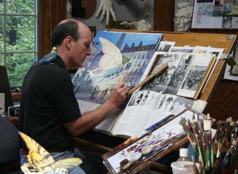
What I love most about dinosaurs is the constantly unfolding revelations about them. New forms are discovered, and new theories emerge about their life and death. Of course that means I have to wince a bit when I look back at the way I portrayed them in my paintings from 20 or 30 years ago, but the more we learn about them the more amazing they become.


2. What impresses me a great deal about the Dinotopia series is the attention to scientific detail and plausibility. What role has science had in shaping Dinotopia?

The very earliest inklings of the idea came from brainstorm sessions with archaeologists on National Geographic expeditions and with paleontologists from the Smithsonian. Throughout the process of world-building I consulted with scientists to help me with the outward form of the dinosaurs. When it came to the more speculative elements of the story, such as saurian writing systems, I was surprised how most scientists were interested in contributing science fiction ideas. I realized most scientists start out as science fiction buffs, and many of them remain fans.

Will Denison and Ambassador Bix. 
3. The characters of Dinotopia, such as Ambassador Bix, Lee Crabb, and Oriana Nascava are so memorable and rich. How do you go about creating such characters?

Most of those characters are based on real people, or combinations of real people, and I then try to focus their personalities. Lee Crabb is based on an art teacher friend of mine who is a rugged, physical guy, very sweet natured, but he likes to pretend to be Crabb. Oriana is based on a friend of mine who taught art to sixth graders, and she said her students got a big kick out of seeing her appear in the book. Bix is a combination of my chihuahua, my grandmother, and the Dalai Lama.
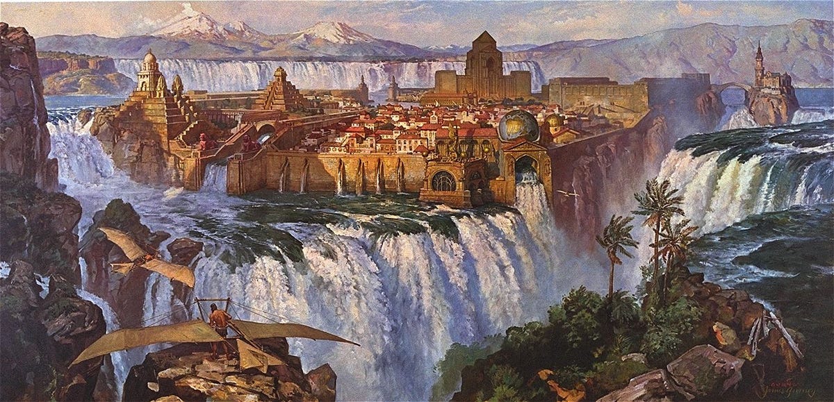
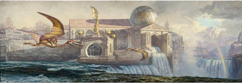
“Waterfall City” by James Gurney. 
4. Your paintings are an essential part of the Dinotopia experience. The most iconic, I’d argue, is “Waterfall City.” What inspired you to create such an original vision?

I first painted a city built on a waterfall around 1981, and again in 1988. That panoramic painting was the first image that ultimately became a part of the first book Dinotopia: A Land Apart from Time. The city is a combination of Italian hill towns which I saw while on assignment with National Geographic, together with Niagara Falls, which I painted from Goat Island before undertaking the big painting.


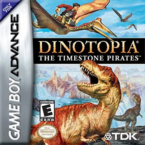
5. When I was a kid, I enjoyed playing Dinotopia: The Timestone Pirates for the GameBoy Advance. To what extent were you involved in the game, and do you have any fond memories of it?

I love the job the developers did in translating Dinotopia into a GameBoy platform-jumper. Although I wasn’t directly involved in creating that game, its development came at a good time because my own two sons were heavily into GBA at that time.


6. Nowadays you have also been sharing your passion for painting on your blog as well as through YouTube videos. How has your experience been interacting with fellow artists through the Internet?

I like interacting with other artists through the Internet, and I get a lot out of creating posts and videos for Instagram, Blogger, and YouTube.

There are at least four reasons:

  1. It provides a good excuse for learning. Explaining or demonstrating some aspect of your art life forces you to understand it, and you learn even more from the feedback.
  2. It helps me as a writer. I find out right away if a topic is controversial, confusing, electrifying, or boring.
  3. It builds a following. People who follow any artist’s artwork want to hear what went into making it. They feel a sense of belonging to your next project if I include them in its creation.
  4. We all benefit from sharing. The Internet at its best is about sharing, and it has fostered a spirit of openness that has never existed before in the history of art.

7. One of my favorite sayings in Dinotopia is “breathe deep, seek peace,” which I see as a good practice that we can all use when confronted in moments of conflict. Do you any words of wisdom to offer for those of us who are still seeking peace in our own lives?

The world is always in need of a vision of people getting along and working things out, both with each other and with the natural world. We’re always going to be a work in progress, but we’ve got to remember that we’re all in this together. Hopefully good things will emerge from times of stress, both in our personal lives and the world around us. The best way to eliminate worry for me is to remember that the things I have worried about the most never came to pass, and the bad things that happened have usually been unanticipated. So all we can do is try to fix things, grow things, and encourage people to find common cause.
----
First published in Medium
Get Dinotopia signed by me from my website

Saturday, May 30, 2020

Proko Challenge Deadline Coming Monday


We’re coming up on the deadline for the May Proko Challenge that I’ll be officiating. The goal is to reimagine something as a creature or character. I painted this weird encounter in grisaille gouache around 1981 when I was a self-taught art student. Rules
1. Like this post & follow the Instagram accounts of @jamesgurneyart, @prokotv, and @wacom
2. Transform household objects, vehicles, or whatever into a character or creature! Depict them interacting with an environment rather than individual character design. It can be a drawing, painting, or sculpture. Digital or traditional.
3. Post it to your Instagram account using #prokochallenge
4. I will judge based on originality, consistency of vision, well-thought-out implied story, and convincing execution in terms of design, color, lighting, dynamics, and perspective.

And I'll make a reaction video! The deadline is - Monday, June 1 at 11:59 pm (EST)


Heinrich Kley, High-Speed Press Schnellpresse
Prizes
1st place - Wacom One Creative Pen Display, signed print with a sketch by James Gurney, and the Proko Figure, Portrait, and Anatomy courses.
2nd place - Wacom Intuos medium tablet, signed print with a sketch by James Gurney, and 1 Proko course of their choice.
3rd place - Signed print with a sketch by James Gurney and 1 Proko course of their choice
RANDOM WINNER - To give students a higher chance of winning, a random winner will also get a Wacom Intuos small tablet and signed print with a sketch by James Gurney
PROKO TEAM CHOICE - The Proko team will choose their favorite along with a few fun awards with prizes TBD.

Winners will be contacted via DM. This promotion is in no way sponsored, endorsed or administered by, or associated with, Instagram. Free shipping of Wacom prizes to US, Canada, Latin America (except Venezuela), EU, UK, Japan, and Australia. Participants in all other countries would pay shipping costs to claim a tablet.

COVID-19 Alert: Shipping to certain countries will not be possible right now because of the pandemic. Please be aware of an indefinite delay for shipping prizes to winners outside of the United States.

Friday, May 29, 2020

Schoonover Recalls Howard Pyle's Nature Excursions

Howard Pyle and Frank Schoonover
Illustrator Franklin Schoonover said that it was Howard Pyle's custom to take his students on frequent excursions through the low hill country of Chadds Ford, Pennsylvania.

 "Upon these gentle voyages through field and woodland, there was the subtle pointing out of a purple, of broken color in a whitewashed wall, of all the delicate gradations of tone and value, the knowledge of which is not always accredited to the varied equipment of an illustrator. I recall most vividly an October day, clear and cool, with a touch of winter in the hazy air. 

Frank Schoonover at the easel
"With easel and canvas within the shadow of a barn Mr. Pyle had been working from the models — a team of white horses and a plough-boy, posing in the autumn sunlight. As the light of afternoon faded and the chill of a frosty air crept up from the valley, the artist laid aside the brushes and called some of his pupils to go with him in search of adventure. 


"We were glad to relax and to enter into a short interval of, perhaps, well- earned rest. We followed the windings of a small stream that brought us finally to a broad opening and the summit of a hill. On the crest of this gentle knoll stood an oak — a wonderful, radiant picture, silhouetted against the sky. Mr. Pyle stopped and drank it in as one athirst. 

 "'Look,' he said, 'just look at it!; 'It's like the exquisite creation of a worker in metal, a great yellow thing with plate after plate of burnished gold towering up against the arch of heaven.' 'Yes, that is it,' he continued, with a tenderness and reverence so characteristic of him. 'After all, it is not a mere inanimate tree with its leaf turned yellow, it's fashioned as a human being with a trunk, arms and fingers, all clothed in shining garments, standing there to reflect the glory of the Divine Maker.'" 

"How, simple and how true it was. I doubt if a single one present that October day has forgotten the translation of what might otherwise have appealed as commonplace, into a world of divine purpose, leagues beyond the shell that surrounded our own feeble efforts."

Exploring nature together with reverence and common purpose was a central part of Pyle's teaching.
----
From "Howard Pyle" by Schoonover

Thursday, May 28, 2020

Heiligenschein


Heiligenschein, is an optical effect where a bright spot appears to surround the cast shadow of the head of the observer. The glowing spot is caused by rays of sunlight reflecting back from individual dewdrops, and the effect is best seen on a cool, clear morning.

The word translates from the German as "saintly illumination" or "holy light." The effect was described in the memoirs of Benvenuto Cellini (1500-1571), so it's sometimes called "Cellini's halo."
-----
Photo courtesy New York Times, which published the article "How to become an angel in the morning dew"
Heiligenschein on Wikipedia

Wednesday, May 27, 2020

The Preservation of Fire


At our forest campsite: roasted hot dogs, French potato salad, a sketch in gouache, and a thought about continuity.

Tuesday, May 26, 2020

Quick Landscape Impression Alongside the Hudson River


In this YouTube video (Link to video), I paint a quiet estuary from the edge of a forest.


I'm using casein paint, a gouache-like paint that was popular before acrylics. Along the way I share tips for capturing that simple first impression. Here are the colors I'm using.


The forest is shadowy, and the light increases as we go out into the fringes of the estuary. This painting is a fairly quick one, about 45 minutes altogether.
----

Monday, May 25, 2020

Adolph Menzel's Hochkirch Painting

Adolph Menzel (German 1815-1905) undertook this ambitious painting without a commission. It was a battle scene, but it didn't glorify the war.

Adolph Menzel, Frederick the Great and His Men in the Battle of Hochkirch
(Night Attack at Hochkirch),
1856, oil on canvas, 295 x 378 cm,
destroyed during the Second World War
It shows Frederick the Great's soldiers engaged "in a crushing defeat suffered during the Seven Years War, and, to make matters worse, a defeat that could be laid entirely at the feet of the king and that cost the lives of a sizable number of his leading generals, not to mention those of nine thousand soldiers, was not a painting that lent itself to propaganda purposes or the the glorification of the Hohenzollern dynasty."

Nevertheless, the painting was much talked about, and eventually it was bought by the king. What helped sell it was the argument, which Menzel made in a letter to the king, that the painting shows Frederick's nobility in the way he accepted defeat.

The work took Menzel a long time to complete. It come down to us in photographs of poor quality, because the canvas itself was destroyed in World War II.
----
Quote from the book Adolph Menzel: The Quest for Reality by Werner Busch.

Sunday, May 24, 2020

Grouping Heads in a Composition

"Alas, poor Yorick," scene from Hamlet by Pascal Dagnan-Bouveret
Compositional tip: If you're staging a scene with more than two figures, overlap two of them, especially if those two are reacting to something.

This illustration from Emma by Jane Austin by Charles and Henry Brock
In this scene from Jane Austin's Emma, the two characters have been whispering to each other, and the tale is told from the point of view of the woman on the left. By bringing two of the faces close together, it's easier to see their reactions.


Saturday, May 23, 2020

Luis Jiménez Aranda, Capturing Everyday Life

Luis JimĂ©nez y Aranda (Edit: and his brother Jose) (1845–1928) painted moments from ordinary life in Spain.  

Jose JimĂ©nez y Aranda The Bibliophiles, 1879
Here he shows book lovers from various walks of life surveying the wares. To paint scenes like this, he used models, and he would have set up the actual costumes on lay figures. 
Luis Jiménez y Aranda, The Artist's Studio
Here he paints of an artist's studio, showing the artist with his palette standing behind a wealthy patron, as a model lounges in a festive pose on the far right.

 Jose JimĂ©nez y Aranda, Self Portrait
Luis JimĂ©nez y Aranda was part of a worldwide artistic movement using realism to capture the detail of everyday life.
-----
Previously on GJ: Costumbrism

Friday, May 22, 2020

Attacked by a Bugling Elk

Wildlife artist Ken Carlson (born 1937) learned to draw animals at the zoo." Eventually the director gave him the keys to the animal cages so that he could go there at night after work."
Bugling elk by Ken Carlson
"'At night I would turn on the lights in the zoo and sketch. I worked in the pens, wearing a keeper's jacket. One day I went into the elk pen to get photographs of him bugling, and the animal charged and almost killed me."


"After that,' Carlson says wryly, 'I lost my zoo privileges and spent a week in the hospital. I had paid my dues as a wildlife artist."
----

Thursday, May 21, 2020

What's in Your Kit?

Charlie asks: What’s in your kit?
Everything I need for drawing or basic painting lives in a belt pouch which I bring everywhere. It's small enough to take everywhere and big enough to hold a whole painting kit.


What are your favorite watercolor art supplies to use? 
I have a 12-color watercolor pan set and a small, changing set of gouache. 

What brands do you prefer in watercolor and gouache? 
I keep coming back to M. Graham and Winsor and Newton, but I have samples of most brands. I keep a several different brands in play at any given time, and combine colors from more than one brand in any given painting. Holbein makes a good starter set, and Shinhan Pass makes a watercolor/gouache hybrid set that is quite reasonable with a wide variety of colors. People who watch my videos know I also use Richeson casein occasionally, both for doing finished paintings, and for underpainting. 

What brushes do you use?
I use flats and rounds the most. A good starter set is the short-handled travel brush set made by Richeson.

What kind of paper do you recommend? 
I use a Pentalic watercolor sketchbook, which has heavyweight, medium-textured watercolor paper that works for all my water media paintings and sketches. I use illustration board and linen canvas for my separate framable oil paintings. 

What cameras and audio do you use to capture your videos?
Lately, I've been using a Canon M6, which is great for video, stills, and onboard timelapse. I keep a compact point-and-shoot Canon PowerShot Elph on a belt holster. For a digital audio recorder, I use a Zoom H2N, and that's handy for capturing voiceover and for room tone. I also include a Rode Video microphone.


What else do you carry?
I also carry a couple of water cups with lids that hold on well. In the metal box I carry a water-soluble colored pencil set, plus graphite pencils, a few pastels, a fountain pen, erasers, and water brushes, which work with the colored pencils in tight spaces. And of course I need a paint rag. 

Where can I learn more about your easel?
I use a homemade sketch easel and a tripod. Here's a link to a tutorial on how to make one, and here's a link to a Facebook group of other builders.

Wednesday, May 20, 2020

Alfred Munnings Paints a Horse


Here's Alfred Munnings painting a white horse while a stableman holds the subject roughly in position.


Scenes like this could have been painted in that way, by having each horse pose with an assistant.


Tuesday, May 19, 2020

Monday, May 18, 2020

How do you paint portraits in gouache?

Daniel asks:
"I have been drawing portraits for some time, then chose gouache as my painting medium, not oil, because I have a very cramped apartment.... I would definitely like to mimic the opaque properties of oil in gouache, though know that is not totally possible.

My issues are that the color value changes slightly when put on paper vs when on the palette, and also about the fast drying nature of gouache. I have tried paper towels and stay wet palettes, but found it not good for me. Moreover, I know that gouache reactivates with water, but when I go to my dry paint after about 10-15 minutes, it has a more crusty and undesirable feel compared to first when out of the tube.

I would like to blend and do transitions better. I would also like to do a more classical style, with a first drawing, then a grisaille Underpainting, then adding color layers on top for the portrait. I could perhaps even glaze with thin layers. Is trying to mimic a traditional indirect oil process somewhat futile in gouache, do you think? Should I attack the paper surface more directly Alla Prima style? Is gouache conducive to multi layers like oil? I think I want to know more about the nature of this gouache medium.

I have bought a few painting courses, which have been very helpful, but none have been in gouache. So I was wondering if you could just give me a few tips on a better way to paint portraits in gouache? (I will always start with a drawing at first, at least for now. I love the drawing part). Your portraits in the wild course might be a start. 
----
Answer: Gouache can be used for portraits, but it presents all the problems you mentioned if you try to use it in the slow, indirect way of grisaille and glazing.  


The issues that you're facing with its fast drying time are really unavoidable. You've just got to work faster. Speed of execution can be gouache's virtue in painting from life. I show several examples of directly painted gouache portraits on my Gumroad tutorial "Portraits in the Wild."


Here's a sample of the new video "Color in Practice" which shows a portrait of a Greg at his workstation in an auto repair shop. (Link to YouTube)


You can always use pastel to get controlled gradations, following the example of Maurice de la Tour, who did the one above. Pastel lets you work at whatever speed you want, but de la Tour worked quickly to avoid tiring his sitter. The advantage is that he achieved a sense of fleeting, momentary expressions. 

You can use acryla gouache if you really don't want to pick up previous layers. But I like having an open surface because it allows me to soften blend later if I need to. With regular gouache, you can place a wet stroke over a dry passage if you have a very light touch and don't mess with it. 

You can also varnish it to recover the values of the darks. I would only recommend varnishing if it's a very dark-keyed painting.

Adolph Menzel, Senior Privy Councillor Knerk,
portrait study for the painting The Coronation of Wilhelm I in Königsberg, 1863/1865,
watercolour and gouache over a preparatory sketch on vellum paper

I would practice painting vegetables first until you're familiar with the medium. If you try to figure out the properties of a type of paint while handling the immense subtlety of a portrait, you're inviting frustration.


I hope that gets you started on the path,
James G.

Sunday, May 17, 2020

Art Chat with Justin


(Link to YouTube)
I enjoyed this conversation with Justin Donaldson. I should have explained that I can't do a video chat, because my internet connection is too weak. At least I got decent audio.

Saturday, May 16, 2020

Thomas Hart Benton Talks About Popularity


In a vintage audio recording, Thomas Hart Benton (1889-1975) talks about art and popular taste. 
He argues that advertising and illustration can be great art only if it has a form that transcends the message. Link to YouTube.

Friday, May 15, 2020

Object-come-to-life Challenge

I'm looking forward to seeing and reacting to the new Proko challenge to draw or paint an object that comes to life as a creature or character.
View this post on Instagram

James Gurney is judging the MAY PROKO CHALLENGE - Win a Wacom Tablet, Signed Prints and Proko Courses! RULES: 1. Like this post & follow @jamesgurneyart, @prokotv, and @wacom 2. Transform household objects or vehicles into a character or creature! Depict them interacting with an environment rather than individual character design. It can be a drawing, painting, or sculpture. Digital or traditional. 3. Post it to your IG account using #prokochallenge 4. James will judge based on originality, consistency of vision, well-thought-out implied story, and convincing execution in terms of design, color, lighting, dynamics, and perspective. James will make a reaction video! Deadline - Monday, June 1 at 11:59 pm (EST) PRIZES: 1st place - Wacom One Creative Pen Display, signed print with a sketch by James Gurney, and the Proko Figure, Portrait, and Anatomy courses. 2nd place - Wacom Intuos medium tablet, signed print with a sketch by James Gurney, and 1 Proko course of their choice. 3rd place - Signed print with a sketch by James Gurney and 1 Proko course of their choice RANDOM WINNER - To give students a higher chance of winning, a random winner will also get a Wacom Intuos small tablet and signed print with a sketch by James Gurney PROKO TEAM CHOICE - The Proko team will choose their favorite along with a few fun awards with prizes TBD. Winners will be contacted via DM. This promotion is in no way sponsored, endorsed or administered by, or associated with, Instagram. Free shipping of Wacom prizes to US, Canada, Latin America (except Venezuela), EU, UK, Japan, and Australia. Participants in all other countries would pay shipping costs to claim a tablet. COVID-19 Alert: Shipping to certain countries will not be possible right now because of the pandemic. Please be aware of an indefinite delay for shipping prizes to winners outside of the United States. #prokoandwacom #artcontest #drawingcontest #wacom #digitalart #traditionalart #characterdesign #jamesgurney

A post shared by Proko (@prokotv) on


Link to Instagram

"Lines and Colors" Review of Color in Practice

 Charley Parker, in his blog Lines and Colors, reviewed my new Gumroad tutorial "Color in Practice"     

Here is an excerpt of his review.
      "Many artists’ instructional videos on color want to start out running and dazzle the student (i.e. prospective buyer) with promises of color mastery, but undeservedly breeze past these important stages, the most fundamental of which, of course, is black and white, or value.
      Gurney starts there, with easily grasped exercises like comparing transparent and opaque methods of making value steps in the form of simple charts.
       Gurney has an uncanny knack for what I think of as “teaching within teaching”. In the process of covering basics, he touches on more complex concepts like like chroma, alternative color wheels, color temperature and color gamuts — not in depth, but in a context that allows a basic understanding and prepares the student for more a extensive explanation later. He lets you absorb these secondary concepts almost unconsciously as you follow his main thread."
-----
Lines and Colors Review of 'Color in Practice'

Thursday, May 14, 2020

A Tip for Sketching Kids

How do you draw kids without them being self conscious?

Adolph Menzel "would go out in wind and weather but one day when there was too heavy a downpour, he came into the music room where my two little sisters were playing Haydn’s ‘Serenade’ together on the piano."

Adolph von Menzel (1815 - 1905) 
Therese and Grete Herrmann at the Piano, 1872
Pencil on paper, 24.5 × 33.6 cm

"'Children,' he called out, 'I want to draw the candelabra, play something for me while I’m drawing’, and thus he could capture the undisturbed image of their playing in all its naturalness and sketch the picturesque, unique likeness of them with which he later delighted [their] parents." Quote from Art Dealer Stephen Ongpin
----

Wednesday, May 13, 2020

Portrait by Nicolai Fechin

Nicolai Fechin (1881-1955), born in Russia and ended his years in the southwestern USA. Beneath the eye-catching brush texture is a solid understanding of form.


Fechin's father was a woodcarver, and he himself turned to sculpting at the end of the day when there wasn't enough light for painting.
-----
Nicolai Fechin on Wikipedia

Tuesday, May 12, 2020

The Sphere in Character Models

Classic characters from 1930s animation often used a ball for the head or the pelvis. 


A good source of this style is the 1936 book Cartooning Self-Taught by Otto Mesmer, which shows heads, hands, and body shapes based on circles or spheres.
---
Read Cartooning Self-Taught on Archive.org
More about this book at CartoonSnap
Essay by Mel Birnkrant about the Art and Imagery of Comic Characters

Monday, May 11, 2020

Gouache Seascape by William Trost Richards

The notes from the Brooklyn Museum say: "Already established as a landscape painter in oils, William Trost Richards began working in watercolor in earnest about 1870 and over the next decade was widely regarded as one of America’s best watercolorists." 

William Trost Richards, American, 1833-1905, A High Tide in Atlantic City,
Opaque watercolor with touches of translucent watercolor   8 7/16 x 13 15/16 in. (21.4 x 35.4 cm)
on moderately thick, moderately textured wove paper
.

"This turn to the medium coincided with a new focus on coastal subjects—watercolor was particularly well suited both to sketching outdoors and to capturing the constantly shifting climatic conditions at the water’s edge."


"He generally used an additive technique: laying down transparent washes of color and then applying touches of more opaque paints to create body and texture."
----

Saturday, May 9, 2020

Surrounded by Studies

Here's a photo of Parisian-trained American artist Edwin Lord Weeks (1849-1903) in his studio. He was known for his paintings of the Near East and India.


Above him on the walls are many of his plein-air paintings made during his travels. He used these studies for reference as he created new studio paintings.

The purpose of plein-air painting for most artists of his era was not to produce a commodity to sell to collectors, but rather to generate a record of the artists observations that they could revisit from the confines of their studios. 


Friday, May 8, 2020

Upcoming Article in International Artist on Black and White

The new issue of International Artist magazine has an article on basic painting in black and white, based on my new Gumroad video


Thursday, May 7, 2020

Art Battle Manchester


Art Battle Manchester was a performance event in Manchester, England, where a group of artists competed in an event where they produce a painting in 30 minutes or less.


Fun idea! But I'm not sure how such a gathering will fare in the post-pandemic era.

Wednesday, May 6, 2020

Short film about out-of-date visual effects

In an affectionate tribute to the history of visual effects, filmmaker Michael Shanks (Link to YouTube) imagines a stop-motion skeleton monster named Phil who finds himself out of work in Hollywood. 

Phil is joined by an animatronic dinosaur, a rubber-suit creature, a 2D animation character, and a computer-generated liquid metal man.
---


Tuesday, May 5, 2020

Painting Rapids in a Mountain Stream

I've got the mask and I'm social distancing, so why not head into the wilderness and paint a mountain stream?


New 7-minute YouTube video at this link

Some of the topics I cover while painting rapids in Kiskatom Creek:
• Casein underpainting 
• Palette of gouache colors
• Lay-in with a brush
• Anatomy of stream rapids
• Tips for realistic foam
• Dealing with changing light
----
Colors I used

Monday, May 4, 2020

Painting with a Warm vs. Cool Palette

By using just two colors of gouache (ultramarine blue and burnt sienna) along with white, you've got everything you need for creating a feeling of complete color.
Snow Pile at Hannaford Parking Lot
The blue-versus-orange polarity of color is the most basic and primal of all the complementary color combinations. We share the perception of this dynamic with all mammals. The perception of red and green is an experience we share only with primates among mammalian vertebrates. (Birds and insects also see red and green.)


(Link to YouTube) To capture that red car, I had to add just one color, alizarin crimson, to the basic complementary pair. This is a teaser from the Gumroad tutorial "Color in Practice: Black, White, and Complements."

Here are some additional promo quotes from experienced art teachers:
"James Gurney wrote one of my favorite books on color - Color and Light. Now finally, there's a video series! He's the perfect teacher for artists just starting to explore color in their work because he explains things clearly and provides in-the-field demonstrations. He eases you into color by starting with black and white, and then slowly introduces more colors as you get comfortable."
—Stan Prokopenko, proko.com
After 30 years of being in the trenches, teaching college students the theory and practice of landscape drawing and painting there is always the intimidation of them taking it into the real world and practicing it. Watching James walk us through the process really sands off the "sharp edges" of translating tone to color in plein-air painting and makes it thoroughly understandable. My students really watched and listened to the "down and dirty" realness of the practical knowledge in the video and it certainly help them in their own artwork. Having been painting for years I watched and learned a lot myself, amazed at the fluidity and simplicity of how James presented the step-by-step instruction and painted results. This is such a great learning tool and would be a great addition to any classroom.”
—Gary Geraths, Artist and Professor, Otis College of Art and Design

"Colour in Practice is a superb instructional video. James' explanations are crystal clear and everything is beautifully demonstrated. For each colour palette, James shows you exactly how to build it and then shows you how to make great use of it in a step-by-step painting demo. James also provides handy painting tips as well as practical exercises that will make you a better artist. I highly recommend this for anyone who wants to improve their painting skills.”
—Anthony Walsh, Founder of Syn Studio : Art School

Sunday, May 3, 2020

Basic Watercolor Kit

My most basic portable kit is just three tubes of gouache: Titanium white, ultramarine blue, yellow ochre, and light red. 


Those colors can capture most natural effects, and the pan watercolor set is there need an accent color. The flat and round brushes can accomplish most of the strokes. There's not much palette space and the 2-oz water cup isn't really big enough, but it works in a pinch. 

Dinosaur Descendants


"A new study comparing the genomes of birds suggests that, genetically speaking, the turkey and the chicken is closer to its dinosaur ancestors than any other bird is."
—Jennifer Ackerman, "The Genius of Birds."

The study referenced by M.N. Romanov et al, BMC Genomics, 2014, also cites the the chicken as being very closely related.