
There's a horn-drum on an Ankylosaurus to set the tempo. I realized I needed to pull back the view to show the whole parade.


The Norman Rockwell Museum in Stockbridge, Massachusetts, is currently hosting an ambitious summer exhibition called "What, Me Worry? The Art and Humor of MAD Magazine". This is the first comprehensive museum show dedicated to MAD Magazine's art and satire.
The exhibition explores MAD's evolution from its beginnings as a popular humor comic book in 1952 to its emergence as an influential magazine that tweaked those in power, engaging generations of loyal readers, me included. The show is popular, and the audience includes both young and old people who grew up loving the magazine’s mildly subversive attitude.
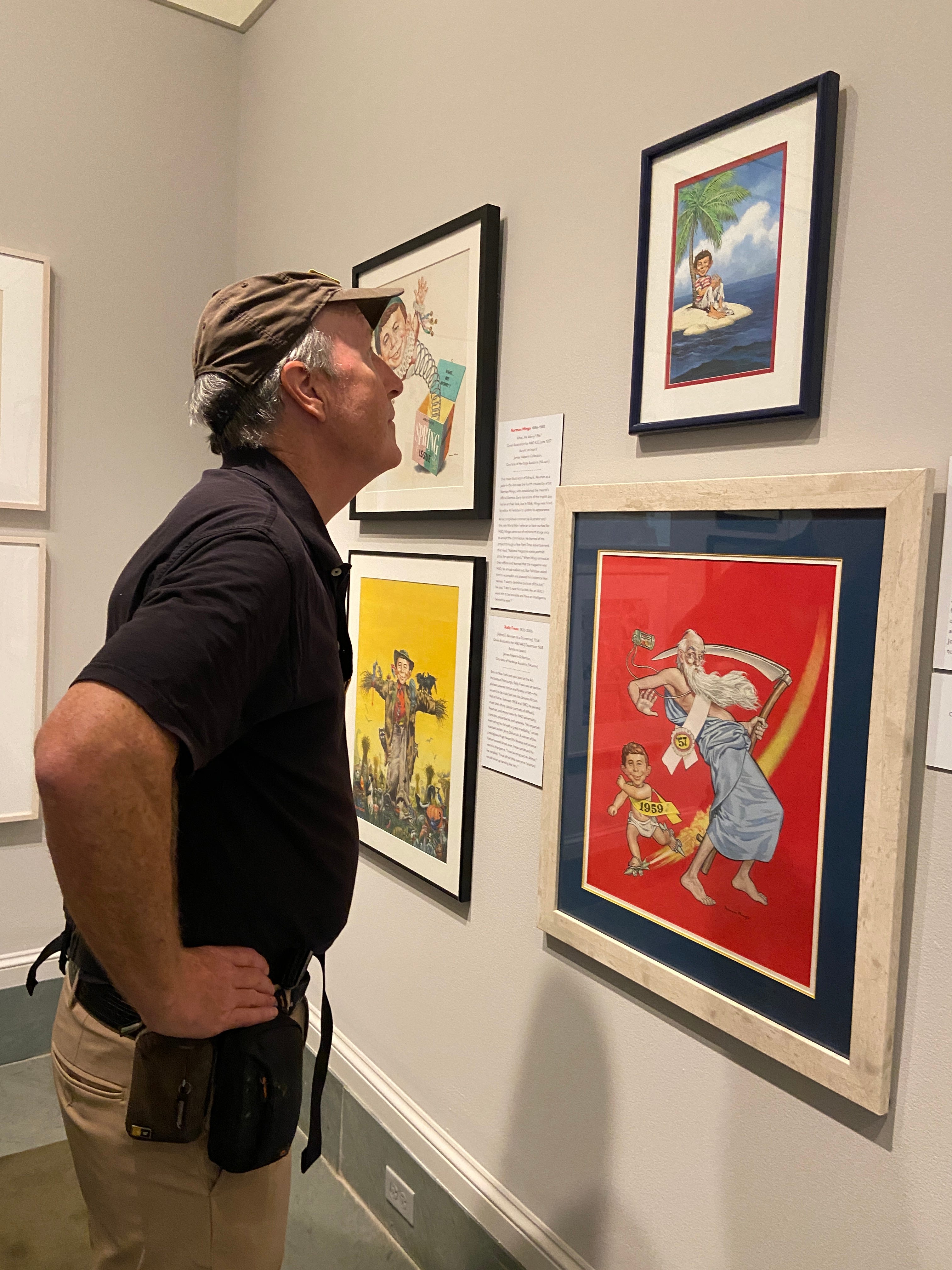
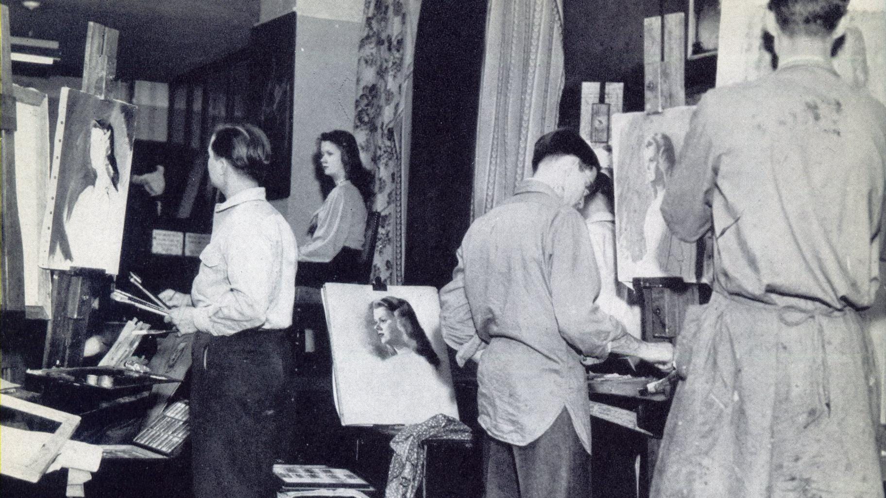
Curator Stephanie Plunkett selected a wide range of original pen-and-ink drawings and paintings created by MAD's "Usual Gang of Idiots" — including the regulars such as Jack Davis, Sergio Aragones, and Norman Mingo. There’s even a whole room devoted to works by the self-taught caricature artist Mort Drucker.
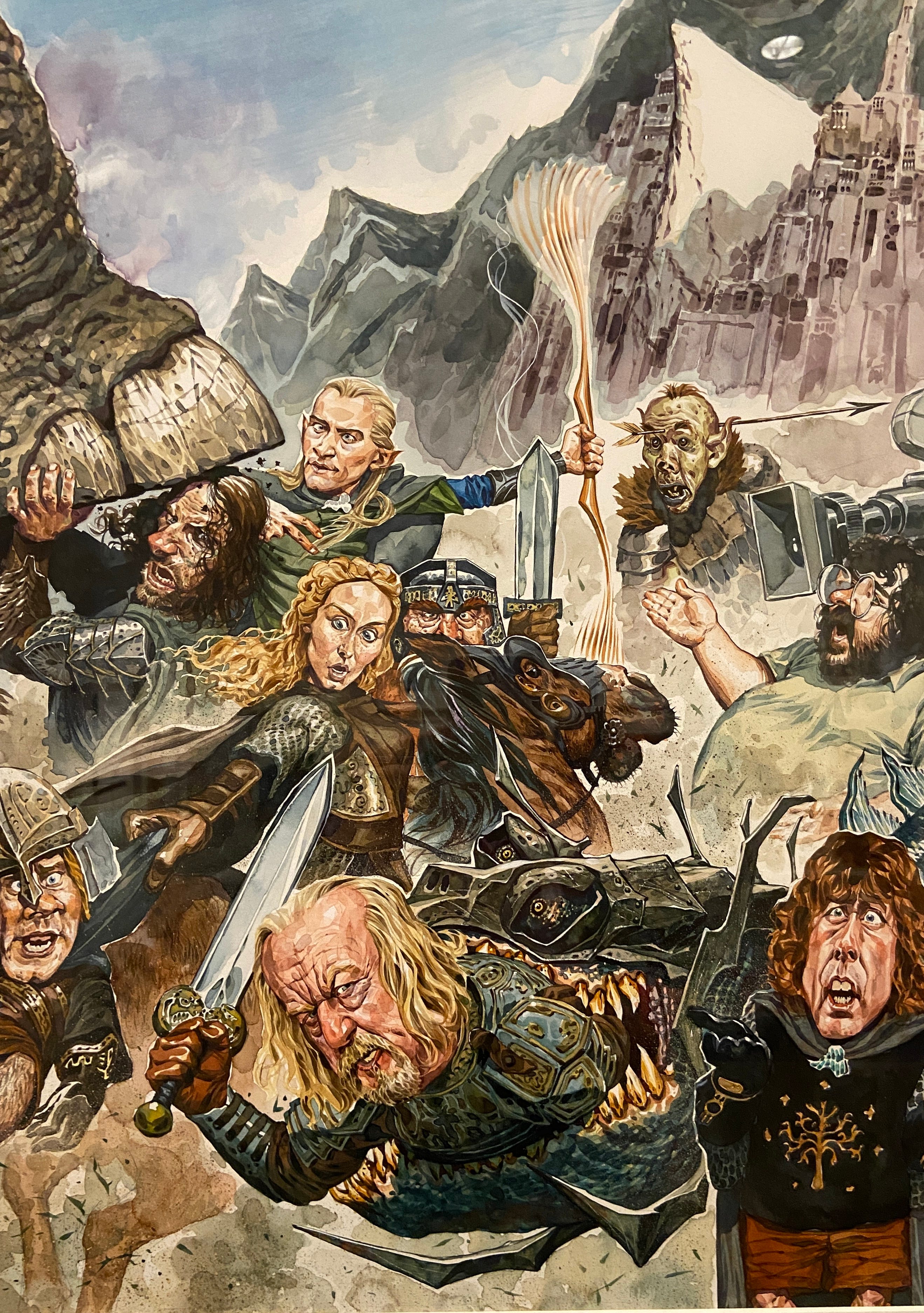
Hermann Meija -Bored of the Rings—The Fellowship of the Ka-Ching!, 2002, Ink and watercolor on paper.
The exhibition provides a nostalgic journey for Baby Boomers who grew up with MAD, while also introducing younger readers to its satirical ingenuity.
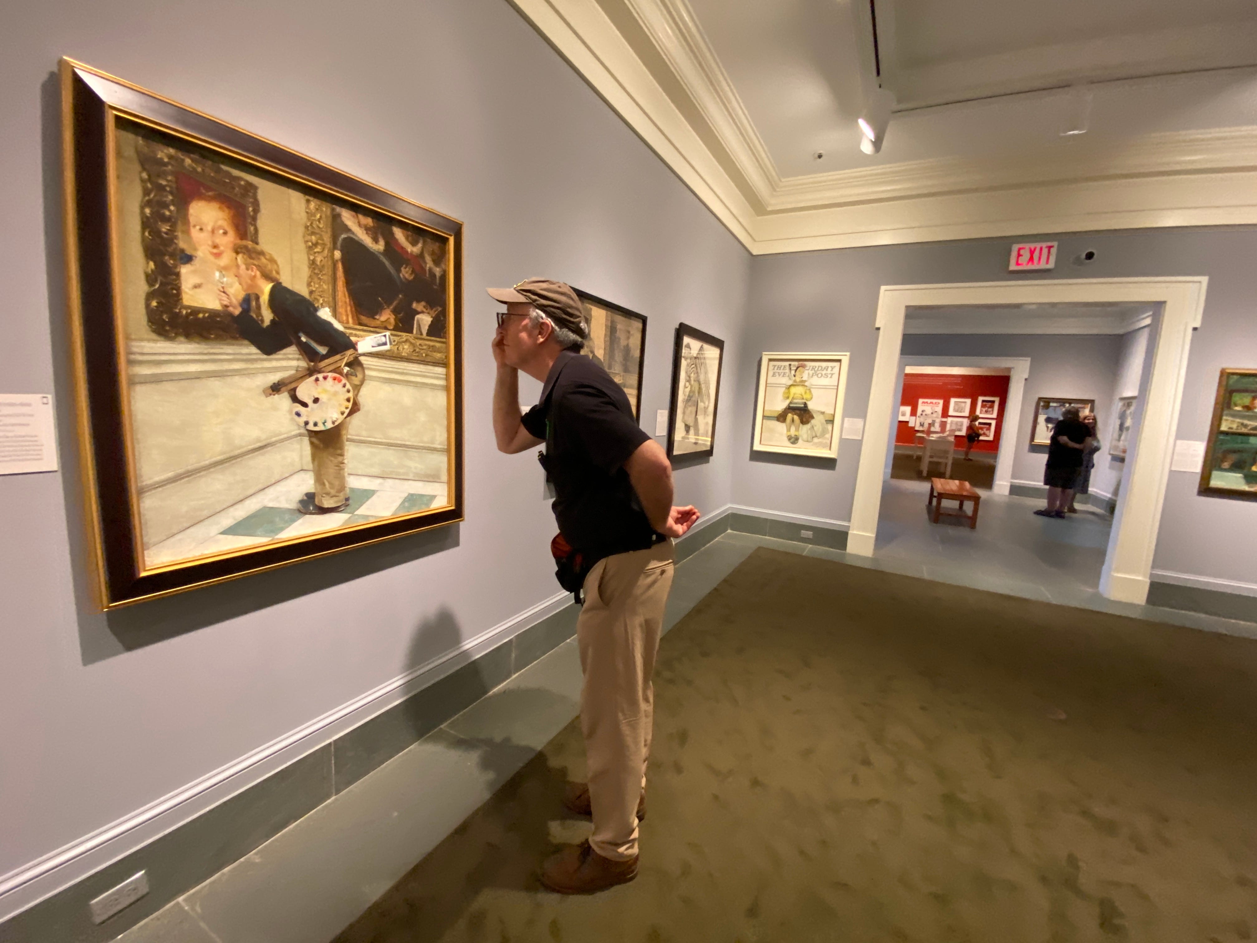
Along with the MAD show, there’s also an accompanying exhibition of Norman Rockwell’s humorous illustration. Rockwell himself never illustrated for MAD, but he came close to doing so, and there’s an exchange of letters where he almost accepts an assignment to paint the definitive Alfred E. Neuman, but ultimately he turned it down.
Speaking of James Warhola, there’s a screening tonight, June 28th, of the documentary “My Nephew Jamie.”
Admission price to the museum is $25 for adults. The exhibit runs through October 27. Allow lots of time, because there are more than five big rooms jammed with art, and many of the pieces have a lot of elements to digest and a lot of text to read.
Complete list of artists on my Substack.
In this new video on YouTube, I explore the practice of negative painting.


Carl Brenders (b. 1937) is a wildlife artist from Belgium known for his richly detailed gouache and watercolor paintings of mammals and birds in their environments.
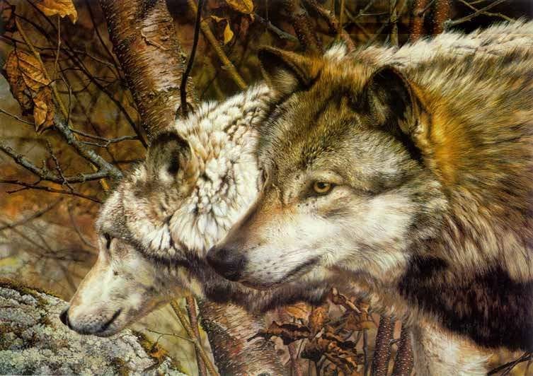
How does he do it? There’s not much information about his technique available online, but I did some digging.
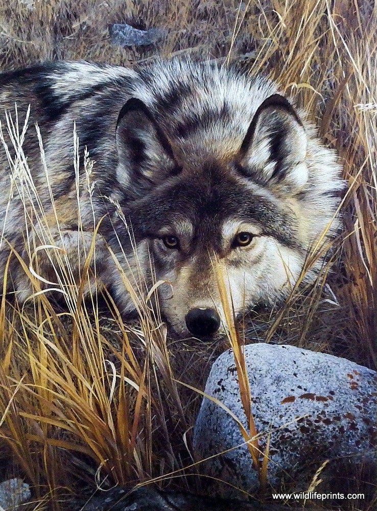
He begins by taking a lot of photographs of the animal and its habitat.
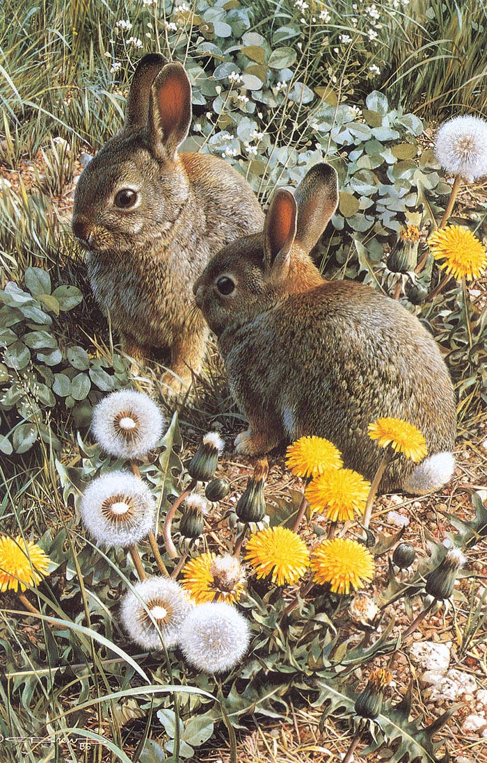
According to his 1994 book Wildlife: The Nature Paintings of Carl Benders:
“Even after spending weeks of research and photography in the field, the artist devotes more time to develop the concept of the painting.
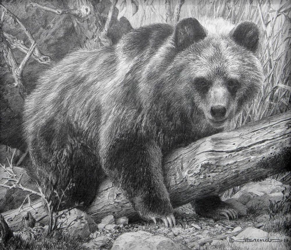
“With this planned, he first makes a complete pencil drawing of the entire subject, including the background.
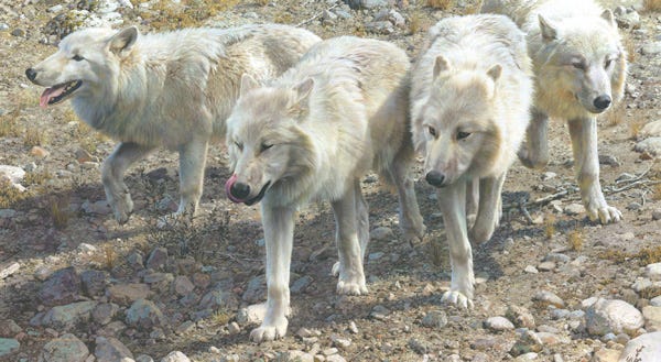
“Over his pencil work he then paints with sepia watercolor much like pen-and-ink drawing. On top of the sepia he airbrushes areas in watercolor, and then paints over all this with gouache.
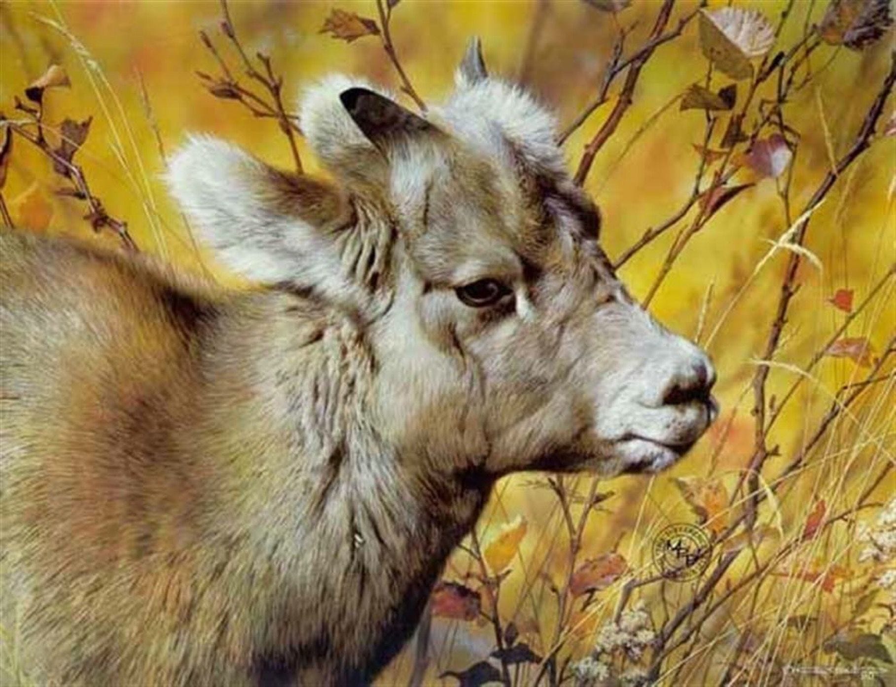
“He finds the combination of gouache and watercolor perfectly suited to his detailed work; it achieves an effect he finds impossible with acrylic or oil paint.
“Only the Flemish masters, says Brenders, could achieve such detail in oils.”
Quotes by Dana Cooper from the book Wildlife: The Nature Paintings of Carl Benders