Showing posts sorted by date for query mucha. Sort by relevance Show all posts

Sunday, January 28, 2024

Line Weight Hierarchy

If you draw in line, there’s a principle called line weight hierarchy. Thicker lines seem closer and more important, while thinner lines float to the background.


Examples by Charles Dana Gibson, Gustave Doré, and Alphonse Mucha at the link.

Sunday, September 4, 2022

Image-to-Image Style Transfer

Suppose you made this rough sketch and wanted to finish it in a photo-real or painterly style.


Twitter user @TomLikesRobots is a digital artist who did just that, using the new image generation tool called Stable Diffusion (#stablediffusion), the open-source model which has a powerful feature called Image to Image (#img2img). 


He uploaded the sketch and told the system to render it as "A black and white photo of a young woman, studio lighting, realistic, Ilford HP5 400." The hair style is a little different, and the ear is weird, but the basic pose and lighting is pretty close to the sketch.

Tom says: "Overall, composition is controlled by the sketch and the details are controlled by the prompt. 


This time he told it he wanted it to make the sketch look like "A portrait of a young woman by Norman Rockwell." 

It looks like a painting, but not much like Rockwell—more like a Victorian artist like Charles S. Lidderdale. On close scrutiny it doesn't hold up too well: the blue ribbon and the costume don't make sense, and her left eye has too many eyelashes.


Here's the sketch rendered in the style of Gustav Klimt. It's got a lot of drawing problems that Klimt never would have allowed, but it is somewhat reminiscent of his style.


And here's the sketch as painted by Vincent Van Gogh. Again, we can pick it apart, but it's in the ballpark.

.
And finally Alfonse Mucha. He is one of the hardest to emulate. It used soft internal transitions and clear outline.

The system was also able to translate the sketch into the features of famous celebrities:

Selena Gomez

Scarlett Johansson

Nicole Kidman

Emma Stone

All of them have big problems with the hair, but they're recognizable, and let's admit the tech is in its infancy and will only get better.

If you're an artist, you might find all this a little scary, threatening, or astounding. I do too! I feel like we've been introduced to a magical genie who can bring whatever we wish into existence.

Some have responded by calling for laws to ban the technology from creating images in the styles of living, working artists. What if someone created a print for sale that was supposedly painted by you or me?

I think we have to be careful how we respond to this apparent threat. Let's keep in mind that the technology is transformative, meaning it doesn't copy/paste images. It creates something new. And artistic styles can't be—and shouldn't be—copyrightable. These tools are here to stay. They're only going to get more advanced, and they're open-source. Also the people who are developing it are artists, too. 

I'm wary of laws or AI bots that restrict the growth of this new art form, or that drive the prompts underground. Instead of involving politicians and lawyers and AI bots, we should encourage a culture of mutual respect and fair play. Perhaps we should encourage generative artists to share their prompts when they use a living artist's name, and never to mislead their audience into thinking the work was actually painted by that artist. Basically, people should give credit where credit is due.

How do you think we should regulate or guide this new art industry?

Thursday, August 4, 2022

It's Hard to Classify Will T. Bradley

Will T. Bradley (1868-1962) was the highest paid American artist in the early 20th century*, but don't feel bad if you haven't heard of him.


At a time when magazines were the chief vehicle of cultural expression, Bradley was a prolific and noteworthy cover artist. 


His style featured simple shapes, smooth lines, and large areas of flat colors, which lent itself not only to covers, but also to posters.


When he wanted to, he could draw in a more ornate pen-and-ink style, influenced by Aubrey Beardsley and Alphonse Mucha.


Bradley was a type designer he created the original version of what is now known as Bradley DJR (designed by David Jonathan Ross.) And he was also an art director for Hearst films.
---
*More about Will T. Bradley at Wikipedia 

Tuesday, February 15, 2022

Mucha: 'The Purpose of My Work'

Alphonse Mucha, Portrait of Madame Deschamps, 1903, pencil & white chalk on tan paper

Alphonse Mucha said: "The purpose of my work was never to destroy but always to create, to construct bridges, because we must live in the hope that humankind will draw together and that the better we understand each other the easier this will become."


Saturday, January 8, 2022

Color in French Art Prints

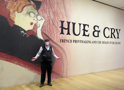
The Clark Art Institute in northwestern Massachusetts is presenting an exhibit of French printmaking called Hue and Cry: French Printmaking and the Debate Over Colors. It examines how color found its way into the world of black and white prints. 


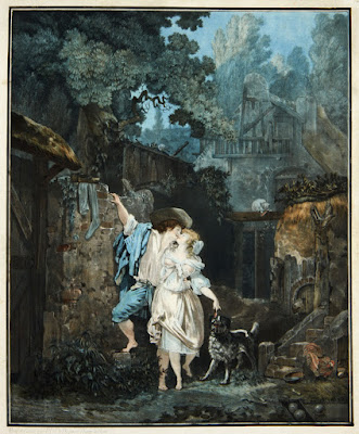
Philibert Louis Debucourt, The Climb, or Morning Farewell, 1787, 
Color engraving on paper. The Clark Art Institute, 1955.1897.

The earliest prints were all black and white, using methods such as woodcut, wood engraving, and etching. When the technology made it possible to print in full color, tastemakers in France dismissed them, arguing that they were cheap and low-class. 

The exhibit includes fine examples of these early intaglio color prints, such as the one above.

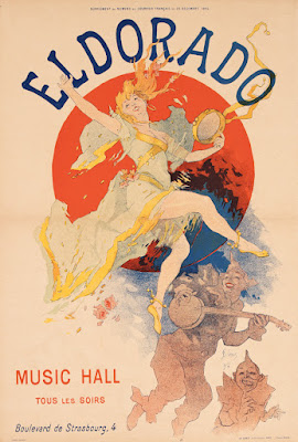
When color lithography was developed, artists embraced it as a fast and efficient method that was perfect for large public posters. The show includes many prints by Jules Chéret, the master of the show poster.

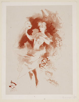
Jules Chéret, Lady with a Mask [Comedy], c. 1891, Lithograph in sanguine on paper. The Clark Art Institute, 1955.2391.

I was also impressed by the informal sanguine prints by Jules Chéret, where he explores different arrangements of carefree figures. 
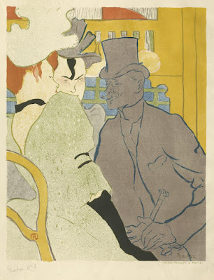
Henri de Toulouse-Lautrec, An Englishman at the Moulin Rouge

The exhibition also includes prints by Pierre Bonnard, Mary Cassatt, Paul Cézanne, Maurice Denis, Camille Pissarro, Edouard Vuillard, and Henri de Toulouse-Lautrec.  

I was hoping the show would include printed works by Alphonse Mucha. He was Czech, technically, but he was the major star in the Paris print scene, and his graphic works were extremely influential. Théophile-Alexandre Steinlen and Eugène Grasset were also notably missing from the show, perhaps because the Clark doesn't have good examples of the color prints in their collection. 

A secondary exhibit called "Competing Currents" about Japanese prints of the 20th century makes a perfect enhancement to the show. I'll share more about that on a future post. 

Hue and Cry: French Printmaking and the Debate Over Colors closes March 6. Admission is free for the month of January.

Friday, November 12, 2021

Mucha: 'Beauty is the Communication of Emotion'

Alphonse Mucha's ideas about beauty come across as strongly in his oil paintings as it does in his better known Art Nouveau posters.

In his lectures on art, he said: "The expression of beauty is by emotion. The person who can communicate his emotions to the souls of others is the artist."
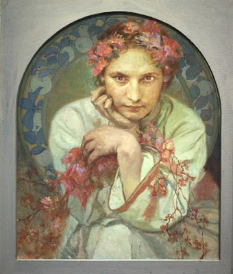
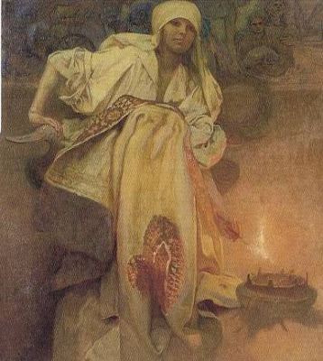
"To communicate with the souls of man the artist must address himself to the senses of the body."


"This harmony between the suggestion of the artist and the senses is memory, the first condition of beauty."


The goal of the artist, Mucha said, is to communicate "the emotions of his own soul to the souls of others, even at the price of laborious work, and his greatest joy will be that of seeing other souls also vibrating with the happiness of his emotions."
--
Lectures on art: A supplement to The graphic work of Alphonse Mucha 

Wednesday, October 27, 2021

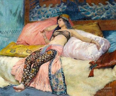
Paintings of Sarah Bernhardt


Sarah Bernhardt by Paul Merton

Sarah Bernhardt was a French actress who lived from 1844-1923.

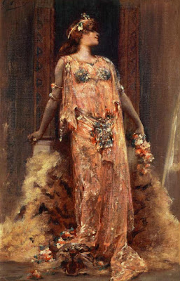
Sarah Bernhardt in the Role of Cleopatra by Georges Clairin

She was greatly admired for her stage presence, her striking poses, and her emotional presentation.

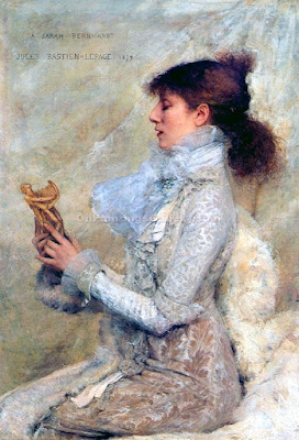
Sarah Bernhardt by Jules Bastien-Lepage

Because of her striking appearance and theatricality, she was a favorite model of artists of the period.

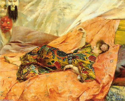
Sarah Bernhardt by Georges Antoine Rochegrosse

Rochegrosse painted her several times in Orientalist mode.

Sarah Bernhardt by Georges Antoine Rochegrosse

In this one she reclines in a chinois interior.

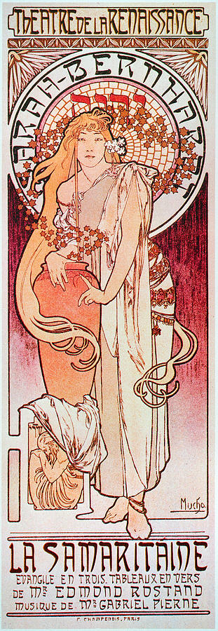
Poster design by Alphonse Mucha

She chose a young Alphonse Mucha to create one of her posters, and the image was a sensation, making both of them much more famous.

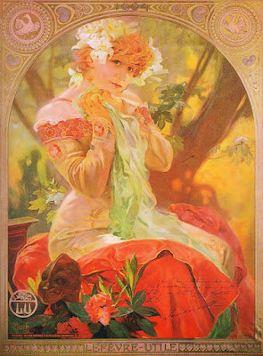
Alphonse Mucha

Mucha went on to do many portrayals of her in various guises.

Portrait of Sarah Bernhardt as Roxanna by Walford Graham Robertson (1866-1948) 

The playwright Edmond Rostand referred to her as "the queen of the pose and the princess of the gesture." 

Sarah Bernhardt by Georges Clairin

Victor Hugo said she had a "golden voice."

She's one of the first actors from the period who appeared in silent movies.

Her voice also appears fleetingly in sound recordings. It sounds strange to our ears, but in her day it brought people to tears.
---
Book: Sarah Bernhardt: The Art of High Drama (Yale University Press) 

Saturday, January 2, 2021

Review of Thomas Blackshear's Illustration Master Course

Thomas Blackshear has produced a series of instructional videos called the Illustration Master Course. I have had an opportunity to watch most of the videos in the series and can highly recommend them. 

If you're not familiar with his work, Thomas Blackshear emerged in the '80s and '90s as an illustrator, creating about 30 US postage stamp designs, plus posters, art prints, and 3D figurines.

He trained in Chicago and worked for Hallmark Cards and the Godbold/Richter Studio. 

At that stage of his career he was inspired by Mark English, Bernie Fuchs, Drew Struzan, and David Grove, and he either learned directly from them or figured out their techniques. 

The first volumes in the series demonstrate these unusual techniques with gouache and acrylic.

In Volume 4 he demonstrates the "lifting out" technique, where you apply a gouache base layer over a pencil drawing and lift out light areas with a wet brush or Q-tip.

He has since pursued a gallery career for his original paintings, developing his own style that he calls 'Western Nouveau,' inspired by a variety of painters of the past such as Maynard Dixon and Alphonse Mucha. 

Most of his gallery paintings start in acrylic and finish in oil, sometimes with special touches of gold leaf.

His videos take you through the entire process, with closeups of his palette, his brushwork, and his special techniques, which he explains at each stage in a clearly recorded voiceover. 

The video occasionally cuts away to him sitting in his studio explaining the thinking behind what he's doing. His process is 100% 'old school,' using pencil, brush, tracing paper, and acetate overlays.

He often does a very detailed and complete pencil drawing and several color studies before he starts the finished painting, and the quality of his final results proves the value of solving all the problems sequentially.


Blackshear puts a lot of emphasis on getting the drawing right, no matter how much effort it takes, before proceeding into the paint. He hires models and shoots photo reference, but he freely interprets his reference to make it better.

There are six episodes so far, produced by Thaxton Studios. Each video is about an hour long, and priced at $45 for either a download or a DVD. Each is a standalone exercise and you don't have to follow them in order. I would suggest starting with whichever one that sounds closest to your interest. 

You can get info about Thomas Blackshear's Illustration Master Course at this link. The videos are also available at Gumroad as digital downloads or streaming videos.

Muddy Colors did a blog post featuring his gouache 'pick-out' technique as featured in the magazine Step by Step Graphics. (Thanks, Matt Dicke and Dan Dos Santos)

Thursday, December 31, 2020

Happy New Year


Alphonse Mucha's cover for Hearst's Magazine in 1922 showed his fair-haired son Jiří.

--


Tuesday, April 28, 2020

Luděk Marold: From Black and White to Color

Many of the illustrations by Luděk Marold (Czech 1865-1898) use black and white watercolor on a gray or tan board. That's a technique we're experimenting with, so let's see how he does it.


He uses the black transparently when painting the easel and the sculpture stand. He saves the opaque white for the window. The top planes of the dress are painted in semi-transparent white.


He uses white, black, and gray in varying degrees of opacity, letting the drawing show through in the figures. The warm tones of the board show up in all the leftover spaces.

Wonderful use of foreground elements.


Festive party scene, dark hats over light area, above that light lanterns against dark. The blank area in the lower part of the picture make the busy detail decipherable.


Classic male/ female discussion, but look at what he chooses to show and what he leaves to our imaginations.


The white is spotted selectively. The rest of the modeling is mostly done in transparent gray, but there seems to be a little white and black mixed to make the gray patch at the top, and maybe in her shawl.


This painting has a lot of "color" achieved just with black, white, gray, and the background tone.


The pure white is reserved for a few glints on his hair, shoulders, and paint box. A soft gray mixed from white and black on the portfolio at left gives it a bluish appearance.


Most of these originals were used by an engraver to create a woodblock print, so speed and efficiency were paramount. Creating light and dark tones in relation to a middle tone gave a feeling of completeness. 


Luděk Marold had a difficult and short life. He was born out of wedlock, fathered by an Army lieutenant who was killed soon after in the Austro-Prussian war. His mother died six years later. 


Marold entered the Academy in Prague at 16, but was later expelled. He connected better with the art schools in Munich and Paris, where he befriended Alphonse Mucha and started working as a poster artist and a magazine illustrator. 

His big project was a gigantic battle mural, but the stress of working on it, combined with rheumatic fever, brought him to his grave at age 33.


A somber-toned religious procession outdoors in the rain.


As he brings limited color into his paintings, they really come to life. This could have been painted with black, white, and burnt sienna, maybe a touch of blue.


Here are two women, one leaning forward, her chin resting on her hand.


Now easing more into full color, but you can see the roots of those simpler grisaille pictures.


And now full color in oil, the color feels rich and abundant but still relatively limited to iron reds, a blue, and ochres.
-----
Wikipedia on Luděk Marold