Friday, February 8, 2008

Eye Stripe

Once in a while a design feature will show up in animals that are not closely related. A good example is the “eye stripe” coloration pattern, which appears in sparrows, antelopes, and chipmunks.


In all of these creatures, a dark facial stripe runs from the snout to the eye. Directly above the eye stripe is a bright white line called a supercilium, and above that another dark line called a lateral crown stripe. Presumably, eye stripes serve as protective coloration in all of these prey animals, disguising their eyes from predators.


Whenever such features exist in animals as diverse as birds, ungulates and rodents, it’s reasonable to speculate that they may have appeared in dinosaurs as well. This was my rationale for showing eye stripes on the Beipiaosaurus in Dinotopia: Journey to Chandara.


I used the same idea when I painted a dark patch on the flank of a Camptosaurus in the World of Dinosaurs stamps for the US Postal Service. This flank patch also appears in the springbok.

The Camptosaurus was a tasty morsel for ceratosaurs and allosaurs in the Jurassic, just as the springbok is the Chicken McNugget of the Kalahari.

Tomorrow: Mahl Stick

Thursday, February 7, 2008

Stormtrooper Doughboy

Has anyone ever noticed that an upside-down Star Wars Stormtrooper is really the Pillsbury Doughboy's evil father?

Tomorrow: Eye Stripe

Lit Graphic at the Rockwell

Last week Jeanette and I visited the Norman Rockwell Museum in Stockbridge, Massachusetts to see the exhibition called “Lit Graphic: The World of the Graphic Novel,” which is on view through May 26.

Co-curators Stephanie Plunkett and Martin Mahoney told us that Tom Wolfe invented the term “Lit Graphic” to describe the art form of the contemporary novel-length comic book, which has unfortunately been overlooked by most art museums.

Will Eisner, whose work on the groundbreaking Contract with God (1978) is well represented in the show, is associated with the more familiar term “graphic novel” (though some say the term was used as early as 1964 by Richard Kyle). Another pioneer was Lynd Ward, who told wordless stories with woodcuts in the 1920s and 1930s. Forty-nine of those delicate images, each separately framed, festoon one wall.

Let me say a word about what is not in the exhibition. There are no French or Japanese comics, no daily or Sunday comic strips, and only a few samples of Marvel or DC superhero comics. Although most of the works deal with serious, real-world themes, the curators stopped short of exhibiting work that is extremely violent or risqué. But that still leaves a diverse and vital field of talent.

In the room tracing the history of the graphic novels, there are some representative examples by Robert Crumb (including a teenage sketchbook) , but the other two rooms place the emphasis on the contemporary American scene.

As Mark Wheatley observes, graphic novels are not a genre, but "a language--and it's a visual language." Altogether, there are 146 works by 24 artists, including pages by Peter Kuper, Lauren Weinstein, Harvey Kurtzman, Marc Hempel, Dave Sim, Terry Moore and many others.

You can get an online preview of the work and the personalities by viewing the half-dozen mini-documentaries shot on location by producer Jeremy Clowe and recently posted on YouTube:
Part 1: Peter Kuper
Part 2: Marc Hempel
Part 3: Brian Fies
Part 4: Continued

The Rockwell Museum deserves a lot of credit for their pioneering spirit in championing American narrative art in all its forms. In conjunction with the Lit Graphic show, the museum is hosting a student graphic novel contest, inviting high schoolers from the northeastern US to submit their creations. Winners will be honored in a mini-exhibition at the museum. More information: Link.

Norman Rockwell himself explored personal, edgy themes like war and racism in his later career, and he was always supportive of young talent and new graphic ideas. I feel very sure that he would have been pleased to see the huge turnout of young people who attended the opening.

For museums interested in hosting one of the Rockwell Museum's traveling exhibitions (including Dinotopia), Link
Lit Graphic press release: Link
Recommended reading list from TIME: Link
Tomorrow: Eye Stripe

Wednesday, February 6, 2008

Two Values

Comic artists naturally think in two tonal values, black and white. Masters like Roy Crane, Milton Caniff and Hal Foster (below) told epic stories with nothing else. This simplicity of means automatically lends power to their images.
But painters have to work at creating contrast. If we don’t, our paintings get the “middle-value-mumbles,” the tendency to paint everything in the middle of the tonal range.

Here’s a good exercise to cure yourself of the middle value mumbles. Do a sketch where everything in the light is rendered in white and everything in shadow is stated in black.


I’ll show you the idea executed in several different media. The medium or technique doesn’t matter; the idea does. In this picture I used a brushpen with no pencil layin. The faces are people in an audience listening to Irish music. They were lit by a single light bulb overhead.

For this to work, you need to have a subject lit by one light source, or by the sun. Try to ignore the actual local color. Push everything to dramatic extremes. The effect will resemble an old photo or a painting that has been photocopied a million times. Try not to use any lines. Define everything with shapes. For the picture below of the library, that meant leaving off the vertical lines on the right of the columns and the horizontal lines defining the stairs.

I laid in the drawing in pencil, and used a fine Micron pen and a marker for the shadows. I drew it in daytime from across the street. I had a hard time deciding whether to make the sky white or black.


If you evaluate the library image in “Image/Adjust Levels” in Photoshop, the histogram looks like a wide flat valley (no middle tones) with tall peaks in the black and the white.


Here's the idea carried out in oil at a sketch group. I used pure titanium white and ivory black, each with its own brush, working over a dark gray ground.

It takes supreme determination to avoid the temptation to blend the colors into greys. Don’t give in! Let edges disappear! The viewer of your picture will not mind seeking out or imagining the edges that you have to leave out.

For more on a related subject, visit the earlier posts on shapewelding and high contrast shapewelding.

Tomorrow: Lit Graphic at the Rockwell

Tuesday, February 5, 2008

Color Wheel Masking Update

On the two last Color Sunday posts here and here, we’ve been looking at the concept of color wheel masking, the idea that we can map out a color scheme on top of a color wheel.

Blog reader David Briggs has made a brilliant contribution to this idea. He discovered a website called couleur.org by Philippe Colantoni that allows us to actually visualize a color scheme in three dimensions.

What you’re looking at here is a Dinotopia painting called “Palace in the Clouds” paired with a representation of the color scheme expressed in three dimensions.


The little floating blobs represent the amounts of each component color of the composition. On the left you see the hexagonal color wheel in pastel tones. Floating above that, white and blue blobs indicate the large areas of white and blue areas of the picture.

The diagram on the right shows the same diagram as viewed from the side. The vertical dimension indicates the value—or the level of lightness or darkness. The yellow and brown colors show up as little beads floating to the right of the red center line.


Here’s another painting with its color scheme chart. You’ll notice that most of the colors are fairly grayed down, which places them near the center of the axes. The light warm colors show up as a sprinkling of dots in the yellow-orange region at the upper right. The diagram on the right shows dark dots clustered at the bottom, greenish on the left of the red line, and brownish to the right.

My thanks to Mr. Colantoni and and Mr. Briggs for your generosity in sharing your discoveries. Don’t miss this coming Sunday, where we’ll continue our exploration of color wheel masking.

Tomorrow: Two Values

How About a Book?

I was looking at the blog and I had an idea - why don't you write an instructional textbook on painting? --Dan
You should consider compiling an instructional book! --Tom

Have you ever thought about putting your adventure and art lessons into a book form? –Michael

I swear on my life, if you wrote a book on painting, color and picture making it would be the biggest thing since the Loomis books (and possibly Harry Potter). –Victor


Thanks guys. You are very kind. Good questions. You deserve a thoughtful answer, so I’ll devote this post to the idea.

As most of you know, I’m just doing this blog for the fun of it. I fit the writing into spare moments each evening, after my “day job” of writing and illustrating stories. I do it simply to learn new things about art by means of writing about them. Presumably you read it for the same reason. Together we put in a little time each day with the hope of picking up a new thought to put into practice. In this way we become each others' students.

I love how-to books. Being mostly self-taught, I owe much of my education to them. But I have always felt that there’s a gap in what’s available.


  • There are lots of books now about plein-air painting, and there are books on how to draw dragons or dinosaurs, but there isn’t much that connects observation with imagination, or that gives you practical methods for painting a realistic image of a scene that doesn’t exist.
  • There are books with bold techniques served up like recipes, but not many that really explore the thinking behind picturemaking, or that offer tips on research, maquettes, models, and sketches behind the final execution.
  • And how-to art books generally don’t touch on the amazing discoveries in the science of visual perception from the last 30 years or so. As we’ve seen already, a lot of the art school assumptions we have about things like “eye pathways” and “primary colors” turn out to be antiquated dogma.
What do you think a Gurney Journey book should include? Plein-air painting? Color? Lighting? Dinosaurs? Step-by-Steps? Fantasy? Dinotopia? Perspective? Pencil sketching? Caricature and animation? Art History? Lettering? Book Design? Materials? Art school reports? Goofiness? Half of the blog posts are just cotton-candy stuff, like Gallery Flambeau, or Gurning or the Kaaterskill Creek Disaster. GOOD GRIEF! It’s all over the place!


Should the material be broken up, as Tom suggested, into a series of separate books? Maybe a single book shouldn’t try to encompass everything. Books have to be comprehensive and focused, right? If you weed out all the goofiness and road tour stuff, is there enough material yet for a book?

Blogs and books are so different. Blog posts can wander like a beagle following its nose through the tall grass. And as my wife points out, reading a blog is free. If you’re not interested in a post, you can scroll down or click off.

If it does turn out that Gurney Journey becomes a book, then perhaps the blog can serve as an Athenian idea laboratory. I really love the amazing feedback that you are all bringing to the experience. As all bloggers know, writers benefit from being more accountable to real live readers. I can tell you that your input has taken me down avenues I never would have traveled alone, and given me the nerve to go backstage and do interviews.

One of the things that inspired me to do this blog in the first place was a Wired article from a year or two ago called "Radical Transparency." The idea of radical transparency is to let blog readers completely into the thought process of your business. The article itself was rough-drafted as a blog, and the readers played an important role in questioning assertions and pointing out resources or second opinions before the article found its way to print.

So I guess it’s possible that Gurney Journey could evolve into a book. But I’m not in any rush, and I want to keep my day job. But I do have a large and growing backlog of topics yet to cover on Gurney Journey, and it’s better to compile a book from too much rather than too little. For now I want to build up more material in the freewheeling climate of daily posts.

The blog has has led to at least two real gigs. ImagineFX magazine recently asked me to write 25 tips for painting dinosaurs. And Illo magazine is just about to publish an in-depth interview feature that goes behind the scenes. I’m really excited because I love both magazines. I’ll let you know when they hit the stands.

Tomorrow: Two Values

Monday, February 4, 2008

Mountains Underfoot

Not being much of a geologist, I’m not sure what it was I picked up along the shore of the Hudson River.


I’m guessing a chunk of coal? Charcoal? Maybe you know. But what attracted me was the wonderfully complex form, with all the intricate planes and cracks.

I brought it home and spray-painted it with flat gray primer. The paint unified the surface, and made it photograph clearly. Below is how the same little rock looks in real sunlight. Now I’ve got a great reference tool for the future, whenever I need to paint a jagged rocky mountainscape.

It’s hard to sculpt such forms from clay or foam, and hard to find existing photos that meet your specific lighting needs. Why bother, when you can find great rocks everywhere? I got this idea from Maxfield Parrish, who had a small collection of "bonsai" rocks to help him imagine his mountain backdrops.


Next time you take a walk in a rocky place, keep an eye out for mountains underfoot.

Tomorrow: How About a Book?

Sunday, February 3, 2008

The Shapes of Color Schemes

Last week I introduced the concept of color wheel masking, and suggested that any color scheme can be represented or mapped as a shape on a color wheel. Let’s take that idea and run with it.


I painted the wheel at left, below. As you recall, it has the full-intensity hues arranged around the outside edge, gradating to neutral gray in the center. It uses the traditional subtractive red-yellow-blue pigment primaries.

This painter's color wheel goes back for centuries, and was influenced by the theories of Goethe and Newton. Two of the astute commentators on this blog, ZD and Painterdog, correctly pointed out that the traditional painter's color wheel is technically obsolete and even somewhat arbitrary and dogmatic, but I still have a fondness for it.
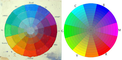

On the right is a mathematically correct digital color wheel based on the red-green-blue “additive” primaries of light. Spaced halfway between RG and B are cyan, magenta, and yellow, the subtractive colors used in printing inks.

My photographer friend Tobey Sanford created this wheel (downloadable here). It may be less familiar to traditional painters. It places the component colors differently around the wheel, but for the purpose of exploring the world of color, especially on our computer screens, it will serve us better in some respects, and we’ll see it again from time to time on future Color Sundays.

Regardless of which wheel we use, most color schemes are built from three component colors or primaries arranged in a triangle called a triad. The area inside the triangle is called the “gamut.” It includes all the possible mixtures from those three primaries, whatever they are.

The primaries don’t have to be red, yellow, and blue. You can use any three colors as primaries, even orange-green-purple—which in fact is what early color photographs called “autochromes” used.

In the case of the limited palettes we looked at a couple weeks ago, for example, we talked about using a less saturated pigment like yellow ochre instead of cadmium yellow. This reduced or muted yellow corresponds with a point well inside the margin of the wheel.

By using a paper mask and rotating it around the wheel, we automatically get interesting reduced gamuts, each with a dominant full-intensity hue and two subordinate, weaker “primaries”.
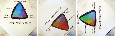

The mask sets us free to choose exactly the color schemes we want. We’re not limited to the haphazard choices of existing tube colors in limited palettes; instead we can use the mask to analyze or invent any gamut.

The equilateral triangle that I call the “atmospheric triad” is only one kind of color wheel mask. There are other shapes, and each of these basic shapes carries its own personality, regardless of the component colors. Atmospheric triads are moody and subjective, great for “color scripting” a graphic novel or a film.

When you rotate the triangular window around the color wheel, you can see the color groupings change, yet each one seems complete to itself. It suggests the feeling of walking from a room lit by incandescent light into another room lit by fluorescent light, and then stepping outside into the blue twilight. Your brain shifts from one color environment to another. I’ll talk more about the brain physiology behind color adaptation in a future Color Sunday.
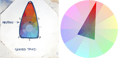

Here’s a color mask that crosses over the center a bit more, which I call the “shifted triad.” It’s shifted toward red, which means the subjective gray or neutral (N) in the composition is also shifted toward red. The secondaries (S) are what you get when you mix the dominant full-intensity red with the weaker blue-violet and blue-green primaries (P).
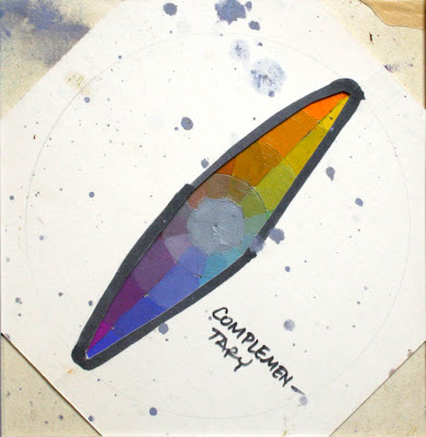

Here’s a complementary scheme, similar to what we’ve seen before. The complementary gamut, regardless of its component colors, suggests an opposition of elemental principles, like fire and ice. At the same time, it’s fairly stable, because its neutral coincides with the center of the wheel.
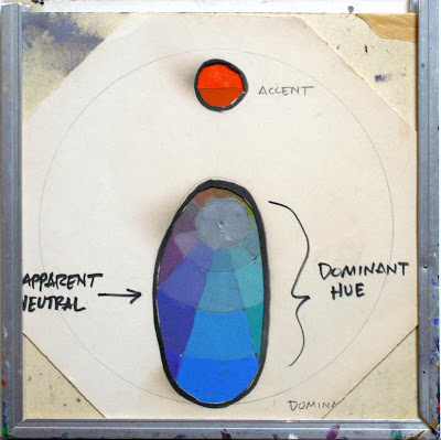

This one is called “mood and accent.” Most of the picture is in one color mood, with just one accent area from across the wheel and no intermediate mixtures. By the way, note that the octagonal color wheel mask and the color wheel slide into the top of the aluminum U-molding.
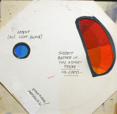

You could also pick an accent color that’s offset from the complement. It looks less natural, and therefore perhaps more attention-getting.
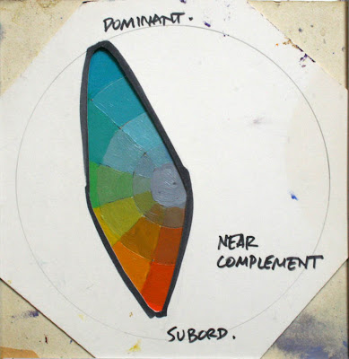

What happens when you create a mask that shifts the color balance off the axis? To me it feels like one of those diminished seventh guitar chords, or a dollop of sour cream dropped into sweet squash soup.
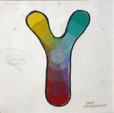

What effect do you feel with a split complementary arrangement, avoiding secondaries? To me it seems vibrant and attractive, but also a little unsettled and jarring.
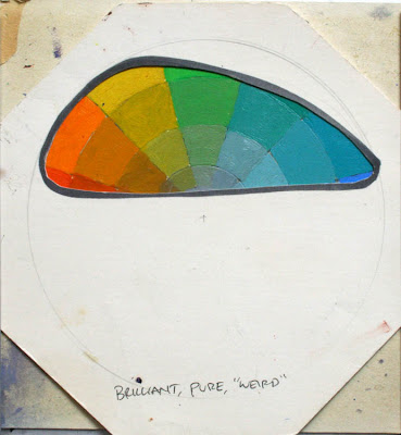

What if the mask selects colors all to one side of the wheel? To me it gives a sense of brilliancy, purity, or weirdness, not something you’d find in nature, but great for otherworldly science fiction.

There’s no limit to the kinds of masks you can cut, and then the infinite combinations you can generate when you start rotating a mask above your own wheel.

Next week, I’ll show you how to take a gamut you’ve selected, and prepare the paints on your palette so that you can use those exact colors in your own painting. The beauty of this method is that it jolts you out of any color mixing habits, and at the same time it forces you to stay within the limits you’ve chosen.

Tomorrow: Mountains Underfoot

Saturday, February 2, 2008

Baseball Cap Space Helmet


When you’re seven years old, an ordinary mesh-back baseball cap takes on new life as a space helmet with a rear stabilizer fin.

Tomorrow: The Shapes of Color Schemes

Friday, February 1, 2008

Downfacing Planes

Most of the time we think of shadows as blue. Surfaces in shadows do tend toward blue if they are facing upward beneath an open stretch of sky. We can make a general rule if we hedge it a bit: “Upfacing planes in shadow are relatively blue on a sunny day.”

In the sketch of the library in Millbrook, New York, I observed plenty of bluish color in the cast shadows on the sidewalk, for example.

But planes in shadow that face downward are different because they pick up the warm reflected color of illuminated surfaces below them. You can see this effect in the white pediment. Where the projecting forms faced downward, they’re distinctly orange, not blue at all.

So let’s revise that quick rule of thumb about the color of shadows: “In shadows, upfacing planes are cool, and downfacing planes are warm.“ If you click on the photo above, taken at Bryce Canyon by Tobey Sanford, you can see the cool upfacing planes (1), and the warm downfacing planes (2). What you can't see are my knees shaking.

Tomorrow: Baseball Cap Space Helmet