You can use
illustration board
,
watercolor paper in sheets
, a
watercolor paper pad
or
spiral bound watercolor sketchbooks
. However, I prefer to paint gouache in 5.5 x 8.5 inch hardcover stitched-in watercolor journals.
The two I recommend are
Pentalic watercolor journal
(which has 100% rag, 100 lb paper), and the
Strathmore 400 Watercolor Journal 
(which has 140 lb paper and comes in
hardcover and
softcover
formats). The
Moleskine
book is OK too, and has more pages than the other two, but the paper is thinner, so I'd recommend that one if you're doing more drawing and dry media compared to watercolor.
Brushes
• Flats, synthetic 1/4", 1/2", and 1"
• Rounds, synthetic or Kolinsky sable, assorted sizes 4-10
A good bargain is to get a
watercolor brush set with carrying pouch
(regular length handles) or a
short-handled water media brush set with carrying case
. The latter will fit over the left hand page of the open sketchbook.
There are a lot of brands available, including very expensive
Kolinsky brushes, but I don't think you have to spend that kind of money for most purposes. The cheaper synthetics can be very good. If I find a good brush, I buy a few extras to have on hand. I've found brushes of acceptable quality at the big box craft stores for very reasonable prices, but you have to check them out. What you want to look for are brushes that have good spring or snap, not floppy. The brush should come to a fine point — or edge in the case of a flat. That way you can use a fairly large brush to paint your picture.
If you're painting in
casein
, use only synthetics; don't use natural hair brushes (bristles or sables) because the paint can be hard on the fibers.
Paint
The Holbein gouache sets are good quality, and you get a lot of colors for a good value. Holbein makes a
set of 12 colors
of the normal size 15 ml tubes. They also make a
set of 18
that sells for an inexpensive price, but the tubes are much smaller, only 5ml.
They also make an
Acryla Gouache
line, which has a closed surface after it dries, meaning water won't dissolve the dry paint.
Winsor and Newton's set
is good quality, but overpriced at $139.
Edit: Here's a W/N 10-tube set for $43 Royal Talens
makes a set of 8 and
M. Graham has a 5 color set, but they lack earth colors, one of the joys of gouache.

You can always buy the set for the pure primaries and then supplement with individual tubes of raw sienna, yellow ochre, raw umber, and Venetian red or burnt sienna, plus black if the set doesn't come with it.
Shinhan Pass
makes a 48-tube set of "hybrid" gouache/watercolor paints. They're pigment-rich, non-toxic, and use gum arabic as the binder and most of the colors can be used transparently or opaquely. But note that 8 of the 48 colors are not lightfast pigments, so they're better for designers or sketchers than gallery artists. The set is priced around $180, not bad considering they're 20ml tubes, while most other brands are 15ml.
Here's a link-rich
previous blog post about the various brands you can choose from. You can always buy individual tubes from other reputable firms but the price will add up rapidly.
What I do in practice is try all kinds of brands and colors. At any given time I carry around about 12-15 colors of different manufacturers. When I set up for a painting, I select the smallest possible set of colors that I need to paint the scene. I store unused tubes in large glass jars with lids that seal tightly. That keeps them from drying out.
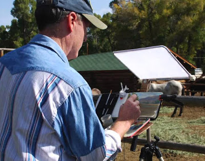 Palette
It can be a plastic or metal tray of your choice, and it should be white or painted white. There are gray palettes, but I don't like them for watercolor and gouache because they make it harder to judge transparent mixtures.
I use the lid from a a
colored pencil box
spray painted white. It attaches to the bottom panel of my
lightweight sketch easel with magnets.
Rags or Paper Towels
Paper towels made by
Bounty
are lint free. They can be dampened and applied to the palette to extend the working time of the paint, and of course they can also be used to clean brushes. Another solution for brush cleaning is old T-shirts cut into foot-square pieces.
Water Brushes
I use
Niji Water Brushes with
round tips
. I normally carry between three and five water brushes. One is filled with water, and the others are filled with blue, black, brown, and gray water-soluble ink, such as
Higgins Eternal ink
.
Transparent watercolor kit
Having a watercolor set as an add-on isn't essential for gouache painting, but if you have a transparent cake set, it opens up many more options. I recommend a small set with in an enamel steel box so that you can hold it to your easel with magnets.
Erasers
I carry two erasers, a
Kneaded Eraser
and a
White Latex-Free Eraser
.
Sharpener
I've used a
Kum Pencil Sharpener
, which not only catches the shavings, but also has a little flap that covers the hole, so the shavings don't leak out and pollute the pages of the sketchbook as well as anything else in my sketch bag. Another good one is the
Staedtler pencil sharpener
, which has a flap to protect from shaving leakage, and two holes for graphite and colored pencil.
Here's a
2-Inch Plastic Clamp
and a
3.75-inch Clamp
. Of all the clips and clamps that I've tried, these seem to be the most versatile for holding the book open or clipping the watercolor box to the easel.
Chair and easel
The biggest decision of your setup strategy is whether to sit or stand. A
tripod folding stool
is a strong and lightweight option. I usually like to sit if I'm painting something that's close to the ground, like a flower, or if I'm painting an upshot. It's good to have a chair if you want to hold the sketchbook in your lap. I use a homemade sketch easel that I described on an
earlier blog post. The nice thing about a tripod easel is that it will work for either standing or sitting.
The workshop


 from the 1980s, but it mainly covered his western art work. This one spans his whole career, focusing mainly on his magazine illustrations.


 ) and they'll be hard to get after that.

 ,
 , a
 or
 . However, I prefer to paint gouache in 5.5 x 8.5 inch hardcover stitched-in watercolor journals.
 (which has 100% rag, 100 lb paper), and the
 (which has 140 lb paper and comes in
 formats). The
 book is OK too, and has more pages than the other two, but the paper is thinner, so I'd recommend that one if you're doing more drawing and dry media compared to watercolor.
 (regular length handles) or a
 . The latter will fit over the left hand page of the open sketchbook.
 , use only synthetics; don't use natural hair brushes (bristles or sables) because the paint can be hard on the fibers.

 of the normal size 15 ml tubes. They also make a
 that sells for an inexpensive price, but the tubes are much smaller, only 5ml.
 line, which has a closed surface after it dries, meaning water won't dissolve the dry paint.
 is good quality, but overpriced at $139.

 You can always buy the set for the pure primaries and then supplement with individual tubes of raw sienna, yellow ochre, raw umber, and Venetian red or burnt sienna, plus black if the set doesn't come with it.
 makes a 48-tube set of "hybrid" gouache/watercolor paints. They're pigment-rich, non-toxic, and use gum arabic as the binder and most of the colors can be used transparently or opaquely. But note that 8 of the 48 colors are not lightfast pigments, so they're better for designers or sketchers than gallery artists. The set is priced around $180, not bad considering they're 20ml tubes, while most other brands are 15ml.

 spray painted white. It attaches to the bottom panel of my
 are lint free. They can be dampened and applied to the palette to extend the working time of the paint, and of course they can also be used to clean brushes. Another solution for brush cleaning is old T-shirts cut into foot-square pieces.
 for a palette-side jar and a
 attached lower on the easel for cleaning brushes.
 will do for the lay-in stage. If you want to use watercolor pencils, I recommend the
 .
 .


 (24 half pans)
 , which has a flap to protect from shaving leakage, and two holes for graphite and colored pencil.
 is a strong and lightweight option. I usually like to sit if I'm painting something that's close to the ground, like a flower, or if I'm painting an upshot. It's good to have a chair if you want to hold the sketchbook in your lap. I use a homemade sketch easel that I described on an