(
Link to video excerpt)
Here's a complete list of materials and a buyer's guide for plein-air watercolor painting.
This is a supplement to my instructional video "
Watercolor in the Wild."
I carry these art supplies practically everywhere. The basic elements are pretty simple: a sketchbook, a paint box, a few brushes, watercolor pencils, a rag, and some water. They're all listed in detail below.
Watercolor Sketchbook
• I have often used the
Moleskine Watercolor Album (5 x 8.25 inches) 
I like the fact that it opens flat and I like the horizontal (landscape) format. It has 36 pages—72 if you paint on the facing pages. It has a fake leather hardbound cover, an elastic strap, and a pocket in the back. The paper is 90-pound weight, which is rather lightweight for very wet watercolors, but it's OK if you're doing mostly drawings rather than juicy paintings.
• I also recommend the
Pentalic Aqua Journal (5 x 8 inch)
, which is priced about the same as the Moleskine but has better paper — 140 lb (300gsm) cold press, acid-free paper.
[Edit: I inquired directly with Pentalic to find out the fiber content of the paper, and heard back from the factory that it is indeed 100% cotton rag, which is excellent quality.] With the heavier paper, it has just 24 pages. But they'll hold up to wet washes or even light impasto, such as with casein. It has generous extras, such as an elastic strap, a back pocket, an elastic brush-holding sleeve, and a placeholder ribbon.
• The
Stillman and Birn Beta Hardbound Sketchbook (5.5 x 8.5 inches)
is a vertical book with 26 pages of cold press 180lb. archival paper. The paper is substantial, but it doesn't open flat easily [Edit: unless you work to press open the binding, which doesn't hurt the book]. It can be held flat with clips. If you're thinking of working in casein, the heavier paper reduces the chance of impastos cracking.
• The
Pentalic Watercolor Field Book (7 x 10 inches)
, is well suited those who prefer a spiral binding. It's bigger, so check to make sure it will fit in your belt pouch or purse.
• One other option: There's a Kickstarter campaign by Erwin Lian Cherngzhi going on for the next nine days to build
"The Perfect Sketchbook," with 60 pages of 100% cotton paper at a pocket size of 3.5 x 5.5 inches, with a grayscale and and 18% photo gray built in.
To decorate the cover, I use the oil-based
One-Shot Sign Painter's Lettering Enamel
, which is very opaque. Paint markers also cover fairly well, but they tend to wear off faster. I usually title the sketchbook with a phrase taken from the first page of the sketchbook.
Watercolor Sets
Quality Metal Pan Sets
Custom Sets Made from Empty Pans
You can get exactly the colors you want by buying an empty metal box and filling it with colors that you choose. When the colors run low, you can refill the pans with tube colors.
Large size empty box. In my videos, I'm using an old Talens box from the 1960s. You can get a similar
large empty metal watercolor box, which holds 24 half pan colors or 12 full pans. This box opens up to 9 x 8 x 1 inches. You can combine half pans and full pans in the same box, using full pans for colors you use more often. Sometimes I put in two pans of the same color if I use them a lot.
Small size empty box (left). The
smaller empty metal watercolor box
opens up to about 5 x 8 inches, which fits the left side of a Moleskine or Pentalic sketchbook. This box will hold 12 half pans or six full pans.
Empty half pans. The most economical route is to buy plastic
empty half pans
and fill them with tube colors. The empty pans cost only 34 cents each. For students or anyone on a tight budget, you can get the
12 Tubes of Student Grade Winsor and Newton Watercolor Tubes
for just $30.00. If you have dried up watercolor tubes, don't throw them out; cut them open and scrape out the tar-like pigment to fill empty half pans. Even if they're dried hard you can reactivate them with water once you cut the tube open.
Alternately, you can fill your box with factory-filled pans.
Colors--Here's a basic set of 12 half pans. These are really all you need.
Eight more classic colors if you have room for them.
The smaller the set, the more likely you'll have harmonious color. I've been reworking my own small metal box to limit it to just nine colors. Here's what I've got in it at the moment.
Economical options
If you're looking for a super-compact pocket rig, or if you're a student, a first-timer, or on a budget, I recommend the
Winsor and Newton pocket watercolor set with 12 colors
, which you can get for around $15.00. This has a plastic box containing
Cadmium Yellow Pale Hue, Ultramarine, Yellow Ochre, Cadmium Yellow Hue, Cobalt Blue Hue, Burnt Sienna, Cadmium Red Pale Hue, Sap Green, Burnt Umber, Alizarin Crimson, Viridian Hue, and Chinese White. That's a pretty good assortment, and the quality of the paint is OK. Note that when it says "hue," they're replacing an expensive pigment with a cheaper pigment of a similar hue.
A lot of field artists and urban sketchers love the
Sakura Koy 12-Color Field Set with Water Brush
, which is under $20. It includes the brush and fits in your pocket. The case is made of plastic, so you can't use magnets on it, but the lid has mixing wells, which helps if you're laying down larger washes. Two cautions: the lid doesn't open all the way flat, and when the colors are wet they can spill over into each other.
There's kind of an arms race for small sets. Some of the smallest watercolor sets are the size of a business card, and easily fit into a pocket. At left is the
Pocket Palette by Expeditionary Art. The metal pans can be filled with tube colors, and they're held in place by a magnetic backing inside the case. The flip-up metal lid has a white surface for mixing colors. The downsides are: 1. The lack of mixing wells to hold wet washes, 2. The reflective metal, which can be blinding on bright days, and 3. The overlapping flange on the left side that covers part of the pans.
At lower right is a 30-year-old Winsor and Newton "Bijou Box," which they no longer make. It has an enameled steel case with 18 colors and a tiny travel brush. The pans are tiny, and I think there are more colors than necessary. I'd rather see 6 or 8 for a box this size. The lid has four mixing wells, which is a big plus. If you can find one of these used for a good price, grab it, but a comparable super-mini set that you can get in USA is the
Winsor and Newton Cotman Water Color Mini, or you can make your own equivalent of the Bijou with an old Altoid tin, some spray enamel paint, and some extra half pans.

Water Cup and Rags
I keep a second jar with clear water handy, and often just a regular drinking water bottle, and I use an old plastic "Tupperware" basin or yogurt cup for a brush cleaning bucket when I'm painting with the tripod easel.
I cut up old cotton T-shirts for paint rags, or use paper restaurant napkins or paper towels.
Brushes
Here's a good inexpensive starter set of brushes:
Richeson Sable Hair Watercolor Brush Set/5
I like sable flat brushes, such as:
1/2-Inch Sable Brush 3/4-Inch Sable Brush
I also use a
1/4-Inch Synthetic Watercolor Flat Brush
, which work well for architectural detail.
For laying bigger washes and wetting the paper, a
Cat's Tongue Wash Brush is a good tool. It has a flattened ferrule similar to a filbert brush.
Round Kolinsky sables (note: some brands may become discontinued in the U.S. as the
Kolinsky ban exhausts stock on hand):
Winsor and Newton Series 7  Richeson Siberian Kolinsky brushes
 Escoda Optimo Kolinsky
Da Vinci Maestro Series Kolinsky Red
Escoda Optimo Kolinsky
Da Vinci Maestro Series Kolinsky Red 
If you have a very compact kit and can't carry a box of brushes, you might want to use a
Sable Round Travel Brush
, which safely stows the brush tip inside the handle.

Water Brushes
I always try to carry four
Niji Water Brushes with large round tips
. They're the best brand I've found, and stand up to a lot of hard use. For info about filling them with ink, please scroll farther down this post.
I also carry a tube of

white gouache, such as
Holbein Permanent White Gouache.
Winsor and Newton is also good. Sometimes I bring a whole set of
gouache colors to supplement the transparent watercolors, but gouache will be the topic of future posts.
Plastic clamps
Here's a
2-Inch Plastic Clamp
and a
3.75-inch Clamp
. Of all the clips and clamps that I've tried, these seem to be the most versatile for holding the book open or clipping the watercolor box to the easel.
Sharpener
I use a
Kum Pencil Sharpener
, which not only catches the shavings, but also has a little flap that covers the hole, so the shavings don't leak out and pollute the pages of the sketchbook.
Eraser
Water-Soluble Colored Pencils
These add a lot of options and variations to traditional watercolors. I recommend trying a few test pencils from several different brands to see which ones you like. My favorite brand is
Caran D'ache Supracolor
, but I also like
Derwent Inktense Pencils
for rich, saturated colors.
I started with a
Caran d'Ache Supracolor Set of 18
. Over the years I have added and subtracted individual colors from the standard set. Below are the colors I take with me most often. It emphasizes warm colors that I like for portraits and animal drawing.
Caran d'Ache Supracolor watercolor pencils
#001 White
#003 Light Grey #009 Black
You can also get woodless watercolor pigment sticks or crayons. Derwent makes
Aquatone Woodless Pencils
, which are like pencils made of solid pigment, and they also make square pigment sticks called
Derwent Inktense Blocks
. Another company is
Lyra, which makes pigment sticks that have the feel of wax crayons.
 Caran d'Ache
makes round water-soluble pigment sticks called
Neocolor Pastels (shown above)
They're all a good value because you get a lot of pigment for the price, and I do use them occasionally for creating rough textures.
 Pencil Box
The pencil box I use was customized by armorer
Tony Swatton. It began as a metal box I bought at a Japanese bookstore called
Kinokuniya in Los Angeles. (I painted the
Apple logo as a gag.)
Tony then added the hammered brass piece with rivets and I aged it with paint.
Waist Pack / Fanny Pouch / Belt Bag
[The Explorers] Multi-Purposes Fanny Pack
looks pretty similar. I recommend that you buy the pack at an outdoor store
after you select the contents to make sure everything fits. A quiet zipper and minimal Velcro is a consideration if you plan to sketch in quiet places where you don't want to attract attention.
Tripod
I use a Velbon CX 444 tripod because it's lightweight, folds small, and reaches up to a reasonable standing height when fully extended. Unfortunately, that model has been discontinued, but a similar replacement that I've used is the
AmazonBasics 60-Inch Tripod
. The square quick release plate matches the
Velbon
quick release plate, so the two are compatable. You can get extra
generic Velbon size plates
to attach to any cameras, easels, or sliders that you want to attach to a tripod to aid quick setup.
Three-legged stool
A
Tripod Stool
is something I carry in the car or in a backpack when I plan to sit. Sometimes I bring an extra to use as a field taboret for art gear. If you want a very compact folding stool that fits in your backpack, and you're lighter than 175 pounds, you might prefer the
Coleman Event Stool
. I'm too heavy for those, and one of them gave out on me once in a museum, but my wife sat happily with no problems, laughing at my misfortune.
Sketchbook Pochade
The simplest sketchbook holder is a piece of 1/4 inch or 5/16 inch thick plywood cut to the dimensions of the sketchbook opened up flat. I call it a "sketchbook pochade." I drill a hole in the back of the panel and insert a
1/4-20 Tee Nut
which will attach to the tripod and securely hold the plywood. The sketchbook attaches to the plywood base with rubber bands or plastic clamps.
Homemade Easel
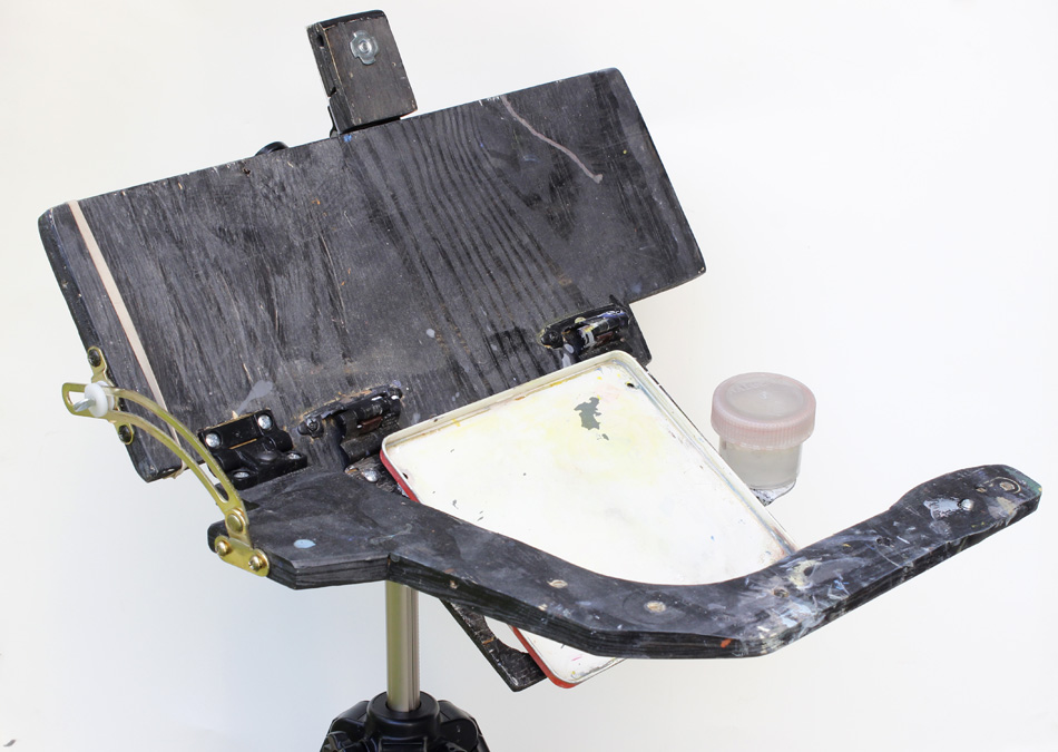
I made this device, which I call a Sketchbook Pochade Easel to hold the paint set, the water, and the sketchbook. I also use this for gouache and casein. The diffuser frame attaches to the top, and it uses
White Rip-Stop Nylon Fabric
that I sewed onto an old aluminum Pendaflex file folder frame, a holdover from the dinosaur era.
Here's a clearer shot of the sketchbook pochade. It attaches to the tripod with a
Tee Nut, and uses a
Southco SC-773 Adjustable Torque Hinge and a furniture slider to hold the parts at the proper angle. The "camera bar" for holding the video camera swings out from the front, held at a constant position by a piece of brass furniture hardware called a
Friction Lid Support.
The palette area is made from the lid from a pencil box, primed and then spray-painted with white enamel, and held on with Velcro. That way it can be removed for cleaning, especially when I use it for casein or gouache.
EDIT: Aug 16--
 Refilling Water Brushes and Fountain Pens
Water Brushes
I've tried several brands, but none seem as reliable as
Niji Water Brushes. I recommend the ones with
round tips, but you can also get them with
a 12mm Flat Tip
. I normally carry between three and five water brushes. One is filled with water, which fills easily under a normal faucet by unscrewing the handle and squeezing the barrel.
The others are filled with blue, black, brown, and gray. I mix the gray myself, put it in an empty bottle, and mark the bottle. To identify which water brush is which, I paint the back end tips with acrylic (see lower left of photo above).
Ink
The ink in a brush pen should be water-soluble so that it doesn't clog the brush fibers. I use
Higgins Eternal Ink
(black), and an old bottle of
Sheaffer Skrip Ink
. The color in my 30-year-old bottle is mellow blue-black, which I believe is no longer available. The
Waterman Fountain Pen Blue Bottled Ink
is a bolder blue. For a brown color, I use either the
Higgins Sepia Fountain Pen Ink
or the
Waterman Brown Ink
, the latter of which has a redder cast. If you mix two colors of ink, you should mix the same brands.
Refill Tool
Several different tools will work for refilling water brushes. My favorite is a
Syringe with a Blunt Tip Fill Needle. You can also use a
Syringe with a Tapered Plastic Tip
(center of photo above). A
Glass Eyedropper
doesn't always work as well because the tip isn't small enough to fit inside the chamber of an empty fountain pen cartridge or water brush.
Fountain Pens
I use a relatively inexpensive
Waterman Phileas Fine Point Fountain Pen
(top) for written notes. In the USA, you can buy refill cartridges in black and blue, but it's not easy to find brown or gray or other colors. As with the water brushes, you can refill them with your favorite color. The pen comes with a piston converter insert, but if you don't have one of those, you can refill empty cartridges with the syringe.
When I need to use waterproof ink for my line work, I like
Micron Pens and brushpens. They

come in many colors, and give a constant indelible line, similar to the classic Rapidograph pens. For a brush-style tip, I've used the
Pentel Pocket Brush Pen, a waterproof brush-tip pen with replacement cartridges. A caution about the Pentel: the ink can bleed through some thinner paper.
-----
For a PDF version of this list and buyer's guide, check out the extras of
gum.co/watercolor.
To learn more about the 72-minute video "Watercolor in the Wild":
HD download: (Credit Card)
HD download: (Paypal) buy
DVD: (NTSC, Region 1)
Feel free to bookmark and share this info, and please let me know of any corrections or suggestions in the comments.




 . It's similar to one called "The Perfect Sketchbook" being


 .
.
 have a bit more the feel of wax crayons. But they're all a good value because you get a lot of pigment for the price, and although I didn't use them on this drawing, I do use them occasionally for creating rough textures.


 is another alternative with a linen cover. The linen cover is attractive if you want to do a little acrylic or oil painting on the cover.

 (24 half pans)


 , a small travel brush, and a sawed off brush. The book is the
  with three
  . You could also use a generic
  instead of the Magic Sculpt. The magnets are powerful, so keep them away from your credit card and phone.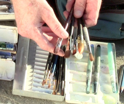


 and a
and a  .
.


 (HB, B, or 2B) for the initial drawing.


 . The square quick release plate matches the
  quick release plate, so the two are compatable. You can get extra
  to attach to any cameras, easels, or sliders that you want to attach to a tripod to aid quick setup.

 held on with an adustable
  I'm holding a
  , which clips onto the bar for night sketching.
 , which is small and light and full-featured. I also use a
  with a
  . For time lapse, I use a
  with a free time lapse program called "Time Lapse Assembler."