Tuesday, May 11, 2021

Are Artists Right-Brained?

There's a lot of information online about the difference between the two hemispheres of the brain and what that means for artists.

Many commentators suggest that each of us is either a "left hemisphere person" or a "right hemisphere person," as if we think and act primarily with one dominant hemisphere. This idea originated from studies in the 1960s and '70s with patients whose two hemispheres had to be separated by cutting through the connecting nerve bundle called the corpus callosum.

The notion that has percolated through popular culture is that each half of the brain functions separately.

Recent studies reveal that the truth is actually more nuanced than that.

Iain McGilchrist, a psychologist who has investigated this topic, suggests that different hemispheres of the brain are actually engaged in similar cognitive tasks, but each half approaches that task in a different way.

The right half focuses more on the big picture, and the left hemisphere focuses more on the details. The right brain appreciates metaphor, poetry, humor, and music, while the left brain is more focused on the notes, the denotive facts, and the logical conclusions. 

Although they have somewhat different styles of information processing, the two hemispheres are both engaged as you navigate through most tasks, and they work together when you're creating a painting. 

In this YouTube video, which is illustrated by a whiteboard animation, Iain McGilchrist explains the lateralized brain, and how that affects our personal and cultural styles of thought. 


The art teacher most strongly associated with this line of scientific reasoning is Betty Edwards, who wrote Drawing on the Right Side of the Brain and has updated it with a 4th Edition

Monday, May 10, 2021

Designing Book Covers

Lucas Schneider asks: 
What would you say is the most important thing to consider when painting book covers?

Answer:
Think beyond the point-of-sale function of the image.

Sure, it's important to get the potential reader to pick up a copy in the bookstore or to click on the image online. That's the main concern of the publisher, the art director, and the sales force when they think about your cover. Of course it should stand out from the competition and it should accurately convey the spirit, style, and type of the book.

But that's just the start of how the reader will relate to the image. The cover image also has to offer something to the reader while they're reading the book and after they've finished it. 

In other words, it has to be a poster that invites them into the adventure, and it must sum up the experience of the book after they've read it. 

Plus, it's important to keep in mind that the image will live entirely independently of the book, as you share it without the type on social media and in your portfolio.

For example, I wanted the painting for Glory Lane to present the odd situation of some American kids encountering a whole planet full of aliens far weirder than they are. The image is loaded with details that go beyond that moment in the book, making it fun for the reader to explore later. 

You obviously don't want to give away the story, but it's essential to communicate the genre, the main characters, and at least one provocative situation. 

Sunday, May 9, 2021

Mother and Daughter Reading

Although she never had children of her own, American illustrator Jessie Wilcox Smith (1863-1935) painted some of the most enduring images of motherhood. 

She would invite her friends to bring their children over to visit, and she'd sketch them while they played. She preferred to look for authentic moments from unprofessional models, rather than posing professional actors.

Book: The Red Rose Girls: An Uncommon Story of Art and Love

The Subject Was Children: The Art of Jessie Willcox Smith

Saturday, May 8, 2021

Why Cell Towers Keep Getting More Complex

This cell tower looms over our village hall and it keeps getting more complex as more carrier companies add their antennae to the central lattice-type tower.


The first company to set up there received the highest space, and newer carriers have added their equipment on triangular arrays farther down the structure. The antennas are the vertical segments. They both transmit and receive signals from your cell phone.


I liked the way the hot sun flare burned through the wires and antennas and set them on fire, coloristically speaking. 

See how the same cell tower looked 11 years ago in a previous post.

Friday, May 7, 2021

Two Paintings in Upcoming Exhibit in Massachusetts

Two of my paintings will be part of a big fantasy exhibition this summer at the Norman Rockwell Museum in Stockbridge, Massachusetts.
 

"Skeleton Pirate" and "Garden of Hope" will be featured among works by Arthur Rackham, Maxfield Parrish, Jessie Willcox Smith, Joseph Clement Coll, N.C. Wyeth, and many contemporary illustrators.

The name of the exhibition is "Enchanted: A History of Fantasy Illustration.

"Fictional worlds of magic and adventure come to life through fantasy illustration. Myths, legends, fables, romance, and epic battles involving swords and sorcery occur in a world unfamiliar to us. Unlike science fiction, which is based on fact, fantasy presents an imaginative reality built on universal themes—heroes defeating fire-breathing dragons, angels and demons engaging in combat, and mythological tales of love and loss."

The exhibition opens to the public on June 12, 2021 and will be on view through October 31.

Thursday, May 6, 2021

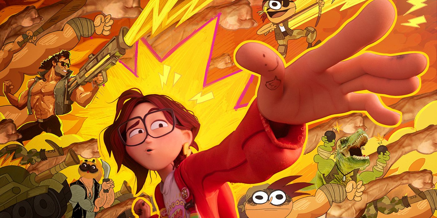
Look Development in "Mitchells Vs. Machines"

The new Netflix movie "The Mitchells vs The Machines" uses innovative techniques to create the contrast between humanistic world and the machine world. (Link to YouTube)


The team at Sony, which won the Oscar for the Spiderverse movie, developed new tools for this film, creating a look that was a notable departure from the unified style of a typical Pixar / Disney outing. 


This behind the scenes video features interviews with visual effects supervisor Michael Lasker, character designer Lindsey Olivares, director Mike Rianda, and producers Phil Lord and Chris Miller. 

Fun With a Weird Gamut

That color scheme on the right is just flame red, brilliant purple and raw sienna, plus white. The purple serves as the blue. It pushes everything into a magical realm, especially if you put it next to a sketch made from other gamuts that contain blue-green or bright yellow.

Wednesday, May 5, 2021

Lebedev's Oil Study

Klavdy Lebedev (1852-1916) did this oil study from a costumed model as a preparation for a larger painting. 


I'm just guessing, but he probably did study on an oil-primed surface, and that he must have done a preliminary pencil drawing and laid in the tones fairly thinly. 

Lebedev was a member of the Itinerants, and a student of Perov. 

Martha the Mayoress. Destruction of Novgorod by Ivan
by Klavdy Lebedev. 1889. Tretyakov Gallery.

The Destruction of Novgorod was "an act of vengeance against the perceived treason of the local Orthodox church, the massacre quickly became possibly the most vicious in the brutal legacy of the oprichnina, with casualties in the tens of thousands and innumerable acts of extreme violent cruelty."

Tuesday, May 4, 2021

The Air Scorpion

The air scorpion is one of the biggest of the fleet of enforcer ships from Dinotopia's ancient Poseidos. 


The design is based on eurypterids, with mechanized prosomal appendages, skid plates, and podomeres that were equally dangerous while in flight or walking on land.
--

Monday, May 3, 2021

Chicken People in Poughkeepsie


Two weeks ago there was a DNA leak from the Agricultural Biotech Lab at Varist College. They tell me that the janitorial team in Building 14 was the first to grow the comb and wattles. Everyone thought it was an IG face filter at first. They tried to cover it up, then they tried surgery, but it made it worse. Now everyone in the CheapRight Market in Poughkeepsie has got the beak and wattles, and I'm starting to grow them, too.