The animated film Fire and Ice was made by first filming actors on a sound stage, then using the resulting frame-by-frame photographs as reference for the animation.
The animators didn’t exactly trace the photos. They found all sorts of ways to enhance and exaggerate the action, and there were a lot of giant lizards and pterosaurs that had to be completely hand drawn.
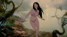
This rotoscoping process was kind of an ancestral analog version of the digital motion capture methods used nowadays on Avatar and the new Planet of the Apes. Director Ralph Bakshi had developed his rotoscope technique on American Pop, the film he produced and directed before Fire and Ice.
Bakshi oversaw all the staging and blocking of the scenes and worked closely with the actors on the set. Bakshi was fun to be around, always razzing us, drawing cartoons, and talking art. The building didn’t have a proper intercom system, so he’d yell into the ventilation system: “COFFEE!”
I was near a vent, so I yelled back, "NO COFFEE." He responded, "GET TO WORK, SLAVES!"
Ralph invited me to the set during one of the days of shooting and I did some sketches of cast and crew, but I can’t seem to locate that sketchbook.
The backgrounds were planned by layout artist John Sparey and drawn out in pencil by background layout Tim Callahan (who appears at 4:37). Though most of my time was taken up with painting the backgrounds, I sometimes contributed design work. We were all stumped by what the throne of Nekron, the ice king, should look like.
I went home and sculpted a wax maquette inspired by the Laocoön. Nekron seemed like sort of a tortured fellow, so an image of a gargoyle wrestling with a giant snake seemed to fit him. After using the maquette for reference I put it in the back of my car and forgot about it. On a hot day and it half-melted into a pathetic lump.
Tomorrow I’ll wrap.
Other posts in this series:
Part 1: Fire and Ice -- Rekindled
Part 2: Fire and Ice -- Frank Frazetta
Part 3: Fire and Ice -- Tom Kinkade
Part 4: Fire and Ice -- Ralph Bakshi
Part 5: Living Inside Paintings
Wikipedia on Rotoscoping
Wikipedia on Ralph Bakshi
Wikipedia on the original Fire and Ice.
Friday, September 30, 2011
Thursday, September 29, 2011
Part 3. Fire & Ice: Tom Kinkade
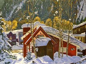
The other background painter on the movie Fire and Ice was Tom Kinkade (misspelled Kincade in the credits). This was several years before he became Thomas Kinkade, “The Painter of Light.” At the time I knew him he was painting gritty city scenes and Indian teepees.
That’s me on the left and Tom on the right, working at Ralph Bakshi’s animation studio in Burbank, California, I believe in 1981.
Here’s the painting I have on my board in that photo, an establishing shot of “Fire Keep,” the castle of the good guys in the movie.
Tom and I had been assigned to each other as freshman roommates a few years earlier in 1976 at the University of California at Berkeley. He headed down to southern California to go to Art Center College of Design, and I followed there later.
At the point where we started at Bakshi Studios, we were each 21 years old. He had a lot more painting experience than I did, having painted hundreds of canvases since he was in grade school. I had drawn a lot, but hardly painted at all.
To answer Arnaud’s question yesterday, we walked in Bakshi’s door together and sold ourselves as a background painting team. But my skills sucked at the time. Tom helped me get the job, and I learned a lot by watching him paint. We had to match styles so that the backgrounds were interchangeable. So you might describe the Fire and Ice background style as by “Gurkinzetta.”
OK. Stories. One thing about Tom and me was that we both enjoyed pulling off practical jokes on the rest of the crew. Once, when the production coordinator came by to check on our progress, I grabbed a razor blade and start scraping the paint off the porcelain palette. I had made a fake thumb out of latex and I filled it with red paint.
Just when I turned around to tell her that the backgrounds were coming along fine, I pretended to slice off my thumb. The chunk of thumb bounced over on the floor next to her feet. She threw down the backgrounds she was holding and screamed. We took turns doing this stunt on just about everyone on the crew.
Tom and I were always thinking of how we could create an interesting diversion for the animators. They slaved away for countless hours in their dark cubicles, bored out of their minds, looking around for any distraction.
We found a roll of brown paper and unspooled a 100-foot-long piece. Tom grabbed the front end and I grabbed the back end. He started down the hallway, dragging the long piece of paper, and I followed along way behind. We snaked that piece of paper through all the hallways, past the open doors to the animation rooms.
The animators looked up from their work and waited and waited for the piece of paper to go by. It was a long time before I came along holding the tail end, waving and saying, “Long pan shot!”
All of our paintings were done in cel-vinyl acrylics, the same paints they used for painting the cells. They are remarkably small. Most are about 9x12 inches. This establishing shot of Nekron's glacier was about 11x14 inches.
Cel-Vinyl acrylic is very opaque and great to work with, but it it clogged the airbrushes, and it destroyed the Winsor and Newton Series 7 brushes that we used. Those brushes were beautiful and expensive, and I felt bad that they only lasted a few weeks. But we were each on a quota of 11 finished paintings a week.
Other posts in this series:
Part 1: Fire and Ice -- Rekindled
Part 2: Fire and Ice -- Frank Frazetta
Part 3: Fire and Ice -- Tom Kinkade
Part 4: Fire and Ice -- Ralph Bakshi
Part 5: Living Inside PaintingsWikipedia on Thomas Kinkade
Wikipedia on the original Fire and Ice.
Cartoon Color Cel Vinyl official site
That’s me on the left and Tom on the right, working at Ralph Bakshi’s animation studio in Burbank, California, I believe in 1981.
Here’s the painting I have on my board in that photo, an establishing shot of “Fire Keep,” the castle of the good guys in the movie.
Tom and I had been assigned to each other as freshman roommates a few years earlier in 1976 at the University of California at Berkeley. He headed down to southern California to go to Art Center College of Design, and I followed there later.
At the point where we started at Bakshi Studios, we were each 21 years old. He had a lot more painting experience than I did, having painted hundreds of canvases since he was in grade school. I had drawn a lot, but hardly painted at all.
To answer Arnaud’s question yesterday, we walked in Bakshi’s door together and sold ourselves as a background painting team. But my skills sucked at the time. Tom helped me get the job, and I learned a lot by watching him paint. We had to match styles so that the backgrounds were interchangeable. So you might describe the Fire and Ice background style as by “Gurkinzetta.”
OK. Stories. One thing about Tom and me was that we both enjoyed pulling off practical jokes on the rest of the crew. Once, when the production coordinator came by to check on our progress, I grabbed a razor blade and start scraping the paint off the porcelain palette. I had made a fake thumb out of latex and I filled it with red paint.
Just when I turned around to tell her that the backgrounds were coming along fine, I pretended to slice off my thumb. The chunk of thumb bounced over on the floor next to her feet. She threw down the backgrounds she was holding and screamed. We took turns doing this stunt on just about everyone on the crew.
Tom and I were always thinking of how we could create an interesting diversion for the animators. They slaved away for countless hours in their dark cubicles, bored out of their minds, looking around for any distraction.
We found a roll of brown paper and unspooled a 100-foot-long piece. Tom grabbed the front end and I grabbed the back end. He started down the hallway, dragging the long piece of paper, and I followed along way behind. We snaked that piece of paper through all the hallways, past the open doors to the animation rooms.
The animators looked up from their work and waited and waited for the piece of paper to go by. It was a long time before I came along holding the tail end, waving and saying, “Long pan shot!”
All of our paintings were done in cel-vinyl acrylics, the same paints they used for painting the cells. They are remarkably small. Most are about 9x12 inches. This establishing shot of Nekron's glacier was about 11x14 inches.
Cel-Vinyl acrylic is very opaque and great to work with, but it it clogged the airbrushes, and it destroyed the Winsor and Newton Series 7 brushes that we used. Those brushes were beautiful and expensive, and I felt bad that they only lasted a few weeks. But we were each on a quota of 11 finished paintings a week.
Other posts in this series:
Part 1: Fire and Ice -- Rekindled
Part 2: Fire and Ice -- Frank Frazetta
Part 3: Fire and Ice -- Tom Kinkade
Part 4: Fire and Ice -- Ralph Bakshi
Part 5: Living Inside PaintingsWikipedia on Thomas Kinkade
Wikipedia on the original Fire and Ice.
Cartoon Color Cel Vinyl official site
Wednesday, September 28, 2011
Part 2. Fire & Ice: Frazetta
Here’s a photo of me and Frank Frazetta, taken at Comic-Con in 1995.
This was quite a while after the animated movie project “Fire and Ice” was released in 1983.
Frank Frazetta was a co-producer, along with Ralph Bakshi, who directed. Frazetta worked with Bakshi to come up with the original story, which was scripted by comics writers Roy Thomas and Gerry Conway. He was involved in casting and in supervising the live action shoot that was used as the basis of the rotoscoping.
Frazetta brought a lot of inspiration to the art crew: animators, layout people, and background painters. He would tour the building with his famous friends, like Arnold Schwarzenegger. And he would lug in stacks of his famous canvases and prop them up around the break room every once in a while. He wouldn’t talk specifics about his techniques, but he loved to sit around the background room and talk about his art.
Art was an intuitive thing for him, something you didn’t analyze unless there was something the matter with you. He often bragged about “pulling off” paintings at the last minute, though we all knew how hard he really worked at them. What did come out of our conversations was how much he valued understatement and subtlety, though he might not have put it in those terms.
Frazetta prints were all over the walls, of course, I admired the simplicity of his compositions, and the confidence he brought to creating an image totally out of his head.
But I didn’t come into an awareness of Frazetta’s work until I started on this movie job with him. I knew about Howard Pyle before I was aware of Frazetta, so I saw his work in terms of theirs. (Above left, Pyle's "Attack on a Galleon. Right, Frazetta).
I was looking for ideas about composition and light in other places—Dean Cornwell, N.C. Wyeth, Arthur Rackham, Frederic Church, and the other Hudson River School painters.
That would irritate Frank sometimes. I’d say: “Look, Frank, what do you think of this spot of light in the forest? It’s just like Wyeth would do!”
“Wyeth?” he’d shout, “Forget about Wyeth! This is a Frazetta movie!”
One time Frazetta came in with a stack of his original paintings and set them up near the coffee machine. He saw me standing there with a spray can of clear enamel. “Come over here, Gurney!” he said, “What you got in that can?”
“It’s a finish varnish,” I said. “We use it to give some shine to our acrylic paintings.”
“Acrylic? How can you work with that crap?” he asked.
He handed one of his classic Conan covers to me. “That baby’s got some dull spots. Why don’t you give it a coat of that stuff?”
“I don’t know, Frank. I’m not sure this kind of varnish is made for oils.”
“No problem, don’t worry about it,” he said.
But I refused to do it and handed him the can. I didn’t want to be the guy responsible for wrecking a Frazetta painting.
Working with Frank Frazetta gave me my first real exposure to fantasy as a genre of art and storytelling. As a result of seeing Frazetta’s paperback covers, I started to think about covers as a career option, which had never occurred to me in art school. When the movie work finished, I began illustrating covers for science fiction and fantasy novels.
Other posts in this series:
Part 1: Fire and Ice -- Rekindled
Part 2: Fire and Ice -- Frank Frazetta
Part 3: Fire and Ice -- Tom Kinkade
Part 4: Fire and Ice -- Ralph Bakshi
Part 5: Living Inside Paintings
Tuesday, September 27, 2011
Part 1: Fire & Ice Rekindled
Director Robert (Sin City) Rodriguez recently announced that he will be creating a live action version of the 1983 animated film Fire and Ice.
The announcement was accompanied by a few pieces of preproduction artwork showing the characters of Teegra, Larn, and Dark Wolf, painted in the style of fantasy artist Frank Frazetta (1928-2010).
The original movie Fire and Ice was co-produced by Frank Frazetta and Ralph (Fritz the Cat) Bakshi. Here’s the trailer.
My first job in the movie industry was working as a background painter for that film. I had the opportunity to paint hundreds of scenes of jungles, volcanoes, swamps, and forests into which the rotoscope cel-animated characters would perform.
I’d like to take the next few posts to share some memories about that project.
Part 1: Fire and Ice -- Rekindled
Part 2: Fire and Ice -- Frank Frazetta
Part 3: Fire and Ice -- Tom Kinkade
Part 4: Fire and Ice -- Ralph Bakshi
Part 5: Living Inside Paintings
Wikipedia on the original Fire and Ice.
See Justin Sweet's concept art for the Rodriguez film
The announcement was accompanied by a few pieces of preproduction artwork showing the characters of Teegra, Larn, and Dark Wolf, painted in the style of fantasy artist Frank Frazetta (1928-2010).
The original movie Fire and Ice was co-produced by Frank Frazetta and Ralph (Fritz the Cat) Bakshi. Here’s the trailer.
My first job in the movie industry was working as a background painter for that film. I had the opportunity to paint hundreds of scenes of jungles, volcanoes, swamps, and forests into which the rotoscope cel-animated characters would perform.
I’d like to take the next few posts to share some memories about that project.
Part 1: Fire and Ice -- Rekindled
Part 2: Fire and Ice -- Frank Frazetta
Part 3: Fire and Ice -- Tom Kinkade
Part 4: Fire and Ice -- Ralph Bakshi
Part 5: Living Inside Paintings
Wikipedia on the original Fire and Ice.
See Justin Sweet's concept art for the Rodriguez film
Monday, September 26, 2011
Wheels in Perspective
Last May, the US Postal Service released a stamp honoring the 100th anniversary of the Indianapolis 500.
The stamp shows the Marmon “Wasp” in an Art Deco style. The car is lifting off the ground, with the wheels leaning forward.
The “leaning wheels” look was probably influenced by the illustrator Peter Helck, who was renowned for his pictures of early race cars. In both of these pictures, the artists made deliberate artistic choices to make an aesthetic point, which is completely OK.
But I wouldn’t want to ride in either of those cars, though, whatever the speed. Why? In real life, the axles on that poor car would have to be broken -- or those wheels would have to be out of round.
According to Dora Norton's Freehand Perspective and Sketching, the rule is: “The long diameter of a wheel seen in perspective is always perpendicular to the axle.” Or, put another way, a “the long axis of an ellipse on the end of a cylinder is always perpendicular to the long axis of that cylinder.”
Similarly, a round window seen in perspective above the eye level follows the same rule. The long axis (AB) is perpendicular to the short axis (CD), which vanishes along with the other lines to the horizon at left.
-------
Addendum: In the comments, several people pointed out that early action photography often used a slit shutter, which traveled upward vertically, capturing the subject at slightly different instants in time. This photographic technology resulted in images which actually did have this "leaning forward" quality. Above is an example. Thanks, Mike, PeteJoe, The Jalopy Journal, and those who commented.
-------
More about the stamp at Indianapolis 500's site.
Peter Helck.com
The diagram is by Dora Norton from her classic book Freehand Perspective and Sketching.
The book is available as a free download
or as a book:
Sunday, September 25, 2011
Carpaccio
Carpaccio is the name for thinly sliced raw meat. The word was coined in 1950 by Giuseppe Cipriani after the Renaissance painter Vittore Carpaccio, whose works were being exhibited in Venice that year.
Cipriani believed that the red of the beef matched the colors found in the artist’s paintings.
Adapted from the "365 Words" Page a Day calendar, Workman Publishing.
The sliced meat "Carpaccio" on Wikipedia
The Artist Carpaccio on Wiki
Book: Carpaccio, the Pictorial Cycles
Cipriani believed that the red of the beef matched the colors found in the artist’s paintings.
Adapted from the "365 Words" Page a Day calendar, Workman Publishing.
The sliced meat "Carpaccio" on Wikipedia
The Artist Carpaccio on Wiki
Book: Carpaccio, the Pictorial Cycles
Saturday, September 24, 2011
"Focus on Nature" Call for Entries
Do you paint scientifically accurate illustrations of birds, insects, mammals, dinosaurs, or plants?
There’s still a week left to enter your natural science artwork in the prestigious biennial exhibition Focus on Nature.
The exhibit is open to artists of every medium worldwide. The winning entries will be exhibited in Albany, New York in the spring of 2012.
Unlike most art competitions, it’s free to enter, and you can do it digitally. The deadline is October 1.
Credits and Links:
The Zebra Swallowtail (right) is by Gillian Harris
Focus on Nature Call for Entries Related organization: GNSI--Guild of Natural Science Illustrators
Previously on GJ: Focus on Nature Exhibition
Poster for the Last Exhibition
Related books: Botanical Illustration with the Eden Project
Friday, September 23, 2011
Plein Air Magazine Salon Winners
I’d like to announce the winners of the July/August Plein Air Salon, hosted by Plein Air Magazine.
I was honored to be the juror for the competition. It was a difficult job with hundreds of excellent entries, but several works rose to the top on repeated viewings as exceptional examples of plein air artistry.
First place: “New Extended Hours” by Scott Lloyd Anderson of Minnesota.
A superb painting in every respect. Nice handling of the natural and artificial light, and fine control of detail module, putting just enough well-drawn detail where you need it. Bravo for choosing a subject that most people would pass by.
Second Place “Red Buildings” by Shaun Horne of Colorado.
The artist warranted that the work was painted entirely in plein air. It's beautifully observed, particularly in the reflected light, and it goes way beyond what photography could ever capture. There's a confident design sense informing all the small and large forms.
Third Place “A Table Setting” by John Ball of Florida.
Very tasteful handling of the low window light and the rich darks. Good control of focus and highlights. It’s an unexpected subject, with an execution worthy of Sargent.
The semi-finalists include Rajesh Sawant, Scott Lloyd Anderson, Eleinne Basa, William Wray, Frank Strazzulla, Jason Tako, Jim Wodark, Tracey Maras, and Becky Joy.
Honorable mention awards went to to Stewart White, Ron Grauer, Colin Page, Scott Lloyd Anderson, and Mamie Walters. There were many other fine works, too many to mention here.
In this video, follow along with the grand prize winner, Scott Lloyd Anderson, as he paints a suburban landscape. (link to video.)
Read about the prizes and upcoming competitions at Plein Air magazine's blog.
Scott Anderson
Shaun Horne
John Ball
Thursday, September 22, 2011
New “James Gurney” Website
My website, JamesGurney.com has been rebuilt from the ground up.
The new site has ten image galleries, including never-before-published photos of the making of Dinotopia, and a collection of “teaching images.” There are lots of pencil and watercolor sketches and plenty of plein air oils.
There’s also a video feature that lets you dig into the GurneyJourney YouTube archives for videos that are everything from wacky to informative. And at last US customers can order signed books and prints by PayPal.
The designer and programmer is my son Dan Gurney, whose motto is “Information, Organized.”
The things I like best about what he built for me is that he not only constructed each of the pages, but he also created a custom control panel that lets me go in and add images and captions, change event listings, and generally tinker around with it.
I don’t know HTML coding. So before, I was dependent on begging my web person to make every little change. With his user-friendly website system, if you can blog, you can update your site.
If you're are thinking of redoing your art or music website, send Dan an email at gurney.dan@gmail.com !
JamesGurney.com
DanGurney.net
Wednesday, September 21, 2011
Talking models
In 1993, Andrew Wyeth invited Metropolitan Museum director Thomas Hoving to Chadds Ford, Pennsylvania for a two-session portrait.
(Link to video.) It ended up being perhaps the only time Andrew Wyeth was filmed in the act of drawing. Wyeth insisted that Hoving talk during the entire posing session because, first, he wanted to hear Hoving’s stories, and second, because he wanted Hoving’s face to be animated: "I must have animation," Wyeth said.
John Singer Sargent also liked his subjects to talk while he painted them. Vernon Lee told her mother that she enjoyed sitting for Sargent very much: “John talking all the whole time and strumming the piano between times...He says I sit very well; the goodness of my sitting seems to consist in never staying quiet a single moment.” They were childhood friends and she was as much a whirlwind talker as he was.
via Muddy Colors
Book: John Singer Sargent: Figures and Landscapes.
Gamut Masking Follow-up
Follow-up on gamut masking: Alex Castillo has made a digital Yurmby wheel and generously offered it to everyone to use. It has a finer set of increments, so it’s better for color picking. Thanks, Alex!
Grafite has translated some of the material into Italian. Grazie.
And Charley Parker of the blog Lines and Colors did a post about it. If any art school teachers try using this in a classroom, please send me photos of what you do with it, and I'll do a post.
LINKS
Book: Color and Light: A Guide for the Realist Painter
Previously: Gamut Masking Method
Tuesday, September 20, 2011
Seeing Through the Sky
In his book Modern Painters, John Ruskin speaks of looking not at a sky, but through it.
Painting: Thomas Hill (1829-1908), View of Yosemite Valley, 1871. Thanks, Armand.
Wikipedia on John Ruskin and Modern Painters
“It is not flat dead colour, but a deep, quivering, transparent body of penetrable air, in which you trace or imagine short falling spots of deceiving light, and dim shades, faint veiled vestiges of dark vapour.”
Painting: Thomas Hill (1829-1908), View of Yosemite Valley, 1871. Thanks, Armand.
Wikipedia on John Ruskin and Modern Painters
Monday, September 19, 2011
Foliage Article in International Artist
The new October/November issue of International Artist magazine has a masterclass article that I wrote on painting trees and foliage.
Foliage is a special challenge because it’s not like painting a plaster cast or a figure. It doesn’t follow the form principle, and it presents a whole different set of issues: texture, detail, translucency, and atmospherics, which follow laws not usually taught in art schools. I also cover the “green problem,” and how to deal with it.
This issue also has a presentation by Thomas Schaller about how to handle large variegated watercolor washes.
In the “Art of Illustration” section, there’s a piece written by Kurt Huggins and Zelda Devon about the “Making of Comic Art” and an article by Greg Ruth about drawing and graphic novels. International Artist has been one of the leaders among mainstream art magazines to take an interest in illustration, comics, and fantasy.
Thomas Schaller
Kurt Huggins and Zelda Devon's "Teetering Bulb"
Greg Ruth's "Greg Things"
International Artist magazine
The topic of foliage and trees is also covered in Color and Light: A Guide for the Realist Painter
Previously:
The Form Principle
Sunday, September 18, 2011
Why do veins appear blue?
I’d like to straighten out an incorrect statement that I made in a previous post and in my book on color.
On page 156, I said that in the region surrounding the lips, “there are relatively more veins carrying blue deoxygenated blood,” It turns out to be a misconception that blood turns blue when it loses its oxygen contact.
Yet veins deep below the skin certainly do appear blue. Why, then has no one seen blue blood? I had always assumed the answer was that if when a vein is cut open, the blood immediately turns red on contact with air.
In fact, blood is always red (or at least a deep maroon color) when it is deoxygenated.
What’s going on here? The scientific answer involves a lot of factors, but according to Wikipedia, on light Caucasion skin at least, “veins appear blue because the subcutaneous fat absorbs low-frequency light, permitting only the highly energetic blue wavelengths to penetrate through to the dark vein and reflect off. A recent study found the color of blood vessels is determined by the following factors: the scattering and absorption characteristics of skin at different wavelengths, the oxygenation state of blood, which affects its absorption properties, the diameter and the depth of the vessels, and the visual perception process.”
READ MORE
PDF of scientific paper
Wikipedia on Veins
Good summary by Quora.com
Science Blogs.com on the subject
Color and Light: A Guide for the Realist Painter
Previously on GJ: Three Color Zones of the Face
Photo from We Heart It.
Thanks, Myke!
Saturday, September 17, 2011
Albert or Marilyn?
When this picture appears big, it looks like Albert Einstein.
If you back up from it or see it reduced, it looks like Marilyn Monroe.
This illustrates a phenomenon that portrait painters often notice. As you back up from a portrait, the eyes can seem to shift direction, the expression seems to change, or the whole likeness alters.
Here's more about the illusion from Mail Online:
More great illusions at the Mail Online
Thanks, Beaman Cole!
If you back up from it or see it reduced, it looks like Marilyn Monroe.
This illustrates a phenomenon that portrait painters often notice. As you back up from a portrait, the eyes can seem to shift direction, the expression seems to change, or the whole likeness alters.
Here's more about the illusion from Mail Online:
"The work of Aude Oliva and her colleagues at the Massachusetts Institute of Technology, the illusion was created in three steps. First, the researchers obtained a photograph of Marilyn Monroe and removed the fine-grained facial features, such as any wrinkles or other blemishes.
Second, they obtained a photograph of Albert Einstein and removed the more coarse features, such as the shape of the mouth or nose. Finally, the two images were superimposed on top of one another. Because the fine-grained features are visible close up, the image looks like Albert Einstein when you're just a few inches away from the page. However, move a few feet away and suddenly only the coarse features are visible, magically transforming the image into Marilyn Monroe."
More great illusions at the Mail Online
Thanks, Beaman Cole!
Friday, September 16, 2011
Part 3, Gamut Masking Method
Let’s see how the gamut masking (or "mapping") method actually works, using the example of that bright colored Las Vegas scene.
This video walks you through it, step by step.
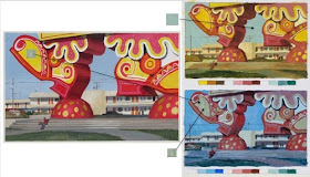
(Video Link) By comparing the three paintings below, you can see how the two smaller paintings were shifted to the warm and cool.
Note that underneath each of the two shifted paintings is a set of nine swatches. Those are the subjective primaries carried through three values each. Each of the paintings was done with those carefully limited subjective primaries, leaving aside the tube colors. Note also that two of those primaries are the same: the green-cyan, and the red-magenta.
The wild card is the yellow in the top one and the blue in the bottom one.
Now look at those three swatches connected by arrows. The color note that appears as the blue sky in the warm scene is almost exactly the same color as the color that appears yellow in the cool painting. Both are basically a neutral gray. It’s a subjective secondary belonging to each of the two gamuts.
I’ve out lifted those swatches out of the smaller paintings so that you can see how they look out of context. I’ve also lifted a swatch of the “yellow” from the cool painting and put it over the yellow shoe in the original painting.
It’s hard to believe that a neutral gray could appear either blue or yellow.
These are weird mixtures, and you wouldn’t think of using them unless you forced yourself with the gamut masking system.
This is reminiscent of the colored cube illusion we’ve seen before, where the red and cyan squares look different, but they’re both really the same gray.
This little demo will be part of an article that I wrote, which will be appearing in the upcoming fall print issue of American Artist’s Plein Air Painting magazine.
Previously on GJ:
Gamut Masking, Part 1
Gamut Masking, Part 2
Colored Cube Illusion (aka "Color Constancy")
2008 post on color masking
A free online gamut masking tool for digitally minded artists by Richard Robinson
You can order the book "Color and Light" by mail from my online store.
Thursday, September 15, 2011
Part 2: Gamut Masking Method
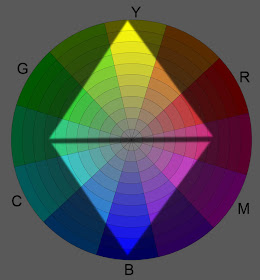
A gamut is a geometric shape (usually a triangle) superimposed or "mapped" over the color wheel. What’s inside the gamut are the colors you’ve chosen for your painting. What’s outside the gamut are the colors you want to leave out.
The gamut will contain the full range of color notes that can be mixed from a given set of starting colors. Those starting colors could be the paint pigments you choose for a limited palette. Or they might be a set of custom starting colors, called color strings, which you premix with a palette knife.
Any triangular gamut has three primaries, one in each corner of the triangle. These are called subjective primaries, because they may not correspond at all with the full-intensity colors we may think of as primary colors. Yet they are the purest and most extreme colors within the gamut you’ve selected.
Note that in the cool gamut above, the purest "yellow" is a warm gray, a mixture of the weak red-magenta and the weak green-cyan. So what looks "yellow" on the Las Vegas sign is really just that warm gray.
Premixing is the key to staying within the gamut you want. You define the range of colors, then you mix those colors and use no others. That way, you’ll get exactly the range you want.
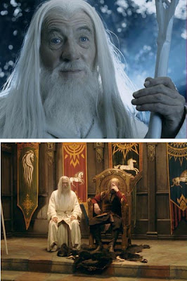
Gamut planning becomes especially important for sequential artists, such as book illustrators or comic artists, or for concept artists or game designers. It's a tremendous aid for painting color ranges like those above. Those skin tones on the top image of Gandalf are in ranges that most traditional painters aren’t used to mixing. (From The Lord of the Rings, directed by Peter Jackson, ©New Line Cinema, all rights reserved.)
This method is also a good tool for gallery painters. You can bring plein air paintings home and develop them into studio compositions with interesting moods. By placing a gamut mask over the color wheel, you can define a very specific range of color for your painting. Tomorrow I’ll show you the method in action with those two Las Vegas paintings.
-------
You can order the book "Color and Light" by mail from my online store and get it signed.
Read the full series
Gamut Masking, Part 1
Gamut Masking, Part 2
Colored Cube Illusion (aka "Color Constancy")
2008 post on color masking
Wednesday, September 14, 2011
Part 1: Gamut Masking Method
I’ve presented the paint mixing method called gamut masking before on this blog and in my book on color. But I’ve always wanted to do a demo for you so that you can see how it actually works with a specific image.
So for this three-post series, we’ll have some fun with the method. Let’s start with the final results, so you can see where we’re heading. Above is a plein air painting of the colorful Circus Circus sign in Las Vegas, painted in gouache.
It has intense local color to start with, and it’s lit by a midday sun from in front. And there’s not much hazy atmospherics. So most of the colors that I used in the painting are pretty close to the local colors I was looking at.
Suppose that later on in the studio you wanted to shift the color scheme in one direction or another, similar to the digital method called “color grading” in film. Of course in Photoshop, you could just move a few sliders around, but how would you do it in paint?
You could shift the color by using a very limited palette of tube colors. But that’s an inexact method because you’re limited to the available pigments. A better method is by premixing within a specific gamut that you select, and I'll explain more tomorrow.
Previously on GJ:
Gamut Masking, Part 1
Gamut Masking, Part 2
Colored Cube Illusion (aka "Color Constancy")
2008 post on color masking
From Mask to Palette (2008)
Color and Light: A Guide for the Realist Painter
Color Grading
Tuesday, September 13, 2011
Cows Love Music
I was hanging out once with a dairy farmer in his milking parlor in Wales. He switched on a tape machine to play some reggae for his Friesians. He said it helped get the milk flowing.
Apparently, cows love music.
(Direct link to video) This video proves that cows in France have a fondness for New Orleans jazz.
...Oh, and belugas like Mariachi music. Thanks, Dan
-------
Previously: An audio visit to the Tyddyn Perthi farm in Gwynned near Caernarfon in Wales
Apparently, cows love music.
(Direct link to video) This video proves that cows in France have a fondness for New Orleans jazz.
...Oh, and belugas like Mariachi music. Thanks, Dan
-------
Previously: An audio visit to the Tyddyn Perthi farm in Gwynned near Caernarfon in Wales
Monday, September 12, 2011
Another take on Highland Avenue
Jeanette here...It’s amazing how Jim and I can sit sketching right next to each other, using the same tools, and come up with completely different results. It’s always been this way since 1980, when we met at art school.
I used a Windsor & Newton enamel 12-pan Lightweight Sketcher’s Box, a sable filbert travel brush in a Moleskine 5" x 8" watercolor book (just like Jim used).
I finished it with a black ballpoint pen. It’s my favorite tool. Lately, it’s been a Pilot easytouch fine point, which doesn’t get goopy and leave blobs on my sketch. The detail is blown up from about the size of a postage stamp.
First steps in a watercolor
After yesterday's post, Tom Hart asked:
"When you're doing a quick painting of architecture, how likely are you to carefully draw with respect to perspective (checking horizon line, etc.) as opposed to free-wheeling it? I get the impression that for your longer plein aire sessions that include buildings you do a quite detailed drawing of the architecture. Is that right, and if so, how much by contrast do you wing it on these quicker sketches?"
So Tom, here's your answer. I do try to get the eye level, perspective, and big lines right before winging it later. If I rush ahead with color and washes before working that out, I regret it later.
The top image shows the picture partway finished, at the point of blocking in the main tones in watercolor with a brush. You can see the underdrawing just establishes the main lines, not the clapboards and smaller window details.
I added those smaller details with water-soluble colored pencils after the big tones were laid down.
Sunday, September 11, 2011
Highland Avenue
Yesterday, in honor of the Ninth Annual Worldwide Paint Out, I stopped to paint a snapshot of Kingston, New York.
I was struck by two old houses, both of the same design. One was covered over with white asphalt shingles and the other still kept its wood details, though the paint was peeling.
The houses stood side by side on Highland Avenue, one of the steepest streets in Kingston. A guy walking his Boston terrier stopped to tell us what it is like to live here.
“In the winter, when this street is covered with ice,” he said, “it doesn’t matter if you’re trying to go up or down. And it doesn’t matter if you’ve got a big four wheel drive SUV. Either way you end up at the bottom. There’s nothing you can do.”
He pointed to a spot in the weeds at my feet, where his dog was snuffling, tugging at her leash. “My truck ended up right there one time,” he said. “It slid all the way down out of control.”
Saturday, September 10, 2011
Korpus Lectures, October 6.
Thanks to Mark Frauenfelder at BoingBoing for the nice post about my little mud puddle sketch.
For those of you in the Los Angeles area, I’ll be doing two back-to-back lectures in one evening at the Korpus School of Art next month. The date is Thursday, October 6, from 7 to 10 in the evening.
The lectures are “Imaginative Realism: How to Paint What Doesn’t Exist” and “Color and Light.”(Faked photo above)
Since we’ve got three hours, you can ask any question you like, and I’ll try to answer it, and I’ll do a short demo following the lectures. There will be a book sale and signing to wrap up the evening. Please sign up now, as space is very limited.
Korpus event
Color and Light: A Guide for the Realist Painter
Imaginative Realism: How to Paint What Doesn't Exist