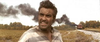
It seemed revolutionary then, but it’s standard practice now. Each shot of a live action film is routinely enhanced or drained of color. This process is called “color grading” or “digital color timing.”

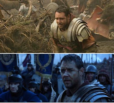
The top image shows the color palette that faced the cameras on location in southern England while filming the opening battle scene in Gladiator, also from 2000. The lower image shows how the sequence appears in the film.
Sometimes the whole scene is pushed toward a given hue to suggest the cool of the night or the heat of the desert. But you can also pick out individual elements and shift their color wherever you want.

Unique artistic effects are possible that were never possible before. In this scene from "Sin City," a portion of the scene is made black and white, and another is brought into color.

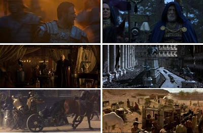
Representative frames each scene are assembled into a chart called a “color script” or a “color bible,” where the director can see the color movement of the whole film in a single glance. Each of the sequences in Gladiator is recognizable at a glance, just from the overall color scheme.
One popular technique recently has been to bring out the warmth of a face while cooling the background in the same shot. Todd Miro, a film editor, has argued that the practice has been taken too far. The skin tones are out of key with everything else, and therefore look unnatural. He argues that such orange skin tones could never exist in such strongly blue environments without golden hour lighting.
LINKS
Wikipedia on Color Grading
Last still from "Transformers Two," from The Abyss Gazes: "Teal and Orange: Hollywood Please Stop"
Book: Color Correction Handbook: Professional Techniques for Video and Cinema


15 comments:
While this can create some striking looks for certain films, the problem is now everyone is seeing it done and trying to copy it with the teal/orange contrast and now everything looks the same!
In fact heres an interesting blog post points out a number of the problems with this trend:
http://theabyssgazes.blogspot.com/2010/03/teal-and-orange-hollywood-please-stop.html
I immediately admit to being outside my area - not to mention out of my depth - in this sort of discussion. But I just perused the blog that you cited, James - Todd Miro's. I see the point in some of his examples, but not all. Mostly, I'm left wondering if Mr. Miro would say that the coloration in films is - or ever was - "right" and if so, it would be great not just to see what he considers failures, but also what he would deem a success. That being said, I must confess that I read his blog quite quickly, and could have missed positive examples. If so, I hereby apologize.
Whew, Todd Miro's article is pretty loaded with angry and bitter with little to nothing in offering a positive solution. I also think his scope is a little too narrow. He's only picking at one small part of a larger problem.
Cracked ran an article on this very topic about a year ago: http://www.cracked.com/article_18664_5-annoying-trends-that-make-every-movie-look-same.html
They not only cover the teal/orange trend, but also the grey/brown trend (That is most especially a plague in video games), the all blue and all green trends, as well as genre colour coding and the abuse extending to movie posters.
I wonder if a large part of the problem has to do with not enough staff being assigned to the colour grading. I knew one of the guys that did it for the US remake of The Grudge who was one of two guys for that whole film. I imagine I get more sleep in one night than those guys did in a month. If filmmakers are going to be doing colour grading at all I think they need to hire more people for it to solve this one or two colour problem.
I dunno what I'm talking about, but grading as a term probably comes from the pre-digital use of graded filters -- Check out a Tony or Ridley Scott film from the 80s or early 90s --The filters were used to knockdown the exposure of the sky while increasing its chroma. Once you noticed them they look pretty unreal.
I see this trend as a "growing pain" of the continuing confluence of animated and live action movies. Animated movies tend to start with a color script whereas a lot of the overly slick fx/live action movies do it as an after thought, with a kind of " fix it in post", laissez faire attitude .
wolfman, matrix, lord of the rings, and iron man 2 are among my favorite films of all time, therefore, i guess i'm a big time fan of "color grading"
maybe it is adding to the feeling of the film? maybe its over done or over used? but in these examples it works.... big time!
by the way i would say "matrix" (1999) created this phenomenon a year before "brother were art thou"(2000)came out
The Baroque was also infected by the complementary "teal and orange virus"; it seems to be overwhelmingly the most popular color scheme for ceiling frescoes.
I worked in broadcast or post houses for decades. We called it color correction. It was done by a colorist. I never heard the term color grading until recently. I wonder if it's because of digitized film rather than digitized video. Probably the filmmakers said we have to come up with a special name that sets us apart from video. : )
Colour grading and telecine chains have been around for decades but it is only more recently that they have consistantly been used to give a whole film a more unreal tinge.
Colour grading was traditionally used to make all the footage look more realistic and similar from shot to shot.
It took a while for the technology to make the leap from 35mm film to digital feature film quality, but when it did colour grading was right there with all it's tricks and effects.
I worked as a compositor on the original Matrix film and we had a little slide viewer with a slide of a previously graded image in it. You had to glance into the slide viewer, then grade your layers and elements to match that as much as possible. Not an ideal technique, nowadays you can probably just flick on screen between a saved frame and the one you are working on.
The Matrix had an overall green tinge but it was not really possible to hold the slide image in your mind with absolute accuracy so you did the best you could.
No doubt the whole film was given a final grade that made it all look seamless. This is important these days as each shot might be coming from a completely different post-house from anywhere in the world.
Colour grading can go too far but I think it looks even worse to not have any, which you sometimes see on cheap television commercials and tv shows, each shot jars with the lighting and tonal range of the next. It breaks the spell for the viewer of experiencing something real.
Although Miro sites the Coen Brothers as the starting point, he doesn't really criticize the direction they took. In fact it could be argued that the Coen's made the light more natural and consistent by warming the background to match the light used on the actors. Also, I think that Ridley Scott used the grading in a consistent manner keying the whole scene in blue rather than just the background. It seems Miro's pet peeve is directors suspending reality for the sake of highlighting the actors in an unnatural way. I tend to agree with him.
This conversation is interesting. I wonder if the tone would be similar or different if we were discussing a trend in the dominant colors of two-dimensional art.
Art is all about choices. I guess in the end I respect the director's choice, and make my decision about whether I like the film or not based on how ALL his/her choices combine to affect me, positively or negatively.
Just a funny little thing to think about, but theatre and stage have been using this type of color grading since electric lighting was introduced. Certain scenes need a special "fell," so out come the color gels (if your unfamiliar, their square color transparencies that sit infront of the lights changing the color).
As Robin Cave pointed out, the original purpose of color timing (the original name is because it was first done by manipulating the time of exposure during film processing) was to get the various bits of the film looking the same, and to partly manipulate mood (e.g. shooting day-for-night).
The first point was the original reason, and it's not often appreciated. From the first experiments with colour, it was observed that different batches of the same type of film had different colour response. That's not even taking into account variations in atmospheric conditions, time of day, filters added to the camera and so on.
Worth mentioning is that the application most likely used for manipulating the colours of the films mentioned in the post, is the free of cost and open source application CinePaint (then FilmGIMP, it is a GIMP clone). There are starting to come commercial alternatives to CinePaint, but around the time those films were made, it was the only player in town, unless the studio created their own software from scratch (and since early filmGIMP was (is?) more or less a framework, they still had to employ someone with basic programming skills).
Thanks for sharing this post with us.Filmydost
Post a Comment