Friday, January 31, 2014

J. Gurney's Daguerreotype Gallery

That would be Jeremiah Gurney, hailed as "the finest daguerreotypist in Gotham." He opened the first American photo gallery in 1840. His establishment at 349 Broadway in New York "consisted of nine spacious rooms, devoted exclusively to this art."


Thursday, January 30, 2014

My Eighth Grade Portrait Disaster

My eighth grade art teacher, Mr. Kinear, asked me to come up to the front of the classroom. He turned me to face the class and put the question to me in his big public voice: 

"Jim, would you be willing paint a picture up here in front of the whole class?" 
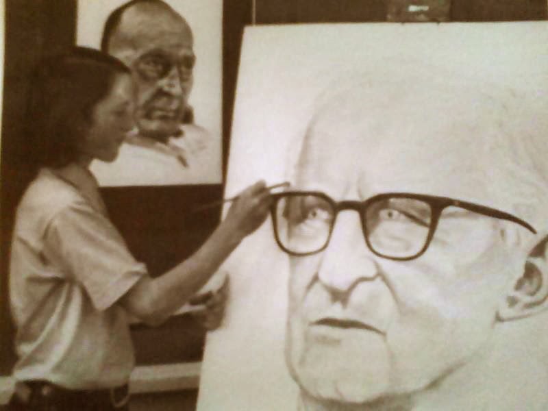

"Um. Sure," I said. My reflex was to say yes first and dig myself out later.

"Here, you can use my easel."

He dragged his easel, squeaking horribly, across the linoleum floor. He started twirling the cranks and the top went up like a guillotine. Everyone set down their pencils and stopped working on their contour drawings.

I was the entertainment.

Suddenly I wanted to rejoin my peers, blend in, and become invisible again.

There was another problem. I had no idea how to paint a portrait in oil. I had never painted anything in oil. No one in my family painted, at least not since I was born. I had seen a few tubes of my mom's old paint box, but I couldn't even get the caps off. I didn't know how to mix colors or thin the paint or how to use the brushes. I never saw anyone do an oil painting. Middle schoolers didn't paint in oil. We used charcoal or ink or poster paint.

"Don't worry, I'll get you set up," Mr. Kinear said, sensing my rising panic. He took out his personal tubes of paint and uncapped each one with a grand flourish.

"Viridian...Alizarin...Burnt Sienna," he said. I was hearing some of these names for the first time. I didn't dare admit my ignorance to him. He had chosen me as the star student. This was my chance to shine and to impress the girls, because I was way too shy to talk to them.

What was I supposed to paint? Mr. Kinear handed me a photo of a retired principal. He was a rather hard-faced old bird, not exactly a favorite with the students, and certainly not with me. I had been called into his office a couple of times on minor infractions, and he seemed to me rather short on humor or sympathy.

I brushed my long locks of hair back over my ears and tried to focus. I had been to an art museum a few times and had seen a Rembrandt. I had seen Norman Rockwell's book on illustration. Those guys used oil, didn't they? If they could do it, why couldn't I?
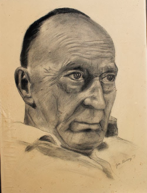

I had drawn some faces before. Above is a charcoal portrait that I did at home to show Mr. Kinear. My idea of a portrait was to make the face really big so that it filled most of the frame. I knew I could draw fairly accurately.

I started by drawing the face with a pencil. Then, as the class watched my every move, I squeezed out the paints and started mixing and dabbing on color. How do you mix a flesh tone? It wasn't pink exactly. I tried mixing burnt sienna with white: white to make it lighter and black to make it darker. The principal was taking on a ghoulish pallor.

I had a lot of trouble with his eyes. Everything I did made him look more and more like a turkey vulture, glaring back at me in a hungry sort of way, like he wanted to pick the flesh off the bones of my carcass.

After a couple of weeks of effort, I finished. I was surprised when Mr. Kinear declared the final painting a success. Newspaper reporters came and took photos. It was decided to hang the finished portrait in the cafeteria, high up on the wall, where the principal could cast his gaze down over everyone eating their lunches. I was proud, but also embarrassed when I stood there in front of everybody for the unveiling. I was a hero. The girls liked me, and it was all because of my art.

The next day, my pride came crashing to the ground when I came into the cafeteria, and saw that my portrait had been the target of a food fusillade. Big hunks of bologna stuck with mayonnaise to his cheek. Strings of spaghetti festooned his forehead.

I never really knew if they messed up the portrait because it was a poor painting, or because he was a poor principal, or just to pay me back for being the head student. Probably a little of all three. It was my first taste of public opinion, and I learned a very important lesson: The nail that sticks up above the rest will get hammered down first.


Wednesday, January 29, 2014

Chromatic Snow Sparkles


Looking at this photo that I just took, you might assume that it's a view of the stars and planets in the night sky, but it's not that at all.

It's a view looking down at the snow outside our breakfast window. The colored lights are sparkles of sunlight reflected and refracted internally inside snow crystals. Like a prism or a rainbow, the hexagonal crystals break the light into component wavelengths, giving the observer a variety of colors sampled from the rainbow: red, magenta, yellow, cyan, blue, and violet.

I took the photo with a digital SLR underexposed enough for the colored sparkles to register.

The conditions today are perfect for chromatic snow sparkles. It snowed three days ago, and has stayed below freezing since then, allowing the crystals to grow larger. This morning the temperature was five degrees Fahrenheit. 

It appeared to me that the colored sparkles are most pronounced about 45 degrees away from the sun. In the photo above, that band passes through the right central part of the picture, with the sun coming from the left. 

If you look at the sparkles on an angle farther away from the sun—or closer to the sun, the chromatic effect is much less noticeable.

Related previous post: Annular Highlights
Related topic: Sun dogs (rainbow effects on ice crystals in the sky near the sun)

Tuesday, January 28, 2014

So Long, Pete Seeger

Yesterday, folk singer Pete Seeger died at age 94. I heard him perform several times at music festivals in the Hudson Valley of New York state, where he lived. 


That's him in the middle of the group of three faces at the bottom of this sketchbook page. Whenever Pete got up on stage, he always got the audiences caught up in the choruses.


Another way we got to know Pete Seeger was through our tattered copy of his songbook, a collection of classics like "Clementine" and "If I Had a Hammer" that we often sang together at home in the evenings. In 1991, When my son Dan was a four-year-old budding accordion player, he wrote Pete a fan letter, and Pete wrote back on a postcard drawn by Ed Sorel showing Pete with his banjo trying to outrun the Horsemen of Time.

At his concerts, Pete made every person feel that they had a good enough voice and that it was worth joining in. And he made everyone believe that the dream of a peaceful world is possible, not just by dreaming about it, but by singing about it it or painting a picture of it.

More about Pete Seeger at Wikipedia
More about my son Dan at his band website YanksBand.com or his music streaming company ConcertWindow

Monday, January 27, 2014

The Value of Copying

Photo by Dominique Faget/AFP/Getty
In the Daily Beast, Malcolm Jones makes the case for the value of copying the work of earlier masters as a way of improving one's artwork.

"More than fun, it was an education. If you assiduously try to copy something, you can’t help learn about what you’re replicating. I understood more about Vermeer by painting my own Vermeer—about his use of light and sense of color and proportion—than I had ever learned by simply staring at his paintings." 
"Then it hit me (yes, I’m a slow learner): this was how I’d learned to draw in the first place. When I was little kid, I didn’t learn much from all those teachers urging me to express myself—frankly, I don’t think I, or most people for that matter, have much to express, certainly not when they’re six."

Thanks, Patrick O'Hearn

Sunday, January 26, 2014

Music video with digital transformation of singer

BOGGIE - NOUVEAU PARFUM (official music video) from THE SOUP on Vimeo.
In this music video, Hungarian singer Boggie's face is given a digital makeover throughout the course of the song. Blemishes are removed, the neck is elongated, hair swapped around, and the colors are graded to make an increasingly glamorous—and increasingly artificial—appearance. (Link to video on Vimeo)

The result is a clever reminder that every photo and video we see may be far removed from the initial capture.

In fact, the video itself is not quite what it appears. Of course, the makeover doesn't happen in real time. The digital control interface surrounding the singer is invented. Really, it's done in Adobe AfterEffects. Also, the singer was shot with two or more initial live action plates with different practical makeup effects.

Thanks, Marney Morris!

Saturday, January 25, 2014

Art Teacher Portrait Winners

We received several dozen entries for the "Sketch Your Art Teacher" contest, and it was really difficult to narrow them down to the winners. I'm very excited to present you the ones I chose as the best of the best.

First, here are the five finalists:


Sean Cheatham, drawn by David Patel at Art Center in Pasadena, CA.
David captured Sean's way of holding his painting brush and his off-hand brushes, plus the tattoo on his left arm, and I love the slight exaggeration of the shapes. The nervous pen line has a lot of energy.


Pratibha Singh, drawn by Annada N Menon  at the College of Fine Arts in Bangalore, India.
This is a very sympathetic portrait which makes every mark count. Very nice feeling to the eyes and the expression.


Andrew Peno of Peno School of Arts in Adelaide, South Australia by Nic Arrighi.
Fine job capturing a personality, with wonderful shapes, and a bold brush-and-ink line that really reflects the strength of the character.
Dwight Harmon by Thomas Webb, Art Center.
Wonderful expression, and it's great to see the tools. This shows how much character you can get by departing from naturalism. 

The quote says "Barron Storey wants art to come out of your body." That sounds like Barron. And the posture looks like him, too. 

And now, the Grand Prize Winner:
Kaspar Schäper by Daniel Napp, Münster UAS-Illustration.
This portrait is efficiently painted, and yet it conveys the poise and concentration of the subject. This could only have been done with a big brush, well loaded with paint, straight ahead with no lay-in. I love the way the wet shapes of the arm and the neck merge into the blue of the shirt, and I love the bits of white paper left untouched. Masterful job!

So thanks to everyone who entered. It was really tough to choose. And to the winners, please email me your mailing address, and I'll get the posters and the DVD on their way to you.

Friday, January 24, 2014

Non-Photographic Rendering


Pixar's technical development team recently unveiled a new set of tools to offer CG animation the potential of a more painterly look. The idea is to give art directors more stylistic options, so that they're not always stuck with the hard plastic look that tends to come by default in CG animation software.

The new process begins by having a stylist hand-paint a few keyframes. The tools then extend the style of those keyframes throughout the whole sequence, keeping the strokes and textures stable. One of the options is to extract outlines and give the output a hand-drawn look.


The initial demo that they showed gives the feeling that the painterly style is just stuck on the surface of smooth digital animation, and it's been criticized for that reason. But this is just an early test, and the full promise of the tools haven't been seen yet.

In order to make the style seem more organic, it might help to introduce some randomness into the timing and the arcs of the animation, or perhaps even to use a completely different technique for rigging and animation, perhaps with a waldo armature, like the DID (Digital Input Device) developed by Phil Tippett. 

I believe one thing we'll see in coming years are all sorts of unexpected combinations between handmade and digital techniques, such as the 3-D printing-enabled stop-motion of Laika's recent Paranorman.

From Cartoon Brew

Thursday, January 23, 2014

Dinotopia on King of the Nerds

If you have TV with cable, check out the "King of the Nerds" show tonight at 10/ 9 central. It's a reality show about brainy kids beating each other out to be the top expert on fantasy pop culture. This will be the first episode of the new season.


A while ago, the producers wrote and asked me to send them some Dinotopia prints to put up in the game's headquarters, which is called Nerdvana. Dinotopia will be part of the décor, keeping company with Harry Potter, Lord of the Rings, and Star Wars. Nerd Heaven!

King of the Nerds

Wednesday, January 22, 2014

Animated paintings

Rino Stefano Tagliafierro created this video by taking old master paintings, separating elements into layers, and applying gentle movements with a digital animation program. 

Together with the music and audio FX track, the animations take on a strange, dreamy, and at times disturbing feeling. (Link to YouTube video)

It's amazing how compelling any movement is—it kind of overrides everything else about the picture, and gives a sense of the painting as a possible moment of a larger continuity. In places, the visuals are sensual and gruesome, but so are the old master paintings they're based on.
Thanks, Mel and Eric

Tuesday, January 21, 2014

Storytelling tips

Illustration by Tom Lovell, 1941
If you're interested in telling stories, you'll love these lists of tips:

The first list comes from storyteller Joel Ben Izzy, a contributor to the podcast Snap Judgment. Like Moth Radio, This American Life, and StoryCorps, Snap Judgment is one of the best sources for stories told out loud.

1) Have a clear conflict
In its most basic form, a story is about someone who wants something, and either gets it or does not. That character's desire brings out the conflict that moves a story forward. The appearance of the conflict is the beginning, the resolution is its ending.
2) Keep it simple
You can always elaborate by adding details and nuance to a simple story. It is much harder - and less satisfying - to simplify a complicated story. To make a long story short is to ruin it. Find the simplest version of your tale and build on that.
3) Take your time when you tell the story 
Beginning storytellers often worry about their audiences getting bored and sometimes try to avoid this by speeding up their telling. Unfortunately, this has just the opposite of the desired effect. Take your time in telling the story, let it breathe, and your audience will appreciate it.
4) Remember the sensory details in your story…
Your words are making a world real, and to do so you need to bring in all elements of that world - sounds, sights, smells, tastes and feelings. These are what root your listener in the world of the story you are telling.
5) …but don't get lost in extraneous details
…because extraneous details can make a story boring. The problematic details tend to be expository, giving information that is unnecessary at the time. Give your listeners information on a “need to know” basis, providing just enough to understand what happens next.
6) Every story is a mystery
A well told story is one where you can stop at any point and have the reader wonder “….and then what happened?” Each time a piece of the mystery is solved, another one appears, and that's what keeps us listening until we reach the ending. If you find yourself lecturing, step back and find the mystery.
7) Know the ending of your story
Know your ending line. And after you say it, stop.
-----
More about storyteller Joel Ben Izzy at his website. 
The second group is from Pixar's story artist Emma Coates. I made a few slight edits for clarity.
-----
PIXAR STORY RULES
#1: You admire a character more for trying than for succeeding.

#2: You gotta keep in mind what's interesting to you as an audience, not what's fun to do as a writer. They can be very different.

#3: Trying for theme is important, but you won't see what the story is actually about until you're at the end of it. Now rewrite.

#4: Once upon a time there was ___. Every day, ___. One day ___. Because of that, ___. Until finally ___. OR: Establish norm. Upset norm. Complicate & Escalate. Climax. Resolution.

#5: Simplify. Focus. Combine characters. Hop over detours. You'll feel like you're losing valuable stuff but it sets you free.

#6: What is your character good at, comfortable with? Throw the polar opposite at them. Challenge them. How do they deal?

#7: Come up with your ending before you figure out your middle. Seriously. Endings are hard, get yours working up front.

#8: Finish your story, let go even if it's not perfect. In an ideal world you have both, but move on. Do better next time.

#9: When you're stuck, make a list of what WOULDN'T happen next. Lots of times the material to get you unstuck will show up.

#10: Pull apart the stories you like. What you like in them is a part of you; you've got to recognize it before you can use it.

#11: Putting it on paper lets you start fixing it. If it stays in your head, a perfect idea, you'll never share it with anyone.

#12: Discount the first thing that comes to mind. And the 2nd, 3rd, 4th, 5th – get the obvious out of the way. Surprise yourself.

#13: Give your characters opinions. Passive/malleable might seem likable to you as you write, but it's poison to the audience.

#14: Why must you tell THIS story? What's the belief burning within you that your story feeds off of? That's the heart of it.

#15: If you were your character, in this situation, how would you feel? Honesty lends credibility to unbelievable situations.

#16: What are the stakes? Give us reason to root for the character. What happens if they don't succeed? Stack the odds against.

#17: No work is ever wasted. If it's not working, let go and move on - it'll come back around to be useful later.

#18: You have to know yourself: the difference between doing your best & fussing. Story is testing, not refining.

#19: Coincidences to get characters into trouble are great; coincidences to get them out of it are cheating.

#20: Exercise: take the building blocks of a movie you dislike. How do you rearrange them into what you DO like?

#21: You gotta identify with your situation/characters, can't just write ‘cool'. What would make YOU act that way?

#22: What's the essence of your story? Most economical telling of it? If you know that, you can build out from there.
-----
Via Pixar Touch. Also, check out the book: The Pixar Touch

Monday, January 20, 2014

Flying on the Back of a Giant


Here's a picture of a kid riding through the sky on a giant troll by Swedish artist Gustaf Tenggren.


The detail shows the loving exaggeration of the nose, the droopy lip, and the tendrils on the ear. I love the worried expression of the rider.

Speaking of young person riding a giant magical humanoid through the sky, I'm reminded of one of my favorite pictures, painted in watercolor by José Segrelles (1885-1969). It shows a young man flying on the back of a genie. You can't see either of their faces, only the paired hands and feet of the giant, who swims through the golden vapors, his hair and the hem of his garment blown forward by a spice-scented tailwind.

There's not enough published about Segrelles on the web, so please share this one with people who you think might like it. There's only one good book on Segrelles that I know of, Jose Segrelles Albert: Su vida y su obra (Spanish Edition), rather expensive, but well worth it, especially if you can read the Spanish.
More about Tenggren at the Gustaf Tenggren blog
Thanks, Bertil Saukkoriipi


Sunday, January 19, 2014

Small Figures

About 35 years ago, when I was in art school, my buddies and I would take turns posing for each other in one minute costumed poses. 


In the series at the upper left I tried to capture the basic gesture of the folds of the costume using pencil and white gouache. At upper right is more of a tubular form emphasis, using just light and shadow and no outline.

In the middle row, I used a brush and ink to try to capture the black silhouette. In the bottom row, we moved the light around to the back and I tried drawing edge-lit silhouettes, where the light side becomes the paper color.

Drawing directly with the brush, I first drew the side away from the light before sorting out the complex lit side. This way of sketching gives a very photographic effect.

Saturday, January 18, 2014

Sargent watercolor techniques: Five observations


This is the last weekend for the Sargent Watercolor exhibition at the Museum of Fine Arts in Boston.


The show combines the best watercolors of the collections of the MFA and the Brooklyn museum, along with a few oils.  


We saw the show a couple of months ago, but beforehand, we visited behind the scenes with conservator Annette Manick (second from right. That's Richard Scarpa at the far left, Garin Baker, and Jeanette).

Annette Manick showed us swatches made with the actual pigments recovered from paint tubes in Sargent's paint kit. She also made a number of test swatches to experiment with some of the unusual techniques that Sargent was known to use with his watercolors, such as wax, gouache, gum arabic and oxgall.

In the back of the show catalog, Manick goes into great detail about these painting methods. I think this represents an exciting new trend in art history scholarship. Conservators, working closely with art historians and practicing artists, are trying to reconstruct the practical methods of artists from the past.

Here are five quick observations that struck me again and again as I visited the show.


1. Unlike many of the British watercolorists who believed in using purely transparent pigments, Sargent used gouache whenever he needed it. This passage of a white dress has opaque white in the bright lights and in the open shadows. He often lays down a spot of white gouache and then, after it dries, he goes over the spot of paint with transparent colors to keep the gouache stroke from jumping out of the paint surface.


2. He used wax as a resist to give a scintillating effect. Here he first laid down a yellow green base color, then stroked it with wax, which resisted the brownish later layers.


3. In the dark passages, Sargent stays away from black, and generally mixes bright blues with browns at the same value. You can see it dramatically in the lower central area of this detail.

4. Sargent was incredibly daring, taking huge risks with big brushes at every step of the painting. It's not just pure boldness and freedom, though, because he's also deliberate and considered, too. I can just picture him thinking, waiting, or planning, and then diving in with an apparently reckless move, cursing under his breath all the while.

5. He defines only what he wants to define, and leaves a lot quickly stated. There are no individual hairs defined in the beard, nor are the lips defined with a strong line between them. The result of this simplicity is that the eyes, with their sparkling highlights, really grab the viewer. This informal portrait is called "The Hermit" "A Tramp." It was really painted from a fellow artist who posed for him.

The exhibition will continue through January 20
Thanks to Marc Holmes and Greg Shea for the closeup photos. Marc has a great blog post with more Sargent watercolor insights. 
Catalog of the show 

Friday, January 17, 2014

Sylvia doll prototype


This one-of-a-kind doll prototype was made in 1997 by the Hasbro toy designers for a proposed Dinotopia toy. 

She is the red-haired character Sylvia in ceremonial costume, with a coronet of flowers and a tiny handmade vest that fastens in the back with Velcro. Her dress is a crinkle cotton gauze made to look like pleated linen, with gold trim. We liked the way she is dressed in a timeless and modest way, and her face has a sweet smile.

This is not a reconfigured Barbie doll; it's completely unique and original, custom made for Dinotopia.

Although the Dinotopia toy line never went into production due to reversals in the movie project at Columbia, Hasbro's toymakers made a beautiful group of proposals, and their marketing people were excited about the prospect of that rare thing: a toy line designed for both boys and girls.
------
Sylvia appeared first in Dinotopia: A Land Apart from Time in 1992.
Thanks, Michael Stone and Robert Gould.

Thursday, January 16, 2014

Dr. Seuss documentary


Here's a documentary on Theodor Seuss Geisel, aka Dr. Seuss, author of zany classics like "Cat in the Hat." (link to video) The quality isn't great on the video transfer, but it's an interesting view of what inspired him and how he approached writing and illustrating children's books.


...and if Dr. Seuss isn't your cup of tea, you might enjoy this 1987 BBC profile of Robert Crumb, made seven years before the more famous Terry Zwigoff documentary.


At 52 minutes in, don't miss the video of Crumb trying to do a plein air painting on a freeway onramp.

Wednesday, January 15, 2014

Article on painting blacksmiths

Check out the new issue of International Artist magazine, hitting the newsstands about now.

Garin Baker and I wrote about how we painted together inside a blacksmith shop at Old Sturbridge Village. Each of us discusses our inspiration, design strategy, materials, challenges, and working process.

The same issue (#95, Feb/March 2014) has features on Jeremy Lipking, Logan Maxwell HagegeEllen Eagle, and Aaron Westerberg, plus a chat with the faculty of the 2014 Art of the Portrait convention, which I'll be attending again this year in Washington.

International Artist was voted the #1 magazine by GurneyJourney readers.
Previously on GJ: Painting in a Blacksmith Shop

Tuesday, January 14, 2014

You must begin!


Frank Netter, the dean of medical illustration, offers universally useful advice in this archival video:

"There's nothing quite as frightening as a blank piece of paper in front of you, and you know you've got to put a picture on it. And you can sit there and look at it all day long and puzzle 'How should I begin? Where should I begin? What shall I do about this? And you'll never get a picture done. You must begin! You must make some strokes. You may throw it away later. But you must begin to paint!"

Frank Netter's book: The Netter Collection of Medical Illustrations: The Endocrine System: Volume 2, 2e (Netter Green Book Collection)

Thanks, RobNonStop

Monday, January 13, 2014

Christine Lavin

I sketched Songwriter Christine Lavin from my computer screen while she and Julie Gold performed a record-breaking live webcast on Concert Window just a few minutes ago.


Successive Contrast

Stare at the muli-colored circle below for about twenty seconds, and then look at the center of the white circle at left. Complementary afterimages should begin to bloom on the white circle. The blue sector at the bottom becomes yellow. Green changes to magenta, and cyan changes to red.

Repeat the same experiment, staring first at the center of the multicolored circle for twenty seconds. This time shift your gaze to the cyan circle at right. Perhaps you will notice that the afterimages now change your perception of each of the cyan sectors. Which sector appears the most intense version of cyan? 

Most people report that the strongest cyan appears where the red sector had been. This is called successive contrast. When you look at an object of a certain color, your eyes adjust or adapt to that color. The resulting afterimage affects what you look at next. 

This is why providing strategic areas of complementary colors helps enliven a color scheme. In this painting by Thomas Moran, for example, the strong chromatic effect of the orange cliffs is heightened by the proximity of complementary colors at close values. 
----

Sunday, January 12, 2014

Before you can see the light....

Colored pencil, watercolor, and gouache.

Dutch masters paintings deconstructed

Michael Mapes recreates 17th century Dutch master paintings by assembling hundreds of small objects pinned to a board in a kind of holographic exploded view.

Some of the objects are photographic prints of the entire painting, which are attached to the backboard with insect pins, or set inside test tubes, bags, or gelatin capsules. The effect is a faux scientific presentation that deconstructs the big image into a mosaic of parts, while those parts are also entire in themselves.Via BoingBoing

Saturday, January 11, 2014

Henry Patrick Raleigh, Illustrator


Henry Patrick Raleigh (1880-1944) was an American illustrator whose drawings of society life defined the Gatsby era.


He began as a newspaper sketch artist on the west coast back in the era when artists were needed to quickly record news events. Some of his early illustrations resemble those of F.R. Gruger, another illustrator who started as a newspaper man.


As a result of that experience, he was extremely prolific, creating about 20,000 illustrations in his career, at a rate of about 800 per year, almost three drawings per day. He had an excellent visual memory and worked almost entirely without models or photo reference.


Even in those days, a single illustration could pay as much a s $3500, so he was immensely wealthy, traveled a lot, and lived like a celebrity.


As color printing entered the magazines, and drawings were replaced by paintings, he tried to introduce washes of color into his own work, but he never liked painted illustrations. He wrote:

"Illustration is distinct from painting, and I vigorously oppose the encroachment of the latter on my chosen field. Line drawing is the one appropriate fundamental medium for illustration, as it most nearly harmonizes with the linear effect of the printed page. Painting, in its purest form, is primarily emotional, whereas illustration is necessarily more rational, more expository. Each has its legitimate sphere of influence, and should be restricted to that sphere."

By the 1940s, his work had fallen out of step with art directors at the major magazines like the Saturday Evening Post. The glamorous life evaporated. In failing health, without having saved money for his retirement, and without steady work, he took his own life.


The new issue of Illustration magazine has a comprehensive article on Raleigh written by his grandson, who has built a big collection and created The Henry Raleigh Archive.

Images in this post from Illustration Art and Jim Lambert's Pinterest
You can preview or purchase the Raleigh article at the Illustration magazine website
The Henry Raleigh Archive
Maybe someone reading this post can start a Wikipedia page for Henry Patrick Raleigh and Frederick Gruger.