


Today we'll take a look at Chapter 5: "Tone Values" from Harold Speed's 1924 art instruction book Oil Painting Techniques and Materials
I'll present Speed's main points in boldface type either verbatim or paraphrased, followed by comments of my own. If you want to add a comment, please use the numbered points to refer to the relevant section of the chapter.
1. Beauty in tone values comes from tones that are large and simple.
Speed points out that this isn't the only kind of pictorial beauty, but it's an important one. What he means by large and simple tones is big, unbroken shape of tone. We've talked about this principle in terms of "Shape Welding."
It also has do do with the modeling of form, where the light areas are grouped into close values to give a sense of a flat poster-like appearance, even if there is subtle glazing and variation, as in the Velazsquez below.
 |
| Portrait of Cardinal Camillo Astali Pamphili - Diego Velazquez |
2. "The thick atmosphere of our towns simplifies the tones, and is responsible for much of the beauty our artists find in such unexpected places of manufacture."
A nice side benefit of smog from coal in London 100 years ago, where the air was so polluted you couldn't see to the end of the block.
3. Tone beauty not important to the Pre-Raphaelite Brotherhood (PRB).
Speed isn't knocking them exactly, but just saying they were after other pictorial goals. Ruskin, a friend and champion of the PRB and other super-naturalist painters, was a great fan of microscopic detail, and also an advocate of gradation, rather than the flat-tone approach of Whistler, Brangwyn, and the Newlyn School. Speed makes a few exceptions among PRB painters, such as the Blind Girl by Millais, which is reproduced in my book Color and Light.
Speed isn't knocking them exactly, but just saying they were after other pictorial goals. Ruskin, a friend and champion of the PRB and other super-naturalist painters, was a great fan of microscopic detail, and also an advocate of gradation, rather than the flat-tone approach of Whistler, Brangwyn, and the Newlyn School. Speed makes a few exceptions among PRB painters, such as the Blind Girl by Millais, which is reproduced in my book Color and Light.
4. Velazquez was the great master of tone values.
Carolus-Duran, Sargent's teacher, was also a huge fan of Velazquez, and much of Sargent's love of the big tone approach came from him. Pyle of course in this country was a big tone fan, and I've talked about that on this blog quite a bit.
Carolus-Duran, Sargent's teacher, was also a huge fan of Velazquez, and much of Sargent's love of the big tone approach came from him. Pyle of course in this country was a big tone fan, and I've talked about that on this blog quite a bit.

5. Head of Aesopus (Aesop, i.e. of Fable fame) probably painted with warm and cold black, burnt sienna and white.
Here's the image Speed is referring to. Has anyone tried this? By the way, I love using a warm black and a cool black in watercolor, too. A cool black might be Payne's Gray, and a warm black might be Sepia, for example.
6. Vermeer's technique
I don't have time to recapitulate Speed's points here, but maybe some of you who have experimented with the methods Speed is talking about would care to comment.

7. "Strongly contrasted schemes of tone had been in use since the days of Leonardo da Vinci, but used chiefly to augment the expression of form; whereas Rembrandt used it as an expressive thing in itself, giving it aesthetic value."
"The Philosopher" by Rembrandt, above, may be different from the one Speed showed in the book, but it makes the same point. Intriguing big tones. EDIT: The one Speed referred to is below (thanks, Steven).

8. "What is often called muddy colour is generally the result of bad tone relationships."
A very important point that has come up before and will come up again here.
Here's the image Speed is referring to. Has anyone tried this? By the way, I love using a warm black and a cool black in watercolor, too. A cool black might be Payne's Gray, and a warm black might be Sepia, for example.
 |
| Vermeer, Lady at the Virginal |
I don't have time to recapitulate Speed's points here, but maybe some of you who have experimented with the methods Speed is talking about would care to comment.

7. "Strongly contrasted schemes of tone had been in use since the days of Leonardo da Vinci, but used chiefly to augment the expression of form; whereas Rembrandt used it as an expressive thing in itself, giving it aesthetic value."
"The Philosopher" by Rembrandt, above, may be different from the one Speed showed in the book, but it makes the same point. Intriguing big tones. EDIT: The one Speed referred to is below (thanks, Steven).
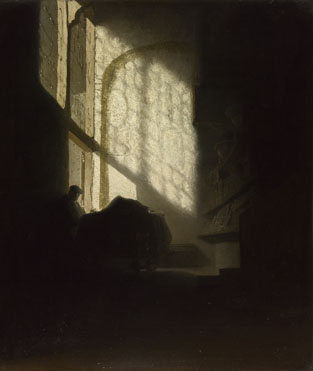
A Man seated reading at a Table in a Lofty Room
about 1628-30, Follower of Rembrandt
8. "What is often called muddy colour is generally the result of bad tone relationships."
A very important point that has come up before and will come up again here.
 Next week—Chapter 6: Elementary Tone Exercises
-----
In its original edition, the book is called "The Science and Practice of Oil Painting ." Unfortunately it's not available in a free edition, but there's an inexpensive print edition that Dover publishes under a different title "Oil Painting Techniques and Materials
 ," and there's also a Kindle edition.
12 comments:
This is a lesson today's fantasy illustrators and concept designers could use, whose works are often messes of competing tones, details, light sources,and colors. The best in these fields that ever were, artists like Frazetta and Syd Mead, frequently organized tone in the manner Speed describes.
Simplicity makes for (seeming) complexity.
Sorry to sidetrack the discussion. I just bought Fantasy in the Wild (download). Can anyone help me understand the advantage of watching it as a download versus streaming it from the Gumroad site "on demand", once purchased? I can't see an advantage in downloading (taking up the 1G) except for the issue of data usage if you're not connected to wifi. (Maybe I just answered my own question.) Will it be available to stream from Gumroad "indefinitely".
In any case, I'm really looking forward to watching it this weekend.
Tom, not sidetracking at all. I'd be interested in peoples' answers, too. I may have only set it up for downloading, I'm not sure. (I'm still kind of a DVD guy). To be honest, I'm not even sure if streaming and renting are the same thing. What form is best for everyone, and should I offer a rental, too, and if so, for what price?
Hi James - Not to tell you what you may already know, but when you purchase from Gumroad you essentially purchase a download, but you are given the option to either "watch now" (which I equate to streaming - correctly or incorrectly - as you would from Netflix, for example). You are also given the option to "download" which (if I'm explaining this correctly) downloads a file to your computer, and therefore takes up some of your available computer memory - 1G, in this case, according to Gumroad. I'm not knowledgable enough to say if that's much "space" or not these days. Again, the only advantage to downloading the file, versus "watch now" - that I can see - is that you could then watch it anywhere, without an internet connection and therefore a data usage issue.
I'm sure others can elaborate - or correct me as needed.
Tagging on to my last comment: the "download" or "watch now" options both seem to remain available indefinitely, after purchase. At least that's what I have found with the "How I Paint Dinosaurs" purchase.
Relating to the question about streaming vs. download: The advantage of download to streaming is both a connection issue (a slow or bad connection can mean a jumpy playback or one filled with lots of annoying pauses and freezes), and a psychological one (if you download something you feel like it's yours - possession is nine tenths the law kind of thing). Also, once you've downloaded it you can watch it anywhere, any time regardless of connection, which comes in handy in places like in-flight where WiFi isn't available or expensive if date-based.
James - as far as a rental goes, I think a rental can be a good thing if you're either not sure you want to buy something (I wish I hadn't bought some of the movies I thought I was going to like, even when they weren't expensive - they just take up space and you feel somehow cheated), or can't afford it. Tutorials can be tricky since you don't always know if you're going to really learn something new or it's worth the price. A well-edited 'preview' can allay fears about that, but a rental - to Tom's point - can also mean you don't have to download it (which I suppose means streaming only), but a great option if you don't feel like you need to own or have possession of something. Also, being able to apply the rental charge towards purchase would be an attractive benefit to renting for those on the fence. The only thing I can say about price is that a less-expensive rental is easier to swallow than a higher purchase price. Netflix and Redbox kind of turned the movie-rental industry on its head, but they've been successful because it's made rentals easy and affordable to everyone. And if you really like what you rented, then buying it's a no-brainer.
As to Chapter V and Speed, I'm afraid I'm a chapter behind, but one thing relating to tone that jumped out at me in Ch. IV: '...in painting, form is expressed by masses, not lines. The student who tries to paint by filling in the spaces between outlines will never develop any freedom of execution or much quality of painting.' As a small child I loved coloring books, but I swear my intense desire to stay within those lines when I was young - and I was really good at it! - has made my ability to paint something with energy and a beautiful flow incredibly challenging as an adult. Coincidentally, my painting classes have really helped my drawing sessions.
As always, thanks for the insights. Interested to read Chapter V with those in mind :)
On the rental question: Your Gumroad price is so reasonable, and Gumroad seems to allow the "download" or "watch now" options indefinitely. (Others may correct me on the latter, but I just tried to "watch now" How I Paint Dinosaurs" again, and it worked.) Considering that, and with Seadit's point about well-produced previews - which yours are - I wouldn't think that the rental option would be necessary. Another factor would be whether Gumroad even offers that as an option, or if you could find another vendor who does.
Enjoyed this chapter more than previous ones. I'm liking that he's starting to zero in with specifics and used a lot of examples. I can say I felt I got most every point without a lot of speculation or interpretation about what he really meant!
He spends some effort discussing the differences between Vermeer's and Terburg's handling of tone. Concluding that Terburg's work "...is marred by his having carried his work to a higher degree of realisation;" It's impossible to see in the black and white reproduction in the book and even looking at the online photos of the two examples I can't see his point. I've always considered Vermeer's paintings full of detail, very realistic. But perhaps Mr. Speed's advantage of seeing the two works in person and almost side-by-side made it more obvious. Anyway, he had made his point earlier on by example of the Pre-Raphaelites "excessive detail" at the expense of "tone value."
James ... The painting Speed thought was by Rembrandt, can be found in the National Gallery, London; go to www.NationalGallery.org.uk, find Rembrandt, and once there scroll down towards the bottom of the page where you will find it listed as:
A Man seated reading at a Table in a Lofty Room
about 1628-30, Follower of Rembrandt
I remember being drawn to that lighted trapezoid amidst the darkness during my early years in London, when I believe it was still thought to be a Rembrandt. I still enjoy seeing it, when I'm in town, even though it is by a follower. Speeds comments on the handling of the edges, in this painting, will be readily seen.
Thanks, Steven. I've added that image to the post.
I like the idea, that Speed is trying to explain, of building blocks of a picture. Starting with form (having deal with it in the previous book too), then tones, and lastly color. I have started the next chapter's exercise on cast already, and I do feel I am learning something from it. Well, I guess I will have more to say (and ask, technically!) on it next week
Post a Comment