Saturday, July 31, 2021

Yuri Volkov's Painted Studies

NOTE: If you get my blog posts by email, you should know that Google is taking away Feedburner email subscriptions next month. If I'm unable to replace it with another service, you'll just have to click over to the blog to see new posts.

Yuri Vasilyevich Volkov (1921-1991) was a Russian painter who painted field studies to understand light effects for his studio paintings.


From the water's edge, he painted the transparency and reflectivity of the shore waters.

He was interested in how you could see the pebbles through the shallow water and the way the far planes of the water reflected the sky colors.

He also painted studies of models posing outdoors in natural light to aid him in his battle paintings.


His studio paintings include seaside scenes with lots of people playing and bathing... 


...and joyous scenes of home and harvest. Presumably these composition were "built" from studies made on location. But Volkov is best known for his battle paintings.


Volkov was injured in World War II, captured by Germans, and escaped three times from POW camps.


He dropped out of art school, having completed only two courses. He studied directly with military painters to learn their methods. 


According to the Russian Wikipedia page, "he painted from life, made mannequins himself, for which he studied anatomy." 


"He compiled an extensive collection of military props, uniforms, and trophies, which he began to collect at the front."


Journalist B. Sluchanko, who visited him in 1956, wrote: “Everyone who entered the workshop could involuntarily think that he was in the defeated German headquarters."


"Overcoats, black German uniforms, helmets lay in bulk, the silver of the officer's shoulder straps glittered dully, the barrel of the machine gun was threateningly darkened ... ”


But Volkov's memory of the war didn't always match with the official interpretations, so he passed up many opportunities to create official history paintings. 

Read more
Thanks, Shane White
NOTE: If you get my blog posts by email, you should know that Google is taking away Feedburner email subscriptions next month. If I'm unable to replace it with another service, you'll just have to click over to the blog to see new posts.

Friday, July 30, 2021

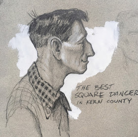
Tex, Square Dancer


I sketch this guy at a square dance. Some call him Smiley and some call him Tex. 

I ask if he's from Texas. "No sir, I'm from Louisiana," he says, but I'd rather they call me Tex than Louise

Thursday, July 29, 2021

Sensor Fusion Problem

One of the mysteries of visual perception is how the information all binds together into a singular experience after raw sensory data is decoded. 

Light enters our retinas, and the optic nerve feeds information back to the visual cortex. After that, the signal follows neural pathways to various areas scattered throughout the brain.


For example, the dorsal stream interprets movement, while the ventral stream decodes information about shape, color and object recognitions.

In addition to the visual streams, other streams of sensory information arrive via sound and touch. Those signal pathways also appear distributed around the brain. 

For a long time, neuroscientists supposed that all the various streams of sensory impulses must converge or fuse together at a central location, but it doesn't happen that way. 

Given the scattered nature of that neuronal activity, how is it that we feel that our perception is a single experience? 

According to neuroscientist Jeff Hawley's new conceptual model of the brain, the various areas in the cortex arrive at a preliminary conclusion of what they're looking at. They appear to form a consensus in a manner very much like voting. To do that they don't need to be in the same place.

Read More:

Sensor Fusion on Wikipedia

A Thousand Brains: A New Theory of Intelligence by Jeff Hawkins

NOTE: If you get my blog posts by email, you should know that Google is taking away email subscriptions next month. I'm trying to figure out a way to replace Feedburner for getting you your daily feed. Otherwise, you'll just have to click over to the blog to see new posts.

Wednesday, July 28, 2021

How to Begin a Drawing

NOTE: If you get my blog posts by email, I'll need to set up a new mechanism, because Google is taking away email subscriptions next month. I'll send you a special email sometime next month to let you know where to subscribe if you want to continue receiving a daily feed.

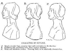
Which of the following is the best way to start a drawing? 

A. Simple straight lines. B. Sketchy lines leaving the exact contour unclear, and C. Short, indefinite strokes. 

In his 1916 book Practical Drawing, E.G. Lutz suggested that students should follow the first method. The other two lead to "vacillating" and "characterless" results.

He suggests you look for the longest and most prominent lines first and sketch them in lightly, but to keep them simple and straight, rather than drawing curving lines. 

It's easier to measure the other lines and slopes after you have the big, straight lines worked out. You can hold up a plumb line to judge the vertical lines or just use a pencil, which is also useful for measuring slopes. 

You can also trace the line invisibly in the air with your finger before you actually draw it on the paper. Lutz says "It may look odd to a spectator to see you make mysterious gestures in space, but what of it? The practice serves its purpose of giving you a better notion of the subject and making pictorial rendering easier."

After you're sure the big lines are right, you can begin placing the secondary and tertiary lines. Draw them lightly and be willing to erase and correct them early in the process. It's hard to fix mistakes later.

Once the drawing is accurately established, the next task is to begin shading. Lutz discusses the following methods:
—"An even tone put on first, nearly that of the half-tint. Try to work this way; in in continuing, keep the shadings in simple, unbroken tones.
—Shading reduced to an aggregation of flat areas of flat areas of tints from the darkest to the lightest. A good way to work if not overdone or carried too far.
—Trying to get the exact effect of roundness with the first strokes of the pencil or charcoal. This way of starting will result in uncertain and vague forms, looking less like the subject than a drawing made in flat tints. Not a good way to start."

In my experience, whether you're painting or drawing, you have to organize values. That means classifying the tones in your mind. Group together the parallel planes and simplify them into a finite and recognizable group of tones. This gives more force and clarity to your drawing or painting.

I have copies of Practical Drawing plus Drawing Made Easy in my web store, and would be happy to sign them for you or a young artist you're encouraging.

NOTE: If you get my blog posts by email, I'll need to set up a new mechanism, because Google is taking away email subscriptions next month. I'll send you a special email sometime next month to let you know where to subscribe if you want to continue receiving a daily feed.

Tuesday, July 27, 2021

Gold Bust of Almestra

Gold bust of Almestra, a Chandaran queen who married a king of Poseidos. Oil wash over pencil on illustration board.

--

From Dinotopia: The World Beneath, signed copies available at this link, and you can also get it on Amazon.

Monday, July 26, 2021

When Did the Golden Age End?

A friend of mine who teaches art history asked for my view on this question:

"How and when did the "Golden Age of Illustration" end? Did it end, or just shrink? Has there been a revival? Do you have thoughts on this, as an illustrator working with traditional media, in an imaginative realist genre, in the 21st century. How do artists now, relate to a golden age of illustration that supposedly ended? I would prefer to offer a hopeful analysis!"


My answer: A lot of illustrators who lived through the Golden Age years (from 1890-1920) complained that the great era of story illustration ended as the 1920s settled in, as a result of advertising, photographic illustrations, and other distractions such as radio, movies, and later TV. 

But if you look at magazines from the late '40s and early '50s, they were bursting with great illustrations, in creative layouts and strong storytelling. 

The 1940s and 1950s were a time of remarkable creativity under Coby Whitmore, Al Parker, and the other innovators. The '60s, '70s, and '80s was also a creative, productive era for story illustration, especially in paperback covers, movie posters, album covers and National Geographic illustrations: Consider Tom Lovell, Drew Struzan, James Bama, Frank Frazetta, and Mort Drucker. Big corporate accounts were still buying illustrated advertisements and annual reports all through the '70s and 80s.

When I started doing book covers and Nat Geo illustrations in the early 1980s, it sure felt like the Golden Age was still alive in my little corner of the profession. I didn't pay much attention to the famous illustrators that were popular in my time, but instead I oriented to Rockwell, Loomis, and Pyle and built my reality around their ideas. The art directors I was working with were giving me a lot of freedom, and there was a small but loyal fan base.

But there was no doubt that illustration has been far less mainstream for the last half century than it was in the days of Pyle, Wyeth, Rockwell, Leyendecker, and the illustrators of the "slicks." That difference is reflected in the fees illustrators receive. For instance, Charles Gibson was regarded like a movie star. The pay he would receive for a single pen and ink drawing would be equivalent to about $45,000 today.

Sunday, July 25, 2021

Using "By James Gurney" as a Style Prompt

A couple weeks ago I shared the results of some text-to-image experiments

Code wizards have been using machine-learning tools such as VQGAN + CLIP and BigSleep to create novel images that grow spontaneously from word prompts. 

Erfurt Latrine Disaster (Twitter @ErfurtLatrine) Prompt: "Towers" #VQGAN+#CLIP

The prompts can be simple, such as "Towers."


jbusted @jbusted1 "Forbidden Lands 5"
....Or the prompts can evoke a particular role-playing game, such as "Forbidden Lands."

The results develop a unusual style if you add a descriptor naming a studio, portfolio website, or rendering software, such as "from Studio Ghibli" or "trending on ArtStation" or "rendered in Unreal Engine"

  "The Grand Hall of the Sacred Library by James Gurney"

To my fascination and delight, some of them have gotten interesting results by including the phrase "by James Gurney." 


dzryk @dzryk
 "The tech bubble bursting by James Gurney"

Twitter user Ryan Moulton @moultano created a set of related images starting with the phrase 'The Hermit Alchemist’s and varying only the style cue: 

'The Hermit Alchemist’s Hut by James Gurney'

'The Hermit Alchemist’s Hut rendered in Unreal Engine'.


'The Hermit Alchemist’s Hut by Van Gogh'


"A castle built on the skeleton of a dead god by James Gurney"


Ryan Moulton @moultano "In the Woods, Gouache Painting." 

Using the phrase "In the Woods + Gouache Painting" (without an artist's name) yields something that appears painted in water media, like a Mary Blair concept painting, but with something weird about the kids' faces. 


Ryan Moulton @moultano "In the Woods by James Gurney"

All of the results have issues of basic logic and perspective. They never make sense or seem fully coherent, at least not yet. 

But some of them do suggest a recognizable style. Does this look like my style to you? I'm not sure; it feels both familiar and alien. It almost looks like something from a long lost sketchbook. 
---

Saturday, July 24, 2021

If you don't have much time, skip the pencil and draw with a brush

With only a few minutes to paint a man in a diner, I have to decide which tool to start with tool to start with, a pencil or a brush?


In this new YouTube video, I opt for the brush and dive right in.

The advantage of drawing with the brush is that you can get lines or tones of any lightness or darkness.
----
The #6 round brush I start with is by Richeson / Quiller

Friday, July 23, 2021

Ask your question about on-location sketching

Hi, I'm gathering recorded questions to answer in a future YouTube video about Painting or Drawing on Location.  

The widget above lets you record a question on audio and send it to me. Please think about your question (keep it very brief) and give it a try. Be sure to include a name (real or made up). You get to review your question before it is sent. I may not get to all of the questions, but I'll try.


If you don't want to ask your question with audio, you can write it in the comments.

Thursday, July 22, 2021

Reflections in Shallow Water

Reflections in shallow water follow definite laws. Look first for the edges of dark forms against the sky. These strong contrasts break up in a loose, painterly way. 


Riverbank in Clonmel, Ireland, oil on panel, 8 x 10”

Subordinate edges and details are usually blended and lost in the reflection. In this painting the smaller masses of foliage are swept together with vertical strokes. The color of the reflection is warm in the foreground because the light bouncing off the surface is mixed with the warm colors of the illuminated river bottom.

Wednesday, July 21, 2021

Gouache Seascape by Trost Richards

William Trost Richards, Rocky Coastline, gouache, 1878, 29½ by 43¼

In this large gouache painting by Trost Richards, the sun is centered in the composition. 

The sunlight is echoed in the reflections, which are tucked in the small space between the rocks directly below the sky, and there are even smaller dots of light on the wet pebbles below that. 

Tuesday, July 20, 2021

Pyrocumulonimbus Clouds

The Bootleg Fire in Oregon has spawned tornadoes and has generated plumes of smoke that rise to the altitude of jet aircraft flightpaths. 

Image from hdnux.com

The rising currents of air create clouds resembling cumulonimbus formations, but because they're generated by fire, they're known as pyrocumulonimbus clouds.

According to the New York Times, the pyrocumulonimbus cloud over the Bootleg Fire is "similar to a thunderhead. 'It likely reached an altitude of about 45,000 feet,' said Neil Lareau, who studies wildfire behavior at the University of Nevada, Reno. Like a thunderhead, the huge cloud spawned lightning strikes, worrying firefighters because of their potential to start new fires."


Monday, July 19, 2021

Fog in the Harbor


Harbor Fog, oil on board, 8 × 10 in.

The water in this Maine harbor is glassy smooth, just one tone darker than the sky. Everything is gray except the red details at the waterline. All the color and detail of the far boats drops out. The distant sailboat is just a ghost.

From Color and Light: A Guide for the Realist Painter

Sunday, July 18, 2021

"Make every stroke count"

Stop and think for a second before you place a stroke. Consider how the stroke is going to look before you lay it down. Then commit to it. Don't move the brush three times when once will do.


Painting in gouache helps train this awareness. When you paint in water media, leave a passage alone once it starts to dry. Let it dry fully before you add more. Place the wettest layers on the first pass, and use drier strokes later in the process as you build opaque colors.

I learned all this stuff from my early years doing calligraphy, where you only get one chance to make a stroke, and you can't change a goof. I also picked up the idea from two of my early heroes, Jack Leynnwood (plastic-model box illustrator) and John Berkey (science fiction illustrator). I met each of them and watch them paint a little. As Jack used to say, "Make every stroke count." 

The purpose of this deliberation is not to make a particular virtue of technique, nor is it to make the brushwork stand out. Heaven forfend! 

The goal is economy and efficiency, just as it is in writing. Style gurus Strunk and White put it this way: "Omit needless works. Vigorous writing is concise. A sentence should contain no unnecessary words, a paragraph no unnecessary sentences, for the same reason that a drawing should have no unnecessary lines and a machine no unnecessary parts." 
---
Quote from Strunk and White's book, "The Elements of Style"

Saturday, July 17, 2021

Belt-Driven Drill Press

Here's a drawing of a belt-driven drill press, drawn in pencil and gray wash. Gray wash is watered-down ivory black watercolor, carried around in a little bottle and applied with a sable brush.


Belt drives were common before electric motors were small enough and powerful enough to attach to each piece of machinery. When it was originally set up—probably driven by a water mill—the operator could change the speed (and torque) by switching the belt over the smaller or larger pulleys in the upper left. Bevel gears at the top transfer the axis of rotation from horizontal to vertical.
----
After my post about this on Instagram, there were some interesting comments:

Bonny Hartigan: "My dad had a woodworking business and when I was a child, most machines were belt driven with water power. It was so quiet compared with the electric motors that he had later. All you heard were the whirring and slapping of the belts. What a wonderful memory that is, thank you for reminding me."

DK Vosburgh: "The sad thing is that most of these old machines fell out of use when their babbitt-metal bearings wore out, and people had forgotten how to cast new ones. They worked fine, otherwise."

Ken Simpson: "When [I was] a young fellow working in hardware store we sold the flat belts and joiners, the 2” belt was sold to the local school to make hand straps to punish boys in fractions."

Friday, July 16, 2021

How William Morris Printed His Wallpaper

Experts at the Victoria and Albert Museum have reconstructed the methods used by William Morris to print his wallpaper. 

William Morris, Wallpaper, Acanthus Design 

They're using the same original hand-cut wood blocks that Morris used, with as many as 30 different blocks and 15 different colors for each design.

Here's the link to the video on Victoria and Albert channel.

Read More Online:

HOW NATURAL GREENS INSPIRED THE WALLPAPERS OF WILLIAM MORRIS (Elle)


Book

William Morris Full-Color Patterns and Designs (Dover Pictorial Archive)

Thursday, July 15, 2021

Video of Ernest Watson


Ernest Watson wrote many instructional books and was an advocate of pencil sketching. I didn't realize it, but he also produced instructional videos.


His grandson put this one on YouTube recently. He also shared this bio info:

"Ernest W. Watson was born in 1884, graduated form Massachusetts Normal Art School in 1906, and received an Art Teacher Education Degree from Pratt Institute in 1907, where he subsequently taught from 1908 to1929. He co-founded the Berkshire Summer School of Art in Monterey, MA, with Raymond P. Ensign, was art editor of Scholastic Magazine from 1931 to 1937, when he founded Watson-Guptill Publications along with Arthur L. Guptill and Ralph Reinhold. Watson was vice-president of Watson-Guptill, and Editor in Chief of it's publication, American Artist Magazine, until his retirement in 1955. He died in 1969. He is best known for his broadstroke pencil drawings, an example of which is demonstrated in this film, and for his linoleum block prints which he often co-created with my grandmother, Eva Watson."

Despite that impressive biography, there is currently no Wikipedia page on Ernest W. Watson. Anyone know how to remedy that?

More info: 
Creative Perspective for Artists and Illustrators 

Thanks, Paulo.

Wednesday, July 14, 2021

Vassar Library and Dinotopia

Dinotopia came to life in a library — the Vassar Library in particular — where I spent many hours researching obscure diaries of 19th century explorers and first had the idea of discovering a lost explorer's sketchbook.


When Life Magazine put together a story about the origins of Dinotopia, we brought together several of the models, including publisher Ian Ballantine (who posed for Nallab the librarian), and editor Betty Ballantine (on the balcony, who was Norah of Treetown). 

Photographer Tobey Sanford got permission from the library directors to stage a photo shoot there as a way of visualizing the magical dreams that can emerge from a universe of books.
----


Tuesday, July 13, 2021

Fashion Illustrations of Constance Wibaut

Constance Wibaut (1920-2014) was a fashion illustrator from Holland who reported from Paris in the 1960s on the new styles by Pierre Cardin and Yves Saint Laurent. 


Constance Wibaut (1920-2014), Sketches from Paris, 1966

Her drawings are spare and direct, with bold colors, clear shapes, and strong silhouettes.


According to the European Fashion Heritage Society, "She moved to New York with her husband just after the Second World War. There, In 1946, she found a job as fashion illustrator for the magazine Women’s Wear Daily. At WWD she developed her signature style, drawing ready-to-wear clothes on a hanger for the magazine." 

"The need to be precise and to include all the details, from the buttons to the stitchings – as they were important for sales – would have influenced her future illustrations, which were characterized by elegance and easy legibility."

----

More in the book 100 Years of Fashion Illustration 

Sunday, July 11, 2021

Ladies Picking Flowers


José Jiménez Aranda painted these three young women picking flowers. He captures a moment where the near girl appears to be saying something to the other two. She acts as a repoussoir figure, acting as a transition between the viewer and the people who are fully inside the picture.
---
Previous post: Repoussoir
Previous post on J.J. Aranda