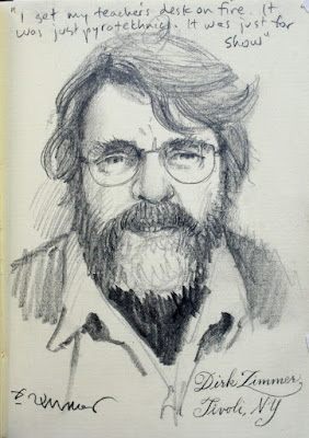
Some years ago I met up with Dirk Zimmer in a diner and sketched his portrait. He regaled me with stories of his early escapades when he was growing up in Hamburg, Germany.
Sunday, July 30, 2023
Dirk Zimmer
Friday, July 28, 2023
Pyle's Advice on Choosing a Subject
American illustrator and teacher Howard Pyle (1853-1911) said:
"A subject must not be chosen because it is picturesque. It should be a general subject and should hold some great truth of nature or humanity so that a person seeing it would give a part of his life's earnings to possess so beautiful a thing."
"After you have chosen a general subject, submit it to the crucible of your own imagination and let it evolve into the picture. Project your mind into it. Identify yourself with the people and sense, that is, feel and smell the things naturally belonging there."
Thursday, July 27, 2023
Gammell / Lack Videos
Someone over at the Gammell Lack Institute of American Art is putting out great videos on academic / impressionist painters of the past.
There are videos about William Merritt Chase, Vojtěch Hynais, Robert Blum, Charles Sprague Pearce, John William Waterhouse, Antonio Mancini, and many more.
R. Ives Gammell and Richard Lack helped keep the flame of academism alive by passing on the knowledge of studio practice in their teaching.
On the YouTube channel I don't see a credit for the writer, editor, or voiceover person, but the art is well chosen and the voice sounds polished. I'd love to know more about how they produce these, because the videos are coming out at a rapid pace.
If you like this GurneyJourney blog, you'll enjoy these Gammell/Lack videos. Check out their video channel: Gammel Lack Institute of American Art
Tuesday, July 25, 2023
Question from a Masters Student
"When working in a field like commercialized illustration, where the subject is more or less dictated to you, do you find that it impacts the level of, or form of, self-expression that you put into a piece?"
There are three assumptions built into the question that I'd like to examine. In my experience illustration doesn't have to be commercial unless you're doing an illustration that's promoting a specific product or service. Even in that case, advertising illustration these days tends to be more creative, indirect, and expressive, and doesn't generally feature the product directly as it did in the 1950s.
You might ask in what other sense can a piece of art be commercial? Well, it can be commercial if it is created purely with the intent to sell it, or if it's just done for the money.
I never accepted the conception of fine art vs. commercial art, which strikes me as a false dichotomy, because it presumes gallery art is somehow more free from commercial considerations or more personally expressive. It's not; it's usually more commercial in that other sense.
A young artist is completely free when they bring their first batch of paintings to a gallery, but once some pieces start selling and other pieces remain unsold, there's tremendous pressure to repeat a success and to focus more and more of one's mind on such commercial considerations. It's possible to rise above such thoughts, but not easy.
That's why I love illustration. I never even thought about whether my covers helped to sell a book or a magazine. It would have been impossible to disaggregate the data, and we didn't get analytics anyway. So in my experience, illustration is far less commercial, more free, and more expressive than gallery art.
The third assumption is that subjects are dictated to the illustrator. Don't kid yourself: many gallery dealers dictate subjects to artists. Nothing is trickier to manage than a portrait commission or a client commission for a piece "like that other thing you did." I never experienced the problem of dictatorial illustration clients.
Monday, July 24, 2023
Whistle Player
Musicians on stage typically move around from moment to moment. As they shift their balance, their silhouette changes. That only becomes obvious if I do a series of poses next to each other. Even if I'm in dim light with a seat far back from the action I try to capture the gist of the gesture.
Saturday, July 22, 2023
Moving Objects Appear More Saturated
This finding might have applications for animators and for designers of digital interfaces.
Friday, July 21, 2023
Painting a Sleeping Dog
Thursday, July 20, 2023
Clausen's War Art
Wednesday, July 19, 2023
Arthur Buckland
Tuesday, July 18, 2023
Foliage: Textures and Tropism
The split brush suggests the growth character of each type of tree.
Monday, July 17, 2023
Smooth Pursuit
Unlike the jerky, saccadic movement of the eye as it jumps around a scene, smooth pursuit is the active tracking of a moving object in your environment.
The purpose of smooth pursuit eye movements is to enable us to focus our eyes on moving objects by utilizing mechanisms of visual motion processing. It helps us maintain a clear and stable visual perception of the moving object.
Wikipedia on Smooth Pursuit
Sunday, July 16, 2023
How are you using Threads?
I have a question for visual artists experimenting with Threads: How is the vibe there different from Instagram and Twitter? Is your strategy for posting different? Are you excited about exploring a new platform, or are you kind of bored by social media?
Saturday, July 15, 2023
International Artist Spotlights the "Fab Four"
International Artist Magazine #152
Thursday, July 13, 2023
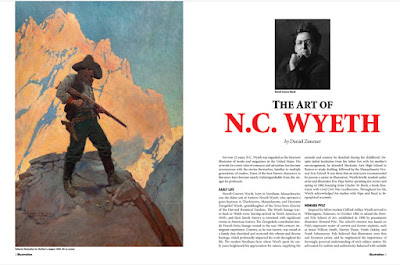
Looking Back on Illustration Magazine
Illustration Magazine has announced that it will end publication. The quarterly print magazine has spotlighted most of the great American illustrators from the 20th century in lavishly illustrated articles. The magazine was the brainchild of Dan Zimmer, who almost singlehandedly did the research, interviews, writing, editing, and publishing.
I asked him a few questions as we look back on his remarkable achievement.
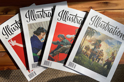
Gurney: You're ending the 20+ year series of 84 issues on an amazing high note by releasing four issues all at once. How were you able to pull off four simultaneous issues?
I began looking at ending the magazine a few years ago, as the numbers were declining and I could see the end was nigh. The problem has always been my overhead of subscribers. I didn’t want to cheat people by suddenly going out of business or something. So… How do I fulfill my obligations to everyone in the most cost effective way? I didn’t want to do “double issues” or something.
As far as getting all of the issues together, I chose artists that were somewhat easy to cover, as I had the material readily at hand in my archives.
It was a lot of work compressed into a short period of time, but I tried to make the issues as solid as any of the others in the past. I didn’t want to “phone it in”. I think I succeeded.
Who were some of the key unsung heroes behind the scenes who helped you bring out the magazines?
I’ve had some great contributors over the years who have supplied me with wonderful articles, scans of artwork and tear sheets, etc.
The advertisers, of course, many of whom probably realized little return at all from their ads in the magazine but who continued to support me regardless. Grapefruit Moon, Fred Taraba, Kayo Books, Illustration House, Heritage, there are too many to list over the years.
David Saunders in particular (the son of famed pulp illustrator Norman Saunders) was one of the greatest supporters of the magazine, and contributed in many ways over the years and he became a great friend and confidante.
The late Charles Martignette was also a wonderful supporter, though his overwhelming blocks of ads in the magazine quickly became a bit of a problem. But it was hard to turn down the extra revenue!
As far as actually physically making, designing, retouching, packing, making the website, etc. I have always done all of this on my own. I would laugh when someone would refer to my “subscription department”.
Do you have any advice for small or individual publishers?
At one time publishing was a great way to make a living, in the 90s especially as desktop publishing turned everything upside down and one person could suddenly produce a magazine by themself. TODAY it’s all about the internet. An art magazine in print is kind of a crazy thing now, as everything is instantly accessible online. It’s an anachronism. I think my own magazine was overwhelmed by Facebook groups and websites, where the imagery is now readily available and best of all—FREE! I can’t compete with that.
Anyone who wants to be a publisher must wear a lot of hats. You will need to know how to do it all, from writing and editing to website design, social media maintenance, Photoshop, graphic design, the list goes on. If you aren’t doing it yourself, you’ll have to pay someone else to do it, and that gets expensive quick!
Print on demand enables you to do extremely tiny print runs, but the unit cost of the product is extremely high compared to “real” printing, so I don’t see where the money is at with such a venture. Each single copy ends up costing $25 or more. There’s no way to sell them wholesale at that rate, so distribution is not possible. It’s a fun hobby at that level, but you can’t do that to make a living.
Only get into publishing if you really love it, and you aren’t worried about making your money back.
Let's go back to the beginnings. How did you first become aware of the history of illustration? Were there any exhibitions, galleries, or personal encounters that grabbed you and got you into it?
Star Wars prompted the publication of a lot of science fiction related picture books that reproduced old pulp covers, which were a revelation to me. What was a pulp magazine?? I had never seen one or heard of anything like that. Strangely I was a member of the Wizard of Oz fan club when I was 12 or something, and they published a directory of their members. Ray Bradbury was listed in there, with his actual home address! Crazy!
Around that time I had purchased a used and waterlogged copy of a book called The Pulps that had come out in 1970. The book had a small color section poorly reproducing incredible pulp covers that just blew my mind. (This was my very first exposure to artist H.J. Ward’s work.)
A guy named Sam Moskowitz contributed to the Pulps book, and I happened to see the same name in the Oz fan club member directory. Was it the same guy?? I wrote to him, and yes it was! I asked him about pulps, and how do I find out more about this stuff? He kindly wrote me back and turned me on to some fanzines and other information that was invaluable in those days.
I was in middle school in St. Louis, I knew NOTHING at that time about comic book conventions, or that a PULP CONVENTION was actually held in St. Louis regularly in the mid-70s. (I never knew about it, so I never went!) I learned much later that Moskowitz was a seminal figure in the history of science fiction. I was a kid, what did I know?
But his information opened up a lot of doors in the pre-internet days, so I was able to start buying pulp fanzines and learning about the great artists of the pulps. Around the same time I also discovered the book 40 Illustrators and How They Worked, which was a great introduction to a lot of great magazine illustrators of the past.
What books or magazines inspired your editorial approach to Illustration magazine?
I was heavily inspired by Communication Arts magazine, as far as the minimal “non-design” of my layouts. The emphasis being on the art, and not on any kind of flashy or distracting design. I didn’t want anything to ever look “campy” or “zany” as so many other books have looked that covered vintage or retro subjects. I wanted to treat the art as you would see it in a book on Money or Sargent. With respect. The boring layout was not intended to be a showcase of MY ability as a designer, I wanted the art to always be the main focus.
I was also inspired by Walt Reed’s auction catalogs, and Russ Cochran’s auction catalogs. The “Methods of the Masters” articles in Step-by-Step Graphics magazine were also a key inspiration. I would be so frustrated when they would skip the column from time to time, as that was my main interest in the magazine in the first place, and I thought how great it would be if there were a magazine devoted ENTIRELY to illustration from the past. I knew it would never be a mainstream kind of thing, but I knew it would make a great fanzine. I first started thinking about this in 1989 and throughout the 90s. As technology evolved and direct-to-plate desktop publishing became a reality, the costs of making a full color magazine by myself plummeted to the point where I started seriously considering it in 2000 or so.
What do you like or dislike in the coverage of illustration history by traditional art publishers or museum institutions?
Things have improved quite a bit over time. As I said, the “campy” type of coverage of the material is still an issue, but it seems like you’re seeing it taken more and more seriously now. In direct response to the MONEY that original illustration art is generating at auctions. The huge dollars always make a difference.
There's a debate in art history: Some make the case that the concept of a "golden age" is baloney. They argue it's an illusion powered by nostalgia. In other words, every age is a golden age, except our own. The other view is that there are creative periods of truly pioneering innovation and peak skills, and there other decadent periods of confusion and decline. Which of those two views of the golden age idea makes more sense to you and why?
I think the old illustrators, when they were referring to the Golden Age, were essentially referring to a time in the field when an illustrator could make enormous amounts of money and have significant cultural impact. That all faded as technology displaced illustrators as THE image and tastemakers of the day.
But as far as artistic opportunity, this may actually be one of the BEST ages yet. Artists have never had so much opportunity to have their work seen instantly all around the world. There are YouTube artists with millions of views, who sell their work to eager collectors. There are illustrators who have had $500,000 Kickstarter campaigns for their books. There are a lot of possibilities today, but you have to wear a lot of hats and master entrepreneurship like never before to be one of the stars who really makes it. Could THIS really be the new Golden Age? I think it might be!
So much of print culture disappeared after it came out, leading to a crisis of confidence for many illustrators about the value of their legacy. Were illustrators right to worry that they'd be forgotten, or do you see a trend for renewed recognition?
I think the internet has fostered a great deal of recognition and renewed interest in the illustrators of the past. The imagery and information is more accessible than ever. So work from old publications thrown out 70 years ago has a chance of being seen again, splashed across Facebook groups and Pinterest pages. The chance to be remembered is better NOW than ever before, no doubt about it.
Do you have any advice for older illustrators about how to preserve their legacy, and how to make life better for their descendants? Can you offer general rules or examples of who did it right or wrong?
Illustrators alive right now need to be very serious about taking great photos of their work and preserving their material in a permanent way.
I would say, build a great website. Share the work every day and get it out there. If you’re invisible you will certainly be forgotten.
Sign your work, probably TWICE! Never leave an original unsigned.
Making a hardcover book is probably the best way to build an enduring legacy. An artist is always taken more seriously when there’s a nice solid substantial book to point at, whether that book is a financial success or not! A book is a great catalog.
As you documented the lives of so many successful illustrators, did you discover common personality traits among them, or common work habits? Were there any that stood out as wildly different from the norm?
The common thread has always been the incredible work ethic. The most successful illustrators simply worked harder than everyone else. Norman Rockwell painted every day, even holidays. He was always at it, and he never cut any corners. The level of craftsmanship was astonishing. Any artist needs to realize that you have to put the time in. Writers have to write, artists have to make art. Constantly.
Were there any illustrators or illustrations you really wanted to cover, but couldn't because of copyright or other logistical reasons?
Gathering high quality material was always the greatest challenge. Photos of original art, and clear tear sheets.
People often asked me if I worried about running out of subjects, and I would laugh. The number of artists to cover is endless. I think I featured around 200 or so over 84 issues. My hard drive has file folders covering over 2000 different illustrators! I could have gone on and on for many years. It’s endless.
I think you mentioned you had an article in production on John Bauer. Were there other illustrators where you gathered some interesting elements, but for one reason or another just didn't get the articles finished?
In the case of Bauer, the magazine expired before the article was complete. There were three or four articles in the works that I couldn’t publish as the magazine was ending. I was continuously gathering material and scans for many many illustrators that I earmarked as favorites I wanted to cover. Sometimes it took many years to gather enough to fill 40 pages. I wanted to feature Mortimer Wilson, for example, but never got a good bio together. I wanted to do a book on Dell comic cover artist George Wilson, but I couldn’t find a photo of him or any link to his family. I had plenty of images, but not enough information.
What do you see coming for illustrators entering the business now? Will they all have to become animators, publicists, or coders? How will AI change things for artists?
Illustrators today have to be entrepreneurs. It’s more the lifestyle of a “fine artist” in that you have to generate your own projects, create your own worlds. You’re not working for clients as in the past. It’s possible that illustrators will still find clients in the old fashioned style of doing business, but the most successful people are working outside of that mold. I see illustrators creating their own “how to” books, video courses, YouTube channels, all sorts of things all at once. You have to be a master of social media now, and you have to be very diverse. You have to enjoy being in front of the camera and turn yourself into a celebrity of sorts. AI art is going to turn a lot of the business upside down, but there will always be room for real artists with vision creating unique things that an AI won’t be able to match. (Maybe!)
When it comes to AI art, I can only imagine that you've had a variety of reactions to the innovations in the last couple years. Have you been amazed, terrified, bored, disgusted, or some combination of those? Is there something people are missing when they talk about this new technology? Is there something about adapting to change that we can learn from the experience of previous illustrators?
The revolution in AI art has been incredible. As the founder of Nvidia said recently, the future won’t be in rendering, it will be in generating. You can make hyper real imagery without 3D modeling or rendering tools. I NEVER saw that one coming. What will it mean when anyone can “prompt” their own Hollywood style superhero movies from home? This reality is coming right around the bend. I can’t imagine how it will remake the entertainment business, the image making business.
In the end, though, someone with talent and taste is going to have to guide all of this in order to create something worth looking at. Who knows how far AI can go in terms of genuine “creativity” but I don’t think talented artists have to be worried. Things will change, but it’s a big world out there and there are always opportunities for the witty and clever to carve out a niche.
Illustrated Press
Wednesday, July 12, 2023
How to Simplify a Complex Subject
In this new YouTube video I paint a blacksmith at his forge and answer questions about strategies for dealing with complexity and detail. Using watercolor and gouache, I show a couple ways to reduce confusing background details and focus attention on the important parts of the silhouette.
Tuesday, July 11, 2023
Archaeology and Art Style
"How has the study of Archaeological and Anthropological aspects influenced the style of Imaginative Realism in [your] Artworks?"
When I was very young I fell in love with archaeology as a result of reading in National Geographic Magazine about the discoveries of lost cities like Machu PIcchu in 1911. I majored in Anthropology (which included Archaeology) in college at University of California at Berkeley. This was a subject that interested me intellectually, but while I was studying it, I had no idea how I would connect it to my even more consuming interest in art.
After graduating college, I went briefly to art school and subsequently learned to paint and draw by reading old instructional books and getting some professional experience in the paperback field. Eventually I got an opportunity to work for National Geographic as a freelance illustrator.
When I started there, National Geographic still sent its artists and art directors to meet the archaeologists on location. On some of my first assignments I had a chance to see Rome, Tarquinia, Cerveteri, Norchia, and Populonia for an article on the Etruscans. We visited some newly discovered tombs with an archaeologist named Rick Bronson.
I wasn't thinking about a style as such. The goal in my mind was to eradicate style as much as possible and to visualize what I believed to be the vision of the archaeologist. I wanted to paint the scene as if I were a witness to lost moments of history. I was inspired by the previous National Geographic illustrators such as Tom Lovell, who I later met and corresponded with.
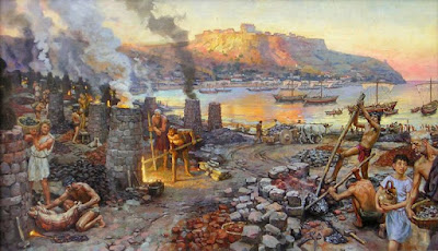
I had to get used to the fact that most of the work would never be seen. National Geographic is a photo magazine, not an art or illustration magazine, so the art never had a secure place, unless there was no other way to solve the problem. That meant working up full comprehensive layouts for editorial meetings to try to steal layout space away from the hundreds of dazzling photographs that had already been taken.
It was routine for entire stories to be cut after a lot of work was done. I did dozens of comprehensive studies for a story on the Roman empire in the Holy Land, but the whole story was canceled because the editor questioned the scholarship of the author. But I didn’t mind too much. It was like taking a college course and getting paid for it.
Sunday, July 9, 2023
Abney Effect
The Abney effect is the name for the apparent shift in a color's hue when white light is added to it.
Note how the blue appears to shift to reddish violet as it gets lighter.
Saturday, July 8, 2023
Friday, July 7, 2023
Thursday, July 6, 2023
Tuesday, July 4, 2023
Painting the Wienermobile
In the newest YouTube video, I paint the 1952 Wienermobile on location at the Henry Ford Museum using gouache on my homemade sketch easel. Plus: information about specularity, diffraction spikes, and concave highlights.
Monday, July 3, 2023
Sketch for Procession by Haag
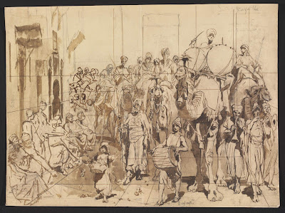
Every figure is placed relation to the height of the viewer. Assuming a level ground plane, the eye level intersects the camel riders in the middle of their chests, and it's about half a figure higher than the top of a standing figure.
Saturday, July 1, 2023
Successive Contrast
Choose either colored circle and stare at the + for 30 seconds. Then scroll down and look at the + on the corresponding orange circle below.
The afterimages of the red and cyan circles float above the orange circles. Those afterimages are opposite to the stimulus color, so red becomes cyan and cyan becomes red.
The floating afterimages mix with the stimulus color apparent color of the orange circles, making the two orange circles appear different from each other until the eye readapts.
This effect is known as successive contrast.

